In contemporary homes, stair skirting ideas have quietly shifted from a functional footnote into a primary visual tool that establishes character, rhythm, and calm order across a whole floor. Where a slim trim once sat unnoticed at ankle height, the newest skirting design for stairs now acts like a drawn line, a wrapped surface, or even a sculptural band that carries color and light along the rise.
The effect is not just cleaner detailing; it is an interior mood decision. Designers are focusing on how the lower wall behaves as a visual partner to wood, wall paint, artwork, and soft LED glow.
These ideas are being seen in many high-style interiors—from cozy homes in leafy neighborhoods to minimalist townhouses and refined metropolitan spaces—where the stair skirt board ideas bring a sense of clarity and composure that feels modern yet warm rather than harsh.

One of the strongest shifts in staircase skirting ideas is the embrace of two distinct visual languages: the contour and the field. Some homes lean into a slim, graphic line—often matte black or charcoal—that traces each riser like ink, creating a crisp zigzag under warm wood treads.
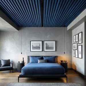
In others, they treat the entire wall-side triangle as one continuous surface in deep navy, soft olive, warm greige, or pewter-gloss, turning the base into a single color plane that behaves like part of the architecture.

Both directions move away from the old “tiny strip at the base” mindset; instead, they shape the wall so the stair feels purposeful. The contour approach gives clarity and precision, ideal for bright homes with pale walls and refined wood tones.
The color-field approach brings grounded energy and elegant stillness, especially when paired with natural oak accents and gentle lighting that grazes edges rather than flooding the wall.

Lighting plays a quiet but powerful role across the most admired stairs skirting design. Instead of spotlighting the stair, soft grazers sit just beneath nosings or above subtle plinth edges, creating a warm halo that outlines the ascent.
Light is not a showpiece here—it behaves as a gentle seam that softens contrast and adds depth.

On dark bands, the glow rides like a thin cloud above the tone, keeping the mass from appearing heavy. On pale bases, toe-level lighting creates a floating illusion that feels calm and refined.
This light strategy supports both thin graphic outlines and full-height board-and-batten wainscot styles.

In either case, the stair reads as something composed, not busy, and the stair skirt trim ideas feel like part of the architecture rather than decoration. The key emotion is quiet confidence, achieved through consistency of light spacing and controlled direction.

Texture has become another standout theme in stylish stair skirt board ideas, often taking the form of slender vertical ribs, fluted wood, or finely spaced grooves running along the pitch. These surfaces respond beautifully to raking daylight or soft LED grazing, producing feather-thin shadows and a gentle ripple effect.
Instead of adding loud patterns, they can are choosing micro-texture scale—detail that only reveals itself up close, offering sophistication without fuss.

Fluted bands often rise to handrail level or meet a low bench shelf, giving the stair side a furniture-like presence. This approach pairs well with plaster walls, clay pots, matte metal balusters, and pieces of natural stone or pottery that echo earthy materials.
It works across a range of interiors—from Scandinavian-leaning calm homes to modern rustic spaces—showing that stairs skirting design can read as warm and organically textured, not just sleek and painted.

Color itself has taken on new depth in stair skirting ideas. Instead of default white or wood-tone bases, they are assigning the lower wall a steady mid-tone role.
Muted olive, soft taupe, pale greige, and gentle slate appear frequently. These shades sit between bright walls and warm timber, bridging them softly rather than creating hard contrast.
Richer hues—deep navy, graphite charcoal, or carbon black—appear where the home already carries strong contrast and sharp silhouettes.

There is also a rising interest in chalky finishes with tiny tonal speckles or subtle matte texture, introducing painterly nuance that feels hand-touched yet simple. Tone-on-tone color plays are emerging too, where the risers and skirting share one color band while nosings remain timber, forming a serene “color river” up the stair without shouting.
The result aligns with the newest skirting design for stairs trends: color that is expressive but calm, tactile but quiet.

Elevation logic—simple, quiet alignments—is a hidden hero across the most refined staircase skirting ideas. The visual trick lies in where edges land.
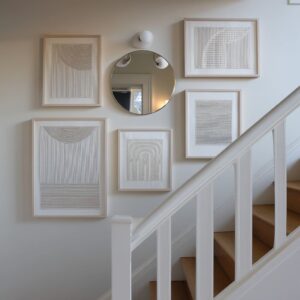
Handrails often line up with the top of wainscot panels, art frames sit just above the band edge, and floating shelves or lighting bars echo the height of nosings or caps. Rather than guessing, the interior lines hum in gentle coordination.
This creates a measured feeling, where nothing appears random and every horizontal line echoes another.

In some ideas, a shallow arc precedes the diagonal climb of the skirting, softening the pitch without gimmicks. In others, a broad plinth wraps the first step before the band thins as it rises, grounding the start of the ascent then lifting visually as it climbs.
These moves demonstrate how stairs skirting design can shape perception of balance and height without needing ornament or elaborate form.

What rests around the skirting has become just as intentional as the skirting itself. Many interiors use negative space as a tool: objects rarely sit directly inside or on the skirting zone unless the design explicitly builds a shelf or bench.
When the skirting becomes part of a continuous surface, ceramics, framed prints, and tall vases shift upward, preserving that uncluttered lower shape.
In other concepts, an oak-capped ledge is part of the stair skirt trim ideas, acting like a slim display rail where lighting grazes below and art rests above.

Placement of frames is coordinated with skirting thickness and line weight; thin black frames match thin black skirt lines, while brushed metal frames echo glossy pewter or slate finishes. These choices create harmony and make the base feel intentional rather than incidental, bringing consistency across the stair, hallway, and adjacent rooms.

Grouped stylistic directions are emerging within modern stair skirting ideas, each with its own visual personality:
Graphic and crisp looks
- Thin black zigzags under warm oak
- Cream walls with matte charcoal lines
- Warm white risers with picture frames matching skirting thickness

Earth-warm banded looks
- Olive or taupe wainscot meeting oak rail caps
- Bronze notes in lighting and hardware
- Natural clay accessories balancing the tone

Monomaterial timber wrapping
- Oak upstands that match tread thickness
- Plaster walls kept matte to respect the wood form
- Gentle shadows marking each step profile

Tonal sculptural bench runs
- Fluted oak extended as a seat then rising into skirting
- Concealed uplight just above the ribbed line
- Grounded bowl or vessel placed off-center for calm asymmetry

Soft pastel and chalk looks
- Dusty coral base with tiny white specks
- Cream caps and oak edges
- Airy wall art and greenery placed above the band

Each direction provides a different emotional tone, yet all emphasize clarity, controlled palettes, and thoughtful silhouettes that elevate skirting design for stairs beyond utility.

Finishes matter as much as form in these ideas. Matte surfaces are common because they keep attention on the stair shape rather than reflections.
When sheen does appear—such as high-gloss pewter wainscot meeting bright cable rail—the shine feels like a quiet echo of polished metal and daylight, not a decorative gloss coat.

Timber skirting remains beloved, especially when the upstand is sized to match tread thickness, giving the effect of a carved block rather than layered trim. This monolithic feel aligns with natural plaster textures, hand-thrown ceramics, and soft linen-textured art, proving that stair skirt board ideas benefit from harmony between materials as much as from color selection.

Pattern, interestingly, has taken a micro approach. Instead of bold wallpaper or heavy motifs near the treads, the most current stair skirt trim ideas use whisper-fine illustration lines, tiny constellation motifs, or pixel-like steps in multi-tone bands.
These patterns stay subtle enough that the space stays grounded, but close inspection reveals thoughtful visual humor or artistic nuance.

It is a way to introduce personality without disturbing calm lines and balanced palettes. These micro-gestures make stair edges engaging without overwhelming the architecture, supporting a broader movement toward interiors that feel personal, curated, and quietly expressive.

Looking across these ideas, one thing becomes clear: beautiful stairs skirting design depends less on ornament and more on intention. Whether the stair shows a single thin dark line, a full painted wedge rising in deep navy, a sculptural fluted wall meeting a quiet bench, or a pale runner framed by slender oak edges, the success stems from discipline.
Lines echo one another, color behaves like part of the room’s architecture, and objects are placed with restraint so the lower wall can speak. The base of the stair is no longer a background detail—it has become the opening act for the interior’s visual rhythm, setting tone and clarity from the first step upward.

In homes today—whether in suburban neighborhoods, urban lofts, or countryside retreats—the most compelling stair skirting ideas use simplicity with intelligence. They treat skirting as a shape, a texture, a soft shadow, or a color story rather than a technical border.
They give the stair the dignity of clear lines, considered lighting, and unified palette language.

And they do so quietly—without shouting for attention, yet deeply shaping the way a person feels when ascending from one floor to the next. It is a fresh, thoughtful way of seeing the stair base: not as trim, but as a visual foundation that whispers refinement across the home.