Closets connected to the master suite have shifted far beyond utility. What once served as a storage passage has grown into a space where architecture, furniture, and daily routine meet.
Across many high-end projects today—whether in quiet suburban homes or newer custom builds—the bedroom walk-in closet ideas being executed reflect careful thought in how people move, choose, and prepare.
Instead of filling every wall with racks or chasing decorative trends, designers are focusing on proportion, alignment, and sensory comfort. It’s no longer just about how much a closet can hold—it’s about how well it fits into the rhythm of everyday living.
That shift means more attention to how light moves across clothing, how materials sound underfoot, and how transitions feel between the closet, bedroom, and bathroom.

This article takes a detailed look at the latest direction walk-in closets are heading. From ceiling textures that guide the eye to lighting choices that support true color accuracy, and from subtle storage gaps to negative space used as visual punctuation—these aren’t flashy makeovers, but deeply tuned spaces that work quietly in the background of daily life.
Each idea shared here is drawn from real spaces where function and calm are treated with equal weight.

Trendy Walk-in Closet Ideas
Designers working on today’s high-end custom walk-in closet projects are no longer treating these rooms as afterthoughts or storage zones—they’re shaping them as key interior experiences. Across dozens of recent interiors, one clear pattern emerges: every surface, especially the ceiling, is expected to do more.
Ceiling as the “Fifth Storage Wall”
In modern walk-in wardrobe design concepts, the ceiling stops being just a blank upper boundary and becomes a functional architectural element. Slatted wood strips are used to conceal HVAC and lighting while keeping the air flow and glow indirect.
In some homes, boxed ceiling coffers lower the visual height above drawers and cabinets, making vertical storage feel more grounded and substantial. In others, walnut paneling laid tongue-and-groove across the width of the room subtly redirects the eye forward toward the back wall or natural light—adding directional movement to the space without clutter.
These treatments aren’t decorative add-ons; they structure the way people read and move through the room.

Passive Daylight Bounce Beats Extra Fixtures.
Instead of relying on dozens of overhead bulbs, designers are placing bright, reflective materials directly across from windows—like mirror bands behind open shelving or soft-finished stone above the countertop. That one window ends up brightening two sides of the closet.
The overall effect feels more natural, more even, and avoids the harsh overhead spotlighting that makes clothes look different in the closet than they do in daylight.

Negative Space as Luxury Signal.
Some of the most refined custom walk-in closet designs intentionally leave large gaps between wardrobe banks. It’s an approach that trades storage volume for spatial rhythm.
These full-height voids don’t serve a practical storage purpose—but that’s exactly the point. The absence of extra compartments sends a message: there’s no rush to fill every inch.
That breathing room reads instantly as calm, composed, and highly intentional.

Hidden Micro-Zoning by Grain Direction.
Closets today don’t rely on signs or labels to guide use—they guide through texture. One subtle but widespread move is the use of horizontal wood grain on drawers and vertical grain on doors.
It may sound minor, but in the flow of daily use, it means you instinctively know whether something pulls out or swings open. It’s an unconscious detail that improves function without adding clutter.

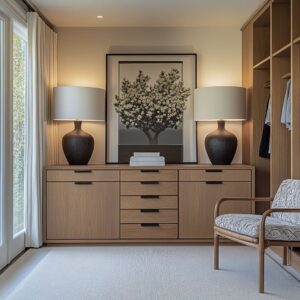
Furniture-Like Islands that Float.
Center islands in walk-in closets aren’t being treated like stationary boxes anymore. Many are designed with inset plinths or base lighting that make them seem weightless.
The visual gap between the island and the floor—just 70 to 100 millimeters—is enough to keep the aisle feeling wide and easy to move through. Even in narrow rooms, these islands appear more like fine furniture than functional cabinetry.
Ceiling Height Used to Tune Mood, Not Just Volume.
Ceiling scale is being used in two opposite ways, depending on the size of the closet. In larger layouts, clerestory windows and tall dark cabinetry bring in high light and define vertical rhythm—turning the closet into something closer to a gallery.
In smaller spaces, a skylight placed over the aisle compresses visual noise at the edge while placing focused light directly over the island surface. It helps guide attention and softens glare.

Hardware as Tactile Way-Finding.
Even in closets with barely-there handles, texture plays a guiding role. Smooth bronze pulls are placed on drawers where hands reach most often, while vertical leather straps mark tall cabinetry doors.
Some sections use recessed grooves carved directly into the wood grain, especially at mid-height cubbies. These aren’t random placements—they’re quiet clues for the user, allowing them to move naturally through the space without confusion.

By drawing attention to alignment, grain, and rhythm rather than ornament, these walk-in closet ideas reflect a deeper shift in how we expect interiors to work. Storage isn’t being hidden—it’s being composed.
And the result is a room that feels calm, deliberate, and deeply connected to the architecture around it.

Design Drivers
| Driver | Design Tactic | Why It Matters | |
|---|---|---|---|
| 1 | Integrated linear LEDs | Warm‑temperature strips hidden in shelf noses, mirror edges, rod valances, or island bases. | Gives even fabric legibility, erases shadows on face and floor, and removes need for decorative pendants that block sight‑lines. |
| 2 | Warm neutral oak or walnut as the anchor finish | Rift‑sawn oak in pale or mid tones; walnut when a deeper envelope is desired. | Couples with soft daylight, keeps clothing colors true, and pairs well with both black and bronze accents. |
| 3 | Axis alignment from bedroom → closet → bath | A continuous sight‑line that lands on a window, fireplace, or vanity mirror. | Mentally extends the closet’s length; makes the suite feel custom even when footprint is modest. |
| 4 | Concealed or no hardware | Finger pulls, routed edge pulls, or tone‑on‑tone bars ≈ 10mm thick. | Lets cabinetry read as architecture instead of furniture, avoids visual busyness. |
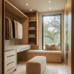
| 5 | Purpose‑built seat or bench | Island‑tucked bench, leather cushion under windows, or tightly upholstered ottoman. | Converts a pass‑through space into a pause point for shoes, jewelry, or travel packing. |
| 6 | Mixed open + closed storage rhythm | Alternating glass fronts, bag cubbies, or cane panels between solid faces. | Balances display and privacy; keeps the user from feeling inside a row of office files. |

Material & Finish Insights
A truly refined walk-in closet design doesn’t start with layout—it starts with how light meets surface. Designers are paying close attention not just to what’s being built, but to how every material looks under different lighting conditions.
The most successful finishes avoid flash, shine, or overwhelming contrast. Instead, they’re calibrated to read quiet and clear—no matter the hour.

Color Temperature Balance
Lighting is being treated like a tool for accuracy, not mood. The most consistently effective temperature range is between 2700K and 3000K—warm, but not yellow.
This range works especially well when used near oak or walnut cabinetry, whose natural reflectance hovers around 4100K. That pairing delivers color rendering index (CRI) ratings above 90, which matters when you’re assessing textures and tones in actual clothing.
It also prevents the amber glow that can tint pale fabrics. In short: garments look like they should.

Reflectivity Strategy
High-gloss finishes still have a place—but only under very specific conditions. Designers limit those glossy lacquers to areas with strong natural daylight, where reflection feels clean rather than chaotic.
In spaces with fewer windows or tight layout, honed stone or matte-painted cabinetry take priority. These choices cut the risk of mirror-like glare, which can distort scale and create disorienting visual bounce, especially under LED strips.
The surface becomes supportive, not overpowering.
Soft Metals
Handle finishes follow a similar logic. Bronze and matte black are preferred across most current walk-in wardrobe ideas because they gently recede into warm-toned woods.
At low lux levels—think early morning or late evening—they don’t glint or grab the eye. Chrome, on the other hand, tends to show up only where it makes sense: alongside gloss cabinetry, or where mirrors are already boosting reflection.
The rule of thumb is simple—if a surface already speaks loudly, hardware should whisper.

Forward-Looking Moves
Today’s closet designs aren’t all about scale or symmetry. Some of the smartest moves are quiet shifts in how users touch, read, and move through the room—details that change the experience without needing more space.
These details aren’t loud, but they reshape daily use.
Leather Strap Handles with Black Pin Fixings
A small material difference can make a big tactile impact. In several closets, drawers now feature wide leather straps anchored with matte black hardware.
It’s not just an aesthetic gesture. Leather holds a slightly different temperature than wood or metal, which helps the fingers find the pull intuitively, especially under low light.
You reach by feel, not by guess.

Mirror Broken Into Vertical Fins
Instead of covering an entire wall with one large mirror, some designers now split mirrors into narrow vertical segments. This stops the user from being overwhelmed by their own reflection.
The mirror still provides brightness and bounce—but attention stays on the clothes. It’s a visual technique that shifts focus from self-viewing to selection.
Finger-Pull in Contrasting Wood Species
A subtle shift in material can signal function. Some drawers use carved finger-pulls made from a wood species just a few tones darker than the door face.
This removes the need for metal handles entirely—ideal for projects prioritizing biodegradable or low-impact materials. It also makes the pull feel fully integrated into the grain story.

Slatted Ceiling Held Off True Ceiling
Where mechanical bulkheads used to create awkward soffits, slatted wood ceilings now mask air returns, sprinklers, and lighting infrastructure. By floating the slats slightly below the structural ceiling, the space stays organized and clean-lined.
The added bonus? Light passes between slats, softening shadows and flattening contrast.
Negative-Zone Framing with Brick
Brick is usually thought of as a solid mass, but in some closets it’s used to frame rather than fill. Slim vertical brick columns border each open bay, creating texture without heaviness.
This gives the layout rhythm while letting each section stand on its own, like compartments in a custom-built cabinet wall.

Full-Height Fireplace Between Wardrobe Runs
In rare high-end layouts, a fireplace becomes the centerpiece of the closet—not the bedroom. This move has more than visual payoff.
Research shows the low flicker of fire reduces stress and slows breathing. Placing it in the dressing space—not only adds character—it subtly changes the pace of morning and evening routines.
These touches aren’t about adding ornament—they’re about tuning experience. In the best walk-in wardrobe ideas right now, every surface is chosen not only for how it looks, but how it helps the room feel functional, calm, and personal without extra instruction.

Takeaways for Master‑Suite Closets
In modern master layouts, success lies less in what fills the closet and more in how the space directs movement, sight, and sound. These are not decorative tweaks—they’re spatial tools that refine how a room feels during actual daily use.
Treat light lines as visual guides
One of the most effective visual organizers in walk-in custom closets is consistent lighting placement. Whether it’s an LED strip running above the clothing rod, a reveal light along the floor, or a glow beneath an island—those lines should align.
Misaligned fixtures across walls and elevations create visual friction. Well-aligned light acts like a baseline, letting the eye rest and read the room without interruption.

Keep at least one wall blank
This simple move is often overlooked. A stretch of unbroken surface—no shelves, no hangers, no hooks—lets the eye breathe.
It doesn’t waste space. It anchors the layout.
A quiet panel offers contrast to all the visual noise of pattern, color, and texture in clothing. In the most composed walk-in closet ideas, this blank zone plays the same role a pause does in music: it adds rhythm.
Adjust ceiling choices to ceiling height
In any closet where the ceiling sits below 2. 6 meters, skip the chandelier.
It chops the space and shortens perception. Instead, recessed lighting or a hidden LED cove near the aisle can quietly illuminate clothing faces without overpowering the scale.
A narrow skylight also works well—especially if it’s placed off-center to cast indirect daylight across cabinetry.

Use flooring to shift between zones
Instead of installing a physical divider between closet and bathroom, use a band of material. A 600mm-wide strip of stone underfoot can do the work of a threshold, guiding the body without needing a wall or sill.
This kind of signal is read instantly and keeps the space seamless yet legible.
Acoustic softness matters
Hard surfaces bounce sound. And in a room filled with doors, drawers, and mirrored glass, that can quickly add up to sharp echoes.
Designers now blend in soft materials—slatted wood ceilings, boucle benches, wool runners—to lower the acoustic tone of the space. This brings comfort not just to the body, but to the ears.

Plan handle hierarchy like a language
Users interact with storage by habit. Large wardrobe doors tend to favor integrated grooves or recessed grips.
Mid-sized drawers often feature metal handles that feel sturdy and familiar. Small accessory drawers, on the other hand, are a chance to shift materials—leather, darker wood, even recessed cups—training the hand to recognize use before opening.
Design empty space on purpose
The absence of storage is never wasted. A vertical space just 200mm wide between cabinets might seem inefficient, but visually, it creates separation and balance.
That tiny strip can stop the room from feeling packed. And it can make a stack of shirts look more intentional just by giving them air.
The best rooms aren’t crammed—they’re considered.

Closing Lens
Modern master closets are no longer competing for how much they can store—they’re standing out by how precisely they’re tuned. Every material, every lighting choice, every open or closed panel is part of a slow, silent choreography that supports how a person wakes up, prepares, and resets.
The real difference lies in what’s removed.

In the most refined walk-in wardrobe spaces, fittings don’t shout. They slide, hide, or recede.
Light falls in lines, not blobs. Surfaces shift from matte to polished depending on where the user stands.
Nothing feels accidental, even when the mood is relaxed.

This kind of design doesn’t overstate itself. It moves in sync with its surroundings—matching the language of the bedroom, the tone of the bathroom, and the pace of the person who uses it.
And that’s where the new standard sits: not in square meters or showy finishes, but in how seamlessly the room lets everything else fade. For anyone gathering ideas for walk-in wardrobe improvements or planning a future upgrade, this sense of quiet cohesion is where true value lives.