There’s a reason neutral bathrooms continue to hold their place in modern interiors—they carry more depth than many expect. Far from being plain, these designs are shaped by undertones, textures, and careful shifts in finish that turn simple palettes into something layered and refined.
A room wrapped in greige, bone, or chalk-white may look subtle at first glance, but each choice plays a part in how light falls, how edges fade, and how materials connect.
Neutral doesn’t mean colorless. It means building a space around temperature, softness, and shadow instead of relying on contrast.
Beige can lean warm or cool. Gray might tilt green, brown, or lavender.
A surface in stone or plaster might shift depending on the time of day. These quiet changes let walls, floors, mirrors, fixtures, and accessories communicate through tone rather than pattern.

In today’s examples, color fades into form—floating vanities create shadows that act as accents, fine black outlines sharpen soft palettes, and texture becomes the focal point. What defines these interiors isn’t what stands out, but how everything sits together without friction.
From slatted wood and ribbed glass to warm brass taps and linen curtains, each part holds its tone and shares it. This article explores the less obvious moves that give neutral bathroom interiors their voice: how size and proportion shift perception, how metal and textile layer without competing, and how light becomes a surface of its own.
These aren’t loud spaces—they speak in the language of precision, repetition, and quiet contrast.

Undertone Choreography
Neutral bathroom design often hinges on undertones that aren’t immediately obvious—but they carry weight. A soft greige wall may seem purely muted at first glance, but depending on its composition, it can hint at rose or even taupe warmth, creating a gentle ambient blush that quietly softens everything it surrounds.
On the other end of the spectrum, greige infused with a moss-like green casts a grounded, cooler tone that aligns naturally with views outside the window or nearby plants. These shifts are subtle but define the character of the room far more than bold colors would.

What makes neutral bathrooms especially compelling is how tone pairing becomes a visual language of its own. An ivory-based palette doesn’t have to settle on one exact tint—it can span multiple soft shades within the same range, from bone to chalk to almond.
This approach allows walls, tiles, sinks, and counters to trade pigment with each other, almost imperceptibly. The result feels continuous—where one material ends and another begins is sensed more as a shadow than a hard line.
In modern neutral bathroom ideas, it’s these silent transitions that give the space its richness.

Texture as Color
In spaces dominated by beige, greige, or soft white, texture steps in where hue might traditionally take over. A matte chalk-white wall will hold light gently, muting brightness, while a satin-finished tile beside it reflects specks of illumination across grout lines.
Though both are technically the same color, the room sees them as separate elements because of how they interact with light. This contrast doesn’t rely on saturation—it uses surface finish to build variety.
Another clever use of texture comes through ceramic tiles that feel hand-shaped. Take a warm taupe shower wall: slightly uneven gloss, faint ridges, and soft dimples in the glaze shift in appearance throughout the day.
Morning light catches these irregularities and makes the wall shimmer gently in places, like light skipping off water. These “micro-motifs” aren’t printed patterns—they emerge from process and finish, giving neutral surfaces an almost animated life.
This is how neutral bathroom design makes use of visual rhythm without ever introducing strong color.

Sheen-Controlled Depth
Color alone doesn’t set mood—sheen controls how that color performs in space. In many of the neutral bathroom layouts, a hand-applied plaster finish takes a central role.
Cool beige plaster, when left with a flat suede-like finish, allows light to blur along its surface, eliminating hard edges and reducing visual distraction. It doesn’t gleam or shadow sharply; instead, it softens every transition and draws attention away from corners.
This effect is especially useful in rooms that lean minimal but want to avoid a clinical feel.

Stone also plays a role in how sheen sculpts depth. Honed travertine—a finish that skips the polish in favor of a velvety matte—lets light skim rather than reflect.
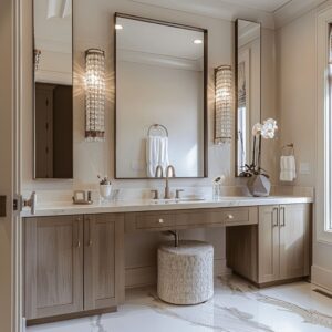
In a soft greige bathroom with brass accents, the stone’s restraint lets the metal fittings capture all the shimmer. It’s a composition of hierarchy: matte surrounds reflective.
Here, the stone supports the glow of fixtures instead of fighting with them. This quiet balance is one of the reasons neutral bathrooms feel refined without any need for bright tones or visual fuss.

Quiet Contrast Instead of Brash Color
In rooms that lean toward subtlety, contrast doesn’t need to shout. Instead of bright accents or graphic patterns, a single fine black line—such as a matte metal mirror frame or slim-profile shower divider—can sharpen the scene without breaking the mood.
Think of it like outlining a shape with a charcoal pencil; the effect is precise, not theatrical. This method anchors the design without calling attention to itself, giving soft surroundings a boundary that feels intentional, not intrusive.

Another less obvious way to introduce contrast is through shadow itself. Floating vanities, for example, do more than create space—they build a dark line beneath them, a quiet pause in the layout.
This horizontal pocket acts like a visual weight at the base of the cabinet, grounding the pale wall tones above. It’s contrast by absence rather than addition.
In many of today’s neutral bathroom color palettes, these dark voids bring the same depth as a bold feature wall might—but without disrupting the room’s calm cadence.

Material Continuity as Sculpture
Certain bathrooms make their strongest impact by refusing to interrupt. A niche, bench, and wall all wrapped in the same limestone or travertine can feel more like a natural formation than a built interior.
The look isn’t fabricated—it’s composed. When this kind of consistency is used with precision, the space appears to have been carved from a single block.
There’s no need for graphic tile borders or eye-catching mosaics; the material alone does the storytelling. The success here lies in refusing change.
No trims, no grout breaks, no pattern switch-ups. The tone of the stone carries through every element, and the only shifts come from soft light or natural surface variation.
In high-end neutral color bathroom ideas, this strategy shapes the volume of the room with subtle strength. It becomes less about walls and fixtures, and more about unified surfaces acting as sculpture.

Scale Play Inside One Hue
Even when the entire palette is ivory or beige, scale gives the space movement. A wall of tiny square mosaics next to a floor of oversized tiles shifts the viewer’s focus from fine texture to open surface.
This contrast of module size within a single tone makes one color behave like two. The eye reads the wall as detailed and the floor as calm, even though both may be the same off-white.
This is one way neutral rooms build complexity—through measurement, not pigment.

In another example, vertical wall tiles in a narrow stack formation paired with large rectangular floor slabs subtly define height and base. The thin verticals elongate the perimeter, while the wide floor anchors the structure.
Both can be in a sandy limestone finish, but their differing scale creates direction and visual rhythm. These changes are architectural rather than decorative.
And in a room guided by neutral bathroom paint colors, they offer variety without introducing color. This approach lets proportion, spacing, and light take the lead—reminding us that even in quiet palettes, there’s room for strong composition.

Vertical Rhythm Without Paint
In bathrooms shaped by neutrals, movement doesn’t always come from color—it often arrives through form and repetition. Slatted timber drawer fronts and fluted glass sconces both create rhythm by casting soft, vertical shadows.
The ribs catch light at different angles throughout the day, shifting tone and definition even when everything stays within the same beige or oak family. This kind of visual motion adds structure without needing a color change, allowing the space to stay cohesive while still feeling alive.

Lighting adds another layer. A set of pendant globes, hung at slightly different heights, doesn’t just light the vanity—it animates the ceiling.
These suspended shapes act like punctuation marks, creating their own layout overhead. The shades—often in white or opal glass—glow evenly, reinforcing the quiet palette below.
But it’s their positioning that provides variation. In many modern neutral bathroom ideas, these soft orbs give the room vertical dimension, allowing the walls to remain calm and unpatterned while the volume of space takes on rhythm.

Warmth by Way of Natural Textiles
In a space full of stone, tile, and glass, it’s the organic elements that make a bathroom feel complete. A single checked curtain in pale flax or a loosely woven linen shade over a tall window shifts the light from clear to diffused.
These fabrics don’t just soften the brightness—they reshape the way shadows land. A bone-colored fringe on a rug near the tub, or even a simple rosemary sprig in a cup by the sink, adds warmth that doesn’t rely on pigment.

What these details share is irregularity. Woven grass, loosely spun wool, even the texture of a cotton waffle towel—all scatter reflection in uneven ways.
That broken reflection introduces depth to the surfaces around them. This tactile dimension turns the neutral palette into something livable.
Many of today’s most thoughtful neutral bathroom themes lean on these natural materials to ease the precision of stone and plaster, allowing contrast through texture rather than hue.

Metal as Whisper, Not Spotlight
In a restrained palette, metal doesn’t always have to command attention. A brushed pewter faucet set against a chalky plaster wall barely catches the eye—until light skims across it and reveals the contour.
This tone-on-tone approach lets the plumbing feel integrated instead of applied. When metals sit just one or two shades apart from their surroundings, they glow quietly instead of gleaming.
The result is definition without dominance. In some cases, two or even three metal tones may appear, but always in small, deliberate amounts.
Matte black window trims, a warm brass pendant chain, and an aged bronze pull on a drawer—all spaced apart, all restrained. Used sparingly, these finishes create visual cadence rather than conflict.
The idea isn’t to match every fixture, but to let each accent hold its space gently. This kind of balance is what gives modern neutral bathrooms their depth without distraction, letting materials speak in low tones that feel coordinated but never too composed.

Light as a Third Surface
In a space defined by soft finishes and calm tones, light behaves like another material—shaping volume, highlighting texture, and giving neutral shades their personality. A back-lit mirror, mounted on a clay-colored wall, can do more than brighten the face.
Its concealed LED strip glows outward, softening every nearby shadow and lifting the greige pigment into a fog-like halo. The glow gently removes edges, creating a transition between wall and mirror that feels like vapor rather than hardware.
Then there’s the effect of warm filament bulbs, especially when paired with bronze fixtures. These pendants do more than light the room—they tint the air around them.
The soft amber glow they emit falls onto pale plaster and picks up traces of gold, subtly warming the surface without changing the paint. The fitting may be small, but it assigns tone to every object nearby.
In this arrangement, the wall becomes a blank canvas and the bulb acts like a brush, tracing light where color has been deliberately held back. These gestures are especially meaningful in neutral master bathroom ideas, where light completes the palette as much as stone or wood.

Psychological Scale Shifts
Neutral palettes often open a room visually, but scale plays a major part in shaping how the space is read. One method is by manipulating proportion through shape repetition.
An arch-topped mirror, for instance, echoes the curve of an adjacent shower window. The pairing pulls attention downward, rounding the upper edge of the wall and softening the ceiling line.
In effect, the height of the space feels compressed, but in a way that promotes calm. There’s no looming verticality—just a gentle enclosure that quiets the room.

Another approach is full monochrome coverage. Pale mushroom tiles applied across walls, floor, and even ceiling erase break lines and flatten the visual field.
When grout is color-matched and tile sheen is kept low, the eye finds no interruption. This uninterrupted plane makes a compact space feel broader, as if the edges were pushed outward.
The technique is especially impactful in layouts based on neutral colors for small bathrooms, where scale has to be managed not with visual noise, but with material discipline. Here, the design doesn’t fight for attention—it stretches space by removing the usual markers of dimension.

Less-Spoken Styling Moves
Some of the most expressive details in neutral bathrooms come not from statement pieces, but from quiet decisions that shift perception. One of those is neutral drapery that puddles—linen curtains that barely touch the floor or softly spill over it.
Instead of forming a crisp horizontal break, the edge becomes blurred, and that loose fold interrupts the room’s precision with softness. The architectural lines stay clean, but the textile introduces something irregular and human, giving the space a relaxed undertone without changing a single color.

Another subtle tactic is using tone-matching accessories. Instead of contrasting the soap dish or vase against the counter, designers pick items that nearly vanish into their backdrop.
A beige bowl on a beige stone slab, or a clay-toned toothbrush holder sitting against a chalky wall, creates cohesion that feels seamless. Even small details—like towel tags or drawer liners—are selected to echo nearby shades.
Function turns into surface, rather than standing apart. Shadow-only hardware is another quiet trick.
Drawer pulls that are finished to match the cabinetry—no metal, no contrast—fade into the wood, and the handle is read as a small shadow instead of a separate object. It invites the eye to focus on grain and form rather than utility.
This approach is often seen in custom installations where the absence of visual interruption becomes a feature in itself.

Then there’s the alignment of sand-hued plaster into a sand-colored rug. When wall tone flows directly into a soft, fibrous textile on the floor, the viewer’s sightline moves continuously, unbroken.
It relaxes the gaze, allowing the eyes to glide across surfaces without readjusting. The walls and floor speak the same language, and the space feels uninterrupted.
A similar visual rhythm is created by placing back-to-back mirrors over a single slab sink. In this case, reflection is used to double the depth of material.
The stone, neutral in tone and flat in finish, appears again in the glass—but without adding any physical weight. It’s a technique that deepens the space without layering extra objects.

Pairing pewter fixtures with clay walls also speaks to subtle contrast. Instead of reaching for brightness or shine, the choice here is temperature shift.
Pewter brings a cooler presence, while the clay offers gentle warmth. Their interaction is more about tonal temperature than value, proving that visual tension doesn’t need bold separation.
And finally, there’s the move of replacing a full cabinet with a neutral stone ledge. By floating a simple shelf and resting a sink upon it, mass is traded for line.
The sink becomes the feature, the ledge becomes a platform, and the wall gains presence. Subtraction—used carefully—can bring out the full richness of a tone like beige or sand more effectively than piling on more pieces.
Closing Thought
In these interiors, neutral isn’t blank—it’s a map of micro-decisions. Every material pairing, every edge finish, every pause in color carries weight.
Gloss and matte, cool and warm, hard and fibrous—they don’t compete, they layer. The effect isn’t loud.
It’s cumulative. These spaces don’t rely on color to speak; they let proportion, shadow, and material do the talking quietly.
The beauty in these rooms lives in what most would walk past—the way a surface shifts in afternoon light, or how a pull disappears into the drawer front. That is the language of restraint—and it’s what makes these bathrooms deeply visual without saying too much.