Television walls once fought for attention; today they fold into curated displays where screen and artwork share a single heartbeat. The gallery wall around TV evolves into a calm composition of line, light, and touch.
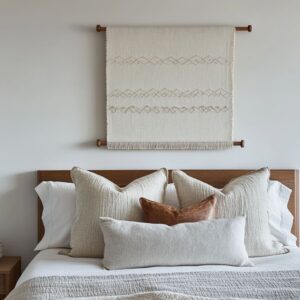
Current schemes trade bright paint for layered materials. Oak slats drum a steady vertical beat, rough plaster sets a soft ground, and linen reliefs catch daylight that wanders over their ridges.
Framed pieces drift off-grid, niches replace borders, and negative space carries equal weight. Layered surfaces tell the story while colour steps aside.

In this modern reading, every shelf line, console edge, and fabric fold participates in the same quiet rhythm. The television becomes a pause in that rhythm rather than a spotlight.
Tone pairing, material grouping, and measured gaps establish a room that feels considered yet unforced.

The Disguised Pause: Rhythm as Concealment
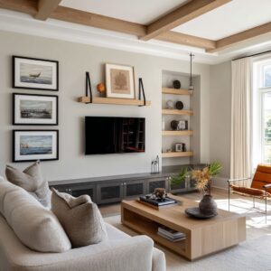
One of the more subtle techniques found in today’s gallery wall around TV ideas is the way visual rhythm is used to shift attention. Rather than treating the screen as a centerpiece or trying to hide it altogether, these compositions fold it into the larger flow of surface elements.

Vertical slats—whether slim oak battens or broader walnut ribs—set a continuous cadence along the wall. That linework isn’t decorative noise; it carries the eye forward in even intervals, creating a structured repetition where the television becomes a necessary break, not a dominant object.

The black screen interrupts the rhythm, much like a quiet rest in music. This moment of visual stillness is crucial—it keeps the pattern from becoming mechanical while giving the dark rectangle of the screen a reason to exist within the surface.
It’s not masked, but also not framed for attention. Often paired with hidden lighting or soft architectural detailing, this move allows the wall to behave as a unified field.

The screen is absorbed—not by concealment, but by belonging. It’s this sense of visual participation that turns the gallery wall around tv into part of a larger composition, rather than a tech feature that demands its own frame.

Shadow and Negative Space as Mediums
In the most refined layouts, what’s missing speaks as clearly as what’s included. Such setups don’t rely on heavy symmetry or dense object placement.
Instead, light gaps and careful spacing do the structural work. Whether in boxed-out niches, floating shelves, or soft gallery groupings, the air around objects feels shaped—given room to expand.
Frames don’t overlap; objects don’t crowd. Every inch of blank wall has purpose, acting like a visual breath between tones and textures.

Shadow plays a similar role. Its shifting weight across textured walls, layered frames, or inset art provides motion and softness without the need for vivid color or graphic contrast.
The most effective gallery wall around tv ideas often feature shadow as a kind of ink—tracing grooves, fluting, or fabric folds across plaster or stone. These walls move gently throughout the day, activated not by screens but by sunlight.

This isn’t about minimalism in the usual sense—it’s about control and release. Compositions feel sparse, but never underdone.
Each shelf, each frame, sits in a field of calm, making it easier for the eye to drift from art to screen to object without abrupt jumps. This use of absence as a shaping force is what gives modern gallery arrangements their sense of quiet clarity.

The Gallery Without a Grid
Modern wall compositions often appear relaxed, yet they follow a quiet internal logic. Bench edges, shelf lines, and slat rhythms act as guide rails, while frames float high or dip low, the screen sliding a bit to one side instead of sitting dead-center.
This loosened alignment gives the wall the easy feel of items collected over time, even though each edge still whispers to another somewhere in the room.

Such balance by misalignment keeps the layout fresh: one frame might kiss the ceiling line while another hovers close to the console, and the whole set feels like a gentle stack of notes rather than rows in a ledger. In practice, arranging pictures around a tv this way brings the same comfort as books left open on a coffee table—nothing stiff, everything purposeful.

Texture-Based Camouflage
Color takes a back seat here; the real conversation happens in surface behavior. Coarse limestone, ribbed plaster, or tight weave pull the eye across the wall, scattering reflections so the screen’s gloss fades into the background.

A cluster of rough stone tiles might sit beside refined micro-mosaic, their contrasting grains sharing light instead of competing for attention. Woven panels, raised reliefs, and gently chipped ceramic finishes extend this tactile field, letting the television rest quietly inside a moving skin of shadows.

The result is a gallery wall around a tv where brightness isn’t the star; touch and grain carry the scene. Light drifts, shadows shift, and the dark rectangle feels no louder than the neighboring artwork, unified through depth rather than hue.

Craft and Artifact Logic
Found elements give these walls their quiet power: salt-bleached shells, driftwood etched by tide, seed pods with fragile skins, hand-thrown clay still rough from the kiln. Each mark, chip, and fiber reads like a footnote on the passage of time.

Framed art sits beside loose objects, and nothing feels polished for display; instead, the wall suggests a slow gathering, the way a shelf in an old study might grow through years of travel and wandering thought. Imperfections invite reading—nicks in the glaze, knots in the timber—so the viewer senses history rather than arrangement.

This material storytelling softens the technology at center. A gallery wall around mounted tv turns the screen into one more dark relic amid sun-faded textures and earth tones; the glow of glass contrasts with matte stone, but the surrounding artifacts keep the scene grounded in touch and memory.

Shadow as Image Substitute
Some compositions rely on depth rather than illustration. Low-relief panels, ribbed plaster, or carved wood catch daylight and throw soft stripes that move from dawn to dusk.
Shadows glide across ridges like quiet animations, refreshing the wall without ever switching a canvas. As light changes, grooves deepen then fade, giving the surface its own slow cinema that needs no pigment at all.

Because shape and light carry the visual weight, these gallery wall ideas around tv feel alive even when the screen rests black. Texture gathers the glow, ridges scatter it, and the wall itself becomes the artwork—responsive, shifting, and quietly rhythmic throughout the day.

Disruption of the Expected Frame Logic
Mixed mouldings, slim on one side and chunky on another, break the old habit of identical borders. Mixed thicknesses and uneven spacing give each piece its own pace.
Frames slip off-center, overlap slightly, or disappear altogether, letting art float in front of plaster or stone as though the wall itself pushed it forward.

Deep-set cubbies step in where wood or metal borders once ruled. Stone, plaster, and textile panels sometimes burst straight from the surface with no rim at all.
The result is freeform rhythm: sculptural pockets share the stage with canvas, and negative space carries equal weight. The grid dissolves, yet an invisible spine—led by shelf lines or timber slats—still keeps the eye moving in quiet order.

Furniture as Part of the Wall Language
A slim bench skims the wall at seat height, its timber grain echoing any shelving above. A floating bench often reads like the first line of sheet music, guiding everything above it.
Console units align with frame edges, their length mirroring the stretch of the display zone so nothing feels tacked on.

Above and below the screen, bowls, books, or small sculptures echo one another, creating a soft call-and-response. Furniture below and artwork above share timber tone, scale, and void, letting the whole wall gallery around tv read as one composition.
Seating, tables, and ledges fold into the same material story, turning furnishings from standalone pieces into anchors that steady the visual score.

Intentional Monochrome and Material Grouping
No loud accents. No unexpected pops.
Instead, these compositions speak in quiet shifts of tone—weathered oak beside pale clay, chalky plaster pressed up against soft-grain linen. The language is muted, but that silence is what gives texture its voice.

Visual complexity builds in layers: bouclé softness set against raw jute, ribbed stone breaking into smooth plaster, or timber slats opening into thin seams. The lack of color contrast lets every surface carry its full detail—creases, grooves, weaves, shadows—all read more clearly without pigment competing for attention.

Even in the tightest layout, this method avoids visual clutter. Materials echo one another in mood rather than brightness, letting the eye glide from object to wall to furniture without a pause.
It’s this low-volume palette that gives gallery walls their density without ever feeling overloaded—tone steps in where color would usually speak.

Art as Architecture
Sometimes the artwork doesn’t hang—it lives inside the wall. Plaster grooves, recessed forms, and carved insets shape visual structure straight from the architecture itself.
You won’t always find a frame. Instead, you might see a curved niche with shadow pooling at its edge or a vertical panel that mimics the rhythm of the fluting behind it.

These surfaces don’t act like separate decor; they rise, sink, or fold into the wall’s own logic. One relief might echo the line of the shelving, another might follow the slope of a built-in bench.
Whether it’s ridged clay, etched stone, or fiber set directly into plaster, the division between artwork and surface disappears. The result: the gallery doesn’t sit on the wall—it’s part of the wall’s structure, behaving less like decoration and more like built-in form.

Conclusion: A Modern Language of Composure and Rhythm
The contemporary gallery wall around the TV is no longer a stage for standout accents but a field where subtle layers converse. Tone-on-tone palettes allow texture, shadow, and rhythm to guide the eye, so the screen rests in a gentle pause rather than taking command.
Slats, niches, and relief panels create quiet pulses—small shifts that read like breath rather than ornament—while monochrome groupings free each surface detail to speak clearly.

In this arrangement, every vessel, frame edge, and timber line holds equal status with the dark rectangle at center. Objects feel collected rather than placed, forming an understated cadence that unfolds through the day with changing light.
The result is visual calm built from patient layering: low relief becoming the wall’s own artwork, furniture tying ground to vertical plane, and negative space granting each element its moment.

What remains is a language of restraint—steady, tactile, and responsive to time—where technology blends with crafted material to form a single, cohesive backdrop. This quiet design discipline trades spectacle for depth, letting viewers sense the slow dialogue between surface and shadow long after the first glance.