There’s more happening on a backyard plant wall than greenery alone suggests. While a casual glance might catch cascading ferns or neat rows of pots, closer attention reveals structure, rhythm, and coordination that connect the plants directly to the materials, light, and furniture around them.
These outdoor walls don’t rely on color or fullness—they rely on intent. Across patios, courtyards, and narrow garden edges, it is popular to have outdoor plant walls as decorative elements that shape space and atmosphere.
Whether the surface is brick, wood, or concrete, plants are no longer an afterthought. They’re being used like building blocks—laid out in grids, paired with shadows, arranged around gaps, or echoed in hardware details.
Each idea in this article highlights a different kind of thinking. From planter placements that mimic window spacing to benches that mirror the form of nearby pots, the examples show how texture, spacing, light direction, and even small decorative accents combine to form a clear, grounded composition.
This isn’t a trend that rests on novelty. It’s about control, pacing, and decisions made in layers—from layout and planting to hardware finish and lighting angles.
Whether the goal is privacy, softness, structure, or something between, the most successful outdoor plant walls show how foliage can behave like architecture—responsive, connected, and quietly commanding.
Hidden Echoes
Many of the most visually satisfying outdoor plant wall ideas borrow lines from the existing architecture around them. This borrowing isn’t accidental—it creates a silent dialogue between structure and nature that the eye accepts instantly, even if the mind doesn’t register it.
When the lines of vines, frames, or planter boxes line up with window mullions, lintels, roof joints, or tile seams, the whole installation feels embedded rather than applied. For example, in homes with brick-and-steel window facades, the vertical rhythm of the mullions is often matched by hanging greenery spaced to mirror those divisions.
A cascade of creeping fig aligned with the windows’ edges will appear rooted in the building itself. In modernist courtyards, where concrete block grids stretch across entire walls, a plant wall that echoes the module of the block—whether it’s in 8” squares or wider horizontals—immediately feels architectural.

Even casual, creative setups lean into this principle. A chalkboard wall dotted with magnetic planters may seem improvised, but its arrangement often tracks the gridlines of pavers below.
Pastel-colored pots hanging on battens almost always match their spacing, so each hook has a visual anchor. It’s this kind of structural echo that separates thrown-together from thoughtfully cohesive.
Using this approach isn’t limited to formal spaces. It applies just as strongly in relaxed, family-friendly backyards.
The idea is simple: let the house lead the rhythm, and the plant wall will play in time with it. These hidden alignments are what make outdoor wall planter ideas feel fully integrated and not like an afterthought tacked to the garden wall.

Purposeful Negative Space
It’s easy to assume that every pocket or hook on a plant wall should be filled—but the most layered designs prove that empty space is just as powerful. What looks like a blank patch may actually be intentional breathing room, built in to give the wall a rhythm or to allow room for future growth.
Many grid-based walls deliberately skip certain cells, often every third or fourth slot. These blank areas function like rests in a musical score.
They prevent the viewer’s eye from getting overwhelmed, slow the pace of observation, and offer a sense of lightness and movement. In tight outdoor corridors, this spacing also encourages airflow, helping vines and ferns thrive without crowding each other.
It’s also a way to control how light interacts with the wall. Empty trellis squares let sun pass through, casting patterned shadows that change over the day.
On backlit panels, skipped pockets give LED fixtures room to highlight surrounding leaves, rather than flattening everything into uniform brightness. This kind of planting restraint creates the impression that the greenery is still in progress—always adapting, growing, or evolving.
Leaving certain boxes open creates anticipation and emphasizes the texture of what is planted. It’s a form of subtle editing that adds sophistication without adding cost.

Dual-Level Planting for Balance
Vertical walls filled with trailing greenery offer drama, but without a base to ground them, they can feel visually top-heavy. The best compositions solve this by introducing a second layer: foliage or form at the lower level that mirrors, supports, or offsets what’s happening above.
One example is seen in walls that suspend lush pothos or creeping jenny above, then anchor them below with Boston ferns or clipped mounds of boxwood. The movement changes direction—falling from the top, reaching out from the bottom—creating a balanced volume that wraps the viewer in softness.
In some settings, the lower layer isn’t a plant at all, but a structural bench, raised bed, or floating seat that mirrors the width of the plant wall and absorbs some of its visual weight.

This technique is especially important in outdoor setups that run along fences or rear walls where space is limited but verticality is emphasized. When greenery pours downward, a contrasting horizontal element—like a planted trough or compact hedge—keeps the wall from feeling too vertical, too towering.
That’s why some of the best outdoor plant wall ideas don’t just look up—they look down too. Instead, it’s contrast: trailing above, blooming below; steel grid above, curved foliage beneath; light vines up top, sculpted shrubs on the ground.
In this way, each layer supports the next, and the result is a wall that feels full, but never overdone.

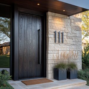
Color Linking through Small Hardware
The power of subtle coordination often lies in details most people overlook. A small piece of hardware—barely visible from a distance—can link multiple elements together in a way that feels effortless.
These are the quiet anchors of visual cohesion. In several outdoor walls, the soft gleam of a brass lantern picks up the same tone as a row of leather hanging straps.
A pastel mint birdhouse placed between vines feels perfectly at home because it borrows its shade from the new tips of spring growth. Charcoal-toned planter boxes gain stronger presence when they echo the nearby window frames or gate trim.
This quiet conversation between finishes isn’t accidental. It’s the result of repeated micro-decisions—choosing hook paint that matches a nearby chair leg, or fastening a planter with hardware that picks up the tone of a pendant light.
What’s striking is how these decisions accumulate: the more links are forged between unrelated items, the more the space reads as whole. Especially in projects that include mixed materials—metal, wood, ceramic, fabric—this detail linking brings stability.
Even small planter ideas for patio spaces benefit from this thinking: a copper hook next to a terra-cotta bowl, or a black bracket aligned with slate pavers. These moves aren’t loud, but they make everything quieter—in the best possible way.

Light as Sculptor, Not Spotlight
Lighting in plant walls doesn’t need to shout. In the most thoughtful designs, it doesn’t even try.
Instead, it plays softly with shadow, texture, and the edges of growth. The goal isn’t to spotlight the plant—it’s to shape the way it’s perceived.
In some layouts, a slim up-light under a row of herbs sends a golden wash across a brick wall, catching both texture and leaf tips without glare. In others, recessed lighting tucked beneath a floating bench reflects softly upward onto trailing greenery, as if the light is rising from the ground.
Square pockets with no plants at all become glowing frames thanks to gentle LED backlights, letting the surrounding growth cast shadows that change shape through the evening. What works especially well is aiming the light to skim surfaces rather than hit them straight on.
The texture of bark, the curve of a leaf, or the gap between slats—all of these come alive when the beam moves sideways. Instead of bleaching out color, it reveals shape.
This method also adds dimension to otherwise flat walls. Even outdoor flower arrangements in pots feel richer when touched by the edges of warm light rather than flooded by a single source.
It’s light used with care—not to show off, but to sculpt.

Interactive Layers Invite Ongoing Editing
Some outdoor walls are meant to stay exactly as they are. Others are built to shift, change, and respond—and those are often the most engaging.
Designs that invite rearrangement don’t feel precious. They feel lived-in.
One example is a vertical chalkboard wall filled with magnetic pots, where notes and drawings appear beside the plants. Some setups use crates that can be lifted, moved, or re-hung to suit the season.
Other walls rely on sliding tracks or hook systems that make switching out containers as simple as hanging a picture frame. This flexibility encourages constant interaction.
It means the backyard becomes a place where rearranging plants or accessories feels like play rather than work. And it allows a wall to reflect time—early spring with pansies, summer herbs in rotation, autumn dried foliage in woven baskets.
This type of changeability is especially welcome in family-oriented yards or smaller homes where outdoor space doubles as both garden and gathering area. Even modest backyard planter ideas become more compelling when the structure behind them expects and accepts revision.
The real charm lies in how adaptable these walls are to mood, weather, or event. The structure makes room for this—encouraging creativity without asking for perfection.

Privacy Screens That Breathe
Good screening doesn’t need to close off a space. In fact, some of the most thoughtful outdoor walls manage to maintain privacy while still letting the sky in, the wind pass, and the plants sway.
The balance lies in how the screen is spaced—not just the material used. Wooden slats and vertical cables are common elements, but it’s the distance between them that shapes the experience.
Tighter spacing near seating zones reduces exposure and softens sound, giving the feeling of a gentle enclosure without harsh lines. As the eye moves upward, those gaps widen, opening views toward treetops or sky while still shielding sightlines at eye level.

Vines often step in to fill these vertical planes naturally. A few slow-growing climbers weaving through a panel will gently break up light and blur boundaries, acting as both filter and softener.
These plants do more than decorate—they buffer cross-winds and help absorb reflected noise from stone or metal surfaces, improving comfort on patios or decks without adding bulk. This method works especially well in compact yards where privacy is needed but space is limited.
Whether it’s a standalone panel or a wrap-around corner feature, the key is to layer opacity and openness in measured zones—narrow near seating, medium through the middle, wide above eye level. This rhythm keeps the wall protective but breathable.

Mirrors and Felt: Depth without Width
In narrow patios or side yards where there’s little room to project forward, designers often trade bulk for trickery. They use surfaces that don’t take up space physically but do plenty visually—reflections, texture, and visual swelling that creates a layered feel in just a few inches.
Mirrors are a favorite here. Set into a plant frame or behind a pot cluster, they double the image of leaves, light, and sky, creating the illusion of more space without moving a single brick.
Unlike high-gloss finishes, the mirrors used tend to be lightly smoked or weathered so they don’t glare or feel out of place outdoors. Instead, they deepen the view and pull in soft contrast.

Another smart approach is the use of felt pockets. These mounted wall systems create sculptural curves as the fabric holds shape even when loosely filled.
The staggered pocket layout gives each plant its own niche, while the overall surface moves outward slightly and rhythmically. There’s real texture here, but barely any projection beyond the wall.
Especially in passages under 1. 2 meters wide, where a bulky structure might feel intrusive, these solutions give form and fullness.
The point is to fake volume—not force it—so that narrow becomes layered rather than cramped. They’re not limited to plants either.
Some pockets hold accessories, others seasonal cuttings, and many pair well with small outdoor flower pot ideas for moments of contrast.

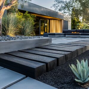
Furniture as Visual Counterpart
In the best outdoor setups, furniture isn’t treated as a separate layer—it works as a continuation of the wall behind it. The connection happens not through color matching alone but through shared forms, echoes in silhouette, and repetition of line or tone that weaves the elements together.
Take the example of a floating bench positioned below a pastel planter wall. The soft-toned wood of the seat belongs to the same color family as the metal pots overhead, tying the vertical and horizontal planes into a single palette.
Or picture a black wrought-iron dining table flanked by chairs with looping curves that subtly mirror the rounded shape of white ceramic hanging pots arranged in a grid nearby. These are not dramatic matches, but they are deliberate reflections—and they make the entire setup feel intentional.

Even choices like leg thickness, edge detail, or shadow line can pull the composition tighter. A thick outdoor coffee table base might repeat the shadowbox depth of a planter wall, while slender barstool legs might borrow their stance from nearby trellis panels.
The effect is cohesion without strict uniformity. This visual connection also improves spatial flow.
Instead of reading as furniture placed in front of a plant wall, the scene reads as one integrated form. And in compact outdoor spaces—especially patios or courtyard decks—this unity matters.
It avoids clutter and keeps the arrangement feeling calm, even if there’s plenty going on. This approach fits well with many backyard planter wall ideas, where repetition and texture carry the aesthetic more than loud color or oversized features.
A shared arc, a mirrored frame thickness, or a consistent material tone is often enough to make the entire composition feel fluid.

Lighting & Plant Growth Synergy
Lighting doesn’t just help people enjoy outdoor walls after sunset—it changes how the plants themselves behave. Where the light comes from, how long it stays on, and which direction it points all influence how greenery grows and fills the space.
One of the most effective approaches seen across multiple outdoor walls is placing warm-toned LEDs either just below the plant structure—under a bench or tucked into gravel lines—or overhead in soffits angled downward. This setup encourages plants to lean gently toward the light, growing outward and downward, which naturally builds thickness without trimming.
Foliage tends to follow light over time, so fixtures aimed at the mid or lower portions of vines or trailing species help build a full curtain effect. The result is a wall that develops its own shape, not just in static symmetry but through slow daily growth that’s been nudged, not forced.
Lighting strategy also changes how the wall reads after dark. Instead of flattening the surface, the direction and warmth of the glow deepen texture, casting plant shadows against stucco or brick, and defining the silhouette of every leaf tip or hanging strap.
The wall becomes dimensional even without touch.

In areas where garden lighting runs on timers, the duration matters too. Keeping the lights on for a few hours after dusk helps guide growth without disrupting insects or overstressing plants that rely on natural rest cycles.
The idea isn’t to create spotlighted drama, but to coax density through quiet repetition. It’s another layer where thoughtful placement does more than brighten a path—it helps shape the wall’s living structure in ways that last long after the fixtures are turned off.

Storytelling through Micro-Accents
No matter how lush or layered a plant wall may be, its impact deepens when it includes a few subtle hints of life outside the leaves. These accents don’t compete with the plants—they anchor them in context.
They tell stories that roots and vines alone can’t. A faded birdhouse tucked among trailing greens might suggest a child once painted it.
A mint watering can placed carefully on a ledge signals someone still comes to tend the wall by hand. A chalk note with a name or a scribbled arrow makes the whole surface feel used, not staged.
These quiet details carry more meaning than any symmetrical layout could convey on its own.

And they age well. As these elements weather—wood fading, paint flaking—they add time to the space.
A slightly rusted metal hook or a sun-bleached toy pot isn’t a flaw; it’s a memory in physical form. These details are the link between the plants and the people who live with them.
The most impactful walls often include just one such piece every few square meters. Any more, and the message turns into noise.
Any less, and the story might go untold. These accents don’t need to stay put either.
Moving them seasonally or once a year keeps the wall feeling alive and responsive without replanting or repainting. The best garden planter wall ideas often succeed because they allow these quiet layers to share space with the plants.

Final Insight
What truly separates these outdoor plant walls from decorative displays is how thoroughly they’re embedded into the spaces around them. The most lasting examples treat greenery with the same importance as framing, texture, or light.
The leaves aren’t filler—they’re structured parts of the wall, working in step with every bracket, bench, or beam nearby. There’s no single formula that makes a wall feel whole.
But several of the patterns observed throughout these designs—aligning planter lines with architecture, intentionally skipping sections, pairing vertical drop with horizontal grounding, tying metal finishes to nearby features, or using directional lighting to shape growth—come together like parts of a composition.

These are not gestures made for a quick glance. They are layered choices that allow a patio or courtyard to breathe with quiet control.
Texture builds through absence as much as through volume. Rhythm comes from pattern and interruption.
Even small accents—hooks, words, frames—play a role in completing the mood. Whether tucked into a tight side yard or spread across a sunlit garden wall, these ideas offer more than color or shape.
They’re small systems. And they succeed not because of any one trick, but because every piece, planted or placed, has a reason to be where it is.