Often, a beige sofa behaves like a “light sponge”: it absorbs the room’s daylight, blends with nearby walls and rugs, and can end up feeling either serene or strangely blank. The most revealing part of the styling is that cushions are not treated as add-ons; they operate like a control panel for how the whole design is read at eye level.
That is why beige sofa cushion ideas often look simple at first glance, yet the best ones are built on very specific visual moves that most people don’t notice while they’re feeling the result.
The three quiet jobs cushions perform on a pale sofa
A beige sofa is rarely “the statement” by itself; it’s the stage that makes everything else either coherent or scattered. In the strongest design concepts, cushions consistently perform three non-obvious jobs at the same time:.

1) Temperature steering at eye level
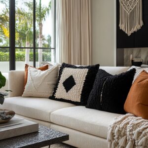
Beige can read warm, cool, creamy, sandy, or slightly grey—often changing during the day. Cushions stabilize that.
A warm camel or clay pillow placed where the body naturally sits sets the emotional tone, then smaller neutrals keep it from turning into an obvious color story. The effect is subtle: the room feels warmer without looking “more colorful.
”.

2) Visual weight trimming
A pale sofa can look like one large block—especially with deep seats. Cushions “trim” that mass by breaking the silhouette into readable pieces.
Darker line-work or ink-like threading does this with almost no actual darkness. The sofa starts to look intentional rather than blob-like.

3) Readability of comfort and shape
Some beige sofas look too pristine and flat in photos, even when they’re comfortable. Chunkier, high-relief textures signal softness and depth, while a smoother accent pillow signals polish.
That tension—soft + refined—is one of the quiet markers of an upscale look.

Contrast works best as a ladder, not a single jump
A popular move in modern designs is the avoidance of “one dramatic contrast. ” Instead, contrast is built as a sequence of small steps—tone, texture, pattern, and only then a darker note.
This is where many beige couch cushion ideas succeed: they don’t rely on bold color; they rely on controlled differences.

The ladder is usually built in four steps
- Near-neutral shift: cream beside oatmeal beside soft beige (a slow gradient).
- Texture shift: smooth beside nubby beside woven (depth without color noise).
- Pattern shift: thin, irregular lines beside thicker, softer motifs (visual rhythm).
- Edge-defining note: a small amount of ink/charcoal thread or a dark object nearby.

What’s unusual here is that the darkest element is often not a pillow. It might be a vase, a tray, a sculptural bowl, or even a shadow line on shelving.
That keeps the sofa from feeling “decorated” while still giving the eye an anchor.

Texture behaves like a shadow engine
On beige seating, texture is doing far more than adding coziness. It creates micro-shadows that function like visual contouring on a face—subtle, but extremely effective.

Three texture behaviors show up repeatedly
- Raised linear texture (ribbed, stitched, or relief-like): reads architectural and clean, and it gives height without color. This kind of pillow makes the back line of the sofa feel finished, almost like a tailored collar.
- Chunky weave / nubby surfaces: reads relaxed and touchable, and it prevents the sofa from looking overly staged. This is the “comfort signal.”
- Smooth accent surface (especially in warm clay/caramel): reads intentional and focal, because the eye notices a surface change before it notices hue.

A non-trivial detail: the richest-looking arrangements tend to mix textures by density, not by “variety. ” One pillow carries heavy texture, another carries mid-texture pattern, another stays smooth.
That density ladder keeps the grouping from looking like a matching set, and it’s central to cushion ideas for beige sofa that feel collected rather than assembled.

Pattern “speed” is the hidden reason some setups feel calm
Patterns have tempo. Some read fast (tight, high-contrast, busy), and some read slow (loose marks, uneven spacing, softened edges).
Beige designs often keep patterns slow so the space stays restful.

What the designs here do differently
- Thin, irregular lines are used instead of bold graphic shapes. Thin lines read like detail, not trend.
- Hand-drawn feeling appears even in structured motifs: slight irregularity makes the pattern feel natural beside plaster-like walls and warm wood.
- Patterns are arranged so they don’t compete: one graphic motif, one softer motif, one texture-only piece.

This is why many pillow ideas for beige couch feel elevated when they include pattern: the pattern is present, but it behaves like quiet typography rather than a loud poster.

Asymmetry that looks accidental, but isn’t
A “high-end cue” is controlled asymmetry. The warm accent pillow isn’t centered, and the arrangement often sits on one end rather than mirrored on both ends.

This does two things:.
- It keeps the sofa from looking like a showroom display.
- It lets negative space become part of the composition—an empty seat area reads like calm confidence, not “unfinished.”

One subtle move: the warm accent pillow is often slightly forward, while the quieter neutral sits slightly behind. That creates depth without extra pillows, and the sofa gains a layered look from a simple shift in plane.

The echo system: how one cushion tone quietly spreads through a room
A beige sofa rarely looks expensive because of the sofa alone. It looks expensive when the cushion tones find small echoes in the design—never identical, but related.

Examples:.
- Warm clay/caramel on the sofa quietly echoes brass (sconces), warm wood (tables, shelving), and ceramic tones (vessels).
- Ink-like threads in a patterned pillow echo darker accents in bowls, trays, or shelf objects—tiny anchors that keep the palette grounded.

The key is that the echo is never too literal. It’s the family resemblance of tones, not a perfect match, that makes the room feel composed.

Lessons borrowed from dark seating, including black
Even when the sofa itself is pale, the most effective beige arrangements borrow logic that is often used on dark seating (including black sofas): edge control.

On a black sofa, light pillows carve out the silhouette and prevent the sofa from becoming a heavy void. On a beige sofa, the same silhouette carving is achieved with:.
- a small amount of dark threading,
- ink-toned pattern lines,
- or a nearby dark object that frames the seating zone.
The result is similar: the sofa’s outline becomes readable, the seating feels “placed,” and the room gains definition without turning dramatic.

Architecture decides what kind of cushion energy looks right
Modern interior designs often show two recurring architectural moods, and each nudges cushions toward a different kind of richness:.

Soft plaster + arches (Southwest feeling)
- Cushions lean artisanal: woven motifs, clay tones, inked patterns that feel handmade.
- The room’s softness means the pillows can carry sharper pattern detail without looking harsh.
- Warm accents feel natural because the architecture already reads sun-washed.
Crisp trim + built-ins (traditional bones)
- Cushions act like controlled punctuation: one deep tone, one textured neutral, one pattern that reads refined.
- The room already has structure in the wall panels and shelves, so the cushions can be simpler in form and still look complete.

In both cases, the sofa remains neutral, while the cushions translate the architecture into something touchable at seating height.

The “comfort signal” vs the “display signal”
A surprisingly consistent strategy here is that one pillow carries “display polish” while another carries “comfort realism. ”.
- Display signal: smoother warm accent, clean edges, simple geometry—reads curated.
- Comfort signal: chunkier weave or nubby texture—reads lived-in, soft, welcoming.

When both signals appear together, the sofa feels both styled and believable. This is one of the simplest reasons a neutral room can feel rich without feeling fussy.

Why the same palette feel either flat or layered
Two designs can use beige + tan + soft black and look totally different. The difference tends to be in the order the eye meets information:
- Flat designs show color first (everything similar, then one random accent).
- Layered designs show structure first (silhouette, texture shadows), then color, then pattern detail.
That order—structure → warmth → detail—is a recurring backbone, and it explains why restrained throw pillow ideas for beige couch can still look complex and finished.

What makes the look feel richer: a visual checklist of depth
Richness consistently comes from a few repeatable visual signals:.
- Depth at close range: micro-shadows from raised weaves and layered textures
- Restraint in color count: fewer hues, more texture grades within those hues
- Hierarchy at eye level: one anchor pillow, one bridge pillow, one quieter “rest” element
- Echoing in the room: pillow tones repeated in small decor—ceramic, wood, metal—so the sofa belongs to the space
- Contrast that feels stepped: dark-to-mid-to-light transitions rather than sudden jumps
- A deliberate pause: a solid or low-contrast pillow that stops the set from feeling busy
This is why many of the strongest designs look calm but still complete: they rely on depth signals, not loud color.

Diagnostic map: what the eye notices first, why it happens, and which visual lever fixes it
Beige seating problems usually show up as a visual symptom, not as a color issue. The fastest way to make the article feel instantly useful is to name what the eye is reacting to, then explain the hidden reason.
- Symptom: the sofa looks blank, like one soft shape with no “face.”
Why it happens: the value range stays too tight at eye level, so the silhouette has no contour. Even in a beautiful room, the sofa can read like one continuous cloud.
Visual lever: adding a single “outline cue” through either a darker motif pillow, a sharply piped edge, or a nearby dark object on the table that sits at the same height as the cushion tops so the sofa gains a readable boundary. - Symptom: beige reads yellow or overly creamy in daylight.
Why it happens: sunlight amplifies warm undertones, and if all cushions are warm too, the whole seating zone shifts into one warm wash.
Visual lever: introducing one cooler counter-note (smoky blue-grey, deep green, charcoal-thread weave) in a matte texture so the warmth looks intentional, not accidental. - Symptom: beige reads cold or greyed in the evening.
Why it happens: under warm interior lighting, pale neutrals can look flat unless there are textures that cast micro-shadows.
Visual lever: leaning on relief texture—nubby, ribbed, fringed, looped—so the sofa keeps depth even when color contrast drops. - Symptom: the sofa feels bulky or heavy, even if the room is minimal.
Why it happens: the cushion cluster becomes a single dense block, usually from matching sizes and similar textures stacked at the same height.
Visual lever: creating a “density ladder”: one dense pillow (dark or high-relief), one mid-density pillow (medium weave), and one airy pillow (light linen-like plane). The sofa looks lighter because the eye can step through the layers. - Symptom: the cushions feel random even though the palette is calm.
Why it happens: the room has no repeating rhythm at small scale. The pillows might be pretty, but nothing echoes them elsewhere (art frame tone, ceramic, metal, wood).
Visual lever: building a quiet echo system: one pillow repeats the wood tone, another repeats the metal note, and a third repeats a soft wall tone. The mix reads “collected” because it has internal logic. - Symptom: the room looks decorated, yet unfinished.
Why it happens: there’s no anchor. Everything is mid-soft, so the scene lacks a point that holds the composition down.
Visual lever: adding one anchor pillow that is visibly heavier—deeper tone, chunkier texture, or stronger motif—then keep the rest as supporting layers.

Common failure mechanics: why a nice palette can still look off
- The single-jump contrast: one very dark pillow dropped into an otherwise pale set with no bridge tones. The result reads abrupt, like a missing middle step.
- Texture monotony: every pillow has the same fuzzy or nubby surface. The room becomes visually foggy—soft, but without crispness.
- Over-matching sizes: identical squares lined up at the same height create a “pillow wall.” The sofa looks stiff even if it’s plush.
- Same-value grouping: pillows sit within one tight shade band. Everything blends, and the sofa loses shape.
- All accents placed at one end: weight gathers on one side, making the sofa feel unbalanced even if the room is symmetrical.
Closing synthesis
The strongest beige sofa cushion ideas often rely on quiet systems rather than loud moves: contrast built as steps, texture used to create shadow depth, patterns chosen for tempo, warm accents placed with controlled asymmetry, and small dark notes borrowed from the logic of styling very dark seating. When those systems are present, a beige sofa stops behaving like blank furniture and starts behaving like a deliberate center of gravity for the whole room—calm, readable, and quietly rich.