Transitional style is easiest to understand when you stop thinking in labels (“traditional” vs “modern”) and start reading the room as a set of visual systems: architecture lines vs soft forms, light fields vs dark outline, texture steps vs color steps, and calm surfaces vs curated focal moments. This guide refreshes the concept using the exact kinds of design moves that show up in real transitional living rooms: staircases, paneling, black-framed doors, pale upholstery, restrained pattern, warm metal highlights, and controlled styling.
Quick Guide: the Transitional “Read” in 10 Visual Rules
1) Let architecture carry the drama; keep the seating calm
A staircase, arched opening, or wainscoting can be your strongest statement. Transitional designs often look most “resolved” when the house provides the bold linework and the furniture answers with softer, quieter mass.

2) Use dark accents as lines, not blocks
The most polished transitional designs treat black/charcoal as thin outlines: railings, door frames, lamp stems, table frames, art frames, curtain rods. A few repeated lines create structure while the room stays bright.

3) Build a stable rectangle under any diagonal
Stairs create a diagonal that can make a living area feel unsettled. The fix is compositional: a rug + sofa + coffee table become a stable “platform” that visually calms the diagonal.

4) Keep the “center of the room” visually low
A reliable luxury cue in transitional living rooms is a low skyline: table decor stays under seat height, florals are kept controlled, and trays gather objects so surfaces look intentional, not scattered.

5) Mix shapes on purpose: one curve, then clean rectangles
Many strong transitional living room design ideas rely on one dominant curve (round ottoman/round coffee table) placed among rectangles (paneling, doors, rugs, frames). This softens strict architecture without turning ornate.

6) Make texture do what color would do in other styles
Instead of loud hues, transitional rooms create depth using weave, velvet-like softness, metallic thread, grasscloth-like walls, glass, ceramics, and warm metals. The richness comes from surface behavior, not bright pigment.

7) Create “temperature steps” inside neutrals
A warm neutral transitional living room rarely uses one beige everywhere. It shifts gently: creamy ivory, warm greige, cooler stone gray, then small warmth notes (brass, caramel wood, soft gold).

8) Treat window treatments like architecture
Roman shades and drapery often act like built-in framing: hung high, wide, and long so windows read taller; subtle patterns behave like texture layers, not “print statements. ”.

9) Use negative space as part of the design
Transitional rooms look expensive when objects have breathing room. Console styling that uses spacing (one tall piece, one low piece, open space between) reads intentional and calm.

10) Place greenery as a scale tool, not filler
Plants often do a structural job: filling tall wall volume, softening stair geometry, and adding a relaxed organic silhouette where the room could feel strict.

Transitional Living Room: the Core Formula You’ll Keep Seeing
A transitional living room is usually built from these ingredients:.
- Comfort forms (sectionals, deep cushions, plush rugs)
- Edited outlines (clean tables, slim frames, restrained silhouettes)
- Classic cues (paneling, symmetry, nailhead trim, picture lights, traditional proportions)
- Modern cues (black-framed glazing, simplified shapes, minimal clutter, glass/metal)

What makes it work is not the list—it’s the balance system:
- architecture provides linework and authority
- furniture provides softness and livability
- accents provide small “jewelry” moments
- styling stays calm, low, and grouped

Modern Transitional Living Room: what changes (without changing the identity)
A modern transitional living room design typically shifts the same formula in three ways:.

- Sharper outlines: more slim black frames, fewer heavy profiles
- Less ornament: classic details remain, but simplified
- More negative space: fewer small accessories; stronger, larger pieces

The result stays transitional because comfort remains central—just edited with cleaner structure.

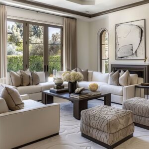
Cozy Transitional Living Room: how warmth is created without loud color
A cozy transitional design is rarely “cozy” because of a bold palette. It’s cozy because of:.
- warmer neutrals (ivory, camel, warm taupe)
- layered textiles (soft rugs, varied pillow textures, subtle patterns)
- warm light sources (table lamps, warm metal finishes, soft gold accents)
- softened contrast (charcoal lines instead of harsh black blocks)

You can feel coziness even in a bright room when neutrals are tuned warm and textures shift gently.

Small Transitional Living Room Ideas: the scale-based version of the style
Small ideas usually rely on:.
- low visual weight (glass tops, slim frames, leggy furniture)
- one anchor rug to define the zone
- fewer, larger moves instead of many small items
- controlled pattern hierarchy (one hero pattern, everything else behaves like texture)
- a calm palette so the space reads open

In smaller rooms, transitional works best when the structure is clear and the styling stays restrained.

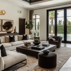
Moody Transitional Living Room: depth without heaviness
A moody transitional living room typically uses:.
- deeper charcoals, ink greens, smoky browns
- warm highlights (brass, soft gold, warm wood)
- softened rugs (washed patterns that blur contrast)
- carefully repeated dark lines so the room feels planned, not gloomy

Moody works when darkness is distributed in several smaller touches rather than one giant dark mass.

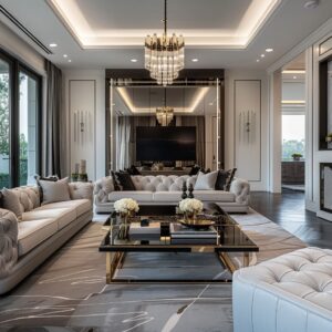
Luxury Transitional Living Room: the “expensive” cues that aren’t loud
Luxury transitional living room styling often looks high-end because of:.
- clear composition (symmetry or controlled balance)
- material contrasts (stone + metal + warm wood + soft textiles)
- negative space on consoles and tables
- a calm “low skyline” on surfaces
- warm metal used in small amounts, placed thoughtfully (high and low)

Luxury in transitional designs is often a result of proportion, repetition, and restraint.

Corner Decoration Ideas for Living Room: transitional corners that look intentional
A transitional corner usually works when it has four parts:.

- Vertical: lamp or tall plant
- Anchor: chair or small table
- Wall companion: one art piece or mirror
- One dark punctuation: black pot, dark table base, or frame line

Corners feel finished when they echo the room’s outline language (thin dark lines + soft forms) and avoid clutter.

Transitional Living Room Style Toolkit
Many transitional living room design ideas repeat a small set of tools. These tools help to understand why the designs look balanced and high-end, even when they use simple neutrals.

Tool A: Outline System
Look for where the darkest tone appears: railings, frames, metal table bases, black-framed doors. When those dark touches repeat, they create a clean structure that makes the room feel edited.
A single dark element can look harsh; several thin dark repeats look intentional.

Tool B: Stabilizing Rectangle
A big rug + sofa + coffee table forms a visual platform that defines the living area. This is why transitional rooms feel organized in open layouts: the platform tells the eye where the room begins and ends.

Tool C: Controlled Shape Mixing
Transitional designs rarely mix ten different shapes. They usually pick one main curve (round ottoman/table) and set it against a few rectangles (paneling, rugs, tables).
That limited mixing keeps the look calm and grown-up.

Tool D: Pattern Hierarchy
Pattern is used with roles:.
- One “hero” pattern (often a chair, drapery, or a bold rug zone)
- Supporting pattern (washed rug texture, subtle pillow motifs)
- Solid rest zones (sofa, walls, large upholstery)
When this hierarchy is clear, patterns never feel random.

Tool E: Temperature Steps in Neutrals
Even when a design looks beige/gray, it usually shifts gently between warm ivory, greige, stone gray, and charcoal outlines. This prevents neutrals from looking flat.

Tool F: Negative Space Styling
Console tables and coffee tables look expensive when objects are spaced, not crowded. The styling reads like a small display: one tall piece, one low piece, and breathing room.
This “space around objects” is a major transitional signature.

Tool G: Greenery as Scale Control
Plants aren’t filler. They often sit where a wall would feel empty or where a diagonal stair line needs softening.
Their silhouette relaxes strict architecture and improves balance.

Closing Note: Why these transitional interior design ideas look “finished”
Designs look polished because they repeat a few visual rules consistently:.
- architecture and dark outlines provide structure
- upholstery stays calm and soft
- patterns follow a hierarchy
- surfaces are styled low and grouped
- warmth appears as small, intentional highlights

That combination is what makes transitional living rooms ideas feel livable, composed, and current at the same time—without needing loud color or heavy ornament.

Transitional designs often feel “right” because the eye always has a clear resting place. The best spaces avoid one-time statements and instead repeat the same cues in small ways—frames, legs, rails, and hardware.
A single curve in the center can soften an entire room of rectangles without changing the palette. Subtle shifts in sheen (matte weave next to a slight gloss) create depth even when everything stays neutral.

When dark accents are distributed as thin lines, the room reads structured but still light. And when styling is edited and low, every object looks intentional rather than decorative noise.