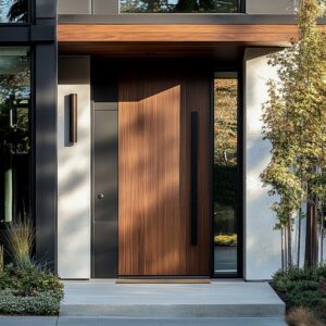
Modern grey hallway design has shifted far from neutral filler. Such spaces now carry their own logic—built on rhythm, texture, and visual control, not just circulation.
Subtle shifts in tone, carefully spaced lines, and muted materials shape corridors that feel composed rather than overlooked. A grey palette doesn’t limit expression—it refines it.
From shadow gaps that outline built-ins to softly reflective plaster that picks up changing daylight, every detail becomes part of a visual system. Furniture floats rather than rests, textures shift from matte to sheen in understated contrast, and vertical rhythm—through millwork, mirrors, or slatted timber—draws the eye with quiet consistency.
This approach favors deliberate restraint over bold decoration, and its impact comes not from statement pieces but from what holds them in place.
Grey Tone Shifts That Quietly Build Movement
In many refined grey hallway compositions, the use of tone isn’t about finding the perfect color—it’s about layering multiple variations so subtly that they pass as a single visual thought. The surfaces range from graphite to stonewashed blue-grey, from soft greige plaster to concrete-matte finishes.
Each is slightly different, but so close in tone that the transitions nearly vanish. The illusion of uniformity only breaks when light hits from an angle, revealing the slight shifts in warmth or coolness.

This method builds a gentle rhythm across the surfaces without using strong contrast, allowing the space to feel continuous yet rich with depth. These are the kinds of ideas for grey hallways that lean into nuance over decoration, and the effect is closer to what’s seen in quiet galleries than in traditional residential entries.
With layered greys working in soft gradation, the result is a visual calm that guides the eye forward without interruption.

Shadow Gaps and Trimless Edges as Precision Tools
Modern grey hallway design often trades trim and ornament for finely tuned edges that create clean separations without visual clutter. Shadow gaps—those slim, consistent lines between walls, ceilings, built-ins, or furniture—are used not as construction details, but as framing devices.
These gaps help carve out consoles, art, and cabinets so that they seem to emerge from the wall as a single form, not a piece attached after the fact.

Rather than relying on molding or painted contrast, the lines come from the absence of material, allowing shadows to outline each element. This controlled use of space and separation makes the overall design feel sharper and more resolved.
It’s one of the quieter approaches within modern ideas for a grey hallway, but it’s also one of the most effective for creating balance, flow, and intentional rhythm across what would otherwise be a narrow or transitional zone.

Vertical Repeats That Expand the Frame
Linear repetition has become one of the most dependable tools in grey hallway designs—not for decoration, but for direction. Slim slats, carved grooves, ribbed surfaces, or aligned vertical mirrors act like visual metronomes, spacing the rhythm of movement.
This measured repetition tricks the eye into sensing greater length and scale, even in compact or narrow footprints. The consistency matters more than the material itself: slats that break rhythm or mirrors that misalign can interrupt the illusion.
When the vertical pattern holds steady—whether carved into timber or softly ribbed in plaster—it cues the eye to continue scanning ahead, as if the corridor hasn’t ended yet. These stretched lines can carry into ceiling soffits or reappear as handle grooves on cabinetry, tying multiple surfaces together.
Within the broader range of grey hallway design ideas, this visual elongation is what gives simple spaces a taller, slower elegance without needing high ceilings or extra width.

Polished Surfaces Used With Restraint
Not all shine pulls focus. Some of the most refined dark grey hallway ideas use reflection as a background effect, not as a focal point.
Finishes like terrazzo, honed concrete, and brushed bronze carry just enough sheen to echo their surroundings—a slight glint from a metal console, or the softened edge of overhead lighting—but they stop short of being glossy. This technique keeps the atmosphere moody and dense, letting light glance across the surface without bouncing too brightly.

The result is a kind of optical layering: smooth, reflective planes give weight and depth to textured ones beside them. Matte elements—boucle benches, woven jute runners, plastered walls—seem to rise forward, creating depth without strong contrast.
Reflection becomes part of the structure, not a surface trick. In these spaces, brightness isn’t used to show off.
It’s used to thicken the air around every object, grounding them deeper in the palette.

Empty Surfaces That Hold More Than They Show
In many thoughtful grey hall ideas, what’s left out often shapes the space as much as what’s included. Long stretches of untouched plaster or calm timber wall—especially in mid-height zones—carry a kind of quiet density, inviting attention without demanding it.
These open zones aren’t blank; they reveal texture under shifting light, show fine-grain direction, or absorb shadow in a way that draws the eye inward.

By skipping visual noise, these sections provide a contrast field, amplifying the presence of a single ceramic vase, a sculpted shelf, or a recessed niche just a few steps down the corridor. This breathing room between objects gives each item a chance to sit in full visual weight, framed by restraint instead of ornament.
In grey colour hallway designs, this curating of negative space often does more to establish mood than accessories ever could—it sets the rhythm, creates expectation, and provides room for the eye to rest.

Natural Interruptions That Make Geometry Feel Intentional
A crisp hallway with strict lines and precise joinery can risk feeling flat unless something human softens the structure. That’s where organic, imperfect elements quietly challenge the grid.
A slightly leaning dried branch, the uneven folds of a velvet pillow, or a carved object with a chipped edge—all these insert a pause in the rhythm. They bring tension in the best way, confirming that every exact line around them was placed with purpose.

This contrast gives shape more meaning: the straight edge looks sharper next to something irregular. In well-balanced grey hallways, especially those shaped around minimal forms, these organic touches are used sparingly—but always deliberately.
Their soft forms and earth tones don’t distract; they complicate the perfection just enough to keep the space from feeling staged. It’s this balancing act that brings depth to grey hallways—where structure holds everything in place, and texture breaks the silence without raising its voice.

Ceilings as Framing Devices, Not Afterthoughts
In many modern grey hallway ideas, the ceiling steps away from being a flat backdrop and instead takes on the role of visual structure. Whether it’s a clean-edged floating plane outlined with a narrow glow, a band of cross-laid timber slats, or a recessed tray that casts a soft perimeter light—the upper surface becomes part of the overall composition.
These features aren’t for show; they shift the eye’s path. Instead of focusing only on horizontal movement, the ceiling pulls attention upward, letting light and material stretch the perceived height of the space.

This subtle use of the ceiling as a design anchor gives the hallway its vertical reach without requiring tall proportions. Even in compact layouts, when the lighting carves a gentle break between ceiling and wall, it gives the space more air.
This shift in focus is especially powerful in narrow settings, where the ceiling’s participation becomes the tool that holds the shape together from above.

Color Echoes That Shape the Rhythm
The most restrained grey designs can still carry layers of pattern—not in graphic form, but through tone recall. A bronze-rimmed mirror might quietly reference the leg detail of a nearby bench.
A painted door handle might carry the exact graphite used in a ceiling fitting. These gentle echoes act like visual punctuation, helping the eye bounce from one element to the next without needing contrast or statement pieces.

Nothing shouts, but everything links. Even the mist in an artwork can subtly nod to the plaster below it, giving the wall and object a soft visual handshake.
This kind of tonal looping makes a narrow corridor feel cohesive in motion, as if every detail was tuned to speak back to another. Within thoughtfully developed layouts, this approach holds the entire space in a subtle rhythm—a quiet loop that ties modern grey hallway ideas together without any one note playing louder than the rest.

Visual Lightness Through Shadow and Lift
There’s a quiet technique used in many modern hallways where solidity is made to feel suspended. Instead of placing heavy benches or consoles directly on the floor, they’re mounted to float—either with deep recesses beneath or invisible fixings behind.
This creates sharp shadow lines under each element, separating the object from the ground just enough to suggest air between the mass and the surface.

Cabinets set on recessed toe-kicks don’t just avoid scuffing—they appear as weightless blocks, almost like sculptures set gently into place. Even thick forms start to read as restrained when their contact with the floor is minimized.
These small lifts introduce calm through contrast: mass is present, but it hovers. The effect works especially well in grey-tone spaces where material can easily lean too dense.
By lifting instead of anchoring, the hallway keeps its posture tall and composed, even when using stone, wood, or thick joinery as part of the core structure.

Contrast Through Texture, Not Through Color
Visual depth in a grey palette isn’t found in bold contrasts—it comes from surface pairings that behave differently with light. Matte plaster meets polished terrazzo.
Deep-split stone faces are set across from smooth painted planes. Velvet is tucked beneath softly lit alcoves, casting gentle shadows that animate the material’s fibers.
These contrasts aren’t about changing hue; they’re about how light slides, scatters, or sticks.

A hallway with no graphic pattern at all can still feel layered and dimensional when reflectivity is used with care. In this approach, touch becomes the language of interest—what’s soft, what’s gritty, what breaks the uniformity.
The grey palette becomes the quiet backdrop for a material conversation that doesn’t compete but complements. The result is a space that pulls the viewer closer—not with colour, but with the way surfaces shift tone and texture depending on how they’re viewed.

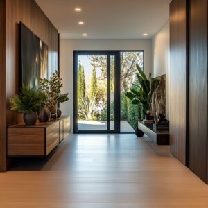
The Framed Destination That Quietly Completes the Path
In many thoughtfully built hallways, what waits at the end becomes the anchor that holds the entire space in motion. The design doesn’t rely on heavy contrast or decorative overload—instead, it leads the eye with rhythm and restraint, gradually building tension until it finds release in a final accent.
A softly lit alcove, a piece of abstract art, or a glimpse through a doorway to a tree or sculpture outside—all these elements act as intentional pauses, subtly placed to reward the visual progression.

The path may be framed by tonal repetition and careful texture, but it’s the endpoint that gives the walk its reason. That finishing touch—always centered, always slightly brightened—serves as a silent signal that the layout isn’t an in-between.
It’s a space with conclusion. This kind of visual storytelling works especially well in quiet, structured interiors, where the end object feels earned, not inserted.
It also allows the corridor to shift from passive passage to something closer to a narrative—one that holds attention all the way through.

Conclusion: Precision That Builds a Narrative Without Noise
The most effective modern hallway designs don’t try to impress with volume—they do it with pacing. Each element earns its spot by contributing to balance, rhythm, or soft interruption.
Tone echoes across materials, organic forms challenge rigid geometry, and light is used as an architectural guide rather than spotlight. Such spaces rely on exact spacing, hidden supports, and visual weight shifts to create corridors that feel finished from every angle.
In this kind of layout, the absence of clutter isn’t emptiness—it’s compositional clarity. Whether the path ends at a single lit object or fades into natural light, the corridor holds its own not by decoration, but by precision in every visual move.