A simple mantel shelf tends to look refined for one main reason: the wall is treated like a controlled composition rather than a place to add decor. The shelf becomes a dominant horizontal line, the surround becomes a calm field of texture, and the objects behave like deliberate interruptions instead of scattered display.
In the strongest fireplace mantel shelf ideas, the effect feels effortless because the visual logic is consistent: proportion first, texture second, contrast used sparingly, and styling kept intentionally quiet.
The mantel as a horizon line that stabilizes the whole room
One of the design ideas is to treat the mantel as a long horizon that steadies everything around it. A single, continuous line gives the eye a reliable reference, so the fireplace mass reads more architectural and less like a decorated object.
Thickness can feel gentle rather than heavy when the grain reads long and calm, the tone stays warm-but-muted, and the front edge looks softened instead of razor-sharp.

This is also where floating mantel ideas often succeed visually: the shelf reads as a clean waistline across the wall, and the space beneath becomes a crisp shadow band that makes the line feel intentional even in very pale rooms.

Texture editing: using the shelf to calm a busy surface
Many walls around fireplaces carry micro-detail—brick joints, stone layers, plaster undulations. A simple shelf works best when it edits that texture into a background hum.
The surface can stay dimensional, but the shelf becomes the first readable band, so the eye experiences order before detail.

A less-obvious move within fireplace shelf ideas is introducing one flatter element among textured surfaces—like a calm panel, a quiet frame, or a broad matte form. That flatness acts as a visual rest stop, preventing the wall from feeling overly active even when it’s filled with small shadows.

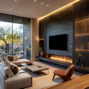
Shadow as the main contrast in low-color rooms
In designs built on pale neutrals, contrast often comes more from shadow than color. The underside of a thick shelf creates a precise dark line, the firebox becomes a deep void, and small dark accents elsewhere (a slim rod, a compact side table, a thin frame) keep the composition from washing out.

This kind of approach makes the wall feel edited because it uses just a few contrast points. The dark opening anchors the entire scene, while everything else stays tonal and calm, so texture and proportion do the heavy lifting.

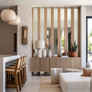
Asymmetry that feels collected, not messy
An off-center cluster can make a mantel feel lived-in while still controlled—especially when the imbalance is structured: one side carries the main weight, the center stays open as breathing space, and the far side gets a low, quiet finishing note.

This is also where boho shelf decor ideas can read sophisticated rather than busy: the boho influence shows up as tactile, matte pieces and relaxed placement, but the silhouettes stay restrained and the palette stays tight, so the mood feels collected instead of cluttered.

The gallery-ledge mindset: leaning art as a quiet luxury signal
Leaning artwork reads as calm confidence because it creates height without turning the wall into a fixed installation. A tall rectangle adds vertical presence while keeping the surface clean, and it introduces depth with minimal inventory: one frame behind one vessel can create a layered look without visual noise.

This mindset shows up strongly in shelf mantel ideas that feel modern and serene: the wall stays quiet, and the styling behaves like movable punctuation—easy to shift seasonally without changing the room’s structure.

Two-level systems: turning one shelf into a composed wall
A single mantel design becomes more architectural when it belongs to a family of lines. A second ledge—whether a side shelf, a lower bench, or a thin companion plane—can widen the fireplace zone and convert it into a longer wall story.
The top line stays clean and dominant, while the lower line carries layered vignettes (books + bowl + lamp + frame) without contaminating the main horizon.

In many strong fireplace shelf mantel ideas, this distribution is the key: styling is spread into zones at different heights and depths, creating richness through composition rather than quantity.

Wraparound and perimeter lines: when the shelf reorganizes the room
A shelf that continues around a corner changes the fireplace from a standalone feature into part of the room’s perimeter language. The wall begins to read like an integrated elevation rather than fireplace + decor.
That continuity often creates a high-end calm because the line behaves like an organizing rule.

The most refined versions distribute objects across multiple planes—mantel top, niche shelf, bench ledge—so each zone can stay sparse. Depth replaces clutter, and the overall effect feels planned without feeling staged.

Shape choreography: how few objects still looks rich
Minimal styling looks complete when the shapes follow a quiet progression. Common sequences include:.
- thin/flat layers (books or a tray) → a vertical rectangle (leaning frame) → a rounded volume (pottery) → an airy, low gesture (branches)
- straight shelf lines paired with curved silhouettes, so the composition stays soft even when the architecture is crisp
- repetition of one form family at different scales (vase + lamp base + rounded cushions), creating unity without copying

A subtle nuance that reads especially mature is introducing one cloudy off-tone—like a weathered bluish-gray or smoky glass—so the palette gains depth without turning into a color story.

Near-match wood logic: harmony without looking overly coordinated
Some interior designs avoid perfect matching. When the shelf tone sits close to the beams, floor, or tables—but not identical—the effect feels collected rather than showroom-like.
This near-match relationship lets wood repeat as a theme while still allowing variation in warmth, grain, and finish.

Classic trim + modern shelf: controlled tension that feels current
A traditional surround can look fresh when a darker, simpler shelf acts like a clean cap. The refinement often comes from profiles that appear slimmer than they are—slight angles, softened edges, and quiet grain that reads tailored rather than rustic.
Styling tends to stay matte and tonal, with only tiny moments of reflectivity so the vignette gains life without looking shiny.

Core strategies that produce the quiet expensive effect
- A dominant horizontal line that behaves like a calm reference point
- Texture used as atmosphere (brick, plaster, stone) rather than as decoration
- One deep dark void (the firebox) acting as the main contrast anchor
- Styling treated as punctuation: low, sparse, and slightly asymmetrical
- Depth created through zones and planes (mantel + bench + niche) instead of adding more objects
- Repetition of wood as a room sentence (overhead, eye level, floor level) so the shelf feels inevitable
- Controlled shape progressions that make minimal groupings feel complete

Within that framework, the phrase mantel shelf ideas ends up describing something broader than a shelf itself: a composition method where line, shadow, texture, and restraint work together to make the fireplace wall feel calm, finished, and quietly intentional.