Bedrooms have long been expected to multitask, but the way that balance plays out today looks different than it did even a few years ago. With remote work becoming a fixed part of daily life in many homes, there’s growing interest in setups that make room for both focus and rest—without compromising either.
That demand has led to a new wave of thoughtful small bedroom and office combo ideas that handle more than just furniture placement. These spaces now lean on built-in design details, light control, millwork rhythm, and tonal layering to support a quieter, more practical kind of functionality.
This article explores the standout choices that designers are turning to for dual-purpose rooms. Across high-end interiors, the best setups aren’t flashy—they’re built on alignment, proportion, and deliberate restraint.
From floating desks and integrated lighting to slatted wall dividers and hidden office zones, each move is shaped by the same goal: to support the two sides of the room—work and sleep—without letting either dominate.

Whether you’re working with a compact floorplan or rethinking a larger suite, the following sections walk through how grain direction, light placement, hardware decisions, and even chair shape can shift the feel of a space. These are choices that reward attention to detail.
And in the best versions, they turn multi-use rooms into places that feel calm and complete—at every hour of the day.

Millwork Language: Rhythm, Grain Direction, and Hardware Choices
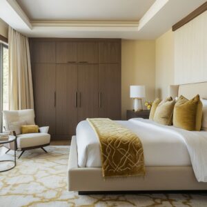
In many high-end bedroom office combo, built-in millwork plays a central role—quietly handling function while shaping how the space feels. Designers use vertical wood slats not as decoration but as a visual tool.
Their repetition hides things most people wouldn’t even think to notice: closet doors, drawer edges, and sometimes even acoustic panels. Because the pattern is consistent, the eye reads the entire wall as one clean unit.

A second layer of visual flow comes from the grain direction. Whether it’s a full-length desk or a row of drawers, designers often align the wood grain so it reads as one single run.
This small decision makes a wall appear longer and more grounded without calling attention to itself. It’s especially common in spaces with oak or walnut, where long, straight grain lines add a calm sense of order.

The choice of hardware, or sometimes the choice to skip hardware entirely, also plays a big role. Many setups use handle-free push-latch drawers or ultra-slim finger pulls—these help keep edges smooth and stop your eye from jumping between small details.
When knobs do appear, they’re usually in aged brass or soft black, and always intentional—typically reserved for adding a subtle contrast in rooms leaning classic or transitional.

Lighting is integrated into millwork too. LED strips are tucked behind lips or shadow lines.
No exposed bulbs. No visible wires.
The glow feels natural, like the space is lit from within. Designers nearly always stick to warm white light in the 2700–3000K range, which works smoothly with wood tones and keeps the space from feeling sterile.

Recessed spaces are kept shallow—around 10 to 14 inches deep. That’s enough for useful shelving or workspace, without losing usable floor area.
The only time you’ll see deeper niches is when the wall is designed to act as a statement element—where the whole surface becomes a quiet feature. In this kind of work, surface rhythm replaces decoration.
Repeat lines, careful grain matching, and soft hardware touches are used to guide the eye without forcing it. In well-resolved office bedroom ideas, the millwork isn’t just a storage solution—it shapes how everything else lands.

Palette shifts: color is nearly absent—but texture never is
| Material family | Notes | |
|---|---|---|
| 1 | White or rift‑sawn oak | Picked for tight, straight grain that lets light glide without glare |
| 2 | Walnut | Used sparingly as contrast—often only the desk top or shelves |
| 3 | Bouclé / boucle‑like fabrics | Adds cloud‑like softness to offset the rectilinear joinery |
| 4 | Leather chairs in cognac/saddle | A mid‑tone anchor that warms cool neutral rooms without bright color |
| 5 | Stone‑look desk tops (travertine, honed marble, concrete quartz) | Subtle veining gives movement without high contrast |

Lighting Choreography: Blending Mood and Task
Lighting in a dual-purpose room isn’t just about brightness. It’s about where the light comes from, what it lands on, and how it changes the way the surfaces read.
In many of these bedroom office combo spaces, lighting is worked into the millwork itself. Wall sconces are installed directly onto wood panels or vertical slats, treating lighting as part of the furniture system—not as something added later.
Designers lean on arc lamps and globe fixtures with warm-toned inner surfaces—like copper or brass—to shift the light’s color slightly. This bounce of warm light makes wooden desks and shelves feel richer and cancels out the blue tone that often comes from computer screens.

Under-shelf LED strips are another move that shows up again and again. They throw soft light downward—not enough to flood the whole room, but just enough to highlight a line of ceramics, books, or woven baskets.
These small touches give functional objects presence, and when placed right, they help turn a storage wall into something visually balanced.

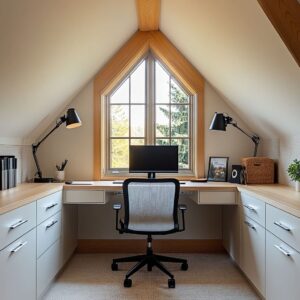
The positioning of the desk in relation to light sources is carefully thought through too. Designers avoid putting a direct overhead downlight above the desk—no one wants glare on their screen or sharp shadows on paperwork.
Instead, side lighting or light that washes in from behind or above the shelf line is preferred. That gives just enough brightness for work, but still keeps the mood relaxed.

Even the lamp and chair choices follow this thinking. In rooms with built-in work zones, task lights are minimal in shape and muted in color, so they don’t add clutter.
The goal is to have the workspace ready at all times but never overwhelming the room it sits in. Together, these lighting strategies aren’t just about function—they shape how the room feels from morning through evening.
Each light source is placed with intent, helping the space shift naturally between tasks and rest.

Furniture Silhouettes and Their Psychological Role
The shape of a chair or bed may seem like a small detail, but in a dual-use room, it carries a lot of weight. In nearly every office bedroom design idea, designers select seating that feels residential rather than commercial.
This often means choosing desk chairs with rounded backs and soft arms—forms that hint at comfort first. Especially when the desk sits close to the bed, these curves send a message: this is still a place for rest, even if work happens here too.

Wire-frame chairs or those with slim tapered legs appear frequently in corner setups. They create structure without adding bulk, helping the office zone feel lighter—especially important when the workspace sits within a compact footprint.
These pieces don’t block light and don’t crowd floor space. The room stays breathable.
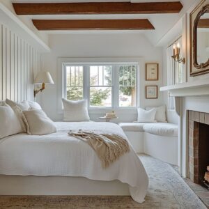
Beds follow a similar logic. Low-profile platforms are preferred in many layouts.
The benefit is visual: by keeping the bed height modest, more of the window—and whatever view it offers—remains visible. This becomes especially effective in rooms where the desk is tucked beneath or beside a window.
The bed doesn’t fight for attention, and the office space gets more daylight by default.

You’ll also notice how often channel-tufted headboards are used. That repeated vertical line echoes the rhythm of slatted feature walls, millwork panels, or even the grooves on drawer fronts.
It’s a quiet way to connect the sleeping and working halves of the room. Rather than create two clashing zones, designers use shared details—like vertical lines or repeated forms—to tie everything together.
This type of furniture selection is intentional, not decorative. It respects the functional split of the room while keeping it mentally calm.
Every curve or slim leg is a soft reminder that this isn’t a cubicle—it’s still a bedroom with comfort at its core, just made smarter through use of scale and shape.

Emerging Directions
The most inventive small bedroom office combo ideas are moving beyond function—they now work harder to make the shift between “day” and “night” feel seamless. One direction designers are leaning into is the dual-use bench desk.
By stretching the worktop under a window and adding a cushion or a few pillows, the desk becomes part workstation, part reading nook, part window seat. It’s a flexible move that invites use at all hours—morning laptop session, afternoon coffee break, or evening quiet time.

Partitions are also getting smarter. Instead of heavy walls or clunky dividers, vertical wood slats are showing up more often.
These dividers mark off zones, like between bed and desk, but still let air and light pass through. In compact city bedrooms, this is especially useful.
The space stays open, but each area still has a clear identity. One of the more refined ideas is hiding the office altogether.
Sliding panels, pivot doors, or even a movable art piece allow the desk area to disappear in seconds. This kind of solution is ideal for anyone juggling remote work while still wanting a restful space at the end of the day.
It’s also a big help when rooms need to double as guest spaces—clutter is easy to clear with a single gesture.

Color contrast continues to drop. Instead of bright accents or opposing tones, designers are now using grain, shadows, and light texture shifts to build depth.
This reads well in person and in photos—especially in homes that favor quiet materials like pale oak, soft boucle, or stone-look surfaces. With no harsh breaks between materials, the room feels unified even when doing double duty.

Lighting stays tightly controlled, too. You’ll rarely see clashing color temperatures.
LEDs used under shelves, in sconces, or behind panels are kept within the same warm tone. This keeps the atmosphere consistent no matter which lights are on—and it’s a trick that pros use all the time but often gets skipped in DIY setups.
In short, the trend is moving toward rooms that flex without feeling transitional. The best examples don’t try to make the office “invisible”—they let it belong to the space fully, while giving the option to quiet it down when needed.
Every finish, fixture, and form is chosen with that soft balance in mind.

Smart Office Bedroom Ideas
Some of the most effective choices in small bedroom office design are the ones that don’t shout for attention. They show up in how materials align, how much floor is left visible, and how light is used to support form instead of fighting it.
Running oak or walnut grain the length of a desk draws the eye outward, which helps compact rooms feel wider. When this is paired with hidden LED strip lights—tucked under shelving or behind edges—the texture of the wood gets highlighted without reflecting glare.
It’s not about shine. It’s about shadow, depth, and tone.

Floating elements are another move that helps tight layouts breathe. A desk or nightstand mounted to the wall without legs underneath frees up inches of floor that would otherwise be boxed in.
That breathing room lets rugs show through, and the whole corner reads as lighter. If there’s a window in the room, that wall is usually the first place to look for desk placement.
Natural light reduces eye strain for long work sessions, but to keep things functional through the evening, many designers add sconces to each side of the window. These create even lighting without needing a large overhead fixture—especially useful in spaces with low ceilings or sloped rooflines.

Hardware deserves attention too. Many setups either go nearly invisible with slim black pulls or push-latch drawers—or make a bold statement with full-sized aged brass knobs.
What rarely works is the in-between. Small-but-visible handles tend to clutter up the look, especially when set against flat panel cabinetry.

One more detail: space above the desk. Open shelving is useful, but too much packed in can turn a clean workspace into visual noise.
Leaving one open shelf segment—totally blank—gives the styled objects room to breathe. That empty space becomes part of the rhythm.

And finally, repeating motifs between work and sleep zones. You don’t need to match materials exactly.
A quilted headboard might be echoed in the grooved front of the drawer unit. A caramel leather chair could reflect the tone of a throw blanket.
These small echoes help the room feel thought-through without looking like a matched set. These small decisions don’t take much space, but they shape the feel of the room in a big way.
Anyone looking for ideas for desk in bedroom should start here—by looking closer at grain lines, light placement, and the balance between function and visual rest.

Final Thoughts
Every room in the set pointed toward the same idea: let the framework do the heavy lifting, and then layer in texture and shape. That means starting with the envelope—wood paneling, storage walls, built-ins that stretch from floor to ceiling—and then letting furniture and soft materials settle in naturally.
Grain direction, lighting temperature, and a focus on restraint all work together. Drawers don’t need extra hardware.
Lights don’t need to compete with natural sunlight. And the layout doesn’t need to squeeze in more furniture than the space can handle.

In a well-balanced bedroom-office hybrid, emptiness matters. Leaving open space is what allows everything else to be seen.
Grain can be appreciated when it’s not competing with color contrast. Lighting feels intentional when all the bulbs are in the same range.
And the room feels usable all day—whether it’s early morning emails or a late night wind-down.
These aren’t ideas built on gadgets or showpieces. They’re built on quiet control—on knowing where to add weight and where to keep things open.
That’s what gives a small bedroom office design its clarity. It’s a space that works, without looking like it’s trying.
And that’s the part that tends to last longest.