The hardest part of small modern luxury living room design ideas is that the “luxury” part has to be felt with fewer objects, fewer square feet, and fewer chances to hide mistakes. A large room can survive a random lamp, a too-small rug, or a TV that feels like a black sticker on the wall.
A compact room can’t. That is why the luxury effect should appear through a set of visual systems.
Luxury in small rooms often starts with “permission to be empty”
A thread running through many small luxury living room designs is that emptiness becomes an active design ingredient. It can be as:
- a long cabinet top with a “runway” of clear surface
- shelves with visible pauses
- a niche that’s lit but barely filled
- a mantel and fireplace wall that stay restrained so the stone can be the texture story
In a compact space, visual emptiness reads as control. Control reads as expensive because the interior design looks like it’s not fighting storage pressure or decoration anxiety.
This is why such interior designs keep returning to one big, confident element (a long baseline cabinet, a full-height slat field, an oversized artwork) and then deliberately “under-furnish” everything around it.

The TV is the black rectangle’s relationship to the wall
Many people think the TV ruins the interior design because it’s modern technology in a cozy design. A more precise issue: the TV can become harsh when it has no visual relatives and no softening context.

A. The “black hole” gets neutralized by building a backdrop that shares its darkness
- A deep charcoal wall, so the TV’s black edge stops behaving like a cutout on a pale plane. The wall turns the TV into a quiet object inside a darker field.
- Continuous wood wall: the screen sits inside a deeper tone, so it feels absorbed, not pasted on.
This is a subtle luxury cue because the wall reads like it was chosen for the TV, rather than the TV being forced onto whatever wall was available.

B. The TV calms down when a second vertical element shares the “attention job”
- Slim sconces near the screen can create tall, narrow light columns that compete with the TV’s rectangle in a gentle way. The wall gains a second “standing” element.
- In slat-wall ideas, the wall itself provides countless vertical lines, so the TV edge becomes one rectangle inside a field of rhythm.
This is where small modern luxury living room designs get sophisticated: the fix isn’t hiding the TV. It’s giving the wall another reason to exist.

C. The TV becomes quieter when it sits inside a framed zone rather than on a blank sheet
- A paneled built-in with a recessed framed TV zone. The TV behaves like a contained object inside a border.
- The TV niche as an architectural edge, which lets open-plan space feel “zoned” without extra furniture.
A benefit: once the TV is framed, the wall stops asking for extra decor to feel complete.

The baseline rule: one long, low line can replace many pieces
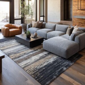
A popular “luxury physics” trick is the dominance of the low horizontal line: the long cabinet, bench, or ledge that visually stabilizes the whole interior design.

This baseline does several quiet jobs at once:.
A. It makes the room feel wider without needing more floor space
Long, low cabinetry stretches the eye side-to-side, which makes compact rooms feel broader. Short, tall furniture tends to chop the space; a baseline unifies it.

B. It hides daily mess while looking calm, not utilitarian
The luxury effect comes from storage that doesn’t look like storage:.
- vertical grain fronts read as texture and rhythm, not “cabinet doors”
- bench drawers that match the wall tone disappear into the architecture feel
- pale stone-like top lines make the cabinet read like a refined surface plane rather than a unit

C. It creates a “horizon line” that the eye can rest on
This is one of the most overlooked parts of luxury small living room design: the eye needs a steady line. For example, a pale top can run end-to-end like a calm horizon.
Or, underlighting can make the cabinet appear to hover, so the baseline feels lighter while still anchoring the interior design.
A compact room feels expensive when the eye doesn’t keep searching for where to land.

Night mood is a major luxury signal
Daylight can make almost any neutral room look decent. Luxury shows up when the interior design still looks intentional after sunset.

This is why small modern luxury living room design ideas use “layered glow” instead of one dominant ceiling light:.
- Vertical wall glow: sconces create tall light columns that stretch the wall and soften the TV contrast.
- Under-shelf or under-cabinet wash: the wall gains depth, the cabinet gains a floating effect, and the TV stops being the only bright rectangle at night.
- Picture-light logic: a slim light line suggests gallery styling, so even a TV wall inherits “art wall” behavior.
- Paired lamps as structure: two lamps behind a sofa form a symmetrical “soft frame” that makes the room look finished from many angles.

The point: lighting here is being used like visual makeup for surfaces. It reduces harsh contrast, reveals texture gently, and creates a low, flattering glow band at eye level.

Scale is a confidence signal
The “unfinished” feeling can be solved through confident scale rather than more items:.
A. Oversized art fixes the wall faster than a cluster of small frames
- One properly scaled piece to set the room’s center of gravity.
- Oversized airy artwork above a long cabinet, turning that wall into a composed scene.
- One large abstract behind the sofa so the sofa reads as a featured zone, not a random seat.
Small art often reads like hesitation. One large piece reads like a decision.

B. Pairs and diptychs create instant order
- Two matching artworks behind the sofa can create rhythm without clutter.
- Side-by-side pieces can feel calm and grown-up because the pair behaves like a single composed block.
- Two lamps + centered art behind a sectional can turn the back of the sofa into an intentional architectural “back line.”
This matters for small luxury living room designs because order is the visual shortcut to “planned. ”.

Texture replaces color drama
These modern luxury designs rarely rely on loud contrast or busy patterns. Instead, they create richness through small surface shifts:.
- nubby rounded chairs against smoother sofas
- ribbed cabinet fronts that break mass into fine rhythm
- stone-like tables that read as sculptural weight without shine
- rugs that behave like atmosphere: low-contrast, washed, and deep enough in tone variation to hide daily life

A useful way to name what’s happening: texture ladders. Instead of stacking many colors, the rooms stack surfaces from smooth → woven → plush → mineral → wood grain.
The palette stays quiet, but the room still has depth because light hits each material differently.

This is one of the most “designer” moves inside small modern luxury living room design ideas: the interior looks rich without looking busy.

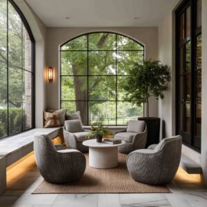
Curves are doing luxury work in tight footprints
In small rooms, curves solve pressure points:.
- Round stone-look tables keep the center walkable and soften the room’s geometry.
- Soft “boulder” ottomans replace hard tables, making the middle feel gentle and lounge-like.
- Organic pebble tables can create a calm dark anchor without sharp corners.
- Curved seating can reduce the “boxy” feeling that can make compact rooms feel strict.
The benefit: curves reduce the sense of “tight corners” visually, even before anyone walks through the space. That’s why curved forms read as comfortable luxury in compact plans.

Symmetry vs. controlled asymmetry
A. Symmetry creates an immediate “finished” read
- Fireplace rooms can use balanced sofas, balanced lamps, and centered mirrors to signal maturity and stability.
- Console-behind-sofa compositions can use symmetry to make a floating sectional feel anchored.
Symmetry works especially well for small luxury living room designs because it reduces visual uncertainty. The eye reads the room quickly and relaxes.

B. Controlled asymmetry prevents the room from feeling staged
Even in very calm designs, the styling often slides to one side:.
- a floral cluster pushed toward one end of a long cabinet
- off-center cabinet styling under a TV
- a shelf that’s curated but not filled evenly
This kind of asymmetry creates plausibility while keeping the overall structure clean. It’s one reason such designs feel livable yet refined.

Rugs are acting as room boundaries
The rug is large and intentionally quiet. The deeper reason: in compact living room designs, the rug is the visual boundary that tells the brain, “this is one planned seating island.
”.
- A rug fills the zone enough to avoid the chopped “furniture islands” effect.
- A thick, faint-grid rug to make the low furniture band feel continuous.
- A rug can be pale and subtle so the long narrow layout reads as one calm lane, not separate segments.
- Restrained patterns can be choosen to add depth without competing with the fireplace stone.
This is a core mechanism behind luxurious small living room ideas: the deisgn feels designed because the seating area has a clear perimeter.

“Living-with-it” luxury: surfaces stay readable, clutter stays invisible
A major hidden goal inside small luxury living room ideas is wanting the design to look calm. It can be handled through three recurring moves:.
A. Trays turn small objects into one intentional cluster
The tray-as-boundary idea. It keeps surfaces readable and makes daily items look composed.
B. Long closed storage replaces many smaller storage pieces
The long cabinet line to remove the need for extra side tables and baskets that add visual noise.
C. Display is kept “low density”
Shelves and niches are styled with pauses and breathing design. The interior concept shows personality without turning into a collage.

The underlying formula for small luxury living room designs
Even though the interior designs vary, the same core systems can work:.
- One anchor that carries the visual weight (dark wall, slats, stone, paneled recess)
- One baseline that stabilizes the room (long low cabinet, bench, ledge)
- Confident scale (oversized art, pairs, strong center table)
- Night layering (warm glow at eye level, under-shelf wash, picture-light cues)
- Micro-contrast texture instead of loud contrast
- A readable seating island (large quiet rug, calm perimeter)
- Edited surfaces (negative space, trays, low-density styling)

That’s why small modern luxury living room design ideas keep feeling “finished” without feeling crowded: the design reads like a small set of strong decisions, supported by quiet repetition and controlled calm.