Color on a single wall can shift how the entire room feels—how the ceiling reads, how the light moves, and how surfaces relate to each other. This isn’t about spotlighting a shade—it’s about how paint, texture, and placement can quietly reframe the structure of a space.
Some walls disappear into the background while anchoring the room’s balance. Others act like gentle borders, dividing zones without a line.
A few even stretch space where none exists, not by brightness but by how color sits between shadow and material.
Every detail matters—from how a finish catches light to how surrounding objects echo what’s hidden inside the color. The results are rarely loud.
Often, the effect of a well-placed tone is quieter than expected—but stronger in how it holds the room together. This article looks closer at how these moves work, what principles guide them, and why certain walls feel right without needing to explain themselves.

Deep Neutrals: How Charcoal Becomes Soft Rather Than Harsh
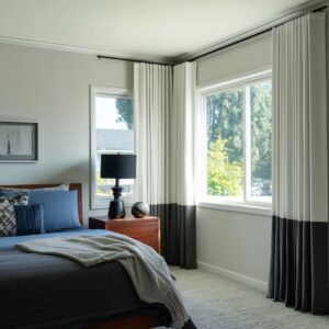
Dark doesn’t always mean overpowering. Matte charcoal finishes act more like fabric than paint—absorbing light, reducing glare, and giving the wall a soft, continuous feel that fades into the background rather than pressing forward.
This surface quality has an almost tactile depth, especially in spaces where color carries a hint of graphite, slate, or warm ash. What’s surprising is how easily this tone shifts under changing daylight—cooler at midday, warmer by evening—making it one of the most adaptive choices in current living room accent wall ideas.

What keeps these deep tones from feeling severe is the presence of subtle contrasts that gently counterbalance their density. Think pale oak or walnut ledges running across the lower third, or a slab-style coffee table that picks up just enough natural grain to soften the vertical expanse.
Caramel leather, off-white boucle, and layered beige fabrics help the furnishings appear brighter without exaggerating the contrast. These combinations allow the charcoal to sit back visually, almost like negative space that makes everything else stand clearer.

There’s also an often-overlooked visual role the wall plays—it reduces sharpness. While a gloss finish would send reflections across the room, these low-sheen surfaces quietly hold shadow and light in place, so no single object pulls too much focus.
The result: a layout that feels still, deliberate, and structured without feeling forced. Among the more compelling accent walls ideas, this quiet, immersive use of charcoal proves how color can lead a room without dominating it.

Earth & Clay: Pigment That Feels Sun-Aged
Not every color needs to shine to feel rich. Clay-based hues—ranging from terracotta to dusted peach—carry the weight of the earth without borrowing its heaviness.
Their natural matte texture keeps reflections at bay, which helps rooms feel wrapped rather than lit. The surface often includes slight irregularities—whether through trowel marks or subtle color marbling—that give the wall visual rhythm even in still air.

What sets these earth shades apart is how they interact with their surroundings. Paired with ivory or oatmeal-toned seating, rather than stark white, these walls build a soft warmth without breaking the visual temperature.
The seating doesn’t interrupt the color—it extends it. Medium-toned woods, especially those with dry or smoked finishes, keep the space grounded without competing for attention.
Crucially, there’s always enough quiet in the palette—nothing feels overly worked.

Lighting tends to lean low here: fabric pendants, soft-edge sconces, and filtered daylight all play into the natural glow that these tones already carry. There’s a clever spatial effect at play too—these colors tend to compress the depth of a room slightly, drawing vertical and horizontal planes inward so that everything feels closer, more anchored.
In larger open layouts, that effect brings cohesion. And in narrow rooms, it makes surfaces feel more related.

What seems like a simple choice—some version of clay or sand—often turns out to be the element that ties material, light, and proportion into one calm visual tone. It’s not showy, but it leaves nothing disconnected.

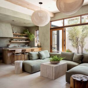
Greens as Quiet Neutrals
There’s a quiet trick to using green without making the room feel themed or seasonal: steer it toward gray. Dusty olive, eucalyptus, and muted juniper shades avoid brightness by pulling from stone tones rather than leafy ones.
The result is a surface that carries a quiet memory of the outdoors without ever becoming literal or loud. With ultra-matte or soft satin finishes, the surface remains even in all lighting—never glossy, never patchy.

These greens act almost like soft putty tones, but they carry more personality. Used in alcoves or built-ins, they wrap into corners and across depth changes to visually carve out space, making architectural features feel more dimensional.
A recessed reading niche or a fireplace wall can feel deeper and more sculptural when this type of color carries across edges and shelving.

In some living areas, a deeper forest tone can act like a shaded tree line. Framing this kind of green with walnut or medium oak shelves introduces a subtle vertical rhythm, evoking a natural structure.
Surrounding it with neutral textiles, soft black details, and natural-toned stone—especially limestone—keeps the green grounded and avoids any sourness that might arise with stark white. Furniture and décor keep their voices low: soft boucle, pale ceramics, and layered rugs in beige or fog-colored tones all allow the wall to lead without overworking the color story.

Of all the ideas for feature walls currently circulating, these gray-green blends offer a way to introduce atmosphere through color without needing contrast or ornament. They fade gently into a room while quietly holding the tone together.

Blues That Control Room Geometry
Blue can do far more than set a mood—it can structure a room, shape its proportions, and direct how the eye moves. Steel, inky, and dusted blue tones are often used not for color impact, but for their ability to carry weight without feeling bulky.
When a wall is treated with a multi-layered oxidized plaster that mixes smoke, charcoal, and dark teal tones, the result is movement—not pattern, but slow tonal shifts that mimic the surface of water or sky.

What’s especially refined about this approach is the placement. A steel-blue inset or niche framed in soft beige doesn’t feel like an accent—it reads as depth.
By concentrating the color inside a recessed structure, the visual impression is of a space-within-a-space. That’s stronger than painting a full wall because the frame keeps the blue contained, giving it a function beyond decoration.

Blues are also used to define transitions. Placing a saturated tone at the point where a living space meets a dining zone, or around a partial divider, turns the paint into a threshold—a signal of shift.
In rooms where stone textures sit nearby, like pale limestone or sandstone, the absorption quality of dark blue makes surrounding materials appear sharper and more dimensional, even with no change in lighting. It’s not about brightness—it’s about contrast handled with care.

Even cooler shades like lavender-gray can add softness without retreating into pastel. Used on a backdrop for heavy or dark-toned furniture, this kind of dusty blue reads more like a shadow layer, giving large pieces a sculptural presence without needing contrast.
Among current accent wall paint ideas, this use of blue doesn’t shout—it outlines, deepens, and quiets the room by changing how walls hold space.

Warm Yellows & Ochres Without Sweetness
Soft golds and wheat-toned ochres often carry more nuance than most expect. These colors raise the room’s warmth visually without tipping into cheerfulness or cartoon brightness.
What sets them apart is their ability to shift across the day—matte ochre can read like fresh straw under daylight, then slide toward baked amber tones as the room darkens. This dual character works especially well in pared-back interiors where subtle changes do more than flat saturation ever could.

In tall, clean-lined spaces, soft ochre tones help bounce natural light up pale surfaces, like ivory cabinetry or ceiling trim, which has the hidden effect of making vertical lines feel longer. That illusion matters—it stretches the room’s feeling without any change in height.
This only works because the ochre stays soft. It doesn’t spike.
It blends.

Instead of pairing with pure yellows—which can flatten the mood—these tones are best flanked by camel, clay, and rust, which sit nearby on the color wheel without competing. The supporting cast stays in the background: blond oak side tables, open shelving, and pale flooring that lets the wall do the lifting.
In this setup, even a whisper of brass or sandstone detail takes on more weight. This approach stands out among modern feature wall paint ideas because it turns color into a soft atmospheric layer rather than a central statement.
It wraps the space in warmth without taking over the visual balance.

Off-Beat Reds & Oranges for Framed Volumes
Certain saturated colors—pumpkin orange, paprika, muted blush—need structure to settle in. The most effective way to use these deeper hues is to contain them fully: inside an alcove, around an arch, or on a defined surface that wraps inward.
When the color touches every surface of that nook or curve, it doesn’t spread—it frames. And that’s the move that brings clarity.

There’s also texture involved. A wall in plastered blush, for instance, carries light differently than flat paint.
It scatters shadows, dulls shine, and lets the color feel dry, like clay or pigment caught in sun. This keeps the palette grounded—more earthen than polished.
In rooms with sheer curtains or soft pendant light, a peach-toned plaster can even catch glow in the corners, giving the whole surface a slow-lit feel.

Neutral furniture placed right up against the wall—ivory boucle, light canvas, or wool—allows the color to be read as form, not background. Creating physical distance would interrupt the wall’s role as container.
That closeness gives the wall its strength.

These kinds of treatments are among the more unexpected living room accent wall paint ideas, not because they shout, but because they’re used as color architecture—giving form and enclosure to the bolder pigments that typically feel loud elsewhere. With soft finishes and close placement, the wall becomes a solid, grounded element within the space.

Plum, Chocolate, and Other Low-Chroma Darks as Connectors
There’s a quiet method to using muted darks like dusty plum or espresso brown—they don’t scream contrast, but they connect the palette behind the scenes. A plum-gray backdrop, for example, can bridge pale woods and soft mauves in a way plain charcoal never could.
These types of tones carry just enough undertone—whether a trace of red, violet, or cool brown—to echo across a space without dominating it.

A smooth chocolate wall with cooler undertones can sit behind rust-colored accents and cream upholstery without shifting the overall mood. The wall stays grounded, but its subtle tint picks up cues from the furniture and textiles, creating a low-key rhythm across surfaces.
This is the opposite of matching. It’s about resonance—letting the color quietly underline what’s already in play.

What makes these shades valuable in many accent wall designs with paint is their adaptability. While bright colors tend to dictate everything around them, these moody low-chroma tones allow other materials—wood grain, soft metal, textured fabric—to show up more fully.
They create unity not by force, but by echo.

Finish & Light: The Silent Twin to Color
A wall’s visual impact depends as much on surface as it does on hue. Flat finishes, chalky textures, or matte plasters behave differently in space—they hold light rather than bounce it, turning even deep shades into something soft.
That’s why so many of the darker walls work: the lack of gloss makes them feel quiet and settled.

Satin, on the other hand, has its own role. Used sparingly—like on a misty green or a dusky pumpkin tone—it gives just enough reflection to shape the wall’s volume.
It doesn’t gleam, but it helps contours show. The trick is placement: walls that catch angled light, like niches or archways, benefit from this minimal sheen.
It lets curves and edges show up more clearly without exaggerating their form.

Some finishes go even further. Venetian plaster, oxidized metal, or layered washes in coppery tones shift slightly as light moves across them.
They behave like slow surfaces—always changing but never loud. Metallics, where used, are always subdued.
They warm the tone instead of calling attention to themselves. In the end, it’s the combination of color and finish that determines how a wall lives in the space.
Glossy surfaces might pop in photos, but in lived-in rooms, it’s the muted, diffused finishes that carry the room’s atmosphere quietly and completely.

Shelves, Artwork, and Furnishings as Tone Tuners
Wall color doesn’t exist in isolation—it shifts based on what surrounds it. Objects, finishes, and materials either dial a hue warmer, cooler, lighter, or deeper depending on how they relate to the wall’s undertones.
The difference between a flat green and a nuanced one often comes down to the shade of wood nearby or the exact blackness of a ceramic vase.

On a forest green wall, for example, matte black ceramics can pull out the cool depth, while pale stoneware softens a terracotta wall’s natural density. A navy or ink-blue wall can feel sharp if left alone, but add walnut frames or a brown-toned console and the edge softens.
There’s nothing random about these pairings—even if they don’t match, they echo something underneath: warmth, weight, saturation.

What really controls the outcome is how the supporting elements respond to the wall’s lesser-noticed qualities. A slightly yellowed green needs a cooler contrast—blond oak does the job.
A green leaning cooler might need warmth, and that’s where chocolate-toned furniture, tobacco leather, or rust textiles come in. This kind of tone tuning doesn’t rely on repeating colors—it’s about reading the color’s temperature and helping it settle into the space.
The most successful living room accent wall color ideas rarely stand alone. They’re quietly shaped by the objects placed in front of them.

Spatial Illusions Through Selective Coverage
Full walls in bold tones can overwhelm if they cover too much. But used with precision, strong color can reshape a space’s visual depth without overpowering it.
That’s where partial coverage, framed sections, and narrow blocks come in. A niche painted in steel blue—especially when surrounded by pale walls—doesn’t just add contrast.
It creates the illusion of depth, like a shadow box built into the wall. The surrounding neutral color becomes a visual breather that allows the bold hue to settle into the background rather than advancing into the room.

This works on the horizontal plane too. A clay-toned strip at the end of a narrow living area can stretch space, helping the room feel longer.
Meanwhile, double-height charcoal walls in taller spaces rely on proportion—not avoidance of dark color—to maintain openness. With pale flooring and ceilings to the sides, the dark tone anchors rather than encloses.

What matters is where the color stops. By allowing the bold paint to live only where structure allows—inside a frame, within a niche, or as a defined central block—the rest of the room stays airy.
These spatial shifts don’t rely on brightness, but on smart placement.

Key Principles
- Undertone controls the entire room’s cohesion. Even when the surface color appears simple, its hidden bias—blue inside charcoal, gray beneath olive, or a dusty clay tint in ochre—quietly dictates how nearby materials react. This is how a wall manages to work with pale woods, muted metals, and soft textiles without looking patched together.
- Surface finish shifts how color behaves. Texture isn’t separate from tone. Chalky plaster, low-luster paint, and wood slats each hold light differently, turning one paint code into multiple visual impressions depending on angle and hour. In some spaces, the wall even changes tone throughout the day, which adds life without movement.
- Placement gives color dimension. Inset panels, framed recesses, and wrapped corners make color function like shadow rather than surface. This trick expands small rooms and creates the illusion of depth without adding square footage. In these uses, color behaves more like space than pigment.
- Contrast is rarely high-voltage. Clean white is almost always swapped out for softer versions—think cream, sandy ivory, or driftwood beige. This keeps the focus on balance, not drama. When there is contrast, it’s usually in tone or material, not in brightness.
- Furnishings act as color moderators. Add a saddle leather chair to cool charcoal, and the wall feels warmer. Place a fog-gray rug below a green wall, and the color shifts cooler. These aren’t corrections—they’re refinements. The room becomes a composition of temperature, not color matching.
- Undertones repeat quietly across the space. Instead of doubling down on one loud color, designers repeat a wall’s subtext. That might mean a throw pillow in the same clay base tone or matte ceramics that match the paint’s cooler cast. These echoes build connection without repetition. The palette stays dynamic without being busy.
- Light rewrites color depending on source and angle. Top-down lighting brings out plaster variations that daylight flattens. Side glare turns satin finishes into soft glow. These shifts are used intentionally—or rather, predicted—so each wall behaves differently depending on time and mood. In this way, light doesn’t just affect color; it gives it structure.

Closing Note
The strongest feature wall colours for living room settings don’t stand out through brightness—they work through restraint, subtle structure, and compositional awareness. These walls shape how a space feels, not through volume but through placement, texture, and undertone.
They support furniture, highlight form, absorb or scatter light, and bring shape to the quiet rhythm of the room. In the end, the wall becomes more of a background pulse than a focal point—one that holds the entire space together without ever needing to raise its voice.