In recent interiors, the accent wall has shifted from trend piece to functional layer. It’s no longer only about adding color—it’s about how that color holds space, reacts to light, and builds mood without decoration.
Dining rooms, often minimal in layout and material, rely on subtle moves to bring focus and flow. And wall color has become one of the most refined tools for doing that.
Wall tones now act as subtle editors of experience—softening corners, anchoring open areas, or drawing out the rhythm of furniture lines. Whether it’s a low-saturation green, a powdery terracotta, or a deep mineral gray, these shades often do more than highlight—they direct.
They help quiet the room or add depth without visual weight.

Today’s approach to accent walls goes beyond simple contrast. It leans on how color interacts with texture, lighting, and the other materials around it.
Some finishes absorb light and slow the eye. Others bring out the detail in soft furnishings or shift temperature throughout the day.
The effect is not theatrical—it’s tuned. This article explores how color has become one of the most subtle yet powerful elements in dining room design, used not to decorate, but to pace, balance, and ground.
Whether muted or rich, cool or warm, these walls carry more than color—they carry the feel of the space itself.

Color as Emotional Architecture
In many modern spaces, the color on the wall quietly sets the emotional tone, shaping how a dining area feels before a single object comes into focus. Instead of acting as simple backdrops, accent walls in dining rooms are now chosen with an awareness of how they affect mood and perception.
- Warm clay tones like terracotta, peach-blush, and soft dusty pink do more than add color—they behave like visual comfort layers. Such walls don’t call attention to themselves; they envelop the space gently. They absorb and return light in a way that feels grounded without closing the room in. Their muted presence wraps the space softly, creating a sense of warmth that doesn’t demand contrast or decoration.
- Deep shades—like charcoal, navy, and weathered indigo—bring a sense of visual depth. These darker tones absorb surrounding light rather than bouncing it back, which makes them recede and subtly expand the room’s perceived boundaries. Instead of feeling heavy, they often introduce a quiet depth—a pause within the palette—allowing furniture and decor to settle into place with more clarity.
- Then there are colors like mauve, muted lavender, and pale sage, which strike a rare balance. These tones sit between warm and cool, between emotional and rational. They hold presence without nostalgia. Such dining room accent wall colors offer a visual softness that avoids being too playful or sentimental, letting the surrounding elements breathe more easily.
A less-noticed dynamic is how temperature in color responds to light. Warm tones tend to expand under daylight but feel more enclosed in shadow.
In contrast, cool colors shrink in brightness but stretch open in dim light. Designers use these optical behaviors—along with the orientation of the dining area’s natural light—to influence how a space behaves throughout the day.
In doing so, color quietly shifts how the room is read—by eye and by feeling.

Finishes as Spatial Signals
Beyond color itself, how the wall holds light is often what gives it shape and presence. The finish of the paint or plaster isn’t secondary—it’s part of the design language.
Subtle choices in texture can create stillness, movement, or atmosphere depending on how light travels through the space. Finishes like chalky matte, limewash, and tadelakt behave very differently from flat paint.
These walls don’t look like they’ve been painted; they appear mineral-like, as though the surface belongs more to earth than pigment. There’s a visual density here—walls that appear aged, textured, or wind-worn—even in new construction.
This tactile impression grounds the space. It draws focus not through pattern, but through texture that holds light in uneven ways.

In some cases, a slightly polished or soft-sheen plaster becomes light-reactive, catching the sun across its surface in selective glints. Instead of bouncing light broadly, it creates streaks and gradients—not dramatic, but quietly active.
This small interaction can make a dining area feel subtly animated, shifting throughout the day with the changing light. It’s particularly noticeable in spaces with side windows or angled sun.

One of the more overlooked techniques is leaving the surface slightly imperfect—brushed, marbled, or cloudy. These small inconsistencies aren’t flaws—they are what give the wall presence.
Instead of a smooth boundary, the wall acts like a surface in motion, suggesting tone shifts and texture variation. These details add a sense of time, like something between a shadow and a memory, giving the space more than a static appearance.
In modern interiors, it’s often these quiet textural choices—not decoration—that define the spatial tone. A dining room with a rough lime-plastered wall doesn’t need much styling.
The finish does the visual work, shaping the feel of the space before anything else is added.

Narrow-Band Palettes for Precision
In modern dining interiors, color is often handled with a high level of restraint—not through sharp contrast, but through carefully controlled tonal proximity. This method doesn’t reduce the visual interest.
Instead, it brings clarity by working within a compressed temperature range, creating a sense of balance that feels effortless even when it’s highly refined.

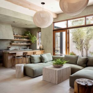
Take, for instance, a space where the wall is painted a soft sage. The upholstery may lean into a muted mushroom tone, while the wood surfaces show a pale neutral grain.
Across the room, there’s rarely more than a few degrees of warmth or coolness separating each tone. These color relationships are close—not identical, but part of a shared climate.
This technique leads to low-saturation contrast that doesn’t ask for attention but still shapes how the space feels.

This approach to accent wall color for dining room composition isn’t minimalism for the sake of emptiness. It’s about cohesion without overstatement.
The colors hold hands rather than competing for notice. What results is a visual rhythm that keeps the space calm, stable, and collected.
One overlooked effect of narrow-band color schemes is how they affect the pace of viewing. When no color demands a reaction, the eye begins to settle into the space instead of scanning it.
This slower visual engagement supports what dining rooms are meant for—conversation, connection, and focus. The room becomes a setting that fades in importance while quietly supporting the scene that unfolds within it.

Wall Color as Visual Gravity
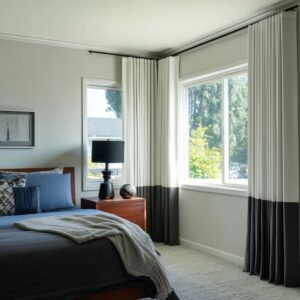
In some interiors, the accent wall isn’t background—it acts like an anchor. Rich, dark, or deep-toned finishes—such as black, navy, or burnt orange—take on a structural role that holds the room together.
These aren’t vibrant accents meant to pop. They’re visual weights that keep the eye steady, giving contrast without drama.
In open layouts or dining rooms with bright flooring and pale furniture, a dark wall can create a necessary counterpoint. It absorbs the surrounding brightness, making lighter materials feel lifted.
A pale ceramic sculpture, for example, can appear to float more delicately when framed against a moody backdrop. This use of accent wall colors dining room design creates a visual balance of tension and ease.

The contrast here isn’t always about brightness—it’s about mass versus lift. A room with mostly airy tones might lack structure until a dark feature wall is added to ground it.
Once in place, this wall helps light fixtures feel lighter, soft chairs feel softer, and wood finishes appear more vivid. The visual gravity provided by the wall pulls things inward, giving the space a center of focus without needing symmetry or large furniture.
This is a rare design move, where the goal isn’t to highlight the wall but to let it quietly carry the visual weight of the room. In that role, color operates like architecture—shaping how furniture relates to the space and how the space holds its shape in return.

Color That Edits the Room, Not Just Decorates It
There’s a quiet technique that often escapes notice—using wall color to reshape how the room is read, not just to style it. In many modern interiors, accent wall color ideas for dining room setups are chosen to redirect focus, soften boundaries, or neutralize contrast.
The goal isn’t always to highlight. Sometimes, the color subtracts attention from one place to let other parts of the space breathe.
For instance, a soft lavender-gray wall can cause white artwork to almost melt into the surface, reversing the expected contrast between frame and background. Instead of a painting standing out, it becomes part of a continuous plane, drawing the eye more slowly and flattening hierarchy in the room.

Similarly, a blue-gray wall can refine architectural structure, giving sharper edge to verticals and corners that might otherwise feel washed out. With just the right undertone, these colors emphasize shape without adding noise.
They help ceilings feel higher, doorways more defined, and shadows more graceful.

A less obvious but impactful move is using color to lower visual volume. Instead of introducing an accent, the wall absorbs some of the foreground energy.
Chairs, shelving, even decor can seem quieter when surrounded by tones that match their palette gently. This is tone harmony used as subtraction, letting certain details fade slightly so others can hold the moment.
These color moves don’t demand attention—they guide it. They are less about decoration, more about editing the scene so the room feels composed, not staged.

Walls as Tone Connectors
There are rooms where the wall color doesn’t lead—it links. In those spaces, the color serves as a visual mediator between materials that otherwise might not agree.
Whether it’s wood, metal, ceramic, or textile, certain hues can pull the pieces together without any of them having to shift. Take pastel greens and dusty terracottas—these shades work across design eras and materials.
They sit comfortably between raw cane textures, blonde wood grains, and unglazed pottery, creating a visual path that connects them all. None of the elements are forced into similarity.
The wall just smooths the contrast.

In other cases, pale pinks and peachy beige tones act as balance points between clean white upholstery and brass or mid-tone wood. Without the wall doing this job, these materials might compete.
But with the right tone behind them, the room reads as one continuous palette, not as a collage. This isn’t about harmony through match—it’s about tone through transition.
The wall becomes the neutral bridge between warmth and coolness, organic and crafted, soft and structured.

The less-acknowledged role of these walls is how they make conversation between objects feel natural. A chair and a light fixture might come from different worlds, but the wall between them pulls them into the same sentence.
That’s the purpose of these color choices: not attention, but connection. Walls here are doing quiet coordination.
They don’t decorate—they translate between textures. And it’s in this subtle role that some of the most impactful paint ideas for dining spaces emerge—tones that give shape not through contrast, but through coherence.

Sculptural Composition Supported by Color
In many modern interiors, color is what gives form its clarity. Even in rooms with minimal furniture or pared-back decor, it’s the wall color that activates the composition, setting up contrast, rhythm, or tension between elements that would otherwise sit flat.
Take a burnt sienna or deep clay-toned wall—its density gives shape to light. As natural light moves across the surface, it creates gradients and shadows that interact with furniture, vases, or artwork.
These shadows aren’t accidents; they become part of the visual story, almost like a silent type of decoration.

What’s especially effective is how color brings texture forward without turning up contrast. Against a cool charcoal or warm ochre wall, materials like pleated fabric, raw ceramics, or layered glass start to show subtle differences in texture—ripples, folds, matte vs.
sheen—that may go unnoticed against white.

The key isn’t boldness. It’s controlled tension between color temperature and material texture.
A pale wood shelf, for instance, looks sculptural when set against a cool slate-gray wall because the wall slightly resists it tonally. The result is depth without dramatics.
This is why many accent wall paint ideas for dining rooms focus on tones that hold the space still, allowing a quiet object—a lamp, a vessel, a pendant—to feel more dimensional, more deliberate, even if it’s not especially large or ornate. The wall gives it context and shape through restraint, not spotlight.

Unpredictable Color Behavior with Light
Some of the most expressive wall colors in modern interiors are not fixed—they shift gently throughout the day, reacting to light in ways that aren’t obvious at first glance. This unpredictability creates a space that feels different at 8 a.
m. than it does by candlelight.
For example, a pale sage wall might lean silvery in cool morning light, only to warm into a soft green-beige as sunset moves across the room. That same color under artificial light may take on a misty tone, subtly pulling back into the background.

A rich indigo may appear stormy gray in the shadows, then pick up muted purple or lavender undertones under warmer bulbs. These color transitions are not visual tricks—they’re how light and pigment respond to each other across time, giving the wall its own quiet movement.

What makes these choices unique is how they introduce variation without needing surface decoration. A single color, when paired with the right finish—like matte limewash or brushed plaster—can feel like several different moods across the same day.
This gives the dining space a slow pulse, letting the color behave like atmosphere rather than surface. And while these colors may seem subtle, they have a lasting effect.
They make the room feel responsive, like it’s tuned into what’s happening outside the window or across the table. That quiet visual shift doesn’t aim to impress—it gives time and mood a place to land.

Final Thought
What gives modern accent walls their strength isn’t brightness or contrast—it’s how they shape attention without asking for it. These walls take on roles far beyond surface color.
They guide how light behaves, how textures respond, and how still or dynamic a room feels at any given moment. Rather than acting like framed statements, they work quietly in the background, adjusting the visual weight of furnishings, defining edges, or softening transitions between materials.
Their job is not to impress, but to steady the space, giving the room rhythm without noise.

The most effective of these choices often go unnoticed at first glance. A soft plastered green that changes with the hour, a charcoal backdrop that lets natural wood breathe, or a pale tone that absorbs shadow instead of reflecting it—all of these contribute to the room’s mood without competing for attention.
This way of using color goes far beyond passing style. It turns the wall into an active part of how the dining room feels, works, and settles.
It’s not decoration—it’s direction, paced by light, grounded in tone, and tuned to the atmosphere.