In today’s interiors, ceilings are no longer treated as blank space or afterthoughts. They’ve evolved into active design surfaces, shaping how rooms feel, look, and flow.
Subtle shifts in lighting, texture, layout, and form are now being used to guide the mood of a space and extend the visual character of everything beneath them. Rather than relying on statement features or heavy detailing, many of the most refined ceiling concepts focus on rhythm, proportion, and material dialogue.
Light is handled like a surface, texture like a quiet echo, and geometry like a soft beat that keeps the eye moving without interruption. This approach gives the ceiling a role that’s deeply connected to how the room breathes—not as a top layer, but as a space-making element.
What follows is a closer look at the visual tools and spatial effects behind these modern ceiling ideas—from how they define presence to how they hold back, creating stillness, lift, or connection across every part of a room.
Ceilings as Soft Boundaries, Not Caps
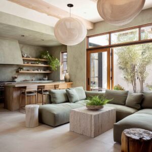
One of the most quietly impactful approaches in modern ceiling design for living room spaces is how ceilings are no longer treated as hard stops. Instead of pressing down on the room, they act more like floating visual planes that shape atmosphere rather than contain it.
What seems like a minimal shift—adding light gaps, recesses, or negative space—is actually a powerful design tool for removing the sense of compression that ceilings often bring, especially in smaller or medium-sized layouts.

In several cases, the ceiling appears to hover gently above the walls. This effect is often achieved through perimeter lighting subtly set back from the wall plane, which lifts wood slats or recessed trays slightly away from the structure.
The slats then appear to float—not because they’re detached physically, but because light is used as a separator instead of molding or trim. The result is a soft border rather than a defined edge.
Another strategy relies on contrast and framing. A ceiling treated as a dark insert—like a shadow suspended in a halo of light—creates a strong sense of weight and presence, but without dragging the room downward.
The light does more than illuminate; it defines the ceiling’s position in space without letting it dominate.

Even in rooms where the ceiling is raised rather than recessed, a cool-toned LED border is enough to create that clean visual lift, making the ceiling feel like it’s hovering in place. The light brushes the upper perimeter rather than spotlighting it, giving the entire space a vertical softness.
What makes this approach especially effective is how it creates zones within a room, not barriers. Such ceilings don’t close off the volume—they define where attention gathers, where furniture feels grounded, and where open space continues upward.
This kind of layout awareness brings an understated sense of calm and structure, where the ceiling becomes a quiet participant in shaping the room’s presence.

Geometry as Emotional Vocabulary
The shapes used in ceiling design have taken on a more active role—not just organizing space, but influencing how a room feels over time. In current interiors, the use of angle, rhythm, and layout in ceilings does more than follow architectural logic; it becomes a visual tempo that guides the way space is read and experienced.
For instance, a diagonal ceiling line, often introduced through a sloped or angled tray, doesn’t demand attention immediately. It’s felt before it’s noticed.
That subtle incline pulls the eye gently upward and across, nudging the room open. The ceiling becomes a directional cue, quietly setting movement and focus within the space.

In rooms that feature grid-based designs, such as wide coffer layouts, the ceiling takes on a measured visual beat. It’s not about symmetry—it’s about rhythm.
Carefully spaced recesses or beams, broken by shadow gaps or black inserts, give the ceiling a layout that almost resembles page structure or typographic spacing. The result is a sense of quiet order that holds the space together without forcing attention onto itself.
Some of the most engaging ceilings do the least. One ceiling lets natural shadows carry the form, using soft backlighting and structural angles to add emotional tone without layering on complexity.
That contrast—between what is lit and what is left in shadow—gives the ceiling its depth and its mood.

What’s often overlooked is how these ceiling layouts adjust the psychological pacing of a room. Grid repetition can calm the eye; soft slopes invite expansion.
The ceiling becomes a tool for setting tone—more like a conductor guiding movement than a decorative cap. This kind of shaping becomes especially valuable in open plans or rooms with limited ornamentation, where the ceiling holds the rhythm that everything else quietly follows.
And in this context, modern drop ceiling ideas often explore new ways to embed that rhythm without relying on conventional molding or multi-level complexity. Through subtle shaping, material alignment, and proportion, they create ceilings that do less—but say more.

Light as a Spatial Material
In current interiors, light has stepped away from its basic role of visibility. It’s no longer an overlay or an add-on—it becomes part of the ceiling’s surface vocabulary.
In this approach, lighting is handled as if it’s a finish—as integral to the look as the plaster, wood, or paint that surrounds it. A clear example of this shift is seen in drop ceilings that operate like visual wells.
Instead of being illuminated from above, the ceiling appears to glow from within. Warm, amber-toned light sits gently inside recessed trays, casting no sharp rays.
It reads more like ambient hue trapped inside a soft-edged skylight than like ceiling-mounted lighting. This effect shapes the room’s upper atmosphere without creating a focal point, quietly changing the tone of everything below.
Some rooms handle this with even more restraint—thin linear lights cut cleanly across a matte ceiling, not recessed but embedded, producing the sensation of sliced light. These lines act as visual scores, dividing the ceiling into measured fields.
Rather than providing brightness, they structure the view above.

There are also rooms where light seems to rise rather than fall. Wall sconces and hidden ceiling tray strips blend together in layered illumination, where brightness sits at the edge of surfaces and appears to gather slowly rather than flash across the room.
These areas feel lit by diffusion instead of direction. What’s compelling here is how light behaves more like a texture than a tool.
It outlines, grazes, and shapes—without needing to shine. The ceiling becomes a canvas where glow draws structure and weight, often replacing the need for bolder decorative moves.
This approach is especially common in contemporary ceiling design for living rooms, where minimalism relies on how space is shaped—not filled.

Texture as a Story of Atmosphere
Texture in ceiling design doesn’t call attention to itself. It works through subtle contrast and how it plays with light, not through volume or ornament.
This quiet role has become one of the most expressive ways ceilings now affect a room’s tone—they either soften the top edge or give it character through material touch. One visual tactic is the shift in grain direction.
Vertical wood on the walls paired with horizontal planks above creates an automatic lift—your eye follows the direction, and the ceiling begins to feel like a natural continuation of the space instead of its upper stop. This creates a kind of visual wrap that’s more atmospheric than structural.

In other examples, texture is nearly invisible but fully felt. A ceiling finished in hand-applied plaster, slightly uneven, lets light catch the smallest irregularities, which ripple softly across the surface like overcast sky.
The effect is grounded and tactile—offering depth without detail. Another approach uses wood beams with backlighting tucked deep inside.
These beams don’t stand out because of shape—they stand out because they glow inward, making the wood feel warm and as if the light is coming through the material, not bouncing off it. This shifts the focus to grain, shadow, and edge clarity.

The value of texture in these ceilings lies in its subtle defiance of smoothness. It either absorbs light unevenly, reflects warmth gently, or invites contrast through grain and natural patterning.
Unlike painted surfaces that disappear, these ceilings hold presence without asking for attention. In the broader language of modern living room ceiling ideas, this quiet control of texture becomes part of the room’s personality—something that helps the ceiling read as lived-in, warm, or grounded, even when the room itself stays within a neutral palette.

Alignment as Invisible Anchoring
Some ceilings carry a sense of clarity without drawing attention to themselves. Their strength lies in how precisely they connect to the room’s layout, forming a visual structure that feels instinctively organized.
This isn’t achieved through showy detail—it’s the result of clean alignment between the ceiling’s geometry and what sits below it. Take linear beams, for instance.
When their placement echoes the shape of the furniture—say, an L-shaped sectional following the same direction—a layered rhythm develops. The eye catches the line above and finds its continuation on the floor, creating a sense of flow that stabilizes the space without needing symmetry.

In rooms with coffered ceilings, this sync goes deeper. Each coffer is matched thoughtfully to a furniture group, rug edge, or even the break between pathways.
The ceiling becomes a visual guide, hinting where zones begin and end. It’s not about directing—it’s about shaping movement subtly, letting the ceiling quietly reflect the room’s logic.
Even simple tray ceilings follow this logic. Their proportions—width, depth, and edge—are often laid out in response to the seating arrangement or shelving nearby.
These trays aren’t randomly placed above—they are part of a larger rhythm, grounded by the layout below. This kind of spatial logic doesn’t shout—it hums.
And while most people won’t notice it directly, they feel the effect. Rooms like these tend to read clearly from the moment someone enters.
The ceiling gives them structure they don’t have to search for. This is one of the more subtle principles in modern ceiling design—a type of visual syncing that holds the room together through lines, proportions, and shared geometry.

The Ceiling as a Second Skin of the Furniture
In many current interiors, the ceiling no longer stands apart from the rest of the room—it’s part of the material story. It behaves less like a background and more like an upper surface of the furniture, mirroring tone, texture, or grain so precisely that it feels like it belongs to the same object family.
One ceiling may use a wood tray inset that runs perfectly in line with a textured horizontal wall behind the sofa. The grain matches, the direction syncs, and together they form a unified composition.
There’s no harsh separation between vertical and overhead planes—the materials communicate. Another space might feature slatted wood planks overhead that continue in color and spacing from a nearby built-in or shelving system.
Even elements like a woven pendant lamp or textured basket pick up on that ceiling’s material language. This creates a vertical dialogue where everything—floor, wall, ceiling—participates in the same story.

What makes this approach so visually strong is that it doesn’t rely on contrast. It draws its strength from unity.
The ceiling shares materials with the cabinetry. It reflects the shelving tone.
It completes a line started by the wall paneling. Instead of acting like a lid, it becomes the fifth surface, contributing to the palette the way any table, sideboard, or sofa might.
This material repetition doesn’t blur boundaries. It sharpens the sense of cohesion, bringing depth and warmth through repetition and alignment.
The ceiling isn’t there to finish the room. It’s part of the room’s visual skin.

Contrast via Shadow, Not Color
In many interiors today, contrast doesn’t rely on bold color differences. Instead, it’s shaped through tone, light direction, and surface structure.
Ceilings are increasingly defined by how they cast and catch shadow, not by how much they stand apart in hue. A ceiling finished in deep black might sound overpowering, but it can feel surprisingly balanced when paired with hidden LED lighting that glides just below the coffer edges.
That glow gently peels the dark grid away from the surrounding walls, softening its weight and turning it into a floating frame rather than a heavy cap.

Elsewhere, tone-on-tone applications take the place of clear contrast. A wood ceiling may nearly match the surrounding materials in color, but the precise cuts, plank direction, and careful lighting bring depth into view.
Contrast appears not through pigment, but through the difference in surface rhythm and glow. In other examples, the ceiling’s elements—the beams, the texture, even the direction—blend into the floor’s color range.
But once soft lighting is added along the base of each beam, a visual lift occurs through brightness alone. You start to read the wood through where it darkens or glows—not where it changes shade.
What’s subtle here is what makes the space feel refined. These are micro-contrasts, layered into how reflective one material is compared to another, how a matte finish absorbs more light than a satin one, or how a beam edge catches just enough glow to show its depth.
This quiet strategy is now one of the most interesting directions in modern ceiling ideas—an approach where surface, shadow, and softness take the place of loud separation.

Ceilings as Emotional Volume
Among the least expected yet most impactful visual techniques in ceiling design is how ceilings shape the emotional tone of a room. Rather than grabbing attention, they often soak up visual pressure and help the space feel grounded, open, or somewhere in between.
One ceiling might use a lightly textured plaster tray. There’s no flash or highlight—just a clouded finish that softens the entire upper plane.
It holds light in gentle shifts, giving the room a muted tone that keeps the eye relaxed. Nothing about it is centered or framed; the entire surface behaves like a backdrop to quiet.
Another room might lean into slope. A diagonal ceiling line tilts upward—not dramatically, but enough to direct your focus out toward a view.
That angle does more than open space visually—it creates movement, pulling the atmosphere gently in a single direction. The result feels light but not unfinished.

In other cases, structure adds gravity. Beams over lime plaster don’t pull the room down—they anchor it, especially when the surfaces carry slight imperfections or hand-finished textures.
The ceiling becomes the weight that keeps the space from feeling hollow, while still letting in soft light and quiet depth. This isn’t about feature ceilings or attention-seeking forms.
These are psychological tools, used to dial in calm, shape attention, or hold space together. A ceiling like this doesn’t decorate—it sets tone, influencing whether the room feels alert, restful, or quietly composed.

Summary of Creative Tactics
| Visual Strategy | How It Works in Modern Ceilings |
|---|---|
| Floating Edges / Hovering Forms | Light gaps and edge lifts create airiness and visual detachment |
| Directional Geometry | Slopes, grids, and trays guide the eye and create subtle emotional movement |
| Textural Light Absorption | Matte, rough, or plaster finishes hold light softly and avoid shine, adding calm |
| Micro-Aligned Elements | Ceiling grids or lights aligning with furniture anchors the space subconsciously |
| Tone-on-Tone Mapping | Instead of contrast, depth is built through lighting, grain, or proportional tension |
| Ceiling as Material Continuation | Matching wood tones or grain direction with built-ins or floors creates a unified envelope |
| Shadow as Geometry | Tray depths, beam edges, and light wells cast shadows that define form instead of using ornament |
| Light as Negative Space | Thin slits of light or perimeter glows suggest form by what they don’t light |
Conclusion
The ceiling plays a quiet but powerful part in how a room holds itself together. Through carefully aligned geometry, gentle lighting, natural finishes, and thoughtful transitions, it acts as more than a cover.
It becomes part of the room’s rhythm. Whether shaped by light alone or supported by material layering, the most compelling ceiling ideas are the ones that balance restraint with impact.
They guide focus without distraction and bring visual weight where it matters. Sometimes the ceiling disappears into softness; other times it becomes the anchor that keeps the space grounded.
In many modern interiors, this subtle balance is where the ceiling earns its place—not by dominating the view, but by shaping how the space feels, line by line and surface by surface.