In today’s most refined dining spaces, visual strength comes from decisions that feel nearly invisible. Proportion, alignment, and texture now shape the atmosphere more than decoration ever did.
Instead of calling attention to themselves, materials are selected for how they respond to light, how they carry weight, and how they echo the shapes around them. A thick table edge softened by a subtle bevel, a matte wall finish that glows quietly under cove lighting, or a ceiling treatment that centers the room without dropping into view—all of these choices contribute to a calm that feels composed rather than plain.
These spaces don’t rely on loud contrast or dramatic focal points. They build identity through rhythm—vertical grain, repeated curves, restrained tone shifts—and through restraint that makes each element carry more meaning.
The texture of a boucle chair reads differently when set against stone; a slim brass line feels deliberate when surrounded by cooler hues. Even plants take on structural weight when positioned in sync with architectural lines.
This article explores the overlooked visual strategies that give contemporary luxury dining rooms their depth—not through decoration, but through quiet control of form, tone, and spatial cadence.

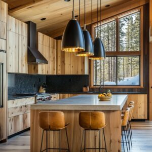
Tone-on-tone massing hides scale
Continuous slabs of limestone, travertine, or concrete-look porcelain often coat floor, island, and table in a single muted tint. Because every plane carries the same grain and reflectance, junctions fade; the eye slides from horizontal to vertical without finding a break.
In a room governed by this quiet camouflage, a table with ten-centimetre-thick edges feels no heavier than a thin console.

Heavy cylindrical legs read as calm pillars rather than furniture feet, and the whole ensemble seems to hover inside its own shadow. This approach to contemporary dining room design turns what could be an imposing mass into an almost graphic wash of colour, relying on subtle bevels or micro-chamfers to hint at craftsmanship without interrupting the field.

Curves offset rectilinear framing in micro-doses
Grids, slatted walls, and long stone blocks give many of today’s dining rooms an orderly backbone, yet designers slip in a single counter-gesture: a live-edge slab that ripples at its perimeter, a round barrel chair that hugs the table, or a bench corner softened into an arc. Because the soft line appears only once per dominant view, it reads as a sculptural accent rather than a playful motif.

One gentle bend among many straight edges lodges in memory, guiding the gaze back to the main gathering spot and adding tactile relief to the overall composition—an insight that quietly powers fresh contemporary dining room ideas.

Plants act as columns, not décor
In many contemporary dining rooms, greenery isn’t used for filler—it’s placed with architectural logic. Oversized fiddle-leaf figs, olive trees, and broad-leaved tropicals often stand in zones where structural elements would typically land: at the corner of an island, beside the end of a bench, or right along a dining table’s centerline.
These placements give plants a kind of spatial authority. Their trunks rise through the composition in vertical sync with cove-lit recesses, pendant drops, or ceiling panel seams.
Instead of breaking the space into zones, they reinforce its framework—quietly echoing a column’s function while softening the silhouette. Texture meets rhythm, and foliage becomes structural without ever touching the ceiling.

Shadow, not fixture, defines the lighting story
Much of the glow in today’s modern dining room design ideas comes not from what’s installed—but from what it touches. Linear LEDs recessed in ceiling coves, and barely-there pendants, play a minor role compared to the sculpted shadows they generate.
These shadows fall across fluted walls, brushed plaster, or deep boucle upholstery, turning every grain and fold into part of the lightscape.

The design strategy isn’t about seeing the fixture—it’s about setting up surfaces that know how to hold and scatter light. In this way, roughness isn’t a flaw; it’s a tool.
Each ripple, edge, and looped weave helps turn blank walls into low-light compositions that carry depth from every angle.

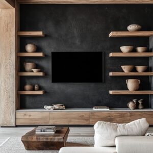
Furniture backs echo background textures
In many modern dining area design setups, the furniture doesn’t simply sit in the room—it’s visually absorbed by it. One of the most refined tactics is the repetition of vertical rhythm between surfaces and seating.
Slatted wood walls, ribbed cabinet doors, and reed-textured panels often match the spacing of chair backs—especially those crafted with thin wooden slats or subtle vertical channels.

When chairs are pushed in, the alignment creates a clean merge, where furniture nearly disappears into the background. This visual fusion reduces clutter without taking anything away, making the space feel open and intentional even when fully furnished.
It’s a quiet alignment, only noticeable upon close observation, but it completely changes the way mass and repetition are read.

Monolithic tables gain softness through bevel hierarchy
In contemporary dining table design, the thickness of the tabletop often signals stability, but it’s the edges that define tactility. Designers apply a range of softening techniques depending on the surface it faces.
A barely-there chamfer might run along a table edge that sits beside a satin-finished wall, where the refinement invites touch.

In contrast, a full bullnose is often paired with coarser surroundings—rough limestone, honed terrazzo, or fluted plaster—giving the heavy material a softened silhouette. These edge treatments don’t just reduce sharpness—they direct how the table meets the space around it, guiding both light reflection and physical interaction.
This layering of shape, though subtle, plays a major role in how softness is read across solid mass.

Vertical grain controls eye speed
Wall panels with narrow vertical grain do more than provide texture—they influence how quickly the eye moves across a space. In modern dining design, evenly spaced vertical lines act like a form of visual damping.
They reduce flicker, slow down perception, and bring attention to details that might otherwise be lost in louder surroundings. Because the grain is continuous and quiet, subtle elements—like a soft-glow light source, brushed brass table feet, or a planter filled with moss—are allowed to stand out.
The rhythm is so controlled that even background textures feel composed, giving the entire room a sense of balance without relying on symmetry.

Asymmetric seating plans disguise circulation paths
Some of the most effective modern living dining room ideas rely on the illusion of informality to manage space. Asymmetry—whether through built-in benches on one side, curved chair layouts, or placing host chairs only at one end—guides movement in ways that feel unforced.
Without the need for rugs or inlays, this spatial arrangement builds in clearance zones around corners and between furniture legs. The result is a room that feels relaxed, but actually performs with high precision, ensuring that people can move around the table naturally without disrupting the layout.
What looks casual is often the outcome of very precise planning.

Reflections replace artwork
In many examples of contemporary dining room interior design, mirrors and reflective surfaces serve a more layered purpose than mere ornament. A mirror framed in brushed brass or a backsplash finished in satin metal doesn’t just bounce light—it captures and repeats elements already present.
Pendant lights, leafy greens, textured walls—all get visually duplicated and slightly distorted depending on where the viewer stands. This duplication adds movement to the space without changing the palette, allowing the room to stay grounded in its core materials.
Instead of adding more pieces to the walls, the space multiplies itself. The result is a visual echo—never loud, always in tune with its surroundings.

Ceiling treatments serve as invisible carpet
Above the table, material shifts often work in silence. A section of bamboo slats, a dropped timber tray, or a diagonally laid ceiling plank becomes the aerial counterpart to a rug—except it doesn’t interrupt sightlines or clutter the floor.
This overhead framing draws focus to the dining zone without needing a single object to mark the spot. It helps the space feel grounded while leaving the horizontal plane open and uninterrupted, especially useful in open layouts where the dining area floats between kitchen and living zones.
These ceiling elements hold the scene together, quietly doing what bold patterns or area rugs might—but in a language of grain, tone, and line.

Tiny brass accents punctuate monochrome stories
Dark palettes often run the risk of becoming flat—but in many modern dining ideas, the answer isn’t color, it’s temperature. A narrow brass pendant, a barely-there cabinet pull, or a slim table foot catches just enough light to interrupt the field.
These accents aren’t about shine—they’re about rhythm. The warmth of brass cuts through deep grays and charcoals like punctuation, giving the eye somewhere to pause without pulling focus.
The restraint matters: these elements are thin, aligned, and positioned with surgical precision, letting metal act more like a whispered highlight than an ornament.

Soft objects sit on hard, hard objects on soft
One of the most tactile pairings in dining spaces today plays with expectation. Rounded boucle chairs on cool stone floors create a cushion-to-ground contrast that registers even before someone sits.
On the flip side, minimalist wood stools placed on smooth limestone or terrazzo feel assertive and deliberate.

This type of inversion flips visual and physical roles, so materials that might seem secondary take on weight through contrast. The body reads these shifts instinctively—long before the eye sorts out the details—making each seating choice feel like a response to its base rather than a separate element.

Hidden repetition creates subconscious calm
Circles show up everywhere in today’s refined dining spaces, but rarely as focal points. Instead, they repeat quietly—cylindrical table bases, barrel-backed chairs, round planters, curved pendant forms—each echoing the last without drawing attention.
The rhythm isn’t forced; it’s embedded. This kind of silent geometry forms a backdrop the eye doesn’t name, but the mind registers.
It brings alignment without symmetry, softening the gridlines of the room while maintaining order. The calm people describe in these interiors often starts with this unnoticed consistency, where shape connects space, seating, and lighting under the surface.

Contrast is handled as temperature, not hue
Strong contrast doesn’t need a jolt of color. Instead, these rooms build drama through temperature shifts inside narrow tonal ranges.
A matte black wall isn’t paired with bright white—it’s layered with deep graphite or slate, keeping the cool spectrum intact. Warm beige tones sit beside brass, honey-toned wood, or sandstone, all sharing a gentle glow.
This type of control keeps the palette tight but rich. Depth comes from value, not saturation, and transitions feel cohesive because they follow the same thermal code.
It’s contrast that draws you in without ever spiking tension.

Conclusion
What defines the quiet strength of contemporary luxury dining rooms isn’t decoration—it’s alignment, control, and the careful pacing of form and texture. Tables soften through edge shifts that change how hands meet volume.
Grain patterns and vertical lines slow the eye enough to notice what’s usually passed over. Ceilings become framing tools overhead, while plants step in as spatial anchors, not afterthoughts.
Even the smallest touches—brass pins, boucle seats, matte shadows—are placed to work with light, not against it.

Every element plays its part without noise, building atmosphere through geometry, reflection, and contrast in tone, not color. The result is a visual field where silence is structured and every surface earns its calm.