Black and white hallway design isn’t built around novelty—it’s built around control, contrast, and subtle movement. With such a reduced palette, the usual cues like color layering or decorative excess give way to structure, spacing, and surface rhythm.
These spaces don’t lean on heavy pattern or trend-driven styling to hold attention. Instead, they rely on carefully placed shapes, finishes, and alignments that let quiet details do the visual work.
Across modern hallway interiors, certain patterns begin to emerge: flat black outlines defining edges, matte and gloss finishes alternating like a quiet code, and soft textures catching light just enough to shift a plain wall into something that feels built, not blank. Furniture is low, measured, and often integrated into the rhythm of the wall or floor.
Mirrors, lighting, and even empty areas are used deliberately to shape how the space feels as much as how it looks.

This article breaks down how such spaces achieve visual strength without visual overload—how balance, contrast, and thoughtful reduction create a hallway that doesn’t need color to hold presence. In many ways, the decisions made in these spaces reveal more than what’s included; they show what was left out, and why.

Black as Visual Framework, Not Filling
In black white hallway ideas, the dark tone often doesn’t aim to dominate but rather act as a precise outline—a method to guide the eye without overwhelming the space. Door casings in thin matte black, narrow-framed mirrors, or slender ceiling recesses with contrast trims function like graphite sketch marks, giving shape to an otherwise white canvas.
This type of layout builds visual tension without loading the scene with solid masses.

White walls and ceilings become like lit panels, softly glowing within those black outlines, creating a setting that feels controlled, open, and exact. The result leans more toward presence than pressure: instead of making black the main color, it becomes the part that defines edges, proportions, and focus areas.
Many black and white hall ideas depend on this idea of outlining—not shading—so the overall look stays light even when the palette is narrowed to extremes.

Shadow Treated as a Layer of Tone
Instead of adding visual weight through extra materials or heavy textures, many modern entries use shadow as a kind of silent contrast. Recessed alcoves, narrow ledges, slatted overhangs, and minimal lighting setups are arranged so that light fall-off creates tonal variation on its own.
These soft transitions across white or pale plaster walls act almost like airbrushed strokes, introducing dimensional depth without visual clutter.

Track lights installed close to the ceiling line may skim across surface edges, while even a bench or ledge can cast a long tapering shadow that mimics the look of a fine gray wash. In such spaces, the design doesn’t rely on pattern or color shift to keep the eye moving—instead, it uses the way light drops off gradually to build rhythm and subtle drama.
This approach allows black and white compositions to feel far less binary; there’s always a range of middle ground shaped purely by the way light touches surface.

Surface Tone as Atmosphere
In black & white hallway ideas, texture often replaces what color can’t express. A hand-dragged plaster wall with irregular grain, a row of whitewashed bricks dulled by age, or a brushed limestone surface catching soft sidelight—all of these introduce tone without pigment.
The interest here is not in contrast by color, but contrast in how the surface responds to light.

From up close, these finishes show faint shifts and irregularities, but take a few steps back, and they blur into a muted haze that loosens the visual edges of the space. Even sharp black lines—from hooks, frames, or trim—feel less aggressive when set against these living textures.
The result is a space that holds form without needing saturation, and that feels stable without turning static. Texture, in these examples, is less about being tactile and more about setting a pulse beneath the stillness.

Soft Curves Amid the Lines
In layouts where right angles rule, curved elements bring quiet relief. Arched doorways, large round mirrors, and asymmetric wall pieces don’t fight the clean lines—they soften them.
Their use isn’t about being decorative, but about shifting the visual tempo just enough to keep the composition from locking into a rigid grid. These rounded forms are rarely reflective or glossy; their matte surfaces absorb light evenly, allowing them to feel settled rather than showy.

What they do best is tilt the line of sight off-center—inviting the eye to move in a slower, looser rhythm through the space. In narrow entries or compressed corridors, a curve has more impact than a color shift, because it changes the way geometry behaves in motion.
This contrast between shape types is especially vital in black and white schemes, where even a small radius carries extra weight against the surrounding order.

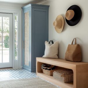
Furniture as Visual Pause Marks
In many black and white hallway designs, low furniture pieces function more like rhythm markers than focal objects. Benches, slim consoles, and floating sideboards aren’t added as standalone features—they’re placed with alignment in mind.
Their edges often line up precisely with the bottom edge of artwork, the height of wall hooks, or the top of a seat cushion across the hall.

That visual alignment creates a single, uninterrupted horizontal line, allowing the space to feel calm and ordered rather than scattered. These pieces also help manage the pacing of the hallway.
A floating bench or a compact console at mid-wall height can act like a visual comma—slowing down the flow just enough to reset the gaze before the next section. Even the way cushions or ceramics are arranged follows this cue, adding quiet emphasis without shifting the overall weight of the corridor.
In tighter layouts, these low elements become even more important—they ground the space without shrinking it.

Light Echoes Instead of Decoration
Rather than layering decor, some hallways build richness through how they handle reflected light. High-shine surfaces—like polished concrete, glossed terrazzo, or even large matte glass panes—don’t serve as finishes alone; they work as mirrored amplifiers for any ceiling pattern, shadow movement, or structural line above.
This subtle repeat effect keeps the composition visually active, especially in hallways that are narrow or lack daylight.

A black ceiling beam echoed on a reflective floor creates a faint stripe; a white pendant reflected onto terrazzo adds a highlight without needing extra materials. This use of reflection replaces the need for more objects.
The rhythm isn’t built with shapes but with softened echoes of what’s already there. In well-balanced black and white spaces, these reflections feel deliberate, not accidental.
The floor becomes part of the wall, and the ceiling becomes part of the floor—blending surfaces into a continuous, visual circuit that reads larger and quieter at the same time.

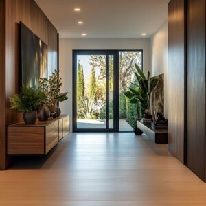
Natural Materials as Temperature Control
In black and white hallway inspo, the use of light wood elements isn’t accidental—it’s calibration. Pieces in oak, rattan, or walnut are introduced in slim volumes, often tucked into sideboards, cubby fronts, open shelving, or low-profile benches.
Their role isn’t to decorate but to buffer the visual temperature of the space. Against bright plaster or flat black doors, these warm tones step in as neutral bridges—never loud, never dominant.

The key is how tightly their tones are curated. Each wood surface lands in a very narrow band of saturation—light enough to contrast black without merging with white.
They register as warmth, not shift. By keeping these materials matte or low-sheen, the textures come through more than the color, giving the room a subtle lift without disrupting the palette’s graphic quality.
It’s this careful restraint—wood that whispers, not calls—that keeps the scheme grounded.

Ceiling and Floor in Quiet Dialogue
Hallways built on contrast often draw their strongest rhythm not from walls, but from how the top and bottom mirror each other. A ceiling beam in black or stained timber may align directly over a tiled herringbone layout, creating a visual link that travels in two directions at once.
The eye follows the grain or pattern in the floor, then catches its echo above—a composition that quietly extends the space without the need for extra decoration. This overhead-underfoot pairing builds structure through repetition, not ornament.

In longer corridors, this strategy introduces visual flow, even when the wall treatments stay muted. Slatted ceilings, recessed strips, or thin linear lights become the upper half of a mirrored rhythm, while chevron stone or lightly grained planks handle the base.
Because these elements are often aligned along the same axis, they guide the viewer forward in a way that feels built-in rather than applied. It’s movement made with shape—not color—and it turns narrow interiors into longer-feeling, better-paced compositions.

Intentional Emptiness as Structure
In many hallway ideas in black and white, the unfilled space carries as much weight as the filled. A plain stretch of wall, the clear area beneath a bench, or a long cabinet with untouched front panels—these are not oversights.
They’re part of the composition. These voids function like pauses in a line of music, framing each object by surrounding it with quiet.
A single vase, a folded throw, or a photo frame gains more presence because nothing competes with it nearby. Storage, when it appears, is exact.
Cubbies and niches are matched to the size of what they hold—no overflow, no distraction. The lack of clutter doesn’t feel like styling; it reads as spatial editing.
In black and white interiors where every object has visual weight, this controlled emptiness keeps the whole hallway readable and balanced.
Repetition as the Guiding Rhythm
What creates calm in black and white layouts isn’t symmetry—it’s measured repetition. Shelves in grid formation, framed art spaced at consistent intervals, or a row of narrow panels set along the wall create a sense of logic that’s instantly felt.
Yet perfection is often bypassed by choice. A console may sit slightly off-center.

One pendant may drop lower than the others. These quiet shifts prevent the rhythm from turning stiff.
The room breathes because the pattern breaks—just slightly. The result is a hallway that feels composed but alive, ordered but flexible.
This approach suits monochrome spaces particularly well, where even the smallest misalignment adds texture to the arrangement without needing color or clutter to do so.

Small Offsets That Loosen the Grid
In layouts where everything feels measured, slight misalignment plays a subtle role in relaxing the structure. A mirror that leans a little off-center, a pendant that hangs just a bit lower than its twin, or a slatted wall panel that extends one strip further than expected—all of these details shift the mood.
They act as tension points, not mistakes. These offsets are small enough not to disrupt, but they create just enough visual imbalance to keep the space from stiffening.

It’s a way of breaking the grid without removing it. In smaller hallways where structure tends to dominate, these calculated slips make the space feel less formal.
There’s an ease built into the composition, reminding the viewer that design doesn’t have to mean perfect alignment to feel right. For small black and white hallway ideas, this approach keeps the setting from reading too flat or over-controlled.

Light Absorption and Surface Play
In monochrome interiors, contrast doesn’t rely only on color—it often depends on finish. A matte black cabinet absorbs light and falls into the background, while a satin white wall bounces brightness forward, making the edge read sharper.
Then there are the spots of gloss: a high-shine ceramic bowl, a polished metal lamp base, or a glazed tile edge. These punctuate the hallway like small sparks, guiding the eye without clutter.
The trick is in how these finishes are arranged—layered in such a way that depth is created without needing more volume. It’s like stacking flatness in different intensities.
In black and white spaces, that balance becomes more noticeable because there’s no color to soften it. The hallway starts to feel dimensional without being filled.
Every change in sheen creates a new surface level, giving the space structure through how light hits—not what’s added.

Conclusion: A Corridor Built by Precision, Not Excess
In black and white spaces where options are limited by palette, every detail becomes more visible—and more deliberate. A hallway shaped by soft shadows, repeated forms, careful spacing, and restrained surface choices speaks with control rather than volume.
It’s not the number of elements that defines the space, but how each one is measured into the whole. Line thickness, slight offsets, contrast in finishes, and texture variation all play quiet roles in setting the tone.
The result isn’t a space filled with features, but one balanced by absence, rhythm, and subtle contrast.

These corridors show how less color can mean more clarity. By minimizing distraction, they highlight movement, proportion, and the interaction between materials.
There’s no need to add more—only to choose better. Whether matte black absorbs the edges or gloss picks out the light, every surface earns its spot through how it feels and what it does to the surrounding quiet.
In that way, a hallway becomes more than a path—it’s a composition made legible through control.