A two toned kitchen island can shift the entire rhythm of a room—quietly or boldly—depending on how it’s done. In recent years, this design move has moved well beyond the basic contrast of light cabinets and a dark base.
Now, it’s all about material combinations, unexpected texture pairings, and smart detailing that speaks without shouting. From soft matte finishes to structural asymmetry, from hidden utility to expressive wood grains—these islands are carrying more than visual weight.
This article takes a close look at two-tone 2 tone kitchen island ideas: recessed shelving painted in a secondary tone, vein-matched waterfall slabs, or integrated appliances that vanish into the layout. Some kitchens play with tone-on-tone pairings that shift subtly in daylight, while others lean into striking opposites—like brick-toned butcher blocks paired with olive green cabinetry.

There’s also a quiet trend of borrowing cues from regional inspiration—like coastal materials or farmhouse accents with a fresh finish. These aren’t just surface choices; they’re informed by proportion, rhythm, and an understanding of how different elements interact across the whole room.
Whether it’s a long open-concept layout or a compact plan with tight flow, these islands prove that contrast doesn’t have to be loud to make a difference.

What follows is a breakdown of thoughtful combinations, small design shifts, and texture-based ideas that turn a kitchen island into something much more dynamic—without shouting for attention. Each one offers insight into how a two toned kitchen island can help bring out the best in the layout, materials, and flow of a space.

Balancing Bold Monochrome with Fine Detail
One approach demonstrates the power of black-and-white or near-black and white pairings. Rather than merely painting an island in a dark hue, these designs incorporate panel grooves, textured hardware, or industrial seating to make the island’s darker base feel more layered.
In some instances, matte finishes and minimal silhouettes stop black from feeling too severe; subtle vertical grooves or beadboard can also lighten the visual weight, lending it rhythm and softness.

Details Worth Noticing
- Split-Level or Slight Step: Some islands use a split-level profile or a slightly raised bar area, giving extra dimensional interest. This prevents a monochrome island from feeling flat.
- Repetition of Paneling: Designers often repeat the paneling motif on upper cabinets or near the hood to tie top and bottom halves of the kitchen together.
- Lighting Continuity: Large pendant lights that echo the base color keep a continuous thread. For instance, dome pendants in black or orb pendants in brass can reinforce the island’s core tone if they share a similar finish.

Incorporating Unexpected Hues Within the Same Island
When an island introduces more than one color in its own structure—for instance, gray on most panels but one stack of black drawers—it highlights the ability to create zones within a single piece of furniture. This approach can be especially handy for visually distinguishing certain functions or for adding a small, refined accent without repainting all cabinetry.

What Makes It Work
- Setbacks and Inset Sections: Slightly recessed sections in a different color give the appearance of a separate module. This trick also breaks up large stretches of cabinetry.
- Hardware Consistency: Even when the island has two different colors, consistent hardware finish—such as brass pulls on both the gray and black fronts—maintains unity.

Color as a Soft Statement (Clay, Terra-Cotta, Sage, and Blues)
Moving beyond simple black or white, the descriptive examples demonstrate how muted versions of clay, sage, and slate introduce warmth or coolness. These choices typically complement the surrounding environment—wood floors, rattan light fixtures, stone backsplashes—creating harmony between the island and other textural elements.

Smart Design Touches
- Tone-on-Tone with Hardwood: Clay or sage bases pair well with the undertones of oak or walnut flooring. Designers pick up the slightest hints of brown or green in the wood grain to connect with the island color.
- Complementary Metals: Warm metallics like brushed gold or antique brass soften a cool slate or gray-blue base, while matte black hardware sharpens or grounds a warm clay shade.

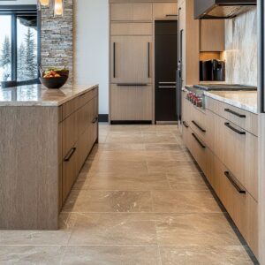
Using Materials Instead of Paint for Contrast
Some designs rely on opposing materials—wood veneer vs. stone slab, concrete-look surfaces vs.
knotty oak, brass inlays vs. polished stone—to create contrast.
Rather than relying solely on paint, the clash or harmony of materials can speak more boldly.

Subtle Choices with Big Impact
- Integrated Butcher Block: If stone counters are everywhere else, a wood top on the island can serve as a standout accent that feels tactile and inviting.
- Reclaimed or Weathered Wood: Rugged or aged planks give an industrial or country vibe, especially when butted against sleek quartz or porcelain. Gaps, cracks, and color variations in the reclaimed wood become focal points.
- Terrazzo Wraps: In an example with terrazzo fully encasing the island, color chips within the terrazzo link to the surrounding cabinetry or floor. This unifies the look in a subtle but precise way.

Creative Edge Profiles and Structural Layers
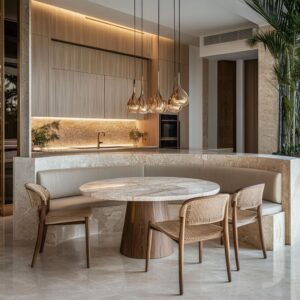
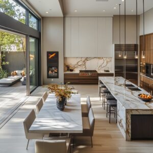
Rather than typical square edges, many designers employ thicker countertops, waterfall edges, or wide base moldings. These details create the impression of a piece of furniture, not just a box with a top.
Sometimes the countertop extends or wraps in surprising ways, such as a wood slab rising above the main stone surface.

Design Clues
- Waterfall with Visible Vein Match: Ensuring the stone pattern flows seamlessly down the island’s side demonstrates precision and adds to the sense of cohesion.
- Furniture-Like Base Moldings: Deeper baseboards, corbels at the corners, or pilaster-like corners can bring traditional character even if the color is modern.
- Seating Extensions and Live Edges: Attaching a contrasting live-edge wood slab to a quartz island top can redefine the seating area and make it feel like a purposeful addition instead of a simple overhang.

Mixing Metal Finishes Thoughtfully
When an island color is strong, designers often select hardware and faucets that either blend in or stand out. Metals can reinforce the color scheme or act as an intentional contrast.
For example, a dark island might pair with brass pulls, while the perimeter uses nickel or chrome, or vice versa.

Visual Logic
- Echoing Metal in Lighting: The pendants above often echo the hardware finish on the island, ensuring the top half of the room matches the base in small but noticeable ways.
- Adding Industrial Character: Exposed rivets, patinated steel hoods, or raw brass faucets add textural interest that balances more refined elements like polished countertops.

Structural Zoning Through Ceiling and Island Alignment
Beams or coffered ceilings can align precisely with the island below, or pendant lights are spaced to match the island’s panel divisions. This kind of alignment subtly highlights the island as the heart of the kitchen.

Nuances Behind the Look
- Spacing Pendants in Grid Alignment: When lights hang at consistent intervals with respect to the island’s paneling or even the tile layout on the floor, it creates a sense of order that can be sensed even if it’s not consciously noticed.
- Pairing Ceiling Color With Island Top: Some designs use the same wood tone in beams and butcher block counters or pick up the island accent color in a painted coffer. These hidden correspondences unify top and bottom planes of the room.

Embedding Function Within the Island
Two-tone islands often serve multifunctional roles: integrated appliances, built-in microwave drawers, trash pullouts, or extra shelving for display. By giving the island its own color or texture, designers differentiate this zone from perimeter cabinetry, emphasizing it as the operational center.
Quiet Design Decisions
- Touch-Latch and Hidden Pulls: Concealing hardware on certain drawers means the island’s color takes the spotlight, uninterrupted by metal accents.
- Tucked Outlets: Painting electrical covers to match the island or hiding them inside side panels merges function with form.

Exploring Scale Variations
Larger islands benefit from bolder color statements or more dramatic material choices. Smaller islands, on the other hand, might rely on a sleek, tight color palette or simplified shapes to avoid feeling bulky.

Notable Subtleties
- Thickness of Countertop: In grand spaces, a hefty stone slab works beautifully with a dramatic color base. In more compact kitchens, a knife-edge or thin counter can keep the volume from overwhelming the area.
- Proportional Panel Framing: Where the island is wide, broad frames around recessed panels suit the dimensions better than narrow stiles that might look too slight.

Color as a Tool for Cohesion
Even when the island departs significantly from the other cabinets, the overall palette often references subtle undertones found in flooring, backsplash, or even seating upholstery. This keeps the composition from feeling random.

Craft Behind the Style
- Undertone Matching: Clay-based paint might match the peach undertone in the stone flooring. Sage might match a subtle green note in the tile grout. These micro-alignments create a cohesive outcome.
- Repeating a Key Color in Décor: Eucalyptus stems on the island or a runner rug that references the island hue can subtly bind the color throughout the room.

Innovations in Texture (Leathered Stone, Microcement, Limed Wood)
It’s not just about the color—texture can add dimension. Leathered or honed stone surfaces bring a softer light reflection.
Brushed oak or reclaimed boards can bring a subtle 3D grain. Microcement or plaster finishes lend a raw look.
Contrasts in texture can be as compelling as contrasts in color.

Thoughtful Touches
- Touch and Tactility: The choice of a leathered granite or a brushed veneer often hinges on how it feels to run a hand across the surface—an important factor often overlooked.
- Visual Depth: Matte finishes diffuse light, while polished stone bounces it. Putting these side by side—e.g., matte wood base with polished stone top—creates an interplay that adds richness without additional ornament.

Evolving Trends: Mixed Finishes and Softly Saturated Tones
Еhe underlying trend is a shift away from purely white kitchens into carefully selected colors and materials that blend practicality with individuality. While bold or contrasting islands remain popular, designers increasingly emphasize warm, natural surfaces or slight variations of color that respond to the existing architectural context.
Two-tone solutions aren’t confined to paint; they can be a dialogue between wood and stone, metal inlays, or even layers of integrated shelving in complementary finishes.

Practical Takeaways
- Layered Contrast: Use more than one method of contrast—color plus texture, or paint plus metal details—rather than relying on a single visual difference.
- Unobtrusive Function: Blend outlets, storage, and appliances seamlessly within the design so that the island reads as a refined element, not just a workspace.
- Continuity with Ceilings and Floors: Look for opportunities to repeat a wood tone or color from overhead beams or floor planks, bridging vertical and horizontal planes.
- Subtle Color Variation: Muted variations of green, blue, clay, and terra-cotta can have significant impact when combined with thoughtful textures and accent metals.
- Texture Counts: A change in finish—from polished to honed, or from painted to natural wood—can make a two-tone scheme feel more nuanced and custom.
In Summary
Two-tone islands stand out not simply because they contrast perimeter cabinetry, but because they can unify the entire kitchen’s design narrative. Through thoughtful choices in color, texture, hardware, and proportions, these islands can provide both a visual anchor and a highly functional workspace.
By handling details such as integrated paneling, carefully chosen metal accents, and material continuity across floor and ceiling, designers create kitchens that feel cohesive yet distinctly layered. Even in more compact layouts, an island can be the centerpiece that balances utility and personality, proving that two-tone is not just an aesthetic quirk but a strategic approach with limitless adaptations.