There’s a quiet confidence in the Craftsman living room—a space built on structure, balance, and texture. While the original ideals behind the style came from early 20th-century American homes, the way it appears today reflects an ongoing refinement.
It’s less about strict replication and more about visual thoughtfulness—how lines meet, how materials settle into each other, and how each piece contributes without competing. The beauty of this approach lies in its subtlety.
Trim isn’t only trim—it sets rhythm. A light fixture does more than illuminate—it traces grain and casts warmth across stone or wood.
Sofas and chairs don’t aim to impress with bulk or flash, but instead anchor the room with proportion and feel.
Throughout many current interpretations, the craftsmanship still matters—but now it shares space with restraint. Neutral palettes step forward, not for simplicity’s sake, but to let tone and shadow do their work.
Furniture shifts between grounded and lifted. Small asymmetries keep the layout human.
Nothing needs to be perfect to feel right. This visual language has held up well because it’s adaptable.
From compact bungalows to more expansive homes, from traditional wood-paneled interiors to lighter, brighter spaces in contemporary settings, the Craftsman vocabulary can stretch. What ties it all together is the focus on shape, weight, material, and calm rhythm—elements that never fall out of relevance.

Tonal Restraint as a Design Strategy
Color in craftsman living room ideas tends to whisper instead of shout. Rather than leaping across a full spectrum, many interiors focus on subtle shifts within a narrow tonal band—think olive leaning gently toward sage, or cream transitioning into a putty wash.
This closeness in hue allows natural textures and finishes—wood grain, plaster movement, or soft tile grout lines—to step forward visually. These background elements begin to carry a quiet rhythm, almost like visual brushstrokes repeating through the space.

What makes this limited palette work so effectively is how tiny contrasts gain more presence. A velvet cushion in rust or a matte black frame against soft-beige walls doesn’t scream; it grounds.
These small accents act like visual punctuation marks, drawing the eye without disturbing the calmness. In spaces that use a restrained palette well, it’s not about what’s added—it’s about what’s left uninterrupted, giving room for textures to communicate on their own.
Even within a unified scheme, warmth and depth are layered through variation in sheen and material, not dramatic color swings. This gives each room a fluid sense of balance, where no single element takes over, and where the eye naturally lingers on the softness of a wall tone or the knot of wood in a built-in bench.
It’s a tonal conversation that feels unforced and complete.

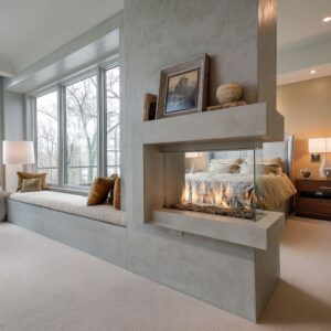
Fireplaces Treated as Living Sculpture
In many craftsman family room design approaches, the fireplace doesn’t recede into the background—it becomes a visual centerpiece shaped with intention. These hearths are not only focal points but sculptural forms that carry the weight and character of the entire room.
Layered massing plays a significant role here. Whether it’s through a stepped surround or a tapered opening, the structure creates a choreography of shadow.
As natural light shifts across the day, these profiles react—casting lines, softening edges, and giving the fireplace surface a sense of slow movement.

Material selection brings out even more depth. Handmade tiles laid with whisper-thin grout lines, or stone with chipped edges and uneven texture, celebrate surface irregularity rather than conceal it.
There’s beauty in seeing the texture of slate or limestone unfold across a large surface, especially when it shows signs of the material’s true nature. Even the finest line or glaze can tell a visual story.
Then comes the quiet tension created through off-center compositions—a firebox placed just slightly to one side, or a single recessed display alcove interrupting a symmetrical setup. These deviations challenge the expectation of balance, creating interest without chaos.
It’s a visual nudge that pulls the room away from formality and into something much more engaging.

These fireplaces feel anchored and expressive, and their role is always more than decorative. They set the rhythm for the materials around them and create a visual dialogue with built-ins, beams, and furnishings without needing to dominate.
Their presence holds the room in place, much like a keystone in a structure, both grounding and defining the atmosphere.

Geometry in Conversation
A defining feature of the modern craftsman living room is its ability to create a visual rhythm through the play of structured geometry. There’s a quiet balance between firmness and softness, order and looseness—nothing shouts, but everything aligns or gently contradicts.
Horizontal discipline is where the room first establishes control. The top edges of wainscoting align with window stools, and those in turn speak to the height of built-ins and the lower border of fireplaces.
Beams overhead often echo the direction of floorboards below, reinforcing a quiet grid-like structure that unifies the space from top to bottom. Every horizontal line feels like it belongs to a larger visual conversation.
This internal logic gives the room structure—both literal and visual.

Then, there’s the gentle disruption of counter-curves. These aren’t grand gestures but carefully placed elements—an arched doorway breaking a run of sharp corners, a circular coffee table interrupting the boxiness of sofa arms, or a boucle-covered lounge chair whose curved back creates a moment of softness within the order.
These rounded elements often sit in small footprints but shift the room’s posture in noticeable ways, giving balance without disturbing the overall framework. This interplay—lines running long and low, softened by subtle arcs—keeps the room from feeling rigid or overly sculpted.
It reflects how a craftsman style living room can embrace structure without becoming stiff, and softness without leaning into excess.

Furniture: Weight vs. Air
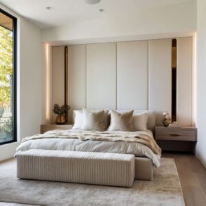
Furniture in such rooms walks a line between grounded form and visual lift. The influence of classic Mission silhouettes still echoes—strong arms, visible wood frames, and a sense of purpose—but today’s versions carry lighter expressions, often through open elements or contrasting textures.
Framing is everything. Even substantial seating—wide sectionals with deep cushions—doesn’t pull the room downward when paired with accent chairs that introduce space between their parts.
Think of leather straps instead of slatted backs, woven cords replacing heavy paneling, or slimmed-down wooden arms that bring negative space into the frame. These open-structured forms add air to the composition, allowing bulkier items nearby to settle in without dominating.

Texture plays an equal role in softening the mass. Fabrics like nubby linen, looped bouclé, or shearling don’t just offer comfort—they scatter light, catching highlights along their surface and breaking up the visual density.
Even the heaviest piece, when cloaked in a textured neutral, feels more inviting than imposing. This balance between weight and breath is what gives the room energy.
There’s a steady rhythm in the arrangement: solid, then light; plush, then woven. Together, they allow the furniture to shape the space without overwhelming it, keeping the layout grounded while still feeling open.

Texture Hierarchies
In many thoughtful craftsman living room design ideas, texture is not applied as a surface afterthought—it’s structured in a sequence that unfolds from bold to subtle, guiding the eye across the room in layers. At the macro level, the space often opens with commanding materials.
Think rough-hewn stone, thick jute rugs, or live-edge wooden furniture, all of which offer a grounded, raw character. These elements set the base tone, adding immediate weight and physicality to the design.
Moving in, the meso layer begins to refine the rhythm. Ribbed wood paneling, fluted table bases, or closely stacked slate courses introduce mid-scale repetition.
These textures play a more architectural role, often reinforcing lines established by millwork or beams. They help bridge the bolder gestures with more finely tuned details.

At the most subtle end—the micro scale—tiny visual interruptions begin to reward closer inspection. Marks left in hand-applied plaster, butterfly joints holding wooden cracks in place, or the soft pitting on matte ceramic vessels give the room a finishing texture that’s almost intimate.
These are the details that invite quiet observation without fanfare. In a well-composed modern craftsman style living room, this stacking of textures isn’t flashy, but it keeps the eye moving—creating depth without excess, and character without clutter.

Light as a Compositional Tool
Light in a modern Craftsman room doesn’t simply land on surfaces—it works with them. Whether drawn in through traditional divided panes or cast from carefully placed fixtures, light becomes part of the room’s composition.
Natural light is structured through architecture. Deep window casings and grid-like mullions filter brightness in geometric patterns.
These shapes then echo across the room’s materials, from the wood beams overhead to the shadowed grooves of paneling and shelving.

Artificial lighting steps in not as decoration, but as a way to extend and reinforce those visual rhythms. You’ll find bracketed lanterns mounted to align with the pilasters of built-ins or beams, subtly reinforcing the room’s layout.
In some rooms, cove lighting tucked just above ceiling beams lifts the ceiling plane ever so slightly, letting light trace the edges and soften the overall volume.

Occasionally, a more sculptural form appears—a branching chandelier or a sputnik fixture, often hung low to break the grid and introduce softer lines. These overhead pieces don’t compete; they cast warmth that activates nearby textures, making plaster glow and natural fibers come alive.
Lighting is less about spotlighting objects and more about highlighting materials—grain, weave, patina. The atmosphere is built not with intensity, but with balance, where even the shadows carry weight.

Plant Life as Soft Counterbalance
In many thoughtfully crafted craftsman living room design examples, greenery plays a subtle yet impactful role. It’s rarely layered in abundance; instead, it’s placed with purpose—used as a visual counterpoint to structure and grid.
A single olive tree standing tall beside a structured shelving unit or a lone branch resting in a sculptural vase introduces contrast without breaking the room’s balance. These organic forms soften the firmness of architectural lines, offering relief from strong horizontal and vertical boundaries.
The foliage often mimics the upright rhythm of mullions, pilasters, or built-in frame edges, giving the room a mirrored tension between natural growth and constructed order.

Even in spaces where blackened steel or dark-stained wood defines the palette, a leafy green addition—whether a full plant or a lean stem—pulls the space back into calm equilibrium. The leaves bring quiet movement and asymmetry, acting like visual breath between more rigid compositions.
That softness is what makes the room feel alive, without overstating the presence of décor.

Built-Ins and Negative Space
In many rooms where craftsman style living room decor leans on classic millwork, built-in shelving becomes more than storage—it becomes part of the visual rhythm. What stands out isn’t always what’s displayed, but often what’s left alone.
Negative space in these built-ins is treated as a design element of its own. A single hand-thrown vessel, placed off-center, can carry more presence than a full shelf of books.
An empty cubby, especially framed in rich wood tones, lets the eye rest—a pause in an otherwise detailed wall.

This use of vacancy keeps the built-ins from feeling overbearing. Instead of pushing every square inch into service, the composition balances full and empty, weighted and light.
The spaces between objects create pacing, like visual rests in a musical score. Each shelf feels considered without appearing staged, and that natural looseness gives the room depth.
What makes these arrangements effective is their ability to work in quiet rhythm with the room’s lines and textures, letting shadow and woodgrain share the spotlight with whatever object is placed inside. There’s no need for quantity when proportion and placement are carrying the message.

Ceiling Treatments as Visual Weight Control
In many craftsman style living room ideas, the ceiling doesn’t fade into the background—it actively shapes how the room feels. While walls and floors ground the space, the ceiling helps define its volume, guiding how the weight of heavier elements—like stone fireplaces or solid mantels—sits within the room.
Coffered grids, with their boxed layout and structured intersections, break up large ceiling spans and help distribute visual weight evenly. They can make even a small space feel more architecturally confident.
On the other hand, tongue-and-groove planks, especially when installed perpendicular to beams or wall orientation, stretch the perceived width or length of a room, giving subtle direction to the layout without changing a thing on the floor.

The finish of the beams or ceiling treatment changes how grounded the room feels. Deep-stained beams give the top plane a sense of gravity, almost like a frame that holds the composition together.
In contrast, pale-washed or lightly bleached tones reflect light and visually lift the ceiling, allowing heavier pieces below—like stone surrounds or dense upholstery—to sit without dragging the atmosphere downward. This is where ceiling work becomes more than a historical nod.
It becomes an active part of the balance, creating stability across vertical layers and making sure nothing feels too weighted or too airy.

Symmetry Interrupted on Purpose
Order plays a central role in the Craftsman style—but too much of it can make a space feel like a set piece. What keeps a room engaging is often the careful shift away from perfect mirroring.
You’ll find moments where the expected rhythm is slightly broken on purpose. A pair of side tables flanking a sofa—yet they don’t match.
One may carry a carved wooden base, the other a light metal frame. Or a square ottoman, rather than sitting dead center, is nudged to one side, catching light differently and offering balance through offset.
Even lighting can play this game—niche sconces or pendant placements that stray subtly from dead center without disrupting the room’s harmony.

These slight irregularities do something essential: they keep the eye engaged. Perfect symmetry can be comforting, but when everything matches, the room can begin to feel frozen.
A small variation adds energy. It pulls a lived-in quality into the design and allows each element to stand on its own, even within a unified setting.
In many of the most compelling Craftsman rooms, this trick—balance without mirroring—is what gives the space its lasting visual depth.

Contemporary Influences That Respect Heritage
What makes today’s craftsman style living room ideas feel current without losing their roots is how outside influences are absorbed without overpowering the original character. There’s a quiet blend happening—subtle nods to Japanese minimalism, Scandinavian lightness, and Mid-Century sparkle—but always seen through the Craftsman lens of grounded materials and human scale.

Take the use of cylindrical table bases—often inspired by Japanese restraint. Their form speaks in soft structure, offering weight without decoration.
Then there’s the rise of whitewashed woods and desaturated tones, reflecting Northern European clarity. These choices bring in air and reflection, lightening rooms that might otherwise lean heavy.
Even brass—when used softly, like in a muted chandelier—adds a glow rather than shine, offering a quiet contrast to matte ceramics or hand-rubbed wood finishes.
What matters here is how these newer layers blend with rather than replace. They respect the tactile values of the original style: touchable surfaces, clean joins, and an emphasis on natural materials.
This mix shows how Craftsman principles hold up—not as period nostalgia, but as a living design language that still welcomes influence, as long as it speaks honestly.
Ideas and Trends Seen in Fresh Craftsman Living Rooms
- Restricted color ranges, expanded textures. Neutral palettes remain steady, but the depth comes from contrast in finish—matte against polished, smooth next to rough, fine grain beside open weave.
- Fireplaces as sculptural mass. Offset fireboxes, hand-set tile, and thick wood mantels contribute to the sense of permanence. These are often treated more like structural features than decorative ones.
- Structured geometry softened by curves. Rounded chairs, arched doorways, and circular tables appear as quiet counterpoints to all the right angles—relieving tension without disturbing the room’s rhythm.
- Texture layered by scale. Many spaces combine macro elements like rugged stone or coarse fabric, mid-scale repetition through fluting or panel grooves, and subtle surface detail in plaster, stitching, or glaze.
- Lighting that supports material expression. Light sources often emphasize surfaces rather than draw focus—casting soft glows along wood grain or washing over walls with warmth rather than brightness.
- Shelves that breathe. Open sections in built-ins allow negative space to function as visual rest. These gaps play as important a role as any styled object.
- Deliberate asymmetry. Side tables that don’t match, lighting hung slightly off-axis, or a lone ottoman placed just left of center—these slight shifts give balance a relaxed tone.
- Global minimalism through a Craftsman lens. Elements drawn from Scandinavian, Japanese, or Mid-Century ideas appear when filtered through tactile materials and grounded proportions.
These quiet shifts give Craftsman living rooms a new dimension—calmer, more edited, and deeply material-focused without losing the architectural backbone that defines the style.