White dining rooms continue to stand out—not because they demand attention, but because they leave space for nuance. In a setting built around restraint, every surface becomes more expressive: a ripple in fabric, the curve of a table leg, the shift in gloss from matte to polished.
The absence of strong color doesn’t flatten the room; it sharpens its details.
Current design approaches favor texture over print, form over decoration, and material rhythm over contrast. Subtle shadows take on as much importance as the objects that cast them.
Layering becomes the way to build depth, not through tone but through the feel of each finish—linen, boucle, ceramic, brushed wood. Light becomes the main participant, shaped by what it lands on.
Such dining spaces are no longer blank slates. They’re compositions where tone, silhouette, and surface all play specific roles.
And as the trend leans into quiet definition, the white palette continues to evolve—not by changing color, but by changing how space is read.

Chromatic Restraint as a Lighting Strategy
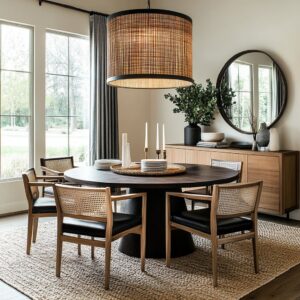
In many white dining room designs, the surface finish of the table becomes far more than a stylistic detail—it quietly controls how daylight behaves. Whether the table reflects every window or mutes the light altogether depends on the surface treatment chosen.
A high-gloss lacquered table doesn’t simply shine—it mirrors the room’s brightest angles. When placed beneath a light source or near a window, its sheen captures and projects light downward, often creating a glowing spotlight on whatever sits at its center, such as a floral arrangement or ceramic bowl.
This effect can feel theatrical without a single spotlight in the room.

On the other end of the spectrum, tables in a chalky matte or honed stone finish scatter light more softly. They absorb brightness rather than bouncing it, which keeps rounded edges, fluted details, or sculptural bases visually clear.
In some white dining room ideas, this difference in reflectivity becomes the only form of contrast in an otherwise restrained composition. By simply shifting the table’s finish from glossy to matte—or vice versa—the atmosphere of the entire room can change.
What might appear as a minor visual choice actually acts as the room’s built-in dimmer switch, managing intensity through surface behavior alone.

Texture “Stacking” Instead of Color Blocking
White dining room compositions rarely depend on strong color shifts to create interest. Instead, depth is developed through texture, arranged vertically in a way that subtly guides the eye.
The topmost layer tends to be soft and translucent: sheer curtains, gauzy linen panels, or thin fabric shades that sway with air movement. These layers let natural light in but blur the outlines, introducing a gentle diffusion near the ceiling or window line.
Beneath this airy veil sits the structured middle zone—think of upholstered chairs in bouclé or slipcovered forms, smooth linen tabletops, or lightly padded benches. These are still soft, but with visible seams, folds, or woven detail that makes them feel more substantial.
They sit at eye and seated height, forming the tactile center of the room.

At the base, where the furniture meets the floor, the texture deepens. Rugs made from ribbed wool, jute blends, or thick cotton braids anchor the setting with a dense weave.
These materials hold the visual weight of the furniture and absorb shadows, grounding the design without needing color. This method of layering textures from ceiling to floor can be seen across many current dining room ideas in white, where visual interest comes not from pattern or pigment but from contrast between smooth, soft, and coarse finishes.
The result is a room that feels calm but never blank—depth is sensed, not shouted.

Curvature as the New Contrast
In a room built entirely on neutrals, it’s not the color that guides the eye—it’s the silhouette. Curves and straight lines begin to do the visual work that color contrast normally carries, and the result is far more layered than it first appears.
Look closely at certain dining table bases: fluted cylinders, ribbed ovals, and pleated cones. These aren’t just structural choices—they repeat the quiet verticals found in other nearby pieces, like rattan chairs, grid-framed gallery walls, or paneled cabinetry.
The rhythm created by these repeated grooves offers the space a kind of quiet heartbeat. Even in all white dining room ideas, this pattern of curve versus line is enough to shape movement through the space.

Elsewhere, curved banquettes wrap into corners like soft punctuation. Arched niches, half-moon windows, and rounded chair backs soften an otherwise squared-off layout.
These forms don’t rely on textile or color to express themselves—they pull the eye gently around the room by shaping light differently. A subtle arc in architecture holds the same power as a bold wall print, but without disrupting the atmosphere.
This careful contrast between geometry and fluidity becomes one of the most effective tools for defining structure in rooms that avoid boldness.

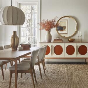
Mixed-Seating “Storytelling”
In many dining rooms, there’s a quiet shift happening at the table—not in color or material, but in how chairs are placed and selected. Matching all six or eight seats is no longer the only option.
Instead, chairs now take on different roles—storytelling pieces in a visual script about form, tone, and purpose. It’s common now to see dining setups where the chairs at each end of the table are different from those on the sides.
But this isn’t done for novelty—it’s used to gently suggest where the conversation centers or where visual emphasis should land. These head chairs might feature an open back, cane weave, or sculptural negative space that catches more light and invites attention without adding visual weight.
They might even sit slightly taller, or carry a different leg structure that gives them quiet prominence.

On the opposite side, a low bench might run parallel to formal upright chairs, giving one side of the space a feeling of ease and flexibility. This contrast can help long dining tables avoid feeling too rigid or symmetrical.
Every variation holds meaning. In spaces built around a subtle dining table design in white, the seating choices add layers of interest—without changing the palette, without adding pattern, and without disrupting the clean lines that hold the room together.

“Whisper Graphics”—Lines Hidden Inside Texture
In spaces where calm is built into every corner, there’s still room for rhythm—but it appears through almost invisible means. Instead of using loud prints or color to energize the space, designers rely on texture that draws with light, not ink.
A tightly looped rug with fine ribbing doesn’t shout for attention, but it reflects the straight lines of nearby chrome legs, adding continuity without echo. Velvet chairs with subtle pinstripes introduce another hidden detail—these tiny channels of texture often mimic fluted table bases or slatted cabinetry, allowing a conversation between materials that doesn’t need a voice.
Even the grain of a hand-woven seat or a chevron-patterned throw can follow the natural motion of a live-edge table, building a soft visual link between layers.

These kinds of barely-visible marks act like breath lines in a quiet room. They give movement to stillness.
In many white dining room design ideas, these low-profile graphics carry more compositional weight than any bold pattern ever could. What ties the space together is not what stands out—but what repeats in silence.

Objects Chosen for Shadow, Not Shape
Not every object on a table is meant to be looked at directly. Some are placed for the way they interrupt light.
Thick-rimmed clay bowls, dried botanical stems, and arc-shaped branches are often selected not for their shape alone, but for the shadows they leave behind. A wide vessel might cast a gentle ellipse that reaches toward a guest’s plate.
A long branch might stretch a faint diagonal across a smooth tabletop, breaking the stillness like a pencil sketch across a canvas. Even stacked books placed horizontally will form a low, flat silhouette—calculated to ground a table without crowding it.

In white dining table decor ideas, these object choices act like tonal punctuation. A terracotta cluster in the center adds a chalky mid-tone that tamps down the brightness of a high-lacquer surface.
Woven trays and neutral sculptural dishes contribute soft dimming where contrast is needed most—without shifting the palette. The purpose here is subtle: build dimension through the quiet behavior of shadow, not through shape alone.
Every object becomes a tool for making light pause—just briefly—before it moves across the rest of the room.

Built-Ins as “Quiet Furniture”
In many white dining rooms, storage isn’t something added—it’s something absorbed into the architecture. Built-in banquettes, shelving, and cabinetry are often painted in the exact same tone as the surrounding wall.
This approach allows storage elements to visually dissolve, keeping the attention on the freestanding pieces in the room—chairs, tables, lighting—without the space feeling empty.

The trick lies in how surface mass is treated. A wide bench might extend across an alcove, fitted with cushions in matching whites or subtle weaves, but it won’t break the wall plane.
Similarly, recessed shelves can hold ceramics, vases, or flat artwork, yet stay visually silent thanks to paint continuity and shallow depth. In arched niches or smaller dining corners, this technique becomes even more effective, preserving openness while offering function.
Rather than acting as visual punctuation, these built-ins frame the main pieces without competing with them. They anchor the layout, but let the furniture float.
It’s a move often seen in interiors where subtraction carries more meaning than addition—a clear direction seen across many approaches to modern white dining room spaces.

Rugs Doing More Than Cushioning
Underneath the table, rugs don’t just warm the floor—they’re working harder than most give credit for. Shape, orientation, and layering all carry a subtle influence over how space is read.
A round rug beneath a round table draws the room inward. It pulls tall ceilings down gently and softens corners, creating a circle of focus that can feel more intimate—even when surrounded by plenty of open air.
In contrast, a long, narrow runner laid under a rectangular table encourages the eye to move lengthwise. The room stretches.
It becomes more corridor-like, even if there are no walls to guide it.

Stripe patterns in rugs are especially deliberate. When their lines are placed perpendicular to the direction of prominent chair legs, they cut the optical corridor that dining setups often create.
That single directional shift introduces balance where vertical lines might otherwise dominate. These subtle decisions add more than softness underfoot.
They reshape the way we read proportion, scale, and motion, which is why they play such a quiet but important role in interior design strategies for dining areas.

Monochrome Art as a Light Modulator
In many white dining spaces, art doesn’t shout—it listens. Large-scale monochrome pieces, especially relief artworks in white or ivory, carry a quiet presence not through imagery but through their surface.
The ridged texture of these works traps light in a way that mimics what sconces do—without introducing a separate fixture. They hold the sun’s angle for a few hours and then disappear into the wall when the natural light fades.

Scribble-style abstracts, often framed in pale tones or washed wood, introduce movement through fine black lines. These aren’t chosen for color impact but for gesture.
They hold just enough visual tension to energize the room, especially when placed on a wall otherwise dominated by smooth finishes. The strength of this choice lies in what it withholds: even the darkest mark stays close to the wall, never demanding center stage.
Used carefully, these pieces act as filters for daylight, keeping the atmosphere soft and slow while offering form and rhythm in place of bold color.

Silent Hardware & The “Vanishing Handle” Trick
In white-focused dining rooms, hardware isn’t a highlight—it’s often hidden altogether. Cabinets, consoles, and sideboards commonly skip traditional handles, opting instead for recessed grips or ultra-thin pulls painted to match the surface behind them.
By removing metal dots, knobs, and frames, the storage elements fade into the architectural plane, and the viewer’s attention is kept on shape, light, and line.

Even where handles are present, they tend to blend. You’ll often see long horizontal grooves or edge-integrated pulls that shadow into the surface rather than reflect light back.
The effect is subtle, but meaningful—it prevents the eye from stopping mid-wall, and instead lets it travel cleanly across surfaces. This type of erasure is not minimalism for style’s sake.
It’s a deliberate move that protects the quiet language of the space, allowing texture and proportion to do the talking.

The Single Dark Accent Rule
In a dining room where nearly everything is soft, pale, or translucent, a single dark object can carry more weight than a dozen bold pieces. This is a technique seen consistently: one item in a deeper neutral is used to anchor the whole room.
It might be a black curtain rod that draws a line through sheer fabric. It might be a graphite-toned ceramic bowl placed dead center on a polished table.
It might be a charcoal-toned art frame floating against a matte wall. The point is not to introduce contrast for its own sake—it’s to prevent the space from feeling untethered.

Used once and used carefully, this lone darker detail provides a visual pause. It gives the light materials around it something to push against.
Without it, even the best-composed spaces can feel slightly airborne. With it, the white palette gains gravity.

Key White Dining Room Ideas in One Line Each
- Finish directs brightness more precisely than any lighting fixture.
- Texture layered vertically replaces the role of strong color contrast.
- Curved vs. straight forms shape visual depth in the absence of tone shifts.
- One dark accent holds a pale space in place without crowding it.
- Cabinetry that vanishes lets the table and chairs lead without interruption.

Closing Note
Across all of these white dining room concepts, the common thread is clarity—not through boldness, but through restraint that’s full of intention. These spaces don’t erase detail; they fine-tune it.
Light catches in the ribs of a boucle chair, folds across linen slipcovers, or skims the surface of polished stone just enough to leave a mark. Shadows aren’t filler—they’re part of the design language.

Each choice—whether in texture, shape, or finish—is placed to interact with the room’s light, not compete with it. And that’s where the strength of a white palette truly shows.
It doesn’t ask for attention, but it earns focus through precision. In the right hands, white becomes an active material—a filter for quiet structure, soft contrast, and the kind of visual rhythm that doesn’t require volume.