White, when used with intention, becomes a silent partner to daylight, shadow, and texture. In a dining design it can shape every hour, catching sunrise blush on plaster, noon glare on lacquer, and dusk warmth along oak boards.
Far from blank, this palette carries a quiet energy: curved banquettes break strict grids, ceiling slats line up with doorways, and subtle black lines mark the boundary between inside and garden. Each choice—scale, surface, alignment—writes a new layer of depth without ever lifting a paintbrush loaded with colour.
The stillness reveals motion: bouclé loops, porous coral, and matte travertine whisper under fingertips; wicker weave repeats in bottles and chairs; cove light settles over fluting like water over stone. Composed imbalance keeps the setting alert—a mirror nudged off-centre or a pendant dropped a breath off the table axis nudges the eye forward, preventing calm from drifting into dullness.
Throughout, greenery stands as the lone vivid note, measuring seasons while echoing the natural textures inside.

White Bends Daylight
In some of the most visually refined interiors, white doesn’t sit flat—it reacts to light like a surface in motion. When walls, ceilings, and arches are finished in the same chalky-toned plaster or soft lime wash, the daylight doesn’t simply bounce off—it hovers, shifts, and flows across the room like liquid colorless paint.
From early morning, when the light casts a faint blush, to dusk, when golden shadows stretch and settle, the space slowly changes without a single object moving. The subtlety is powerful.
This approach, often seen in modern white dining room ideas, transforms what might have seemed like a blank canvas into a dynamic backdrop where brightness takes shape.

These interiors often rely on a quiet architecture of shadow. Without pigment to define zones or frame elements, shape and structure take over.
Soft recesses, shallow curves, and fluted details become the brushstrokes, creating shifts in value that guide the eye gently across the space. These shadows do what traditional decor might do with paint—they add rhythm, contrast, and depth.
It’s a visual technique that doesn’t cry out for attention, yet gives the room a sense of living movement, where every line and surface holds its own tone depending on where the sun falls. White dining room ideas that follow this principle become much more than pale rooms—they become sensitive environments tuned to daylight’s quiet behavior.

Layers of Hidden Glow
As evening settles in and natural light fades, artificial lighting steps in—not to overwhelm, but to continue the softness. In white interiors, light is often used as a material in its own right, layered in precise ways to shape the space without overt decoration.
The fixtures themselves are typically subtle: a loosely woven pendant casting soft shadows over a round table, or a series of slim, frosted tubes floating above a sideboard like faint punctuation. What matters most is not the fixture, but what it projects—shifting patterns on ceiling and wall that move gently when the air stirs or someone walks by.

An especially quiet technique often found in thoughtful dining designs is the use of cove lighting tucked deep behind ceiling trims. Rather than casting spotlight or creating hard contrast, it sends a warm wash down the plaster, making it feel thicker, almost like carved stone under candlelight.
This barely-there lighting strategy adds a subtle density to the finish, rounding the edges of the room and keeping it grounded once the sun disappears. The combination of soft surfaces and soft light becomes almost tactile—something seen and felt without touch.
These refined lighting layers support the quiet structure of modern interiors, giving form and depth to every surface without cluttering the visual field.

Quiet Ornament Through Texture
In refined dining designs that avoid overt decoration, texture becomes the quiet voice that adds richness without raising its volume. Materials like bouclé, matte travertine, woven resin, and porous coral don’t ask for attention—they reward it.
What might seem like a plain white interior at first glance reveals, on closer look, a surface language made up of thousands of small grains, loops, and pits. This is where the room’s visual interest lives—not in color, but in the subtle interaction between hand and light.

You often see natural finishes like straw, paper cord, or soft oak used in harmony, adding a faint warmth that gently shifts the temperature without changing the tone. These elements thread warmth into the setting the way sunlight filters through blinds—thin, rhythmic, and always understated.
The palette remains true to white, yet gains depth through these sandy-toned companions.

What sets all white dining room ideas apart is how gloss meets matte in conversation. A high-shine table surface sits beside an unglazed ceramic vase, and that quiet opposition lets the eye bounce between sparkle and absorption.
It’s not the color doing the work—it’s how the surface carries the light. Even flooring choices follow the same pattern: flagstone or warm oak adds visual warmth underfoot, balancing the coolness of surrounding plaster and giving a natural finish to the composition.
These are designs where white isn’t blank—it’s full of variation built from the smallest possible details.

Curves Soften the Grid
Dining rooms dominated by sharp cabinetry edges or angular glazing often benefit from one crucial shift: introducing curvature to reset the rhythm. In more thoughtful dining layouts, the repetition of arches, ovals, and soft pill shapes brings a continuous flow that offsets the rigidity of the built elements.
Whether in ceiling profiles, table silhouettes, or alcove niches, the presence of rounded geometry lowers the visual tension and allows the eye to move more slowly.

Curved banquette cushions that appear to float above hidden plinths—or pedestal tables that narrow at the base—add to this impression of furniture shaped from the space itself, rather than dropped into it. This sculptural approach makes the dining area feel whole, uninterrupted, and formed with intention rather than excess.

Even the seating participates. Whether it’s a metal-framed chair softened by plush linen cushions or a slipcovered silhouette with relaxed lines, these forms wrap hard structure in comfort, adding welcome softness to a clean-lined interior.
You’ll often find these in dining room ideas in white, where volume and form carry the entire composition without needing color to tell the story. The overall mood isn’t reduced to minimalism—it’s lifted by proportion, line, and gentle contrast, proving that curve is one of the quietest, yet most effective tools for reshaping atmosphere.

Architecture Echoed in Furniture and Scale
In some of the most quietly structured dining rooms, there’s a sense that the furniture isn’t separate from the architecture—it’s an extension of it. This happens when the forms of tables, chairs, and even rugs mirror the lines of the walls, ceilings, or floors.
Slatted ceilings align with door openings; pedestal tables reflect the column widths they sit near. These small alignments give the room an internal logic—a rhythm where furniture feels nested within the room’s framework rather than scattered into it.

This balance of size and placement is where scale becomes a design voice. A square-legged table built with the heft of a support beam feels grounded even without heavy color.
Wide farmhouse-style tops that stretch long over many seats don’t overpower—they stabilize. These choices are quiet, yet deliberate, and they give even the softest palette a strong visual structure.

Above, ceilings often echo the same horizontal rhythm found below. Tongue-and-groove boards or finely spaced beams track across overhead planes, drawing the eye forward or across, in tune with the flooring direction.
This is especially effective in dining room ideas with white walls, where color plays no part in guiding movement—only shape and alignment carry the mood. Visitors may not name it immediately, but they sense it: a room that feels complete because every element pulls from the same architectural DNA.

Garden, Threshold, and Quiet Greenery
The presence of greenery in a pale dining space isn’t random; it’s placed with care, often becoming the only moment of saturated tone in a largely neutral envelope. Oversized fig trees, gently leaning fan palms, or delicate pothos plants offer a kind of visual punctuation.
In all-white interiors, they work like silhouettes—marking the passage of time by how their leaves shift with light, and offering a sense of freshness without forcing color into the composition.

Thresholds matter just as much. Pocketing glass doors, thin-framed windows, and continuous flooring that blends with patio paving blur the line between indoor and outdoor.
This soft dissolve allows chairs and tables to appear as if they hover between zones, without being confined to either. The quiet confidence of such a layout allows for an atmosphere where materials, not walls, define the space.

Inside, the room often includes natural items that reflect the landscape beyond—a travertine bowl that repeats the planter finish just outside, or a woven vase that speaks the same language as a chair’s wicker seat. These subtle echoes build connection.
This kind of white dining room design doesn’t try to compete with the garden outside—it mirrors its texture, pulling the palette of nature inward without needing to change the tone. The result is a space that feels visually open, but layered with careful reference.

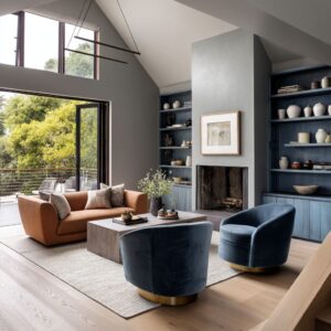
Composed Imbalance
A well-balanced white interior often earns its intrigue through tiny shifts off the expected centerline. Mirrors drift a handspan to one side, pendants hang slightly forward or back from the table axis, and wall-mounted shelves stack in a gentle stair rather than a mirror-image pair.
These subtle adjustments keep the gaze active, allowing calm surfaces to feel alive rather than static.

Black accents take up the role of visual punctuation. Slim window frames, pencil-thin track lights, or a lone charcoal sketch stand out like ink on handmade paper—enough definition to sharpen the outline of a chair or table, yet never loud enough to steal focus from the pale architecture around them.
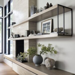
Within many white dining room design ideas, this restraint produces clarity: crisp strokes that define without dominating. Storage zones become miniature exhibitions.
A short run of timber shelving might support still-life arrangements—matte pottery, linen-wrapped books, and soft bisque vessels—that read as pauses in the visual score. Their muted shapes echo the larger room, offering moments of relief and inviting closer inspection.
These tableau settings illustrate how composition, rather than colour, can anchor a view.

White as Future Memory
Over time, a pale dining room develops its own quiet story. Sun-softened seat cords, gentle rub marks on chair legs, and a faint bloom on plaster corners record daily life in a language of delicate wear.
Such traces turn polished minimalism into something personal, proving that restraint doesn’t prevent character—it welcomes it. Within many white dining room furniture ideas, this slow patina shows how white spaces hold memory the way paper holds ink, ready for the next subtle mark.

Conclusion
In dining designs, white operates less as hue than as an ever-changing field where light, form, and time interact. It hosts slim accents of black for clarity, slips of timber for warmth, and living foliage for rhythm, all the while allowing subtle wear—softened seat cords or a gentle mark on plaster—to become part of the story.
The palette’s restraint leaves space for future moments to register, so the setting grows richer without a single shift in colour.
Ultimately, the appeal lies in how seamlessly these ideas combine: daylight writes moving patterns, texture offers quiet ornament, curves temper geometry, and scaled-up furniture grounds the scene. The result is a dining space that feels complete yet open-ended, prepared to gather the marks of everyday life and turn them into its finest detail.