Beige has long stood at the edge of color trends—familiar, understated, sometimes overlooked. But in today’s interiors, it has stepped forward with renewed clarity, especially in bathrooms where tone, surface, and light need to work in quiet agreement.
What once read as background now holds the stage, not by dominating it, but by organizing the space through texture, depth, and controlled variation. In bathroom design, beige is rarely one flat color.
It appears as a broad spectrum, from pale chalk to sandy mushroom, from soft clay to golden caramel. These subtle shifts carry weight.
A slightly cooler beige softens the glare of overhead light, while a warm undertone picks up the reflection from brushed brass or sun-warmed wood. The tone adapts, reacts, and settles into whatever atmosphere the materials around it create.
What makes modern beige bathrooms feel considered is the way beige interacts with form and finish. A matte microcement shell might create visual stillness, while polished terrazzo or marble brings in movement.
Walls washed in plaster reflect light like skin, while ribbed tile or fluted stone turns daylight into rhythm. These aren’t spaces that rely on statement pieces—they rely on consistency of palette and variation in detail.
This article explores how beige works not as a fallback but as a builder of atmosphere. It follows how shape, surface, and light shift within a narrow tonal range—and how that discipline, far from being limiting, becomes the foundation for clarity.
In the hands of a thoughtful layout, beige bathroom color schemes can offer layered visual interest without requiring contrast or noise. They speak through restraint, balance, and form that feels grounded yet visually active.

A Wide Beige Spectrum—Not One Hue, but Many Micro-Tints
The word “beige” rarely means just one thing. In today’s most refined beige bathroom ideas, what appears simple on the surface often unfolds into a spectrum of micro-tones—each tuned like a temperature dial to shift the mood without shifting the palette.
These hues move from near-white vanilla and soft chalky cream to caramel-toned stone and muted mushroom, giving each space its own atmosphere while still sitting comfortably in the same family. Some tones hover in the exact middle between warm and cool, catching light from skylights or niche LEDs and reflecting it in subtly different ways throughout the day.
These sunlit neutrals adapt with the light: bright and open by day, quieter and more muted after dusk.

Others lean into blush or clay-based undertones, which quietly influence how nearby finishes behave. A terrazzo with faint pink chips, for example, brings out the warmth in brass fixtures or adds softness to angular forms without demanding attention.
Beige plaster with a trace of red helps gold finishes feel richer, not gaudy. And tones on the greige side—those with a whisper of grey—bring a hush to the room, toning down glare and making natural light feel softer on the eye.
What sets these beige bathrooms apart is the way small tonal shifts carry real visual weight. Rather than jumping to contrast or bold statements, these interiors use careful tweaks in temperature to respond to changing light.
It’s a palette that behaves differently at noon than it does at dusk—quietly adjusting, always balanced, always present.

Lesser-known insight: Choosing the right undertone in a beige scheme has a more dramatic visual impact than many assume. A faint red, a trace of grey, or a pink warmth can completely change how materials reflect light, how textures read, and how the overall atmosphere feels—without the need for adding or removing color.

Finish First—How Sheen Writes the Story
Beige can flatten when treated the same everywhere, so surface gloss becomes the true accent color:
| Finish | Visual Effect |
|---|---|
| Ultra-matte microcement | Soaks up glare, reveals soft shadows that highlight sculpted voids |
| Honed stone | Feels dry and chalk-like, lets veining whisper rather than shout |
| High gloss lacquer or porcelain | Turns beige into liquid light, doubling room height through reflections |
| Gloss vs. satin in one room | Gloss walls bounce light; satin cabinetry calms it back down, keeping glare away from eye level |
Alternating sheen, not color, builds depth without breaking the palette—especially helpful when a project brief allows only neutral tones.

Geometry as Ornament—Curves, Lines, and Negative Space
In a setting where color takes a step back, form does the heavy lifting. That’s where the power of shape enters the scene—and in beige bathrooms, it’s often this quiet geometry that defines the visual identity of the space.
Arches are a frequent standout. Whether carved into Venetian plaster, shaped into microcement niches, or outlined in mirrors, these soft curves bring volume without sharpness.
They act as natural points of rhythm and movement. You’ll often find them repeated in wall openings, lighting forms, or even in the outline of a tub—giving the eye a gentle path to follow.

In contrast, precise lines ground the softness. Black steel frames, thin charcoal tile lines, or exact marble layouts provide structure, defining the space with refined clarity.
These lines don’t shout; they sharpen. They give each surface a border, a rule, a purpose—especially effective in open layouts or minimalist compositions.
There’s also a clever use of pattern scale. For instance, checkerboard marble floors made from two close shades of beige create movement without noise.
Similarly, fluted oak cabinetry or vertically grooved tile keeps the visual field active while respecting the neutral tone. These micro-patterns don’t rely on contrast—they rely on texture, density, and rhythm.

Stylish idea: The best results come from pairing curves with structure. A softly arched wall niche flanked by razor-thin mirror edges.
A circular tub centered below a grid-framed skylight. These combinations keep the space from feeling shapeless but never push it into rigidity.
The push-pull between fluid and framed adds dimension—and that’s where a quiet beige base becomes visually rich. In these beige bathrooms, the visual impact doesn’t depend on color at all.
It lives in silhouette, in rhythm, in repetition. Beige becomes the canvas for a spatial composition that plays with form, not decoration.

Texture Scale—From Pin-Head to Stone Slab
One of the quiet powers of beige bathroom design lies in how texture carries the visual rhythm. Rather than adding color for contrast, the design plays with texture size—carefully choosing how much pattern, and how tightly, appears across different surfaces.
At the smallest scale, tiny mosaic tiles shimmer like woven fabric. When light hits their surface—whether natural or from a wall sconce—it scatters into thousands of miniature reflections, turning flat walls into something that moves gently with the eye.

Mid-scale terrazzo brings a different kind of energy. The base tone might stay calm, but the embedded fragments—warm white, faint clay, pale gold—add a level of visual activity that makes beige feel alive without becoming noisy.
The effect is never chaotic because the fragment sizes stay controlled and the palette stays tonal. Then at the largest scale, there’s the statement made by full-size stone slabs.
These aren’t simply walls—they’re visual installations. Wide veining that runs across the entire height of a wall or around a tub reads like geology turned into art.
The stone becomes a backdrop, a surface, and a visual anchor all at once.

A key move many designers use in such spaces is to choose one dominant texture scale, then quiet everything else. So when oversized slabs take over, flat cabinet fronts with no visible pulls keep attention where it belongs.
Or, if mosaics are the star, large untextured floor tiles offer balance. This control of texture scale avoids visual static, allowing beige to speak in one clear tone at a time.

Contrast by Material Weight, Not Hue
In many beige spaces, color contrast plays only a small part. Instead, the real contrast comes from material weight, reflectivity, and how forms interact with light.
That’s where the nuance lies—and where the visual richness unfolds. Think about the pairing of heavy against light.
A substantial black marble sink floating against a polished beige wall creates tension not because of color, but because of mass and levitation. Or, a blocky microcement vanity with open niches below gives off the feeling of solidity, while its floating placement keeps it from feeling grounded or bulky.

Then there’s shadow vs. glow.
Back-lit stone niches and LED lines beneath bathtubs cast soft halos across otherwise matte surfaces, transforming stone into something quietly luminous. These shadows act as outlines, sculpting the architecture without needing sharp contrast or dark tones.
Another layer of contrast appears in texture finish. A soft plaster wall with a chalky touch beside a mirror-polished brass fixture creates a push-and-pull where the metal takes on the role of accent color.
No pigment required—just the right combination of matte next to reflective.

Lesser-known insight: Bold visuals in a beige vanity bathroom don’t require loud colors or wild prints. Instead, the effect is built from opposing forces—weight vs.
lightness, dry vs. gloss, glow vs.
shadow. Each pairing keeps beige at the center, but gives it volume, edge, and shape.
In such compositions, beige doesn’t fade into the background—it holds the entire room together, precisely because the contrast comes from depth, not decoration.

Daylight as a Moving Accent
In many beige bathroom design ideas, light isn’t a background element—it’s the feature. While color might stay consistent from wall to wall, sunlight creates movement across surfaces without changing a single material.
These rooms are often structured to welcome light as a slow traveler—touching one side in the morning, fading across the floor by midday, and settling into shadows by evening.
- Framed outdoor views play a central role. A full-height window doesn’t just bring in light—it sets the visual contrast. Green hills, treetops, or distant stonework outside become the only competing tones, while the interior stays wrapped in beige. This makes the landscape feel like part of the palette, not an interruption.
- Sloped skylights bring a different rhythm. Their angled beams skim across terrazzo, lighting up fragments in one corner while letting others fall into soft shadow. This subtle shift creates a push-pull between matte and sparkle, especially when terrazzo chips or gloss tiles are placed to catch the glow at certain times of day.
- Even overhead slot lights, cut into narrow strips along the ceiling, cast a diffused glow down bone-toned plaster or limestone. This lets fittings and fixtures—especially those in matte black or brushed finishes—retreat slightly, giving space for the light itself to shape the wall.
Insight: In these interiors, light becomes the true pattern, more dynamic than any tile or fabric. Gloss tiles, speckled terrazzo, or micro-mosaics are often positioned where the daylight lands first—not for drama, but to extend the light’s path across the room.
It’s a move that keeps beige from ever feeling flat or still.

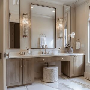
Warm Metals: Brass, Bronze, and Subtle Gleam
Beige interiors carry their tone with calm precision, but within that quiet palette, gold-toned metals add spark—not through boldness, but through glow. Used wisely, these materials offer soft contrast and visual rhythm, much like adding seasoning to a dish rather than changing the recipe.
- Brushed finishes keep the shine under control. Fixtures in this finish allow nearby surfaces—textured plaster, matte tile, or linen-toned walls—to lead the conversation, while metal acts as a subtle echo. Nothing catches the eye first, but everything feels balanced.
- Polished brass, on the other hand, plays with light. It reflects back into the space, adding a subtle warmth to its surroundings. In the right setting, it tints beige slightly rosy, giving cream or clay-colored walls a softer, more luminous presence without tipping into gold.
- Then there’s bronze or antique brass, especially when paired with travertine or honed limestone. These metals often match so closely that fixtures feel like they’re carved out of the same block—not added after the fact, but part of the architecture. The contrast becomes about depth and glow, not shine or brightness.
Design idea: Choosing a warm metal a shade darker than the surface behind it avoids visual glare while still offering crisp definition. In refined layouts, that metal is often repeated vertically—at floor level in tapware, at hand height in hardware, and at eye level in mirrors or sconces.
That repetition creates a quiet rhythm, pulling the eye upward or across the room without shouting.

In beige bathtub decorating ideas, especially, this metal strategy holds power. A brushed brass spout over a creamy freestanding tub, for instance, can feel like the visual centerpiece without actually being large or ornate.
The contrast lives in finish, not in color, keeping the design cohesive while still layered.

Wood as Temperature Moderator
In neutral interiors, especially within modern beige bathroom ideas, wood doesn’t compete—it balances. It plays a background role that becomes noticeable only when it’s missing.
The pairing of timber and beige is less about contrast and more about calibration. Used with care, wood quietly adjusts how beige feels in the room, making it warmer, cooler, or more structured depending on tone, grain, and application.
- Pale ash, whitewashed oak, or bleached finishes are often placed near beige stone with yellow undertones. This cools down the scene slightly, keeping the beige from turning overly warm or heavy. These woods introduce a dry, chalky tone that works well with plaster walls, honed limestone, or terrazzo containing soft clay fragments.
- On the other hand, richer tones like walnut, espresso, or dark oak ground the room. These woods add contrast in depth, not in color, and they work especially well in bathrooms where beige might otherwise feel too uniform or airy. The darker grain introduces weight, particularly around vanities or tall storage, giving the room a defined structure.
- Linear fluting, whether carved into oak panels or created through veneer overlays, brings rhythm. This textural echo is especially effective when it mimics ribbed tile or repeated vertical grooves in stone or plaster. The repetition ties surfaces together without needing additional color or ornament.
Lesser-known insight: The temperature of the wood has a direct influence on how the beige will read. Warmer woods actually allow cooler beige tones to stay calm without tipping into sterility, and vice versa.
This pairing adjusts the room’s balance more subtly and precisely than switching tile or paint ever could. In modern beige bathrooms, that invisible harmony between materials is part of what makes the palette feel intentional rather than automatic.

Single-Tone Immersion vs. Tonal Layering
Two distinct approaches have emerged in the most forward-thinking neutral interiors—each delivering a very different kind of visual depth. Both strategies can be found in modern beige bathrooms, and both rely on nuance more than variety.

The immersive shell strategy wraps the room in one continuous beige tone. Walls, ceilings, vanities, bathtubs—even storage niches—are finished in matching microcement, plaster, or stone.
The outcome is spatial calm, where volume is expressed through form and shadow, not color. This technique thrives in bathrooms with bold shapes: oversized mirrors, arched entries, freestanding tubs placed dramatically.
The monochrome effect gives space to light and form to lead the visual experience.

In contrast, the layered method relies on a range of close beige relatives. From stone floor to wall tile, from vanity cabinet to woven runner, each surface is half a shade lighter or darker than the next.
These shifts might be between sandy cream, pale mushroom, and soft wheat—barely distinguishable in isolation, but together they bring texture and warmth. Layering works particularly well with handcrafted elements, like Zellige tile, slatted wood, or linen drapery.

Design take: Each approach needs clarity. Immersion works best when forms are sculptural and light sources are deliberate.
Layering suits rooms built on fine materials and tactile accessories. Blending both in a single space—say, an all-beige tub platform against a layered wood and stone vanity—can flatten the effect or confuse the volume hierarchy.
In the most successful examples, the strategy is obvious without being loud. Beige isn’t the fallback—it’s the foundation.
Whether through complete immersion or thoughtful layering, the palette becomes a structure of its own.

Quiet Focal Points—When Neutral Steals the Scene
In refined interiors, standout elements don’t always need to shout. Especially in bathrooms built around muted tones, the most captivating focal points are often quietly placed, fully integrated into the material palette.
Beige, when used with control, allows these subtle moments to rise naturally without dominating the space.
- Take the freestanding tub as an example. Set slightly off-center, it breaks symmetry in a controlled way. Its clean silhouette and soft matte surface allow it to read more like an object in space than a built-in necessity. Even without contrast, it becomes the visual pause that reshapes the room’s balance.
- Then there are walls with built-in rhythm—like a fluted niche in soft vanilla tones or a mosaic made from tiny bone-toned tiles. These features don’t rely on color shifts. Instead, they catch and scatter light across their surfaces, producing movement that keeps the eye engaged. Texture becomes the accent, not pattern.
- Even checkerboard floors, done in parchment color and taupe marble, create visual structure without breaking harmony. Because both tones sit in the same chromatic register, the pattern adds weight without turning busy. It becomes an anchor for the rest of the interior, not a distraction.
Lesser-known insight: The most successful focal elements in these spaces are built from variation within the beige family. By staying close in tone but shifting form or finish, the design remains cohesive.
A bold feature in another palette might demand attention; here, it invites a second look. In spaces with bathroom beige walls, this approach turns neutrality into depth.

Take-Home Visual Ideas for Striking Beige Spaces
Good design doesn’t always depend on loud choices—it often comes from a series of very specific, quiet ones. In the case of beige bathroom color schemes, every visual move plays a role in keeping the space rich, not repetitive.
- Trade hue for undertone. A slight tilt toward clay or mushroom can shift the entire room’s temperature. Even a two-degree difference can push the atmosphere toward grounded warmth or crisp stillness.
- Use sheen as contrast. The pairing of a chalky plaster wall beside a glossy slab of travertine creates instant depth. The light knows where to land, and shadows know where to fall.
- Let form speak. Instead of color, work with shape. A rounded mirror, a slim fluted cabinet, or a narrow grid-framed screen gives structure without overwhelming the tone.
- Layer textures at different scales. Think of texture as sound: mosaics offer a hum, terrazzo brings a low rhythm, large stone slabs set a quiet bassline. Each one interacts with light differently, filling the room with variation that doesn’t rely on pattern.
- Anchor with wood or metal. A walnut base, a brushed brass handle, a slim bronze sconce—all give the eye a reference point when every surface is pale. These grounded materials act like punctuation in a beige paragraph.
- Position daylight carefully. Whether through skylights, clerestories, or oversized windows, natural light should guide how the materials perform. Beige holds light uniquely—so placement can shift the mood without moving a single tile.
In the best versions of this aesthetic, every element is chosen for what it reflects, what it absorbs, and how it holds its place. This is the logic behind truly standout neutral rooms: balance, not volume.
Mood, not noise. And always, a careful structure behind the softness.

Conclusion
Beige, once seen as a fallback, now reveals its potential as a refined visual tool—quiet but never flat. In today’s most intentional bathroom spaces, this color is no longer treated as background filler but as a primary material shaped by light, finish, and proportion.
Each variation—whether clay-based, chalky, golden, or greige—brings something new to the room without disrupting its calm.

What makes these interiors compelling isn’t the absence of color, but the precision of choices: form over contrast, texture over decoration, tone over statement. A fluted niche in the right shade of soft vanilla can pull as much focus as any bold wallpaper.
A terrazzo slab with just enough shimmer can animate a room as effectively as any bright accent wall.
These designs prove that subtlety isn’t emptiness. With the right materials, a space layered in beige can hold its own—rich in shadow, grounded in shape, responsive to light, and built from decisions that respect the palette instead of overpowering it.
The effect isn’t quiet for the sake of quiet—it’s controlled, tuned, and deliberate. That’s what turns neutral into something magnetic: not by adding more, but by placing every tone, surface, and reflection with care.