In current dining room design, the focus has shifted from decoration to composition. Shapes carry as much importance as color.
Space is used not just to fit more—but to say more. The table isn’t just centered; it’s weighed, balanced, echoed by the light above or the texture below.
Rather than relying on obvious features or crowded styling, today’s modern dining room design works through restraint. Each item—whether a branch, a bench, or a pendant—earns its place through contrast, alignment, or stillness.
What’s left out is just as important as what’s included.
Many of the strongest ideas for modern dining rooms rely on subtle structure: a slight curve in a mirror frame, a single soft rug, or a rhythm of panels behind the table. Open layouts are divided without using walls, materials are repeated once then changed, and visual weight replaces bright color as the main way to shape mood.
This article unpacks the moves that make modern dining rooms work—those understated design tactics that quietly define the room, build clarity, and give the space a sense of calm strength. Each section below explores how these visual strategies are used, not through loud statements, but through balance, shadow, form, and texture.

Geometry as Mood Setter
In many modern dining room design ideas, shape speaks louder than style labels. The table isn’t just functional—it acts like a character in the room.
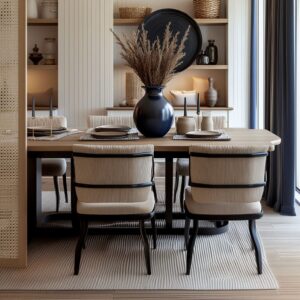
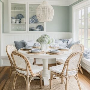
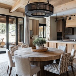
A round pedestal table with soft fluting forms a smooth center, bringing ease and quiet flow into layouts often made of straight walls and corners. That balance of clarity and warmth is one reason many of these spaces feel close to a mid-century modern dining room, even when the architecture itself comes from a different period.It’s an unspoken “O,” a steadying presence that softens the visual field.
By contrast, rectangular tables with thick legs—some carved from solid slabs of wood or stone—bring focus and grounding. These forms behave like visual anchors, giving the room a structured feel that holds its own without needing bright tones or extra decor.

Even the lighting choices often echo this logic. A circular chandelier placed directly over a round table repeats the form below, while a long rectangular pendant mirrors the length of a blocky dining table.
This alignment between ceiling and furniture shapes adds cohesion without relying on extra ornamentation. In rooms that follow this approach, the visual rhythm is built through form rather than added layers—proof that in modern dining ideas, geometry isn’t filler; it’s the frame.

Weight Over Color
What defines tone in many modern dining decorating ideas isn’t the shade on the wall—it’s the heft of what fills the space. Creams, soft wood tones, pale grays—all dominate, but not one of these rooms feels empty or flat.
Instead, visual balance is created through contrast in mass. A solid limestone table naturally draws attention without a drop of bright color, simply because of its dense, tactile surface.
Set that against lightweight chairs or a ribbed pendant in paper or linen, and the shift in density becomes the feature. Some chairs appear almost sculpted from light, others act like stone blocks—each choice reinforcing how the room feels, not just how it looks.
Here, color fades into the background while texture and weight step forward. The finish of a table—whether honed or matte—can pull just as much visual presence as a saturated wall, simply by the way it reflects light or holds shadow.
It’s a shift from decorating with tones to composing with surface depth. Within this structure, the palette becomes more about weight and less about pigment.

Negative Space Used Like Furniture
In many modern dining rooms, it’s what isn’t filled that shapes the strongest impressions. Tables often carry only a single ceramic bowl or a slim linen runner, placed with intention.
These open stretches aren’t accidents—they’re compositional tools. The open space is the design.
It holds tension, lets materials breathe, and keeps the focus sharp. Shelving and consoles reflect the same principle.
Instead of packed displays, you’ll find objects spaced far enough to cast long shadows and create a slow rhythm across the surface. The gaps are where the structure shows up.
They make the objects more defined, allowing one branch in a vase or a small stack of books to carry more presence than a crowded shelf ever could.

In this kind of modern dining room design, emptiness becomes a tool. A blank section of table or a quiet corner shelf gives shape to the rest.
It acts like negative space in sculpture—what’s missing shapes what’s seen. That approach adds a stillness and control that can’t be faked with color or styling.
The design lives not in the objects, but in how they’re placed in space that holds them.

Quiet Asymmetry
Modern dining rooms often rely on slight misalignment to keep the layout from feeling too staged. Instead of strict mirror-image seating, one side might feature a built-in bench while the other uses chairs.
Or a woven pouf appears casually at one end of the table, not duplicated on the opposite side. These moves block the usual reflex to balance every corner, and that intentional irregularity introduces ease without creating disorder.
What keeps these choices from feeling out of place is the consistency of tone and surface finish. A boucle bench cushion still works beside wood chairs because the palette flows.
A lone accent piece in a contrasting material feels at home if its shape or texture quietly echoes something nearby. In this type of styling, the mood leans quiet, but never too perfect.
That off-center detail—a vase that isn’t centered, or a chair that breaks the set—often becomes the thing that draws attention first. It’s an understated method that adds motion to static layouts and is commonly used in both large-scale and small modern dining room ideas.

Vertical Accents in Low Rooms
Many dining spaces—especially those tucked into bungalows, cottages, or older split-level homes—don’t rely on grand ceiling height. Still, they manage to feel tall and open.
One reason is how vertical accents are handled. Instead of calling attention to the ceiling itself, these rooms use elongated forms to lift the eye: branch arrangements that reach past the light fixture, drapes that begin at ceiling level, fluted wood panels that span full walls.

These gestures aren’t loud. A tall mirror, a high vase, or a slender sconce can achieve the effect without adding volume.
The trick is the direction, not the size. Even a pendant light that drops on a thin cord helps stretch the visual plane, directing the gaze upward and balancing lower furniture profiles.
It’s one of the recurring methods used in modern dining room design to help modestly scaled rooms feel taller, without structural changes or added embellishment.

Texture Echo, Not Match
Many modern dining area ideas succeed because they resist the urge to match materials exactly. Instead, they speak in textures that nod to each other from different directions.
A heavy jute rug might be mirrored in the seat weave of a wishbone chair. A travertine bowl on a console may quietly reflect the tone of a stone table, not by copying, but by echoing in scale or surface.
This soft repetition creates harmony without crossing into sameness. It works especially well in spaces where objects vary in form but hold some shared character—grain direction, fiber thickness, or surface finish.
What keeps this approach effective is knowing when to stop: repeat once, then let the rest play against it. For example, in rooms with neutral palettes, one rough-hewn item might be enough to speak to a smoother sibling elsewhere.
That quiet connection does the work of cohesion without resorting to full duplication. It’s this kind of subtle textural linking that often shapes the strongest compositions in modern dining area ideas where quiet formality is paired with tactile comfort.

Soft-Edge Strategy
The strongest dining spaces don’t always rely on sharp angles to define them. In fact, many contemporary dining room design choices are made by rounding edges that might otherwise feel rigid.
Tables might feature beveled corners instead of square cuts. Artwork frames often shift from rectangles to ovular shapes.
Even mirrors lean into arch-topped or fully circular forms, subtly shifting the room’s posture from linear to flowing. A shiplap dining room design can also benefit from this softer geometry, since rounded forms help balance the straight horizontal lines on the walls.

This soft geometry isn’t only visual—it affects how the room feels to move through. In a modern French country dining room, this kind of soft-edged shaping helps traditional textures feel lighter, more current, and less tied to ornament. Especially in compact layouts, where foot traffic runs close to furniture edges, a curved bench or rounded chair back can guide motion instead of blocking it.
The absence of sharp corners creates a gentle pace and makes narrow layouts feel more generous. These changes may be minor in isolation, but when repeated across the room—light fixtures, table corners, mirror shapes—they reshape the way the entire dining area behaves.
It’s a tactile approach to softness that doesn’t depend on fabrics or cushions.

Benches as Architectural Devices
A bench in a dining room often does more than simply add seats. Its form can divide, anchor, or define the dining zone—especially in open layouts.
Unlike chairs, which float as separate units, a bench hugs a wall or stretches beneath a window, drawing a boundary that functions almost like low-height millwork. Whether built-in or freestanding, the bench becomes part of the room’s structure.

What amplifies this effect is surface continuity. If the bench upholstery echoes the wall tone or wood trim, it visually melts into the architecture.
This creates a feeling of cohesion without the need for structural walls or added dividers. In homes with an open plan or transitional layout, a bench is often the element that visually locks the table in place.
The bench also often supports storage, adds softness against hard vertical lines, and shapes sightlines across rooms. In many modern dining area design examples, the bench does more than fill a spot—it defines one.

Branches Over Blooms
Color rarely takes center stage in the centerpiece of today’s dining settings. Instead of colorful flower arrangements, many rooms feature dry or sparsely leaved branches.
They bring a sense of form, negative space, and movement without interrupting a restrained palette. The branch silhouettes are unpredictable and lightweight, making them perfect for casting shadows and drawing height without bulk.

Moss trays are another quiet substitute for floral display. They hold shape, texture, and a sense of life—but without adding noise.
In dining spaces with strong tone control, these choices keep the eye engaged without altering the room’s overall feel. They act like live sculptures, adjusting with light and time of day.

These natural elements often sit in low ceramic vessels, wooden bowls, or stone containers—never glossy, never loud. The aim is always to build presence, not decoration.
Many modern dining room ideas use this subtle natural styling to anchor the table without pulling energy from the surrounding space. The result is calm, deliberate, and grounded.

Framed Vistas and Layered Sightlines
Some of the most effective ideas for modern dining rooms rely less on the furniture itself and more on what’s seen through or around it. Arched doorways, tall mirrors, and centered openings aren’t just decorative—they act as subtle directors of the view.
A dining table placed in front of a framed hallway, or aligned with an opening that leads to another room, instantly feels intentional—even theatrical.

This type of spatial composition gives the dining zone a role beyond just hosting meals. It becomes part of a longer axis, a foreground element in a space that stretches visually through layers: table, chairs, framed view, distant art.
Mirrors amplify this effect when hung to capture a symmetrical or soft-angle reflection, reinforcing rhythm without distraction. Instead of isolating the dining table, this method pulls it into a larger scene.
Framed sightlines build quiet tension and make even compact homes feel like they have depth. These design decisions don’t add more furniture—they give existing pieces a stronger place in the narrative of the home.

Single Statement, Many Rhymes
In refined dining spaces, it’s rare to find several competing showpieces. Instead, the focus usually rests on one defining element—maybe the table’s sculptural base, a striking light fixture, or a large piece of art.
Around this anchor, smaller details appear that echo its tone, shape, or material, building rhythm without repetition. Think of a fluted base table paired with a ribbed vase nearby.
Or a paper-like pendant light whose texture repeats in a sculpted wall piece across the room. These moments aren’t meant to match—they whisper back to the main idea, building visual harmony without staging a theme.

This balance allows the eye to move gently, registering connection without overwhelm. It’s a method that favors restraint and lets each object breathe.
Overdoing it can flatten the effect, but when used lightly, these recurring cues stitch the space together. Each “rhyme” reinforces the room’s mood, giving subtle shape to its overall voice.

Invisible Technology of Editing
In many of the strongest modern dining compositions, what stands out is what’s missing. There are no thick drapes competing for attention.
No bright floral prints shouting over the table. Glossy finishes are absent, replaced by matte, brushed, or unfinished textures that draw the eye through feel, not shine.
This quiet control is where the real editing happens. Even when older details are present—like a brick fireplace, a Tudor arch, or carved crown molding—the surrounding choices allow them space to breathe.
Walls are kept clear. Shelves are restrained.
Objects are sparse but placed with care. Every surface feels considered without being filled.

The result is a room where structure becomes decoration. A tongue-and-groove panel isn’t a backdrop; it’s a rhythm.
A stair railing becomes a design element. With so little noise, the architectural lines step forward.
This editing isn’t about stripping things away to feel empty—it’s about letting each material or piece earn its place. In many refined interiors, this quiet is what creates presence.

Key Ideas for a Visually Striking Modern Dining Room
Think of the ideas below less like fixed steps and more like a working vocabulary. Each one contributes to the way a space holds attention without asking for it.
- Shape leads, color follows. The form of the table—round, oval, slab—sets the emotional tone before any pigment does.
- Deliberate space is part of the plan. A clear tabletop, a half-empty shelf, a quiet corner—all act like objects. Emptiness has visual weight.
- Asymmetry draws attention. One bench, one pouf, one offset vase—imbalance used gently keeps the eye curious without making the room feel off-kilter.
- Vertical gestures carry height. In rooms with modest ceilings, tall branches, curtain lines, or fluted panels shift scale without shouting.
- Texture repeats once. A stone bowl that echoes a travertine table. A corded seat that nods to a jute rug. The goal is to link, not clone.
- Rounded forms ease the layout. An arched mirror, a beveled edge, a soft bench back—all reduce visual resistance, especially in tight dining zones.
- Benches shape space. Built-in or stand-alone, they form low borders in open layouts, helping define the dining area without using walls.
- Natural silhouettes over flower color. A simple branch or moss tray adds life without disrupting a quiet palette.
- Views are composed. Dining tables aligned with openings or mirrors create layered sightlines that feel intentional and cinematic.
- One focal point, echoed softly. A pendant light might be the anchor. Other pieces repeat its shape, texture, or material in quieter forms.
Read through these as you would a map of methods rather than a list of steps. Each detail—a curve, a gap, a surface—is doing something.
Not loudly, but with focus. This is how many of today’s dining spaces achieve a layered, understated strength.
The impact doesn’t come from more items. It comes from the way those items sit together in silence and structure.