An interesting idea is that the fireplace zone can be treated as a visual system (line + surface field + void + a few controlled objects), instead of a surface that gets filled. Modern mantel ideas often tend to feel calm because the wall reads like a composed still-life: proportion does the heavy lifting, texture replaces color drama, and spacing becomes a kind of quiet luxury.
.
Disclaimer: The article is for general interior styling inspiration only and does not address building codes, electrical work, or fireplace safety.

The mantel as a horizon line that edits the whole room
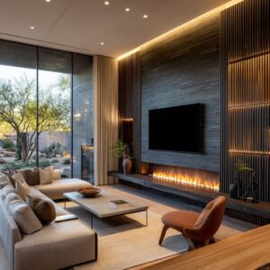
A strategy in fireplace mantel ideas is to treat the mantel as a long “rule” that stabilizes the wall. The fireplace stops reading as a single object and starts reading as a design-wide baseline.

The logic behind it
- A long, uninterrupted line creates a reference point, so minimal styling reads finished rather than underdone.
- Parallel repetition replaces decoration density: mantel line + fire line + bench line become a controlled rhythm that feels architectural.
- The line often extends beyond the opening, which subtly shifts the mantel from “belongs to the firebox” to “belongs to the wall,” making the whole surface feel intentional.

Micro-strategies inside this approach
- Center silence, edge markers: the central field stays quiet while small clusters sit near ends, keeping the line dominant.
- A single curved counter-shape: rounded tables or low circular forms interrupt strict geometry, so the room avoids feeling overly linear.
- Thinness as a design choice: when the ledge is very slim, the shadow gap beneath it becomes part of the composition, adding depth without added objects.

Light as structure: glow layers that turn mass into floating planes
In many modern mantel ideas, lighting behaves like a spacing tool rather than a highlight. Soft glows create separation, making heavy elements read like layers, not blocks.

The underlying logic
- A halo acts as a visual buffer, so dark or weighty materials read calm instead of severe.
- Stacked light bands (high perimeter glow, under-shelf glow, under-bench glow) build a “floating planes” effect: the wall reads as depth, not mass.
- Light often replaces decor by providing rhythm: small pools or linear washes create a quiet beat on the surface.

Fine-detail tactics
- Glow that reduces perceived thickness: warm underlight pulls the eye to the luminous edge first, softening the sense of bulk.
- Glow that makes near-invisible layers legible: glass or ultra-thin planes feel deliberate when light gives them an outline.
- Tiny light accents as luxury detail: small downlights create depth and cadence without introducing visual clutter.

Negative space as the main material
A major creative strategy is making emptiness feel designed: the “blank” is framed by lines, planes, and gentle light so it reads like a calm surface, not a missing element.

The behind-the-scenes logic
- Large quiet fields feel finished when they are held by boundaries: a long ledge, a bench slab, perimeter glow, or a defined panel area.
- Minimal objects gain value through contrast with emptiness; one vessel can read like sculpture because the wall refuses competing signals.
- A lower fire opening relative to a higher mantel increases vertical breathing room, which makes a wall feel taller and more composed.
Supporting moves
- Insert-within-field: a textured or tiled zone can behave like a centered panel inside a larger plain wall, giving the fireplace a “placed” presence.
- Bench as stage: an extended hearth plane creates a platform that supports asymmetrical object placement without visual instability.

Asymmetry that still reads balanced
Nice-looking compositions can often rely on controlled imbalance: the wall feels calm because balance is achieved through visual density, not matching shapes.

The design logic
- A void can be countered by another void-like element (a second dark rectangle, a matte panel, or a deep recess), creating a composed pairing.
- A dominant tall element shifted off-center often needs a low, wide counterweight to prevent the wall from feeling top-heavy.
- Tiny “connector” objects act like hinges between zones, preventing the composition from splitting into unrelated halves.
Small design cues
- Cropping as sophistication: partially cropping a large shape implies the scene extends beyond the frame, reducing a “portrait” feeling.
- Inward placement: keeping tall objects slightly away from extreme edges preserves the sense of one continuous line rather than bookends.

Texture fields that do the work of color
A consistent mantel design method is to use micro-texture—ribbing, fluting, slats, grids, stone pores—to create depth while keeping the palette restrained.

The logic behind it
- Tight, consistent texture reads as richness because it catches daylight in fine shadow bands without becoming visually noisy.
- Direction shifts matter: changing the orientation of linear textures (horizontal field vs vertical face) prevents monotony while staying tonal.
- Sun-shadow patterns function like temporary graphics, adding movement and warmth without introducing objects.
Tiny compositional moves
- Quiet grids: subtle brick or tile grids behave like measuring systems that make spacing feel deliberate.
- Vertical rhythm replacing art: slat fields can provide height and structure so artwork becomes optional rather than required.

The void as a design object
The firebox is often treated as negative-space sculpture: a dark cut-out that anchors the wall and gives pale surfaces something to register against.

The less obvious logic behind it
- The void feels intentional when the room repeats dark notes elsewhere in small doses (window frames, a single vessel, thin metal furniture lines).
- Long, thin fire lines behave like controlled graphic strokes rather than dramatic focal points, fitting restrained compositions.
- Pairing voids (two adjacent dark rectangles, or a void echoed by a dark panel) can replace symmetry with a modern kind of balance.

Objects as punctuation, not collection
Styling reads high-end when objects behave like punctuation marks: few items, controlled silhouette range, and clear grouping logic.

The subtle logic
- A narrow height range with one airy exception keeps the arrangement calm while still having lift.
- “Base strategy” turns multiple small pieces into one composed unit: trays, plinths, or low platforms create a shared shadow foundation.
- Scale stepping creates quiet hierarchy: large void, medium frame, thick ledge—each tier makes the next feel intentional.
Micro-strategies
- Material-as-organization: clear trays or subtle bases group items without adding heavy shapes.
- Low objects protecting the wall field: flat, wide pieces preserve the dominance of the line and the calm surface.

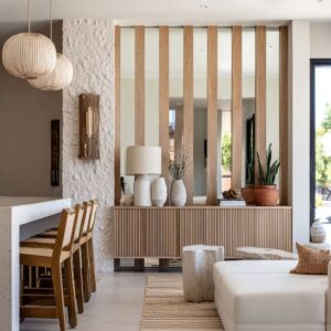
Curves and arches as soft architecture
Arched or curved forms often function as architectural “openings” rather than decoration. The curve acts as relief against a wall built from rectangles and straight lines.

The logic behind it
- A slim dark outline can carry a monochrome scheme by giving the eye a crisp boundary.
- Off-center placement reduces ceremonial symmetry and creates a lived-in, editorial calm.
- Curves soften the severity of linear textures and strong horizontal bands without adding color.

Material tension as the creative engine
An advanced move is pairing materials with opposite emotional signals, then keeping styling restrained, so the materials remain the main story:.
- Rugged, weathered wood set into smooth plaster or clean stone planes
- Expressive grain against planar, quiet surfaces
- Warm metal acting as a neutral through sheen gradients rather than grain
- Transparent glass layers beside raw edges, with light used to make the layers cooperate

The creative effect comes from contrast that stays tonal and controlled, so tension feels intentional rather than chaotic.

Built-ins and wall systems: when the mantel stops being a mantel
Modern compositions can shift from “mantel as shelf” to “fireplace as wall system. ” The key strategy is a continuous horizontal band that absorbs the fireplace into a larger architecture-like field.

Less obvious cues that make the system feel refined:.
- An open cavity left mostly empty can behave like a designed negative-space bay.
- Shelves stacked like a calm skyline create rhythm, while a blank central field provides rest.
- A warm panel field behind the composition can soften contrast and make sparse objects feel deliberate.

A condensed toolkit of creative effects
- Horizon authority: one long line organizes the wall and lowers visual noise
- Layered buoyancy: glow bands separate planes so mass reads lighter
- Composed imbalance: asymmetry balanced through density, not mirroring
- Texture-as-depth: micro-texture replaces color contrast
- Void logic: the fire opening is treated as a graphic shape and repeated elsewhere
- Punctuation styling: few objects, controlled silhouettes, clear bases
- Curve relief: arcs and rounded forms soften linear fields
- Material tension: raw vs smooth, sheen vs matte, organic vs planar
- System thinking: the fireplace becomes part of a continuous wall-width composition
Taken together, these patterns form a consistent language for fireplace mantel design ideas that look edited, calm, and quietly expensive—built from proportion, spacing, texture, and light rather than decorative volume.