In current kitchen design, glass no longer plays a passive role. It frames, reflects, blurs, outlines, and edits—all depending on how it’s placed, what surrounds it, and how it interacts with light.
Upper cabinets with glass doors have shifted away from being solely functional and moved toward being visual instruments. The effect they create isn’t only about what’s stored behind the glass, but how the glass itself behaves in a space.
From fluted patterns that ripple with shadow to ultra-clear panels that float above wood grain, glass panels introduce movement without adding color. Some amplify structure with precise metal grids, others soften it with rounded corners or curved transitions.
In between are versions that blur the view—acid-etched, ribbed, or smoked—each offering a different sense of weight and transparency.

What makes these cabinets compelling is how they interact with everything around them. Framing, interior finishes, shelf lighting, and even negative space become part of the language.
Whether the layout calls for long horizontal runs, tall towers, or corner units that wrap a bend, these cabinets contribute to more than storage—they shape the rhythm of the entire kitchen wall. This article looks closely at those visual moves—the fine contrasts, textural changes, lighting techniques, and layout choices—that give glass upper cabinets their quiet strength.

Transparency as Storytelling, Not Exposure
The surface of a cabinet door may look simple, but glass transforms it into a stage—sometimes clear, sometimes obscured, always part of the story. The way glass is handled shapes how a kitchen feels, and not only how much is seen.
Different finishes create different levels of visual access. Acid-etched glass lets light pass through while gently muting the shapes inside, so ceramics behind it feel softened rather than spotlighted.
Frosted panels offer a milky filter, taking away detail but keeping the sense of structure, like silhouettes drifting behind fog. When fluted or ribbed textures are introduced, vertical bands stretch across the surface, creating a sense of rhythm even before you notice what’s stored inside.
These lines catch light differently throughout the day, acting as texture as much as transparency.

Smoked glass adds another layer. During daylight hours, items behind it appear as faint outlines—recognizable but subdued.
In evening lighting, the same panels become almost theatrical, turning bowls and vases into softly lit shadows. This creates an atmosphere that shifts from crisp to intimate, depending on time and angle.
Fully clear panels are rarely left unedited. In kitchens using this level of visibility, there’s often a method behind the simplicity.
Either the contents are pared down to their most refined basics—like neutral-toned ceramics spaced with intention—or the interiors themselves carry color or tone that creates a visual edge. Color-blocked back panels or uniform shelf finishes act like backdrops, preventing the glass from feeling like a raw storefront.
Through these shifts in clarity, upper kitchen cabinets with glass doors become more than storage—they play the role of filter, frame, and soft divider. The same cabinet shape can take on three entirely different identities depending on how light and content interact: some feel like transparent vitrines, others like illuminated walls, and a few like sculptural forms with a quiet presence.

Light as a Shaping Tool, Not Just Illumination
In a kitchen designed with intention, light isn’t only used to brighten—it draws lines, builds depth, and changes the way surfaces behave. Especially in compositions that include upper cabinets with glass doors, lighting choices become a visual design layer in themselves.
There’s a strong contrast between lighting that frames and lighting that floats. Vertical light strips tucked into the sides of glass cabinets create glowing edges, outlining the entire shape and pulling the frame forward.
In contrast, lighting placed under each shelf produces soft horizontal bands that echo the kitchen’s wood grain or flooring, reinforcing the geometry of the space.

In some designs, this edge lighting leaks beyond the cabinet itself, spilling onto nearby walls or ceiling details. Baseboards lit from underneath make lower cabinetry seem to lift off the ground.
Lighting that grazes from the top creates a similar illusion above, reducing the weight of full-height glass units and making the wall feel lighter overall. These effects work especially well in minimalist kitchens where volume and form are left clean, allowing light to become part of the architecture.

Color temperature also plays a subtle but important role. Inside black-framed cabinets, warm light deepens the contrast and gives ceramic pieces a golden glow.
In kitchens with pale oak framing, cooler lighting makes everything feel fresher—beige dishes reflect as nearly white, and the cabinetry takes on a pale, breathable quality. When used thoughtfully, lighting shapes how we read every surface.
It makes frames disappear or stand tall. It softens edges or draws them sharper.
With upper cabinets with glass doors, these effects don’t simply highlight—they structure the look and guide the atmosphere, from sunrise to evening dim.

Frames as Graphic Devices
A cabinet frame doesn’t have to be heavy to make a strong visual mark. In kitchens where glass is the surface but the outline does the talking, the frame becomes a line drawing rather than a structural edge.
Super-thin silhouettes—often finished in matte black—work like ink lines sketched around glass. These delicate frames aren’t bulky supports.
Instead, they read as flat contours, giving the face of the cabinet a sharpness that outlines the glass without boxing it in. This look works especially well with fluted or ribbed glass, where the subtle distortions inside contrast with the clarity of the thin edge.
Fine metal grids or intersecting mullions turn the front of the cabinet into a structured pattern. An X-mullion, for example, creates a graphic overlay that catches reflections and changes its look depending on the light source and time of day.
Even when the cabinet is closed and empty, the grid becomes a decorative surface. It doesn’t need content—it carries its own presence as a patterned plane.

In other layouts, wood framing is used not for contrast, but for alignment. Light oak frames that echo the width of drawer rails below can make the full wall read as one continuous elevation.
This repetition works in rhythm with panel seams, shelf placements, and shadow lines, so that instead of separate blocks, the upper glass kitchen cabinets feel like a quiet extension of everything underneath. The effect isn’t flashy—it’s measured, controlled, and fully dependent on how framing is scaled and placed.
When these approaches are applied across the kitchen, the cabinet frame becomes more than a support. It sets the rhythm.
It acts like a visual punctuation mark, dividing or connecting, sharpening or softening. Whether it sketches lightly in black or repeats itself in wood, it’s part of the grammar of the room.

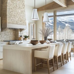
Cabinetry Merged with Architecture
Sometimes storage disappears into the walls. Other times, it becomes the structure itself.
When kitchen upper cabinets with glass doors are shaped to follow beams, peaks, or corners, they stop behaving like furniture and begin to move with the bones of the house. One subtle example is the way cabinetry can meet ceiling elements.
Long glass-front units installed just below ceiling beams look like they were made to fit within the gaps of the structure. Instead of floating randomly on a blank wall, they line up with rafters or moldings, creating a sense of completion.
In kitchens with vaulted or angled ceilings, upper cabinets that mimic that slope don’t interrupt the form—they echo it. The peak of the ceiling becomes a compositional guide.

Rounded corners and curved frames bring another type of integration. Kitchens with radius doors or outward-curving fluted panels pull away from hard 90-degree turns.
These softened shapes help corners feel intentional instead of abrupt. Even without extra material or molding, the cabinet becomes sculptural, filling transitions that would otherwise go unused.

In some layouts, arched forms repeat themselves vertically and horizontally. An arched display niche framed by curved glass doors can mirror an arched window across the room.
These repetitions build quiet symmetry. They don’t rely on decoration—they rely on structure.
And because the arches don’t need added ornament to make their mark, the look stays clean, even when detailed. In these cases, the cabinetry is drawn from the architecture, not added onto it.
The line between room and cabinet fades. Upper glass units don’t float—they fit.
And in that fit, they gain their strength.

Color Placed Inside the Cabinet, Not Outside
Most kitchens lean on outer color to guide the eye. But with glass upper cabinets, the inside walls become part of the display.
That interior face—often overlooked—can become the most expressive surface in the room. A bold interior hue turns the cabinet into a controlled flash of color.
When a strong shade, like sky blue, is applied to the inside of a cabinet with clear glass, it creates the feeling of a glowing panel. Even in an otherwise neutral kitchen, this internal color choice appears contained.
It doesn’t spill into the walls or compete with nearby finishes. Instead, the color is framed, directed, and precisely held behind glass—almost like a backlit screen.
That glow is especially noticeable under interior cabinet lighting, where shadows and highlights play off the surfaces and bring out tone shifts across the glass.

Matching interior and exterior paint takes a different approach. In this case, the cabinet vanishes into the wall from a distance, and only the dishes and objects stand out.
The shelf becomes a quiet pedestal. Ceramics, bowls, or glassware feel cut out and arranged—like silhouettes in a clean composition.
There’s almost a paper-doll effect, where contrast comes not from the cabinet, but from the space between the items. In contrast, switching the interior to wood against a painted exterior brings texture to the front.
A birch grain, softly glowing behind a tinted door, becomes the visual anchor. The cabinet contents don’t carry the weight anymore—the surface inside does.
That wood tone pulls the gaze into the cabinet, warming the view without overwhelming the broader palette. Color inside a cabinet isn’t loud.
It’s quiet but direct. It guides attention exactly where it’s wanted, whether that’s to the shape of a bowl, the hue of a shelf, or the softness of a texture caught between two layers of glass.

Rhythm, Repetition, and Pause
A kitchen is often defined by more than layout. Lines, intervals, and silence between forms do just as much work as materials or finishes.
These visual rhythms—how often shapes repeat, where they break, how far they stretch—give the room its pace.
- Vertical repetition builds structure. Ribbed glass fronts, when lined up with surrounding features like shiplap or beadboard, can create a consistent flow of grooves from floor to ceiling. These lines aren’t loud. But when they align, they create harmony between cabinet and wall, making everything feel composed in one system. This continuous ribbing doesn’t rely on bold contrast—it works through quiet precision.
- Horizontal movement stretches space. One long uninterrupted cabinet—whether in wood grain or smooth painted finish—acts like a sentence drawn across the wall. It directs the gaze sideways, widening the room visually. Matching grain direction across drawers or aligning shelf edges from one unit to the next also extends that momentum. Even in compact kitchens, this gives the layout visual space to breathe.
- Intentional gaps carry equal weight. When rows of cabinets are interrupted by an open shelf or a recessed display, the break matters. It’s a pause in the rhythm—a moment of stillness. These breaks prevent monotony and avoid turning a full wall of storage into a block. In between the glass cabinets, these openings function like commas, giving the eye a rest and highlighting what comes next.
This balance of repetition and relief gives the kitchen shape, not just volume. It lets the eye move smoothly, stop briefly, then move again.
And in kitchens where light, texture, and line all carry equal voice, that rhythm defines the entire experience.

Contrasts That Re-Balance Weight
In kitchens that rely on clean outlines and refined materials, contrast is often what holds the balance. Not through color alone, but through texture, lightness, and visual gravity.
- Wood vs. glass creates a push and pull. Lower cabinets with strong grain—such as walnut, driftwood oak, or burnt ash—bring weight to the bottom half of the room. These darker or more textural bases act like anchors. Above, glazed surfaces appear thinner and more open, often with minimal framing. That contrast keeps the room grounded. The heavier the grain below, the lighter the upper sections appear, even when framed in glass. It’s not just about color; it’s the density of texture that sets the difference.
- Light against dark defines the edges. Thin black frames around clear glass, placed beside pale matte walls, create clean outlines without needing heavy materials. Warm metal, like bronze or brass, placed near concrete grey or charcoal surfaces, has a similar effect. These materials don’t shout—they tighten the lines, making shapes feel finished without ornament.
- Softness paired with shine sharpens the space. Matte plaster walls next to high-gloss cabinetry offer a natural tension. One absorbs light gently, the other reflects it. This contrast makes edges clearer and shadows more defined. Even when both materials are neutral in color, the difference in finish adds movement across the surfaces. It’s a quiet tension—subtle, but noticeable.
Together, these combinations create balance. They let materials carry visual weight, so the room feels steady and thought-through, even if the palette stays restrained.

The Cabinet as Display Case—But Edited
Storage in kitchens with glass isn’t only about access—it’s also about how the items inside shape the look outside. Some upper cabinets behave less like storage and more like display cases, where spacing and lighting do just as much as the objects themselves.
- A curated shelf arrangement changes the mood. Instead of filling every inch, these shelves often feature fewer pieces: uniform tones, matched materials, intentional spacing. Bowls might be stacked three high. Plates may lean back at an angle. Vessels in the same finish might be grouped with just enough space around them to feel considered. The empty space becomes part of the display, giving as much visual weight as the items themselves.
- Height plays a subtle role. On tall glass cabinets, items are often staged with a center-high layout. The tallest pieces are placed in the middle, shorter ones flanking them. This builds a quiet visual slope, leading the eye upward without needing any dramatic gesture. Some kitchens layer pieces front to back in deeper shelves, using overlaps to add depth without clutter.
- Lighting shifts how everything is read. When each shelf has its own light source—often a warm, diffused LED—the effect is less like general lighting and more like a spotlight. Each compartment feels defined. The glow isn’t just ambient—it highlights shape, texture, and placement. Even a basic white bowl can take on more presence when it’s lit evenly across a dark backdrop.
These display-focused cabinets don’t overwhelm. They pull back, leaving space around each object.
And in doing so, they let the room breathe, turning everyday pieces into subtle features.

Glass as Texture, Not Just Viewport
Glass in the kitchen doesn’t always serve as a window into storage. In many layouts, it acts like a surface in its own right—a material that plays with light, movement, and pattern.
Textured glass introduces depth even when the cabinet is closed. Fluted panels, with their narrow vertical ridges, break up reflections into long, shifting stripes.
Ribbed surfaces do the same, but often with a softer, more diffused character. Seeded glass—dotted with tiny irregular bubbles—scatters light into glints and blurs, giving the surface a quiet shimmer.
These finishes don’t exist to hide what’s inside. They change the character of the cabinet front, letting it read like a textured panel rather than a smooth lens.

What’s behind the glass affects how it behaves. On darker cabinet interiors or shadowed wall surfaces, the glass almost becomes a mirror.
Shapes behind it fade, and the reflections in front take over. A viewer standing nearby may see more of the room behind them than the contents inside the cabinet.
This effect adds shadow depth and brings atmosphere to tall glass units. On light-colored or sunlit backgrounds, the opposite happens.
Glass panels scatter daylight, acting like soft filters. Instead of reflecting the room, they glow gently, picking up the tones around them and diffusing brightness across their patterned surface.
The more matte the finish nearby—plaster, oak, or stone—the more the glass becomes the subtle accent that lifts the whole area. In these applications, glass works as both skin and lens, turning simple doors into moving parts of the room’s visual composition.

Subtle Echoes Tie the Whole Room Together
In kitchens where finishes and lines are carefully chosen, small echoes do the heavy lifting. These repeated gestures don’t need to match exactly—they only need to relate.
And that’s where the visual cohesion happens.
- Corners and curves tell quiet stories. Rounded drawer fronts beneath softly curved glass cabinets give a room shape without sharp interruption. A curved edge on a countertop that follows the form of a vaulted ceiling or a radius cabinet door makes the entire setup feel tied together. These repetitions make transitions smoother, especially in corners that would otherwise sit hard against one another.
- Hardware often extends the linework. Thin, horizontal black pulls that align with the frames of nearby glass doors create visual flow. The eye reads them as part of the same element. Nothing interrupts the layout. Instead, lines continue across surfaces, making a small object like a handle part of the broader geometry.
- Material echoes reinforce rhythm. Oak shelf edges that match tambour paneling on an island. A fluted panel behind a sink that echoes grooves in a cabinet face. Even a curved concrete counter can pick up a rounded beam from above. These connections aren’t loud. They’re barely visible unless you look closely. But they build a room that holds together.
These repeating details work quietly, but they shape how a space feels. Nothing appears isolated.
Each element picks up cues from another. And that linking—through line, material, or form—keeps the entire kitchen fluent in one visual language.

Conclusion: Key Ideas for Upper Kitchen Cabinets with Glass Doors
Upper cabinets fitted with glass aren’t simply about visibility—they’re about control, rhythm, and expression. What seems like a clear panel can become a tool for shaping atmosphere, directing light, and balancing materials across the room.
- Glass quality behaves more like a gradient than a fixed feature. From clear to smoked, from frosted to fluted, each type changes how much can be seen and how reflections behave. This range helps guide attention without fully exposing everything behind the doors.
- Light does more than brighten—it shapes. Soft glows tucked along shelf edges or vertical panels turn the cabinet into an active surface. The glow isn’t only inside; it wraps around, pulling shape forward and giving form to what would otherwise sit flat.
- Framing choices carry more weight than size. Thin, clean lines in black metal or brushed brass do the work of bold trim without adding heaviness. Precision in proportion often makes more impact than ornament.
- The room’s structure can suggest the cabinet’s shape. Cabinets that follow a sloped ceiling or round a corner don’t feel added—they feel meant to be there. The outline of the home becomes the outline of the cabinet, and that connection gives the entire wall continuity.
- Interior color shifts the tone from within. A painted cabinet back panel can inject saturated character without affecting the rest of the room. It stays contained, framed, and controlled—more accent wall than storage box.
- Empty space has its own role. Gaps between glass cabinets, open shelves used like pauses, and breathing room around objects make the entire wall feel quieter and more composed. The silence in between gives shape to the pieces on display.
- Glass itself becomes a pattern. Ribbed or fluted panels create movement across the face, even without added color or décor. Texture alone introduces visual change, catching light in new directions every hour of the day.
All of these ideas show that glass upper cabinets are not just about seeing through—they’re about shaping how the room holds itself together. In the right composition, they behave like punctuation marks: defining rhythm, signaling emphasis, and letting everything else fall into place.