There’s a reason the most refined bathrooms don’t feel like showrooms. It’s not the brand of the faucet or the cost of the marble—it’s the quiet discipline behind how each element fits.
From the way mirrors sit flush without trim, to how ceiling panels hide lighting without visible seams, true refinement comes from what’s carefully hidden, not what’s on display. This deep look into current en-suite bathroom inspiration pulls apart the small moves that experienced designers use to shape calm, high-functioning private spaces.
Rather than following flashy trends or pushing visual drama, the focus is on layered textures, aligned geometries, and materials that shift light gently instead of shouting for attention.
The selections here are drawn from homes in various high-end residential locations, each shaped by a different architectural language—from coastal structures and post-and-beam builds, to modern reinterpretations of Craftsman layouts and urban lofts. Within these examples, you’ll find lighting that’s placed with precision, tile that rotates only once to create zoning, and storage that’s integrated so well it barely reads as furniture.
Whether you’re planning something from scratch or rethinking your current space, these ideas bring focus to what usually gets overlooked: proportion, rhythm, and how the small details help the room feel complete. Even if you’re just exploring bedroom en-suite ideas for a future renovation, the principles shared in this guide are built to last.

How a single surface can make the entire layout feel calm and coherent
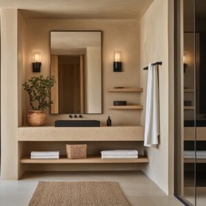
Some of the most visually calming en suite bathroom ideas don’t come from using fancy materials—but from how those materials are handled. Letting a finish continue around corners without interruption can do more for the space than any art or accessory.
This might mean running the same limestone slab across floor, wall, and bench, or wrapping micro-cement around corners without adding edge trims. Pulling this off isn’t spontaneous—it starts early with careful slab mapping, making sure veining aligns at transitions.
Book-matching is often involved, and instead of visible hardware or edging strips, recessed channels and hidden anchoring systems do the work quietly behind the scenes.

Another subtle move is playing with texture without adding clutter. One technique involves running the same travertine-like surface across every plane—floor, wall, even vanity—but varying the depth of the surface texture at eye level.
A vertical rib or fluted detail near the top third of the wall draws the gaze upward, subtly amplifying the room’s height without changing color or pattern. The wall looks like one material, but its behavior changes based on where your eye lands.

Even tile direction can double as a zoning trick. Rotating the surface grain 90 degrees on just the tub wall, for example, offers a subtle signal: this is a transition between dry and wet areas.
Nothing else in the palette needs to shift, yet your body feels the layout difference without even realizing why. These small layout cues are often what separates strong en suite ideas from more typical ones—the room doesn’t have to explain itself.
You simply feel the clarity in how it’s built.

Why layers of light matter more than brightness
Too much light in a bathroom can feel flat and sterile. Too little, and the space feels gloomy or uneven.
The best en suite lighting works in layers—each doing a quiet job to shape the mood and make the materials feel richer. It starts with the base layer: soft ambient light that sets the room’s temperature.
This often comes from LED strips hidden behind mirrors, tucked under floating vanities, or embedded in dropped ceilings. It’s not about lighting the face—it’s about making the space feel settled, especially early in the morning or late at night.
The next layer brings in structure. Slim vertical sconces, often frosted or partially diffused, run beside mirrors to light the face without throwing hard shadows.
Their placement isn’t random. In high-end rooms, these lights often share a grid with wall treatments—so if the wall has fluted glass, vertical wood slats, or even tile grooves, the backplates align perfectly.
This kind of alignment might not scream for attention, but it gives the whole space a quiet logic.

Then there’s the accent layer—spotlights so narrow they could be missed. These are usually aimed at metal details, art pieces, or textured tile walls.
Their beam angles are calculated carefully: tight enough to sparkle off a brushed bronze trim, wide enough to wash a recessed shelf—but never so broad that they bounce off the mirror and into your eyes. And finally, the thoughtful detail that’s rarely noticed but always felt: positioning décor to follow the sun.
In one example from a project inspired by coastal interiors, a simple bath mat was placed not centered on the tub, but slightly off to where the afternoon sun lands around 3 p. m.
It’s a small moment, but it shows that light isn’t just used to brighten a space. It shapes how it’s experienced, down to the hour.
These lighting strategies aren’t about showcasing technology—they’re about building rhythm. Whether planning lighting for minimalist setups or working with more layered en suite bathroom ideas, this kind of thoughtful sequencing creates comfort you don’t need to think about.

Why refined en suite bathroom designs feel quiet, even when made from stone
One of the less talked about aspects of comfort in luxury bathrooms is how sound behaves in the room. Hard materials—marble, stone, glass—can easily create echoes, especially in open-plan en suites.
But in well-thought-out spaces, these echoes are softened before they even begin. Vertical ribbing is one of the most underused but highly effective methods.
Whether applied in fluted wood wall panels or ribbed glass dividers, these grooves break up soundwaves and scatter mid-range frequencies. In spaces where sound would otherwise bounce off polished surfaces, these vertical elements act almost like acoustic baffles—without looking technical or fussy.

Then there’s the use of soft inserts. Adding an upholstered bench under a vanity or a rounded ottoman in the grooming zone isn’t just for comfort—it’s a deliberate acoustic buffer.
These soft elements catch conversational tones, dampen footfall, and stop that harsh, hollow sound many bathrooms suffer from. In quiet homes, especially those influenced by spa-inspired or Japandi en suite design ideas, this makes all the difference.

Another subtle move lies above eye level. In rooms with slatted wood ceilings, the spacing of those slats is sometimes altered depending on where people spend the most time.
Over the bed, for example, designers may tighten the gap between slats slightly—creating more absorption directly where the head rests. It’s a detail you won’t catch unless you’re really looking, but it changes how the room feels.
In spaces where you’re meant to relax, that calm isn’t always about visuals—it’s also shaped by what you don’t hear.

Biophilic Framing Without “Tropical Spa” Tropes
Luxury bathrooms that include plants often fall into two categories: tasteful and overstuffed. The best ones use greenery like a framing device—not an accessory wall.
That’s where biophilic design starts to shift from styling to structure. One of the most sophisticated techniques involves inserting a garden directly into the floor plan.
In some high-end en suite bathroom designs, a raised planter bed is built into a side corridor or between shower and vanity areas. Filled with carefully selected species, this insert behaves more like a light well than a decorative zone.
Irrigation and drainage are hidden inside concrete or tile bases, and since these gardens sit within the home’s insulated envelope, they’re able to support real seasonal growth—without compromising indoor comfort.

Then there’s the move toward curated landscape views. A single window framing a tree or a stretch of sky can do more than a wall of potted plants.
Especially when the view is slightly off-center, it has the quiet visual balance of a scroll painting. This kind of single-view focus has been a staple in many contemporary en suite design ideas, particularly in homes influenced by West Coast or Japanese design blends.

The final touch comes through light—not from fixtures, but from the leaves themselves. Open-weave foliage, like fine palms or feathered bamboo, lets sunlight pass through in irregular patterns.
These shifting shadows land on stone or plaster walls and create subtle movement all day long. There’s no extra decoration needed.
The room becomes active through what the light touches.

It’s not about filling a bathroom with greenery—it’s about placing one or two natural elements so precisely that they become part of the room’s identity. A tree framed in glass.
A leaf’s shadow stretched across travertine. That’s the quiet power of restraint.

Color & Finish Micro‑Strategies
Neutral palettes aren’t boring—but they do demand control. Some of the most visually refined bathrooms rely on a very narrow range of tones, yet still feel layered and expressive.
The trick lies in playing with contrast, sheen, and the smallest inflections of tone. Take the example of what some designers call a warm–cool handshake.
It might be a space with cool natural daylight reflecting off pale marble, but balanced by amber-toned wall sconces or a small arrangement of warm florals. That single move—like a pop of rust-colored orchids next to a cream vanity—can turn a flat space into one that feels quietly grounded.
The contrast is small, but the warmth tips the scale just enough to make the materials feel more tactile.

Another detail that often goes unnoticed is how matte and gloss finishes are used to control where the light lands. A bathroom with matte charcoal floor tile, for instance, absorbs spill light, making any surrounding high-gloss finish—like a rift-cut oak drawer front—appear even brighter.
It’s a simple visual contrast, but it brings movement to a space without adding pattern or color. These kinds of choices define the tone of good en suite decor ideas: clean surfaces that play with reflection instead of relying on busy finishes.

In rooms that lean into single-hue palettes, contrast often shows up in other ways—especially with micro details. Thin black trim on a faucet.
A steel-framed glass door. These tiny punctuation marks sharpen the composition and keep neutral spaces from feeling flat.
One dark line at the edge of a vanity mirror can give an entire wall more structure. These moments don’t shout, but they hold everything together.

The tiniest line is sometimes the most expensive one
True high-end work often hides in plain sight. At first glance, it might seem like a simple room.
But if you start tracing the lines—the seams, the joins, the way different elements meet—you’ll start to notice just how much effort went into keeping everything in order. Grout joints that line up with towel bars, faucet centers, or even shower niches might sound like minor achievements, but they require an immense amount of coordination behind the walls.
This kind of accuracy isn’t added last—it’s drawn into the plans from the very beginning. These alignments give the space its underlying calm, and more importantly, they reveal how much care went into its layout.

Ceiling vents, for instance, can completely interrupt a room’s rhythm unless they’re handled with precision. One thoughtful move is to cut them into the same spacing as vertical wood slats, making them almost invisible.
That way, airflow is preserved but visual clutter is avoided. Mirror tops that match transom window heights are another quiet move.
It’s the kind of thing no one may call out, but it keeps the window rhythm going across the room, even if the mirror and the window never sit on the same wall. It’s a linking gesture that helps the space feel continuous.

And in homes that take cues from contemporary framing or industrial detailing, you’ll sometimes find bathroom partitions that echo the exact grid of the house’s exterior windows. It’s a smart decision that brings architectural logic into the most private areas of the home.
These layers of coordination are often the foundation for what people refer to as timeless. This is the kind of precision that turns en suite inspiration into built reality.

Modern doesn’t mean ignoring the past—it means filtering it thoughtfully
Some of the most thoughtful en suite designs don’t try to reinvent the style vocabulary. Instead, they borrow from regional building traditions and translate those elements into cleaner, quieter versions.
This approach gives the space a grounded feel—something that feels current, but also anchored in familiar forms.

In homes influenced by American Craftsman details, for example, you might find wood vanities with inset paneling and visible grain, but the proportions have been trimmed down, hardware simplified, and overall mass reduced. The spirit of craftsmanship stays, but the bulk is gone.

Industrial references are often handled the same way. Think of grid-framed shower enclosures—clearly drawn from warehouse windows—but paired with large stone tiles or smooth porcelain walls.
The metalwork stays light, the colors are softened, and what could have felt harsh ends up controlled and balanced.

In homes near the coast, it’s not unusual to see elements like wainscoting reimagined in attic-level en suites. A bath niche may be built under a pitched ceiling and wrapped in soft grey millwork, echoing beach cottages without feeling overly themed.
Even ceiling slopes are embraced here, not flattened or disguised—because context isn’t something to erase.

And in timber-framed homes, the bones of the structure are often celebrated openly. Post-and-beam details remain visible, but instead of rustic basins or heavy counters, you’ll find paper-thin vessel sinks and clean lines elsewhere in the layout.
It’s a meeting point between honest materials and refined use.

These filtered references create the most satisfying balance—rooms that quietly carry a memory of place, but speak in a present-day voice. That’s why many of the most compelling en suite bathroom decorating ideas come not from following trends, but from looking at what’s already there and adjusting the scale, the grain, or the edge until it feels like it belongs today.

Conclusion
The best en-suites don’t have to make bold statements to be memorable. They hold your attention by how well they behave—how a faucet lines up with a grout joint, how the view outside gets framed without fuss, or how warm light lands exactly where your feet touch the floor first thing in the morning.
These aren’t accidents. They’re decisions made early, refined repeatedly, and built to look effortless.

Throughout each section of this article, the recurring pattern is restraint paired with clarity. A limited material palette, a few smart lighting layers, and consistent alignment do more to lift the quality of a space than any overdone feature wall or oversized fixture.
It’s these quiet adjustments that shape how comfortable a space feels over time—not just on day one, but years later when trends fade and materials are put to daily use.

Whether you’re working with an architect, hiring a designer, or just collecting references to shape your own space, these ideas show how much depth there is in the subtleties. Strong en-suites aren’t the ones that show off—they’re the ones that stay useful and calm without explanation.
Use that thinking as a filter for your own en-suite decisions, and you’ll avoid designs that age quickly or feel too trendy.
And for anyone gathering ideas for a remodel or new build, let this serve as a reminder: the best en suite bathroom decorating ideas don’t always rely on more—they rely on clarity, control, and the ability to make each choice count.