Cream cabinetry holds a quiet place in kitchen design—never loud, but never without influence. It sits between tones, leaning warm or cool depending on its surroundings.
That flexibility is part of its strength, but also part of what makes pairing it with a backsplash more nuanced than it may seem. A backsplash near cream cabinets does more than fill wall space.
It becomes a visual counterweight, a source of contrast or softness, a tool to set balance, rhythm, and tone. And unlike bold-colored kitchens where the backdrop steps aside, here the backsplash often leads—through texture, reflectivity, layout, or undertone.
This isn’t about statement-making. It’s about how surface choices adjust scale, guide the eye, and shift perception—especially when color is quiet.
Through stone slabs with movement, tiles with variation, finishes that catch or mute light, and materials that read heavy or weightless, the backsplash decides how the space feels to stand in. In neutral kitchens, these shifts are subtle but defining.
Each decision—line direction, finish depth, texture grain, or metal tone—acts like a layer in a composition. The more closely those layers are tuned, the more the room feels intentional, composed, and visually calm.
This article explores those visual strategies in detail—how backsplashes next to cream cabinets don’t just match, but shape the entire space.

Tone-on-Tone Is Never One Note
Cream might seem like a fixed color at first glance, but in kitchens, it works more like a shifting surface—changing subtly depending on lighting, neighboring materials, and the warmth or coolness of surrounding finishes. A closer look at kitchen backsplash ideas with cream cabinets reveals that the success of tone-on-tone schemes often lies in the fine-tuned distance between surfaces, not in strong contrast.
The most visually rich examples rarely use identical shades across the entire kitchen. Instead, they keep a deliberate half-step away on the spectrum, choosing backsplash materials that shift slightly cooler or slightly warmer than the cabinet tone.

For example, a marble slab with soft gray veining might introduce a faint sense of chill next to creamy Shaker doors, while a clay-toned microcement backsplash can deepen the space with warm undertones that sit just outside the cabinet’s palette. This slight tension between similar hues prevents the kitchen from appearing flat, even when the entire room lives in a narrow tonal range.
It’s not the color itself that defines the balance—but the undertone, and more importantly, how often that undertone quietly echoes across materials. Subtle repetition is one of the least obvious visual tools: a blush line in a slab, a soft green tint in a veined quartzite, or a glaze variation in a handmade tile will often mirror something already present in the cabinets or counters.
These matches don’t draw attention to themselves—but the room feels whole, without any one element competing. It’s the kind of cohesion the eye picks up before the brain realizes what’s happening.

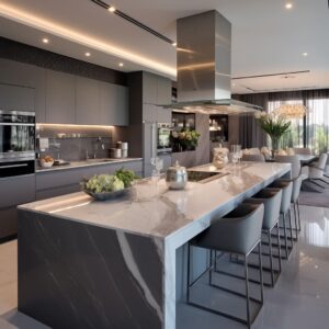
Texture Sculpts Light More Than Color
In cream-toned kitchens, where color contrast is minimal, texture becomes the engine of visual depth. While cream finishes tend to diffuse light softly, the backsplash surface often takes over the job of redirecting brightness, casting highlights, and shaping where the eye lands.
This is where backsplash for cream cabinets becomes more than a surface—it sets the mood and defines how the kitchen breathes through the day. Glazed ceramics like Zellige or Kit-Kat mosaics don’t rely on bold hues.
Instead, they build movement through their imperfect edges, gloss levels, and rhythmic spacing. Their lightly uneven finishes bounce light into subtle sparkles, giving the wall a soft pulse without drawing sharp lines.

Other backsplash materials take a quieter approach, catching rather than casting. Tumbled limestone, whitewashed brick, and rough-finished stone mosaics break up the light into shadows, lending a kitchen quiet depth even in muted daylight.
These surfaces don’t shine—they hold light in their corners and edges, creating an atmosphere that feels grounded, natural, and layered. The smartest uses of texture in backsplashes never shout.
They work by bending the rules of flatness, encouraging variation not through pigment but through the microtopography of each tile or slab. A vertical fluted tile might guide the eye upward, while a scalloped ceramic brings a rolling rhythm that softens strong lines nearby.
What gives these combinations their subtle power is that none of it feels forced. The backsplash responds to the light, the cabinetry anchors it, and texture becomes the quiet tool that keeps a neutral kitchen from fading into sameness.
Through movement, shape, and surface break, light is shaped and guided—not through color jumps, but through finely tuned detail that never demands attention, but always rewards it.

Movement Directs the Gaze
Geometry often guides the eye before shape or color ever registers. Within a neutral kitchen, lines become the quiet drivers of perception—shaping how large the space feels, how centered the stove appears, or how tall the ceiling seems.
In backsplash ideas for cream colored cabinets, these directional elements often do more work than contrast ever could. Diagonal veining in materials like quartzite or book-matched marble doesn’t just create visual drama—it acts like a lead-in line, drawing the eye toward the range.
Even in rooms where the wall layout is off-center or slightly asymmetrical, this kind of natural angle sets a visual target, helping anchor the cooking zone as the visual anchor.

Other kitchens widen themselves through outward movement. A chevron layout—especially in metal tile—radiates energy across the backsplash.
This isn’t visual noise; it’s motion embedded in the surface, throwing highlights outward like slow-moving sparks, gently broadening the field of view. Vertical lines, on the other hand, do the opposite.
They stretch the walls up—sometimes through fluted ceramic, other times through oversized grout joints in tall tiles. These upright rhythms are especially effective in kitchens with low ceilings or bulky upper cabinets, as they create the illusion of lightness and draw attention upward.
In narrow layouts, horizontal patterns such as stacked wood-look tile or etched glass strips quietly expand the room’s edges. They stretch the field of view from one wall to the next, useful in galley kitchens or tighter footprints.
What’s key is that none of these directional patterns shout. They work as silent visual cues, coaxing the eye to move and scan, giving a kitchen shape, rhythm, and subtle proportion control.
Whether pulling up, out, or forward, movement in backsplash geometry adds purpose—and avoids visual dead zones.

Reflectivity as a Layer, Not a Mirror
Sheen plays a quiet but critical role in cream-based kitchens. While soft hues keep things calm, the difference between a surface that absorbs light and one that throws it back can reshape how depth and brightness are perceived.
That’s where backsplash for cream colored cabinets becomes a point of contrast—not through color, but through reflection. Gloss comes in many forms.
Some finishes are gentle, like satin microcement or honed marble, which hold light in soft layers. Others—like back-painted glass or high-gloss ceramic—act more like a liquid surface, bouncing light sharply across the room.
These effects, when balanced correctly, shape how surfaces appear to recede or move forward.

The smartest combinations use opposite surface behaviors. If the cabinetry is matte, a glossy backsplash introduces visual pop without needing contrast in color.
That push-and-pull gives the illusion of space. Gloss appears to float toward the viewer; matte sinks back.
Together, they create a layered atmosphere where the walls don’t collapse into a flat field. This balance also reduces visual fatigue.
A full-gloss kitchen can be overly reflective, especially under strong lighting. Pairing gloss only where needed—on a small mosaic wall, behind a stove, or along one elevation—lets the eye pause in some areas and scan in others.
It gives the kitchen a rhythm that shifts with movement and daylight. So rather than aiming for shine across every surface, these kitchens treat reflectivity as a quiet layer—an ingredient that adds brightness and separation where space needs a push, without overpowering the soft neutrality of the cabinets.
It’s not about being dramatic. It’s about controlling how the room feels through how each surface handles light.

Pattern Can Be Volume Control
In kitchens anchored by cream-toned cabinets, pattern doesn’t always need to dominate. Instead, it often works like a volume dial, modulating the energy of the space depending on what the room can visually support.
One of the most overlooked choices in backsplash ideas with cream cabinets is whether to make the backsplash visually quiet—or rhythmically active. If the cabinetry is already busy—like full-grain wood veneers or detailed panel fronts—the backsplash tends to fall back.
A slab of stone with wide, calm veining or a seamless stretch of back-painted glass can tone the space down, keeping it grounded. In this role, the backsplash functions as a field, not a feature.
It avoids competing and instead gives the other elements their breathing room.

Other times, the cabinetry steps back so the backsplash can speak. Scallop tiles echo soft arches.
Art Deco fan shapes repeat the taper of thin cabinet hardware. These aren’t coincidences—they’re deliberate visual rhymes.
What stands out is that only one surface tends to lead, while others follow in scale or direction. That restraint keeps the design from slipping into visual clutter.
The most cohesive kitchens often repeat one geometry, not in an exact match but as a shared gesture. A backsplash might take the cabinet’s line weight and expand it into a bolder motif, or flip its direction entirely—turning horizontal rail lines into vertical fluting for contrast.
These kinds of echoes tie surfaces together quietly, forming one design language rather than multiple voices speaking at once. In the end, pattern serves as a control, not a decoration—and deciding which element holds the focus gives the rest of the kitchen its balance.

Metal Is the Color Bridge
While most attention falls on the materials and colors of the hard surfaces, the finishing details—especially the metal tones—often act as the link between everything else. Across many cream kitchen spaces, the choice of metal becomes the visual translator between warm and cool tones.
In cream cabinet backsplash ideas, the right hardware or fixture finish can decide whether the space feels connected or off-key. This isn’t about matching metals to each other.
It’s about matching the undertone of the backsplash to the metal that’s adjacent. A quartzite slab with greenish-charcoal streaks tends to hold bronze or aged black better than it would a polished chrome.
A marble with cool gray movement often prefers brushed nickel or stainless. Tiles with warm sandy tones tend to look best near soft brass or even champagne finishes.

These pairings might seem small, but they’re the glue of the entire palette. Switch the metal, and the backsplash can suddenly feel unrelated, even if the colors remain unchanged.
That’s because the backsplash carries more than just texture or pattern—it holds onto the room’s temperature, and the hardware completes that sentence. In several examples, the backsplash and metal finishes appear fused: gold accents mirroring a caramel-toned stone veining, or pewter hardware echoing muted gray tiles.
These aren’t meant to match perfectly—they function more like shadows of each other. The backsplash pulls in the tone, and the metal echoes it, forming a loop the eye doesn’t need to work hard to resolve.
This is why the backsplash often leads the decision on finishes, not the other way around. It sets the dominant surface temperature, and from there, every handle, hinge, and faucet becomes part of a quiet chorus—not a solo.

Illusion of Thickness vs. Thinness
Visual weight in a kitchen doesn’t come only from size or color—it comes from how materials appear to occupy space. In backsplash ideas for cream cabinets, the contrast between weighty and weightless surfaces shapes the entire perception of scale, style, and age.
Slab stone and split-face limestone carry a visual density that makes the kitchen feel rooted. These materials suggest that the wall itself has depth—that it was carved or built from within, rather than simply dressed.
The uneven shadows, chunky edges, and visible seams all feed into a sense of permanence. This quality often suits homes that lean classic or regional, where tactile surfaces and architectural heft are appreciated.

On the opposite end, back-painted glass or microcement gives the wall a thin, smooth skin. These finishes glide across the surface without announcing their thickness, dissolving any boundary between the vertical and horizontal planes.
They help the kitchen feel light, fluid, and open, especially in smaller footprints or more contemporary interiors. Because they offer almost no shadow play, they keep walls clean and uninterrupted.
What’s interesting is how these finishes set the tone for everything around them. A thick backsplash can anchor even the airiest cabinetry.
A thin one can make even deep drawers feel sleeker. It’s not just about mass—it’s about what the material suggests.
Weighty stone says permanence. Seamless gloss says precision.
And both are valid approaches, depending on what the rest of the room is trying to express.

Cabinet Integration Tactics
The relationship between cabinetry and backsplash is often where a kitchen either feels intentional or disjointed. In neutral schemes—especially with cream tones—the way cabinets connect to wall surfaces defines whether the backsplash becomes a focal point or blends into the structure.
There are typically two main directions that work with cream cabinetry:
- Framing the backsplash. This is where the cabinetry provides a structured edge—through beaded inset panels or Shaker frames—that outlines the wall material like a mat around a print. The backsplash becomes the center of attention, especially when it features striking marble veining, metallic tile, or bold texture. These cabinets create a quiet perimeter, giving space for the wall to visually breathe.
- Merging with the backsplash. In this setup, the cabinetry is kept flat and in the same tonal family as the wall behind. Glossy slab doors, flush seams, and soft edges allow the backsplash to run uninterrupted across the vertical surface. Here, the wall reads as part of the architecture, not as a separate detail. This method works well with smooth materials like glass or plaster-look finishes, which blur lines rather than define them.
In both cases, the choice hinges on what role the backsplash is meant to play. Is it an artwork?
Or is it structure? Some of the most refined backsplash ideas start with this question.
The answer defines the cabinet layout, door style, and even finish—whether matte, satin, or reflective. And once that decision is made, everything else falls into place: shelving, lighting, and even hardware selection begins responding to how the wall is being treated.
The quiet lesson here is that integration doesn’t require matching everything. It requires knowing where to let contrast exist—and where to let surfaces support one another without interruption.

Undertone Balancing With Adjacent Surfaces
In kitchens where color remains soft and restrained, it’s often the gradient of tone across surfaces that shapes how the space feels. A common structure emerges in the most visually settled rooms: flooring at the base, cabinets at the center, backsplash above.
This vertical flow becomes more than a layout—it becomes a tonal scale, with each layer tuned slightly differently. Think of it as a three-part progression.
Dark-stained wood floors ground a kitchen visually, giving it weight and a defined anchor. Above that, cream cabinetry bridges the shift from dark to light.
Then comes the backsplash—lighter, reflective, or softly textured—floating above with a lift. This stepwise transition avoids abrupt changes and makes each element feel deliberate, not isolated.

Shelving also plays a key role, especially when materials jump between light and dark. A black tile wall doesn’t clash with pale cabinets when a light wood shelf is placed in between.
It’s not just a decorative insert—it’s a tonal pause that allows the eye to rest and recalibrate before moving to the next surface. This is where undertone does most of the quiet work.
In rooms with cream kitchen cabinets with backsplash, adjacent surfaces often carry shared hints—warmth in the grain of the floor, muted gold in a tile glaze, dusty taupe in grout lines. These shared notes connect surfaces in a way that feels unforced.
The balance comes not from matching, but from staying within a tight, tonal corridor that lets one surface carry into the next.

Backsplash as Mood Setter
In neutral kitchens, color often takes a backseat—but that doesn’t mean the room is flat. The backsplash, through its material, finish, and shape, can define how a kitchen feels, even in a limited palette.
And rather than a single visual role, it can shift between several moods depending on the surface chosen. Organic calm comes from materials that wear their imperfection openly.
Tumbled limestone, rough-faced brick, and layered stone mosaics introduce slight variation in size, color, and finish. These irregularities soften the straight lines of cabinetry, especially in layouts where symmetry might feel too strict.
The result is a surface that never quite sits still—and never tries to.

Subtle luxury leans on refinement through reflection. A large marble slab with veining that flows gently across its face, or a metallic tile laid in a herringbone pattern, can read as quiet richness.
These surfaces glow in soft light and create depth without needing strong contrast or dramatic colors. The room becomes brighter, but in a contained, diffused way.
Kinetic energy belongs to surfaces that respond to movement and light. 3D tiles, wave textures, Zellige, or Kit-Kat mosaics shimmer and ripple depending on how the light falls.
These materials give a backsplash its own animation. Even in all-neutral rooms, the surface feels alive—without relying on bold gestures or gloss overload.

Graphic statement, by contrast, is about clarity. Matte black hex tiles or tiled fans in Art Deco arrangements create contrast through shape, not chaos.
Their power lies in limitation: pairing a complex motif with a restrained color palette—often cream plus one accent. This combination holds the viewer’s attention while still keeping the kitchen cohesive.
Each of these backsplash types brings its own pace and temperature to the space. Whether grounding the room, lightening it, or introducing gentle rhythm, the backsplash becomes the surface that sets the emotional tone—even when the color palette stays soft and quiet.

Key Ideas for Visual Impact
Neutral kitchens aren’t blank—they’re built on fine-tuned adjustments that shape how the space feels. Especially in cream-based interiors, the backsplash becomes the tool that holds these adjustments together.
Every choice—line, finish, thickness, texture—builds into a series of cues the eye follows, even if the viewer doesn’t consciously notice.
- Matching undertone, not hue. Color matching in a cream kitchen rarely means choosing the same shade across all surfaces. A shift just half a step warmer or cooler—through a marble vein, grout tint, or glaze—can bring clarity. These subtle shifts keep the room visually connected while giving each surface its own presence.
- Letting texture do the talking when color options are narrow. With limited variation in pigment, surfaces rely on texture to create movement. Tiles with glaze puddles, ridges, or hand-cut irregularity animate walls softly—making light shift across the backsplash throughout the day. The finish speaks louder than the color.
- Directing the eye with line orientation. A backsplash doesn’t need to be loud to guide the viewer. Diagonal patterns add drama. Vertical formats make the kitchen feel taller. Horizontal layouts widen narrow footprints. These lines give the room pace and rhythm without the need for contrast.
- Alternating sheen for spatial layering. Matte cabinetry next to a glossy backsplash— or the reverse—creates the illusion of depth. Gloss bounces forward, matte recedes. This pairing builds a layered atmosphere where surfaces don’t compete, but instead define one another’s edges.
- Using metals as connective tissue. Hardware often carries the undertone of the backsplash’s color or finish. A brushed bronze pull beside a slab with cinnamon veining, or a soft nickel handle next to a pale marble wall, connects surfaces across small accents. These links are quiet, but they hold the palette together.
- Deciding on mass or weightlessness. Some backsplashes feel carved and substantial—thick stone slabs or split-face limestone. Others feel like skins—back-painted glass, microcement, or high-gloss tile. The choice sets the tone: either anchored and grounded, or open and smooth.
- Employing gradients through shelving and flooring. Between the floor’s depth and the backsplash’s brightness, cream cabinetry often acts as a middle tone. Floating shelves in warm wood or flooring in a dusty oak bring transition points that make the room feel measured and cohesive.
- Choosing the cabinet’s role: frame or dissolve. Some kitchens let the cabinet frame the backsplash, giving it structure like artwork in a gallery. Others let the backsplash run fluidly, with slab doors in matching tones allowing the surface to feel continuous. These two roles create two entirely different visual outcomes—neither louder, but both deliberate.
All of these choices—even the smallest ones—build a layered structure of visual control. The kitchen doesn’t rely on bright color or ornate detail.
Instead, it quietly shapes its identity through light, line, texture, and the distance between similar tones. That’s why the most compelling cream kitchens never feel blank: the backsplash doesn’t just complete the wall—it defines how the entire room breathes.