A white exterior may seem like a blank canvas, but in practice, it asks for a very specific kind of balance. Color choices for the front door become more than a statement—they steer the entire atmosphere of the entry.
Whether the shade chosen is deep and grounding or soft and diffused, the way it interacts with shadows, trim, siding texture, and planting plays a major role in how the entrance feels.
Today’s most thoughtful white house door color ideas don’t aim for high drama. Instead, they focus on restraint, texture pairing, and subtle color shifts that hold attention over time.
The right door can echo nearby greenery, reflect changing daylight, or contrast cleanly through black framing—all while staying visually calm.

From soft neutrals to pastel cools to warm botanical tones, the best combinations work through rhythm and material, not just pigment. This article explores how light, texture, and shape combine with color to create entryways that are visually quiet but finely tuned—each one revealing more the longer you look.

Subtle Neutrals That Shape Atmosphere Instead of Contrast
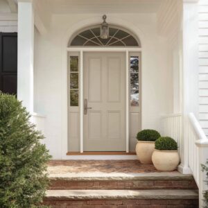
Modern entries often lean on a palette that resists shouting. Soft door colors for a white house—like greige, stone beige, or warm putty—stay near the surrounding wall tone yet pull just far enough away to carry their own depth.
These tones aren’t placeholders; they shape how light sits on a surface, how shadows stretch or fade, and how a facade breathes throughout the day.

A greige door next to sunlit white siding won’t compete—but it will hold its ground, offering a subtle shift in temperature and weight. Brushed steel handles, pale wood accents, and hand-textured plaster help these nearly-neutral choices feel layered rather than flat.
The strength lies in the way these doors absorb the surrounding tones while still setting a quiet visual anchor.

Pastels Used as Ambient Light Filters
Soft hues—mint, lavender, pistachio, blush—don’t merely decorate; they filter and reflect daylight in ways that tint the entire entry zone. These front door colors for white houses create a faint wash across adjacent walls, softening shadows and making even hard-edged architecture feel more open.
Their impact isn’t high-contrast—it’s atmospheric. A pale blue or ice-toned door, framed by matte black trim and paired with dusty green planting, builds an entry that feels cohesive without being predictable.
These tones work best when echoed nearby: silver foliage beside a mint door, or warm planters beneath a soft rose shade. Their glow isn’t artificial—it comes from how they hold and redirect the available light.
With black framing, the color becomes even more distinct, giving it definition without visual weight.

Deep Saturated Hues as Visual Gravity
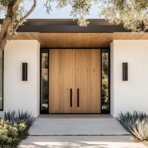
Where light tones float, darker doors ground the composition. A deep storm blue or matte charcoal-blue front door on white house exteriors draws the eye instantly, but without needing decorative trim or bold geometry.
These hues hold light differently—absorbing it, dulling its edges, and spotlighting only where metal handles or sidelight glass reflect a glint. This effect allows the door to read as a statement without distraction.

The surroundings stay muted—white brick, pale stone, minimal planting—making the color a single, controlled accent. Vertical handles exaggerate the door’s height, making it feel architectural, almost monolithic.
This isn’t about making the color louder—it’s about giving it more weight, letting it carry presence through simplicity. Among the many door colors for a white house, these rich, saturated tones serve as visual gravity—pulling everything else into balance.

Color Echoes Between Planting and Architecture
In many of the most visually cohesive entrances, the color conversation doesn’t end with the door—it extends into the landscape. Planting is often used not for contrast, but for gentle reinforcement of the door’s hue.
A storm-blue front door feels more integrated when lavender shrubs nearby echo its cooler notes. Coral-toned doors find balance with red-tinged grasses.
Charcoal grays are softened with silvery agaves. These relationships aren’t exact matches—they work like tonal rhymes.

Where plant tones don’t mirror the door directly, the planters pick up the slack: black cubes align with black window trim, pale gray vessels reflect concrete paving. This kind of layered echoing ensures that every surface participates in a larger palette.
In strong examples of white house front door ideas, it’s this coordination—rather than isolated bold choices—that creates a visually complete entry.

Framing Tricks That Make Hue Look Sharper
A front door’s color isn’t defined only by the paint—it’s shaped by what surrounds it. Black trim around a pale door can sharpen its profile like a fine line around a form.
This trick enhances soft colors like mint, peach, or lavender, giving them presence without needing saturation. It also creates clarity between door and wall, especially important for white façades where tone-on-tone risks visual blending.

On the flip side, some exterior door colors for white houses go the opposite route—by dissolving into the background. Greige, stone beige, and putty tones are framed in the same pale color as the siding, so the door becomes part of a wall composition, with the hardware acting as the only focal marker.
This contrast of approaches—crisp framing versus seamless merging—shows how border decisions can drastically shift the feel of even the most muted door shades.

Linework: Vertical vs. Horizontal Dialogue
Beyond color, line orientation plays a major role in setting the tone for an entry. A vertical layout—common with board-and-batten siding—pulls the eye upward and adds rhythm to taller façades.
Full-height glass panels and slim vertical handles continue this upward movement. These are the moves that make a small porch feel stretched, especially when paired with tall plantings or elongated sconces.

On facades using horizontal lap siding, the effect is more grounded. Doors in these contexts often adopt a block of calm color—no paneling, no inlays—offering a pause in the horizontal script.
Ceiling cladding introduces a final layer of rhythm: narrow wood planks set perpendicular to the wall siding bring in a gentle tension, helping avoid visual repetition. Together, these interactions of line and layout carry as much weight as color in door color ideas for white house entries, subtly shaping how the space is read before the handle is even touched.

Texture as a Silent Partner
In carefully styled entries, texture becomes one of the most expressive tools without ever competing for attention. Matte paint plays a central role—it doesn’t reflect light in blunt flashes, which means undertones in pale peach, cool mint, soft violet, or muted stone get room to reveal themselves slowly across the day.
This controlled surface softness is what allows color to breathe. But texture isn’t limited to the paint.
Brushed brass or stainless steel handles introduce a faint directional grain, which catches light in fine, narrow glints.

That micro-reflection gives just enough detail without taking over the door face. Pairing rough materials—like hand-troweled plaster or limewashed brick—with the smoothness of a matte front door adds contrast that’s felt more than seen.
It creates a difference in surface behavior that feels designed through restraint rather than ornament. In strong front door color ideas for white house entries, this soft/hard contrast sets the visual tempo before any color even registers.

Light That Paints Rather Than Spots
Evening lighting defines how a color performs when sunlight disappears, and in the most refined entries, light doesn’t attack—it floats. Recessed LED strips tucked under soffits or within stair risers release a wide wash that grazes the wall or floor in quiet layers, revealing texture rather than flattening it.

These grazing lights extend the color of the door out into the space around it—letting mint cast a haze over warm tile, or letting storm-blue sink into soft stone. Sconces are never placed randomly.
They line up with key elements—door handles, planter heights, or vertical window seams—extending architectural rhythm into the light itself. This creates a calm, grid-like composition at night, where the door becomes part of a larger pattern, not just a standalone feature.

Hardware as Chromatic Bridge
The handle isn’t just a grip—it’s a chromatic anchor. In such entries, hardware is used to tie tones together across multiple planes.
Brushed brass brings a sun-warmed glow that enhances coral, dusty peach, and marigold shades without adding noise. Black steel or matte iron adds structure to cooler doors—muted lavender, pale gray, or mint—making them feel more grounded.

In several color ideas found in well-balanced porches, the material of the hardware picks up cues from nearby tones—ceiling wood, planter finish, or stone pavement—weaving in one more level of visual logic. Length also shifts tone: a full-height pull makes even soft colors feel architectural, while a short lever keeps things casual.
This scale adjustment matters—especially in compact spaces—where too much shine or size can overwhelm a quiet palette. A successful front door reads through its details as much as its paint.

Regional Cues Embedded in Hue
Front door colors don’t appear in a vacuum—they respond to the light that hits them, and that light is shaped by geography. Cooler climates and coastal zones often see front doors in pale slate, icy blue, soft mint, or dusty lavender.
These tones reflect the cooler spectrum of natural light, softening hard edges and preventing glare on bright façades. Meanwhile, in sunnier environments, warmer door colors like marigold, coral, or sun-faded terracotta feel natural against the stronger sun.

These shades absorb more light without overpowering, letting brightness read as warmth rather than washout. This climate-color relationship rarely announces itself, but it underpins how a home reads visually across different latitudes.
In well-studied front door ideas for white house exteriors, color selection often reads like an atmospheric adjustment—tuning the temperature of a façade by subtle shifts in pigment.

Conclusion: Orchestrated Restraint
The visual strength comes from precise restraint rather than overstatement. Each color is calibrated to its surroundings—sometimes blending into white walls, other times standing out by contrast.
But it’s not just the door alone doing the work. Texture, lighting, planter form, and even the grain of a ceiling plank all contribute to a larger composition.
What looks minimal at first glance often reveals quiet layers the longer you study it. Front door ideas for white house settings don’t require boldness to be memorable.
A soft violet with a black pull, a muted green paired with mossy planting, a coral tone echoed in leaf tips—these are the small decisions that give a simple opening visual clarity and emotional tone. The outcome isn’t theatrical—it’s controlled, specific, and quietly confident.