Long and narrow living room layouts bring their own visual tension. The challenge sits in controlling proportion, balancing light, and introducing depth inside limited footprints.
Without careful moves, these layouts can easily feel tight, overstuffed, or visually flat. But modern design thinking has shifted far beyond simply arranging furniture to fit the room’s shape.
Every surface, angle, and object serves a specific role in reshaping how space is perceived. Width is quietly extended through horizontal visual anchors.
Height is softly introduced with vertical rhythm that lets the eye rise without feeling blocked. Texture and shadow are manipulated to bring life to flat planes, while lighting guides attention without overwhelming the senses.
Floating elements, precise object placement, and calibrated color temperatures all combine into highly controlled compositions. These decisions keep the floor visually open, allow walls to breathe, and maintain comfort inside tight geometries.
Whether using gentle monochrome layering or stronger tonal contrasts, the core principle remains the same: guide the eye, manage spatial pressure, and create rooms that feel open, calm, and fully composed. Throughout modern narrow living room design, nothing is accidental.
Every shift in material, light, and form plays its part in shaping the final effect—a room that feels much larger and more balanced than its physical measurements suggest.

Visual Horizontal Weight Control as Core Spatial Stabilizer
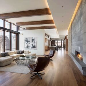
Inside a long narrow living room layout, horizontal balance becomes the silent backbone that holds the entire composition together. The secret lies in how carefully designers pull the eye outward without physically changing the room’s size.
Horizontal elements act like quiet anchors that help prevent the room from feeling boxed in. Long floating consoles serve as more than media storage.
They create uninterrupted linear strips running parallel to the floor, cutting across the wall and breaking the tall vertical mass. These consoles almost act like visual rails that guide the eye laterally, reducing the sense of vertical confinement.
By visually slicing the walls horizontally, the room gains an expanded presence that feels much broader than its true dimensions. Extra-wide sectionals further extend this horizontal pull.
Their generous width often mirrors the full span of the room, giving an illusion that the space stretches from wall to wall. The seating doesn’t dominate by height or bulk; instead, it uses proportionate width as a quiet visual tool to soften the narrow footprint.

In many refined narrow living room ideas, floating shelves are extended almost edge to edge across the wall. This creates a continuous horizontal language that subtly stretches the sightlines.
Even in spaces where physical width is limited, these floating elements visually exaggerate the breadth, allowing the room to breathe without introducing visual chaos. What makes this approach highly effective is how it manipulates the viewer’s perception.
The floating nature of these horizontal features allows floor space to remain open and uninterrupted, while the long linear surfaces gently pull the walls apart in the viewer’s mind. The eye instinctively follows these visual tracks, feeling as though the room expands effortlessly from side to side.

Hidden Vertical Manipulations Inside Narrow Rooms
While horizontal control provides stability, vertical rhythm quietly lifts the narrow space, helping prevent the compressed corridor effect so common in these types of rooms. The key is subtle vertical accents that give the eye places to rise, without overwhelming the simplicity of the space.
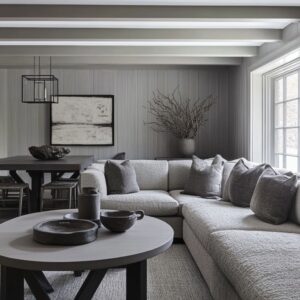
- Soft vertical veining in stone surfaces introduces delicate upward movement. Instead of bold, heavy lines, the faint, natural streaks in materials like marble or limestone create a gentle lift, giving walls texture that draws the gaze higher while maintaining an overall calm appearance.
- Vertical slatted panels often take this a step further. Thin wood slats, combined with indirect grazing light, produce a controlled play of tiny shadows that shift gently throughout the day. These shadows climb up and down the wall surface, offering dynamic depth that prevents the eye from locking horizontally. Even the finest variations in slat width or depth create subtle shadow gradients, allowing the vertical field to feel active without creating busyness.
- Small vertical niches embedded into plaster walls add another layer of refinement. These narrow cutouts act as slender architectural features, offering depth and shadow while staying almost invisible to casual observation. Their presence helps introduce vertical segmentation within an otherwise flat surface, giving structure and rhythm that feels naturally integrated.
The brilliance of this vertical layering lies in its restraint. Rather than forcing the eye upward with bold gestures, these controlled vertical elements provide quiet pathways for visual movement.
This technique keeps the room from collapsing into a tunnel-like feeling, allowing even the most compact narrow living rooms to feel taller, lighter, and far more spacious.

Curvature vs. Rectilinear: Soften or Discipline the Space
Inside many narrow living room design concepts, one of the most subtle moves happens where rigid straight lines are interrupted by gentle curves. The balance between linear structure and soft organic forms plays a crucial role in controlling how tight or open the space feels.
Curved back walls introduce gentle radius points that break strict linear boundaries. In layouts where walls run long and parallel, even a slight arc can dramatically change how the eye perceives the enclosure.
The curve allows the gaze to travel with less visual friction, providing a quiet sense of expansion inside an otherwise boxy frame.

Pebble-shaped or trapezoid stone coffee tables take this principle to the center of the room. Their rounded silhouettes add softness directly into the focal zone, breaking the repetition of rectangles without cluttering the room.
These central forms act almost like visual pauses, allowing the eye to rest naturally in the middle rather than being pushed from wall to wall. Rounded boucle chairs, sculptural ottomans, and soft-edge furnishings repeat this language of comfort.
Their thick, curved shapes contrast directly with the stronger geometry found in most narrow spaces. Even when arranged in clean lines, the rounded surfaces quietly loosen the visual tension created by strict right angles.

This balance is far from accidental. These curves serve as carefully placed visual relief points inside rooms that could easily feel like elongated tunnels.
The eye follows long lines across the space but gently settles on these rounded forms, providing a moment of softness within the discipline of linear architecture. Without these subtle adjustments, narrow layouts risk feeling too rigid or compressed.

Shadow as Active Design Medium
In small, narrow rooms, light isn’t the only tool shaping the atmosphere. Shadow becomes a living part of the composition, introducing a layer of depth that constantly changes with time and perspective.
- Recessed cove lights behind slatted panels produce shifting shadow movements. As daylight and interior lighting interact, the slats cast thin vertical bands across the walls, adding gentle texture that appears to breathe throughout the day. This subtle motion keeps the surfaces from becoming flat or static, allowing the space to feel quietly alive.
- Wood-slat ceilings create fine-grained micro-shadows across the overhead plane. The slender spacing between slats breaks the ceiling into narrow strips of shadow and light. Even without raising the ceiling physically, this technique visually lifts the upper boundary, making the room feel taller and airier.
- Stacked stone ribs contribute their own form of shadow relief. Rather than relying on pattern or bold texture, the slight protrusion of each rib allows light to skim across the surface, creating tiny valleys of shadow that suggest depth. The wall reads as layered and dimensional, even though it remains shallow in physical thickness.
The effect of these shadow plays is both dynamic and quiet. Across hours and days, the light shifts gently, causing the shadows to adjust constantly.
This creates a space that never settles into a flat visual state. Instead, it feels subtly animated without the need for movement or decoration.
These layers of shadow offer a highly refined way to decorate a narrow living room while preserving openness and calm.

Floating Architecture to Lift Mass
Inside narrow layouts, even a slight misstep in furniture weight can pull the space downward. This is where floating architecture becomes a silent tool, offering a way to keep visual air circulating throughout the room.
By removing visible legs or ground contact, pieces appear weightless, helping preserve the openness of the floor plane. Boucle sofas with concealed bases seem to float slightly above the flooring.
The absence of visible legs removes any block-like heaviness from the seating, allowing the floor area to remain uninterrupted. This creates a soft transition between furniture and flooring, making the room feel lighter even when the pieces themselves carry strong form.

Floating shelves, consoles, and benches serve the same purpose across wall planes. Without ground contact, these elements avoid slicing into valuable floor space.
The eye reads the horizontal lines while the floor continues visually beneath, preventing any perception of visual congestion at ground level. In smaller units, even substantial monolithic consoles are lifted entirely off the ground.
Heavy stone or wood media walls that might otherwise compress the space are suspended, allowing light to circulate below and keeping the visual weight firmly attached to the wall surface rather than the floor.

The power of this floating illusion lies in its ability to protect one of the most fragile zones inside a compact space — the floor plane itself. In any decorating a long and narrow living room composition, uninterrupted floor visibility becomes essential.
Once that lower space feels heavy or cluttered, the entire room risks feeling tighter. Floating elements restore that breathing room, letting the eye read the full horizontal stretch of the floor without obstruction.

Material Temperature Discipline
Color choices in narrow layouts often go far deeper than simply picking neutral palettes. There’s a fine control of warmth and coolness being applied, which stabilizes the room emotionally as well as visually.
In spaces where width is limited, even slight shifts in material temperature can impact how comfortable or restricted the room feels. Creamy travertines, pale woods, and soft linen tones introduce an inviting warmth.
These materials bounce light softly while maintaining a sense of calm. Their organic undertones keep the space from feeling clinical, providing subtle richness that quietly supports visual comfort.

In other cases, cooler tones like blacks, charcoals, and deep grays are introduced for depth and contrast. Yet they’re rarely used alone.
Pale wide-plank flooring often accompanies these darker elements, preventing them from dragging the space downward. The light flooring lifts the overall palette, allowing darker seating or wall features to sit heavily without overwhelming the room.
Even in darker compositions, sinking is avoided through precise pairing with lighter surfaces. Reflective coffee tables made of glass or polished stone create subtle light play, while pale area rugs offer grounding layers that neutralize the weight of dark sofas or walls above them.

This approach is far more refined than simply balancing light and dark. It’s a calculated arrangement of warmth and coolness curves that keep the emotional atmosphere steady inside narrow layouts.
Every surface works together to avoid any sense of compression, maintaining harmony throughout the compressed footprint. In many decorating ideas for a long narrow living room, this fine-tuning of material temperature helps prevent the space from leaning toward cold sterility or stuffy warmth.
The outcome feels controlled, comfortable, and visually calm — regardless of whether the palette leans light or dark.

Controlled Object Minimalism as Visual Hygiene
Inside many modern narrow living rooms, visual calm is built through extreme restraint. The fewer objects occupy the room, the more the space can breathe.
This isn’t simply minimalism for aesthetic sake—it’s a carefully managed way of protecting how the eye moves through tight proportions.
- Shelving remains almost empty, holding only the most select pieces. One bowl, a single vase, or a single sculptural plant are often the only items placed along floating consoles or built-ins. This limited placement gives the eye one controlled destination rather than scattering its attention across multiple small distractions.
- Tabletop surfaces stay equally curated. Even in layouts with generous center areas, coffee tables remain free from stacks of books or layered decor. A single decorative object or a small grouping becomes the centerpiece, allowing the tabletop to act as visual breathing room rather than a collection zone.
- Plants are treated as architectural tools rather than fillers. Instead of multiple small potted plants scattered across the room, one tall sculptural tree or a carefully shaped palm brings height, life, and proportion. These organic forms balance the geometry while remaining singular enough to avoid clutter.
This object control plays a far deeper role than surface tidiness. In spaces with limited width, every object takes up not just physical volume, but visual attention.
The fewer elements fight for space, the more open the room feels. This creates breathing zones where the eye can pause, preventing the narrow scale from becoming visually exhausting.
In the process of designing a narrow living room, this control of object quantity protects both intimacy and openness at once. The balance allows the room to feel composed without becoming cold, and spacious without losing personality.

Indirect Lighting as Vertical Expansion Tool
In narrow layouts, lighting doesn’t simply illuminate—it shapes. Indirect light becomes a silent tool that modifies how space is read, especially in vertical dimensions where height may be limited.
- Cove lighting placed along ceiling edges visually lifts the upper plane. As soft light spills upward, it separates the ceiling from the walls, creating an airy impression of extra height without physically raising the ceiling structure.
- Wall-grazing lights bring out the depth in surface textures. Whether washing across subtle stone veining, vertical wood slats, or textured plaster, this lighting softly reveals dimensionality while avoiding flatness. The surface reads richer and deeper, without overwhelming the space with bold contrast.
- Vertical integrated lighting hidden behind slatted walls creates quiet sculptural depth. Thin beams of warm light slide down the narrow grooves, producing vertical rhythm without adding any intrusive fixtures or visible bulbs. The wall gains dynamic layering while remaining calm and restrained.
The true strength of this indirect approach lies in its ability to quietly expand the space. Rather than demanding attention, the lighting softly interacts with surfaces and boundaries, keeping the vertical compression of narrow rooms from becoming too heavy.
Many refined ideas for a long narrow living room rely on this type of indirect lighting to stretch both width and height simultaneously. The light becomes part of the architecture itself, gently lifting ceilings, activating walls, and allowing the entire room to feel more spacious, comfortable, and visually balanced.

Composition of Window Placement for Maximum Expansion
In narrow layouts, windows play a much deeper role than simply bringing in daylight. They are positioned as visual release points, carefully balancing how the space breathes and how pressure along the room’s length is relieved.
Flush glass windows placed at the far end allow the room’s edge to visually dissolve. With no visible framing or trim to interrupt the surface, the wall seems to vanish into the outside landscape.
This technique removes the sense of a hard stopping point, letting the eye travel beyond the physical boundary.

Full-height sliding glass doors turn entire end walls into disappearing planes. The solid wall gives way to transparency, releasing any length pressure that might otherwise build in tight rectangular volumes.
The outdoor view becomes part of the composition, extending the room visually and offering constant movement as light and weather shift beyond the glass. Small vertical windows serve a more refined compositional role.
Rather than punching random holes into side walls, these tall, narrow openings are carefully aligned to match surrounding geometry. Their slim shape creates vertical rhythm that enhances proportional balance without distracting from the room’s sculptural walls.
This window placement operates like a pressure valve inside the narrow footprint. Each opening is positioned to control where the eye can exit or rest, maintaining equilibrium between visual weight and openness.
The mastery lies in how these windows regulate compression without weakening the integrity of the room’s form. Many long and narrow living room ideas depend on this type of careful window orchestration.
The views outside aren’t simply scenery — they’re integrated into the interior’s rhythm, becoming part of how space is visually expanded from within.

Sculptural Monochrome Layering vs. Tonal Punch
Inside narrow living rooms, color and material aren’t always used for simple contrast. Two distinct methods emerge that guide how depth, energy, and calm are controlled: monochrome layering and tonal punch.
Monochrome layering uses subtle shifts in material texture and form to create visual richness. Within one dominant color range — often pale stones, soft woods, or creamy textiles — the designer builds layers of depth through surface softness, faint shadows, and material grain.
Without introducing strong contrast, these quiet adjustments allow the eye to travel across surfaces and sense depth purely through light, relief, and gentle transitions.

Tonal punch introduces sharper interplay between light and dark zones. Here, contrast is more deliberate: dark stone walls may sit behind pale flooring, or black seating may be framed by light ceilings.
This controlled tension adds energy to the composition while keeping geometry calm and precise. The strength comes not from chaos, but from clear opposing planes that sharpen spatial awareness.
Both approaches achieve spatial control, but by opposite means. Monochrome layering calms the space through soft movement and whispered shifts, while tonal punch uses clear boundaries between light and shadow to energize the narrow volume.
In many living room ideas for narrow rooms, these two methods define the entire emotional tone of the space. One delivers subtle elegance through layering; the other brings bold precision through contrast.
Both, however, maintain the discipline that keeps narrow proportions feeling stable, open, and visually composed.

Conclusion: The Master Formula Hidden Beneath the Surface
The visual success behind modern narrow living room designs rarely comes from a single idea. It’s a careful layering of many silent moves working together to shape balance inside these tight footprints.
- Horizontal visual anchoring provides a sense of width, using long floating consoles, extended shelving, and stretched sectional seating that visually pull walls apart.
- Vertical relief creation lifts the eye gently upward through soft veining, vertical niches, and subtle architectural grooves that counteract the natural squeeze of narrow proportions.
- Shadow orchestration brings constant movement to otherwise static surfaces. As light shifts across recessed slats, wood panels, or stone ribs, fine shadows activate depth without adding physical mass.
- Floating mass elevation protects the lower visual field. Sofas, benches, and heavy cabinetry appear to hover, letting floor space remain uninterrupted and fully readable.
- Warmth-cool balance calibration controls the emotional tone. Creamy stones and pale woods add warmth, while deeper charcoals and blacks are tempered by pale floors or reflective surfaces to keep the space feeling light.
- Object restraint for visual hygiene maintains clear breathing space. Every shelf, tabletop, or surface holds only the most carefully selected objects, allowing the eye to rest rather than wander.
- Indirect lighting elevation lifts and softens ceilings and walls, using hidden light to push surfaces apart without the distraction of exposed fixtures or glare.
- Sculptural windows as dissolving boundaries allow outdoor views to integrate with interior space, creating a sense of openness far beyond the physical walls.
- Tonal strategy selection fine-tunes the atmosphere. Some room designs rely on soft monochrome layering built from texture and form, while others introduce sharp tonal punches between light and dark to create energy and rhythm.
Together, these components form a highly controlled visual structure that allows narrow living rooms to feel spacious, modern, and fully composed—without ever feeling heavy or confined.