This article is a comprehensive examination of strategies and subtle ideas for crafting a balanced gray-on-gray living room in various house styles and layouts. The emphasis is on less-obvious observations—those small but significant details that can transform a monochromatic space from ordinary to refined and highly functional.
Recognizing the Importance of Undertones
Warm vs. Cool Grays
A crucial but often overlooked detail is the way different grays carry specific undertones—some slightly warmer (with a hint of brown or beige) and others cooler (with a tinge of blue or green). Designers carefully mixed these undertones to avoid an overly monochromatic look.

For instance, if your walls are a warmer, French-gray tone, pairing them with charcoal or slate furnishings that lean cooler can create a subtle contrast. This contrast keeps the room from feeling flat.

Blending with Existing Architectural Materials
Original woodwork, stone, or tile floors may have their own color tendencies. Colonial Revival and Federal-style homes often have more traditional wood tones, which can influence whether you choose a warm gray or a cooler gray on your walls and furnishings.
Meanwhile, Mid-Century Modern ranch homes may feature polished concrete floors or terrazzo, which tend to read cooler and might pair well with cooler paint hues.

Avoiding Clashes
When layering multiple grays, it’s key to ensure that one gray does not make another look overly brown or green. This is especially pertinent if you have a large statement piece (such as a big gray sofa) dominating the space.
Test samples side by side in different lighting conditions—particularly near windows and under artificial lights at night—to ensure they don’t fight each other.

Subtle Temperature Shifts for Depth
Layering Two or Three Shades
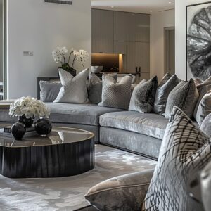
Most of the designs highlight the use of two or three complementary grays. Notice how the walls might be pale gray, the trim or cabinetry a few shades darker, and the furniture a deeper tone still.
This stepwise shift provides depth without veering into busy territory. Look to Federal-style or Georgian homes with subtle millwork painted in a deeper hue than the wall, or Craftsman homes with deeper trim that showcases the wood details.

Tactile Contrasts
Upholstery in smooth wool or linen stands out against a slightly textured rug. Light gray plaster walls might be contrasted by a textured charcoal accent panel.
These textural changes work with the color shifts to create a multidimensional look, even when every piece remains in the gray family.

Furniture Silhouettes and Space Planning
Clever Arrangements in Smaller Rooms
Many of these homes—particularly older Colonial Revival or Craftsman bungalows—do not have huge living rooms. Designers often deploy sectionals or compact love seats to maximize the seating without crowding walkways.
A square or rectangular coffee table, kept narrow, can still provide a practical surface while allowing foot traffic in tight spots.

Dual-Purpose Corners
In spaces like the Federal-style home in Bethesda or the Craftsman bungalow in Montclair, a corner home office is incorporated without overwhelming the aesthetic. The key is a floating or wall-mounted desk, finished in a subtle shade of gray that nearly blends with the wall.
This approach prevents the desk from visually “popping out” and interrupting the monochromatic flow.

Proportions in Mid-Century Ranch Homes
Mid-century ranch houses often feature lower ceilings and open living-dining combos. Long, low-profile furniture echoes the architecture, ensuring the space feels balanced.
In these contexts, you might see an iconic mid-century lounge chair in light stone-gray leather offset by a more substantial gray sofa to keep scale interesting.

Architectural Connections with Other Spaces
Seamless Transition to Kitchens
In open layouts (like a Colonial Gambrel in Darien or a Modern Ranch in Southlake), an uninterrupted color theme from the living area into the kitchen can make these connected rooms appear larger. Whether it’s matching the finish of a media console to the color of kitchen cabinetry or mirroring the tone of the sofa upholstery with that of the island’s bar stools, you build continuity that feels very deliberate.

Gradual Contrast for Adjoining Rooms
If you need a bit of separation (common in transitional homes or modern ranches), consider changing the flooring stain just slightly or introducing a distinct backsplash in the kitchen. The shift remains subtle and still resides within the gray family, but it establishes a gentle cue that the purpose of the room has changed.

Incorporating Dining Areas
Some Cape Cod, Shingle-style, or contemporary ranch designs integrate living and dining in one open space. Positioning a rug under the living seating and a different, complementary rug (or leaving the floor bare) under the dining table helps define separate zones.
Using a unifying black or metallic accent across both areas—like black steel dining chairs in one and blackened steel table legs in the other—ties it all together.

Emphasizing Focal Points
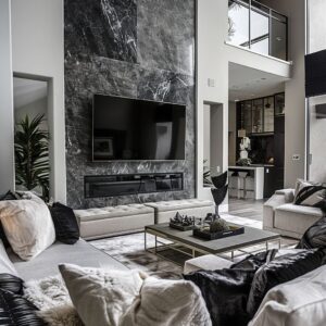
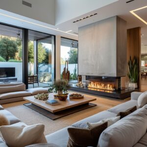
Fireplaces and TV Walls
Many designs feature a fireplace or a custom TV wall as the main visual anchor. By cladding these focal surfaces in a deeper gray or using textured stone (charcoal slate, for instance), designers add a statement feature that prevents the room from looking too uniform.
Even in a small living space, this anchored wall draws attention in a quiet, confident way.

Built-In Storage
Whether in a Craftsman or a contemporary setting, custom built-ins can be painted or stained in a richer shade to ground the space. Open shelving with curated items in pale grays or silver metallics provides variation.
This small design decision can protect the room from feeling monotone—there’s an immediate sense that the built-ins are part of the architecture, not just an afterthought.

Material Contrasts for Subtle Sophistication
Metallic Accents
A bit of blackened steel or matte brass used on legs of an accent chair, the frame of a coffee table, or even cabinet hardware provides definition. Notice how the mid-century ranch rooms in Texas or the transitional homes in Atlanta use black floor lamps or black steel chandeliers to punctuate a wash of gray.
This touch is small yet impactful.

Wood Tones
White oak floors stained in a soft gray or driftwood hue appear often in gray-on-gray living rooms. If the rest of the room tends to be cooler in tone, that slight warmth in the wood keeps the environment from feeling sterile.
In more rustic or farmhouse interpretations, reclaimed barn wood or rough-sawn beams can add a subtle textural dimension without diverging from the subdued palette.

Textiles and Rugs
A single wool or linen rug in a lighter gray hue can help define seating. Tone-on-tone geometric patterns—barely visible unless inspected closely—create depth without introducing a loud design.
Light sheen can also work; for instance, a low-sheen silk-blend rug in silver can bounce natural light around the space in a gentle manner.

Lighting and Illumination Nuances
Layering Light
Instead of depending on a single overhead fixture, layering with sconces, floor lamps, and under-cabinet lighting in adjacent built-ins can highlight subtle color variations in the grays. This layering also maintains a welcoming atmosphere during evenings.
Black or matte steel fixtures offer a crisp outline that accentuates the geometry of the space.

Color Temperature of Bulbs
Lighting that’s too cool can make warm gray elements seem dingy, while lighting that’s too warm may cause a sophisticated gray to read as brown or beige. By using bulbs around 3000K to 3500K, you’ll typically achieve a balanced glow that keeps the interplay of warm and cool grays harmonious.

Interaction with Natural Light
Large windows, sunrooms, and sliding glass doors are repeated themes. The interplay of direct sunlight on a gray rug or sofa can shift how the color appears throughout the day.
Strategically placing reflective surfaces—like a brushed steel coffee table or a thin metal frame around a mirror—will enhance the sense of airiness.

House-Specific Observations
Colonial Revival Houses (e. g.
, Greenwich, Connecticut; Newton, Massachusetts)Georgian and Federal-Style Homes (e. g.
, Scarsdale, New York; Bethesda, Maryland; West Hartford, Connecticut)

- Typically have symmetrical layouts with decorative trim. Paint the trim slightly darker than the walls for subtle layering.
- If the room opens to a bright kitchen, echo the color of the kitchen countertops or cabinetry in a piece of living-room furniture for coherence.

Cape Cod Houses (eg, New Canaan, Connecticut)
- These often feature formal symmetry and more pronounced trim. Using a warm French gray on the walls and crisp white on the ceiling can highlight any existing moldings.
- Built-in alcoves or nooks for home offices integrate beautifully when the desk finish nearly matches the wall color, keeping visual clutter to a minimum.

Craftsman Bungalows (eg, Montclair, New Jersey; Albany, New York; Bellevue, Washington)
- Smaller proportions and traditional beams can appear more contemporary when the beams are painted or stained a contrasting gray.
- Subtle texture on the walls—like limewash—introduces dimension without diverging from the color theme.

Transitional-Style Homes (e. g.
, Buckhead, Atlanta; Wellesley, Massachusetts)
- Craftsman moldings can be highlighted in a medium or deep gray tone, while walls remain a softer gray to emphasize the architectural detail.
- Stone or brick fireplaces can be refinished or clad in slate to anchor the monochrome palette.

Modern Farmhouse (eg, Brentwood, Nashville; Leawood, Kansas; Carmel, Indiana)
- Streamlined trim paired with simpler furnishings merges traditional architectural features with understated design.
- Keep any pattern in rugs or upholstery mild, so that the overall look remains calm but layered.

Mid-Century Modern Ranch (eg, Austin, Texas; Franklin, Tennessee; The Woodlands, Texas)
- Incorporate textural elements such as reclaimed wood coffee tables or ceiling beams in a soft gray stain.
- Shaker or plank-style cabinetry in adjoining kitchens continues the theme, with black hardware for contrast.

Modern Mountain (eg, Jackson, Wyoming; Missoula, Montana; Spokane, Washington)
- Low-slung furniture pieces with slender legs keep the sightlines clear.
- Adding a classic mid-century piece (Eames-style chair or tufted bench) in a slightly lighter or darker gray is an easy way to nod to the home’s origins while still maintaining the palette.

Minimalist Contemporary (eg, Palo Alto, California; Spring, Texas)
- Natural materials like slate or stacked stone in varying shades of charcoal add an organic dimension.
- Wood beams, whether cedar or oak, can be stained gray to coordinate with furniture. Large windows showcasing mountain views benefit from minimal window treatments in a matching gray to emphasize the surroundings.

Adding Discreet Accent Colors (If Desired)
Working with Black or White
The simplest accents are black or white, often in the form of metal frames, lamps, or a floating shelf. This approach adds crisp definition without drifting away from the gray theme.

Using Greenery
An olive tree or simple houseplants can break up the gray while still preserving a serene feel. Keeping planters in charcoal or slate allows them to blend with the overall look.

Metal or Wood Tones
If you want a touch of warmth, consider small metallic objects in brushed nickel or polished steel, or a lighter wood piece that stands out against the deeper furniture. The effect is subtle but keeps the space engaging.

Small but Impactful Details
- Desk and Storage Integration. In corners or alcoves, floating desks or shelving ensure a tidy line of sight. Keep finishes as close to wall color as possible if you aim for a fully cohesive effect.
- Textural Layering with Throw Pillows. Micro-houndstooth or quiet geometric patterns in matching shades bring a layered nuance to seat cushions without introducing loud prints.
- Large-Scale Art in Neutral Tones. An abstract piece in black, gray, and white can function as the main decorative focal point, avoiding an overly stark environment.
- Ceiling Treatments. Subtly shifting the color of the beams or painting a tray ceiling a step lighter or darker can set the tone for the entire room. This is particularly effective in transitional or Craftsman spaces, where ceilings are a key architectural element.
- Minimal Window Treatments. Roman shades or sheer linen drapes in off-white or faint gray ensure abundant daylight, which keeps multiple gray layers from blending into a dim environment.

Key Takeaways for Creating a Balanced Gray-on-Gray Living Room
- Play with Undertones and Contrasts. Ensure that your chosen gray shades have compatible undertones. Consider layering warm and cool grays in subtle increments for depth.
- Use Texture and Pattern to Combat Flatness. If you fear that all-gray might feel bland, integrate diverse textures: a smooth wall finish next to a nubby rug, or a sleek sofa against a grainy wood coffee table.
- Let Architecture Lead. Match the style of your home’s period—Colonial, Craftsman, mid-century, or otherwise—by adjusting the gray palette to highlight or gently modernize original details.
- Coordinate Adjoining Spaces. In open-concept designs, repeat key tones in the kitchen, dining area, or home office to unify the spaces. One or two shared materials are often enough to tie everything together.
- Carefully Plan Lighting. Natural light plus layers of ambient, task, and accent lighting will reveal the subtle shifts in your monochrome palette at different times of day.
- Include One or Two Contrasting Notes. Whether it’s black metal, a bit of natural wood, or a small hint of green from plants, these touches keep the room from feeling overly uniform.

By combining these ideas—focusing on undertones, layering textures, coordinating adjacent spaces, and respecting each house’s inherent character—you can form a gray-on-gray living room that feels calm, rich with variation, and beautifully in tune with its architectural setting. Subtle consistency, nuanced layering, and close attention to the interplay of light and texture ensure your monochrome environment stands out for its thoughtful composition rather than any single bold hue.