Black and white bathrooms are changing. Once defined by bold contrast and strict symmetry, they now lean into subtler shifts—tonal warmth, softened lines, and layered texture.
The old formula of stark opposites has given way to something quieter and more controlled, where light plays a bigger role than pigment, and small material changes matter more than loud finishes. In current design thinking, black isn’t just used to punctuate—it outlines, frames, and adds visual weight in the softest way possible.
White, on the other hand, appears in shades closer to chalk, ivory, or stone dust—never cold, never flat. The result is less about drama, more about balance.
Shape, shadow, and alignment do much of the work. Texture replaces pattern.
Materials speak through how they reflect or absorb daylight. Wood enters as a warm bridge, black fixtures behave like ink drawings, and every surface detail—from veined stone to rippled plaster—adds quiet rhythm to the room.
This article breaks down the design choices that make this shift so effective, drawing from the most thoughtful black-and-white spaces where mood and movement are shaped by much more than just contrast.

Black and White Is No Longer About Contrast—It’s About Visual Temperature Shifts
The classic tension between black and white, once treated as a clear divide, now unfolds with more nuance. In today’s black and white bathroom ideas, sharp contrast often gives way to atmosphere shaped by light behavior and surface finish.
Black isn’t used to dominate—it shapes outlines, softens volume, or erases itself into depth. It behaves more like a shadow drawn with precision than a color with loud intent.
Its matte or chalky finishes absorb just enough light to make space feel weighted without pulling focus.

On the other hand, white no longer means blank or sterile. It has become a material language of tone changes and soft glow.
From fluted ceramic tiles to brushed lime surfaces and cloudy honed stone, white now holds light in gradients instead of flat fields. This makes walls read more like layered surfaces than painted planes.
Some rooms show white that feels warm and muted; others keep it pale and crisp, but with just enough irregular texture to keep light in motion.

The result is a design language where black and white bathroom design isn’t about opposition. It’s about the threshold where dark holds the shape and light spreads the rhythm.
Every shadow cast becomes part of the structure. Every reflection tells you where the surface shifts.

Texture Becomes the Visual Ornament
Instead of relying on graphic patterns or overt decorative elements, surface behavior takes over as the primary visual interest. Texture here isn’t filler—it’s composition.
Light responds to raised stone, ridged plaster, or slotted tile with shifts in depth and shadow that feel alive as daylight moves. These textures change how space is understood, not only through material but through how movement is traced across the room.

A white stone wall with deep linear grooves, for example, won’t read as static. When sunlight brushes it at an angle, it behaves almost like cloth—catching soft highlights in between ridges and pulling visual rhythm up the vertical plane.
These surfaces do more than occupy the background—they shape the experience of being in the space.

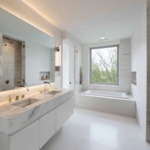
The backlit mirror becomes a key example. Not treated as a highlight, it gently floats forward in dim light, creating a glow that surrounds it like a halo but without overt glare.
This quiet edge lighting gives the mirror a presence that holds attention without brightness.

Even tile placement reinforces movement. Vertical stacks, when aligned tightly and repeated across full-height walls, don’t just add texture—they guide the eye up, echoing the height of the room and extending space beyond what’s physically there.
They’re not there for texture alone—they control flow and create subtle direction.

What ties all of this together is how these materials respond rather than announce. Texture isn’t framed like an accent.
It becomes the backbone of how space feels. Even simple objects—wood benches, soft textiles, or brushed metal—are chosen to support this quiet sense of tactile balance, where the skin of the room does all the talking.

Alignment and Axial Framing Create Order Beyond Color
Rigorous lines replace color drama with quiet structure. In many modern spaces, mirrors and windows share identical widths and sit on the same vertical centerline, so the outdoor view feels woven into the room’s geometry rather than pasted onto it.
Where the wall stops, glass begins, and that seamless switch tricks the eye into reading exterior foliage as another layer of interior composition.

Hardware syncs with surface seams to form an unspoken beat. Faucets rise from grout joints; pendant cords land precisely on tile midpoints; pull handles align with vanity drawer divisions.
The viewer may never measure these pairings, yet the brain registers harmony because every object answers to an invisible grid.

Tile layout becomes a roadmap for the gaze. Large-format slabs might run uninterrupted, but the repetition of grout lines on adjacent walls echoes the same cadence, guiding sightlines through corners without visual bumps.
Black outlines draw crisp edges, while lighter planes supply breathing room, allowing each vertical or horizontal axis to read cleanly. This discipline feels even more pronounced in compact layouts often explored in black and white small bathroom ideas.
Limited square footage leaves no margin for visual noise, so alignment acts as a buffer—delivering calm through predictable touchpoints where eye, light, and surface intersect.

Shadow Becomes a Design Tool, Not a Side Effect
Light withheld is as potent as light revealed. Concealed LED strips tuck behind crown moldings or the lip of a vanity, casting paper-thin blades of illumination that skim across matte walls without flooding the room.
A gentle gradient appears, turning flat surfaces into topography.

Recesses invite darkness to perform. Niches carved into deep black panels host toiletries while the surrounding gloom frames them like still-life objects.
The contrast feels active because the cavity never catches direct light; instead, it captures shifting shades that move as the day progresses.

Black wraps around light sources to temper glare. Inset downlights with charcoal baffles disappear until switched on, when the glow seems to emerge from nowhere.
This technique lets shadow act like a dimmer, keeping highlights soft and controlled rather than stark. The dialogue between glow and obscurity becomes the heartbeat of sophisticated black and white bathroom decor ideas.
Rather than relying on decorative pattern, the space achieves character through the slow choreography of brightness fading into dusk across every plane.

Warm Whites Shape the Palette
Creamy whites settle the room. Lightest surfaces seldom look stark; they drift toward bone, ivory, or chalk, softening glare from LEDs and late-afternoon sun alike.
This gentle tint keeps highlights calm and shadows velvety. Because white carries warmth, black steps forward as a clear outline—sketching mirrors, framing windows, tracing vanity edges—without shouting.
The distance between shades feels cushioned, so planes of plaster, marble, and matte tile read as one quiet composition. In many black & white bathrooms designs, this balance lets mixed textures share space smoothly while still giving each material its own voice.

Decorative Elements Act Like Punctuation
Small accents slow the gaze. A clay vessel that echoes limestone blush, a rough stone tray repeating plaster ripples, or a single branch arching against straight grout lines—each item anchors vision where surfaces might turn repetitive.
Shape contrast matters as well: a globe pendant floats beside rigid tile grids, a woven basket relaxes the razor edge of a vanity, adding a hint of season and hand-touched craft. By limiting objects to one or two, the scheme sparks fresh black-and-white bathroom color ideas without crowding the palette.
The room stays ordered, yet feels lived-in, thanks to these carefully placed pauses.

Bathtubs, Mirrors, and Sinks as Sculptural Interruptions
Large soaking tubs raised on terrazzo plinths take center stage—they feel closer to gallery pieces than plumbing fixtures, commanding attention through scale and elevation. The same idea of sculptural weight carries into elongated floating vanities: long, linear slabs appear to hover, setting a calm horizontal counterpoint to walls wrapped in slim vertical tile.
Round mirrors repeat in pairs, their outlines echoed by globe pendants; this deliberate echo sets up a rhythm of circles against stripes, a soft reply to the strict geometry elsewhere. Nothing shouts—the room relies on controlled spacing, so these monuments read like carefully chosen words inside an otherwise measured sentence.

Material Shifts Replace Pattern to Create Depth
Visual interest often arrives through gentle changes in texture rather than printed motif. A plaster wall touched by daylight blooms into pale clouds, while a stone counter cut with a rough, hand-tooled edge hints at craft beneath the polish.
Marble veins line up with tile seams, so the eye follows organic lines that meet precise grids, adding layers without adding clutter. This approach lets surfaces gain character over time, turning small scuffs or sun-faded areas into part of the story rather than flaws.
The combination sits comfortably within many white black bathroom ideas, proving that variation born from material honesty can outlast any trend in graphic pattern.

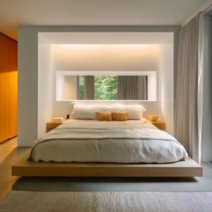
Warm Wood as the Middle Note Between Black and White
Black and white on their own can lean either sharp or chilly; a pale timber insert smooths those extremes. A light oak vanity or a slim pine shelf adds a mellow hue that calms the eye while its grain introduces subtle movement across otherwise even planes.
The timber is usually left close to raw—minimal stain, matte seal at most—so every knot and line reads clearly against monochrome tile. This rawness feels honest, almost tactile, inviting touch in a room dominated by hard surfaces.
By skimming along baseboards, framing mirrors, or edging the bath platform, wood becomes a bridge: it keeps charcoal walls from feeling weighty and soft whites from drifting into glare. Even a single plank bench can shift the room’s temperature, proving that color balance often relies on texture as much as hue.

Black Fixtures as Line Art
Hardware takes on a graphic role rather than ornamental fuss. Matte faucets, pencil-thin towel rails, and blade-like handles sketch crisp outlines that echo grout lines and window frames.
Because the finish stays low-sheen, each piece reads as a silhouette; no reflections break the quiet. Placement matters: spouts sit dead-center on vessel sinks, rails align with tile joints, and pendant cords drop in line with mirror edges.
The effect feels intentional yet effortless, as if someone completed the composition with charcoal strokes. These dark elements act as visual anchors, mapping the room’s proportions without clutter.
Final Insight
The strength of contemporary monochrome lies in restraint. Wood offers warmth, black hardware draws the eye along deliberate paths, and every surface shift—whether grain, veining, or subtle plaster clouding—adds low-key depth.
The palette succeeds because light, rhythm, and touch work in concert, turning familiar tones into a layered experience. A quick glance at curated black and white bathrooms images confirms this quiet complexity: the most compelling spaces rely on measured contrast, gentle texture, and thoughtful alignment rather than loud pattern or color splash.