The color of a front door is often the first moment of contrast on a home’s exterior—and that contrast rarely depends on brightness. Today’s front door palettes lean into subtlety, control, and visual balance, reshaping the way entries contribute to the overall look of a facade.
Instead of acting like a decorative accent, the door often becomes part of a larger conversation between material, light, texture, and proportion.
Current color choices range from smoky desaturated blues to softened pinks, earthy greens, and pale taupes—tones that avoid flatness but also skip over saturation. The result is a shift away from pure visual pop and toward careful modulation.
In some cases, the door acts like a low-frequency signal within the facade. In others, it frames structure or buffers transitions between surfaces.
But in all cases, color plays the long game, guiding the mood and weight of the porch area without taking over.

This article explores how modern door colors shape the visual experience—from matte finishes that diffuse light to framing tactics that define contrast, from tonal layering with nearby materials to quiet geometry that adds rhythm without adding bulk. These are not loud moves.
They are measured, visual calibrations that show how a simple plane of color can reshape the tone of an entire entry.

Color as Spatial Compression and Expansion Tool
In today’s modern porches, the front door color often controls how the whole entry breathes. It’s not always about contrast or standing out—sometimes it’s the exact opposite.
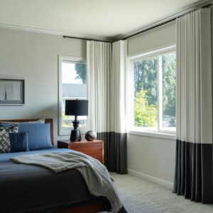
Subtle choices in saturation or neutrality shift how space feels, creating either calm openness or grounded density. Lighter tones, especially those with a powdery or muted finish—like chalk mint, dusty coral, or soft mushroom-grey—have a way of pulling the door visually inward.
These shades act more like atmosphere than object, helping the door settle quietly into the architecture. When the siding, trim, and floor materials carry soft variations of beige, cream, or desaturated green, the pale door doesn’t vanish—it slows down the viewer’s attention.
The entry becomes a low-volume threshold, where each detail blends at a controlled pace.

On the other hand, darker shades—matte black, deep plum, graphite blue—pull the weight of the composition toward themselves. They stop the eye.
These colors can create a feeling of mass and steadiness, especially when surrounded by pale cladding, white plaster, or driftwood siding. The color then behaves like a visual anchor, holding the architectural layout in balance without needing heavy structure.

This technique appears across many modern homes. It’s not about making a bold statement—it’s about adjusting how fast or slow the door reads against the rest of the facade.
Whether the tone invites a quiet pause or plants a deep note of contrast, this control over visual rhythm is often the missing insight in basic front door paint color ideas. Color sets the pace.
It pulls forward, drifts backward, or hovers in place—without moving at all.

Chromatic Micro-Contrast with Adjacent Materials
Subtlety in color layering can often feel invisible at first glance, yet it’s precisely these gentle steps in shade that give an entry presence without volume. Many of the most refined doors aren’t separated from their trim and walls by obvious contrast, but by the thinnest shifts in tone.
This quiet visual spacing is where the real precision happens.

Take, for example, a door in soft mushroom beige against slightly lighter trim. This isn’t high drama—but it catches the eye because it allows the door to register as distinct without cutting away from its surroundings.
The eye reads this tonal variation as a pause, a place to stop before continuing through the porch. Another version: a pale dusty blue placed within a siding composition of light gray and warm off-white.
The difference is only a few degrees in lightness or undertone, but it allows the door to function as a gentle interruption in the rhythm. It doesn’t shout—but it sets the structure for everything else around it.

This method creates a breathing zone between surfaces, where siding boards, door paneling, and casing all carry slightly different weights of color. These are not errors of inconsistency—they are fine calibrations of tone, used to avoid flattening the facade.
Among current entry door color ideas, this kind of tonal layering is rarely appreciated for how much it does to hold visual order without pulling attention away from the architecture. It’s the smallest decisions—two shades apart, or half a degree warmer—that shape how grounded a front door feels, and how confidently it sits within the whole exterior.

Color–Material Echo and Repetition as a Unifying Device
There’s a quiet design technique that often escapes notice but deeply affects the overall harmony of a front porch: color echoing across different materials. This is not about obvious matching.
Instead, it’s a subtle repetition of tone that threads together foliage, planters, stone, wood, and siding—all responding to the door’s color in quiet agreement.

Think of a sage-colored door paired with olive trees nearby. Their soft, silvery leaves aren’t the same color—but they sit near it in tone and depth.
At the same time, the natural stone paving below may hold just a whisper of greenish-beige veining that catches that same hue, pulling the color downward. These fine connections happen in layers, across unrelated materials, but together they build a palette that feels measured and rooted.

Other combinations, like a greige door resting on white siding, find repetition in the soft shadow lines cast by panel edges and nearby grasses or soft-bloom planters. The door isn’t alone; its color becomes part of a visual ripple moving through the porch.
A bolder example can be found with the lilac door paired with plants holding deep plum or lavender-toned leaves, along with nearby surfaces picking up warm purple shadows or cool pink light. In this kind of composition, color doesn’t stand on its own—it’s shared and repeated in different voices.

This use of tone echo is a quiet craft in exterior door color ideas. It connects the entry to the garden, the hardware to the shadows, the cladding to the plants.
The result is a sense of color unity without repetition—a way of building rhythm without doubling anything. It’s not about having the same shade across surfaces, but about making each tone feel like it belongs in the same atmosphere.

Matte Surfaces as a Light Absorber and Contrast Buffer
One of the most defining features of modern front door colours today is their surface finish. Matte and powdery textures dominate.
Gloss is rare. And there’s good reason.
A matte surface soaks in daylight rather than bouncing it back. This reduces glare and gives depth to even the softest tones.
It’s especially visible with darker shades—like charcoal or deep teal—where the lack of shine allows shadows to settle smoothly over the door. Even with softer colors, like pale pink or chalky sage, the matte effect makes the door feel quiet and grounded, without visual flash.

But the role of this finish goes beyond how the door itself looks. It amplifies the presence of nearby surfaces.
Glass appears clearer. Metal feels sharper.
Plants seem more vibrant. Because the door isn’t competing with reflectivity, other elements have more space to show their texture and shape.
This is particularly noticeable when the handle is done in brushed brass, bronze, or blackened steel—the contrast between the matte paint and the smooth metal creates a micro composition within the entry itself.

There’s also the tactile side of matte surfaces. They suggest softness even when untouched.
Viewers read them as calm, deliberate, and solid. On minimalist entries, this finish becomes a key player in balancing shadow, proportion, and stillness.
In the context of current design preferences, the finish is no longer an afterthought—it’s one of the main visual choices. Modern entries often succeed not because of bold color, but because of how light behaves on their surfaces.
And matte finishes are doing the quiet work of holding everything together.

Vertical Grooves and Linear Ridges as Visual Anchors
One of the more quiet but effective techniques used on modern entryways is the introduction of vertical detailing—subtle grooves, slats, or narrow vertical glass strips built into the door’s face. These aren’t decorative flourishes; they serve as visual support beams that help carry the weight of the overall composition.
A flat door in a soft color—say, dusty blue or blush pink—can easily blur into softness. But once vertical panel lines are added, even the most muted shade gains a kind of visual structure.
The grooves break the surface just enough to signal rhythm and continuity, making the door feel less like a solid block and more like part of the larger architectural pattern.

Where this becomes especially effective is in porches with strong horizontal siding. When the door’s vertical lines play against that direction, they break the width and add a lift to the facade.
Even narrow vertical glass inserts contribute to this—especially when they run off-center or echo a siding rhythm found nearby. These linear details often remove the need for high-contrast hardware or loud framing.
Their quiet repetition turns the door into an extension of the wall, rather than an object sitting on top of it. In terms of modern door painting ideas, this use of verticality is one of the most understated yet visually grounding approaches.
It keeps the surface honest, structured, and tied directly into the language of the house around it.

Framing Tactics That Sharpen or Soften Identity
Trim color—though often overlooked—is one of the strongest tools for adjusting how a front door is read from a distance. The same door color can feel sharp, soft, or completely blended, all depending on the outline drawn around it.
Black trim adds edge and clarity, particularly when used around gentle tones like pale yellow, sage green, or muted rose. It’s not the black itself that defines the look—it’s how it carves a clear perimeter around a soft surface.
That separation makes the color feel more defined, more intentional, and gives it a place in the visual hierarchy. On the other end, tone-on-tone framing—where the trim nearly matches the door—has the opposite effect.
The door feels like it’s been pressed into the architecture rather than placed on top of it. This approach works well on minimalist entries or homes with low contrast material palettes.
It lets the eye move across the facade without interruption, allowing the door to surface slowly in the composition.

White framing operates somewhere in the middle, depending on how strong the surrounding colors are. Against deep tones like graphite blue or olive green, it gives clarity.
Against soft pastels or warm neutrals, it calms everything down and flattens contrast. These framing methods act as tools for adjusting visibility, like dials on a camera lens.
They allow the same paint color to feel stronger or quieter, depending on how it’s supported. In the context of today’s front door color ideas, this level of color calibration is often what separates a door that looks placed from one that feels embedded.

Color as Narrative Cue: Regional and Emotional Resonance
Front doors often say more than they seem to. Their color can signal a place, a feeling, or a cultural reference, all without using a single literal element.
It’s a kind of visual shorthand—a way for a house to speak in accents. Soft butter yellow, muted coral, or dusty pink tend to hint at warmth and hand-crafted charm.
These tones often suggest coastal daylight or gentle, timeworn color palettes often linked to Southern traditions, even if the architecture isn’t tied to that region. They carry a softness that people associate with porches that feel open, kind, or sun-washed.

On the other side of the spectrum, plum, deep teal, charcoal black hold a very different energy. These choices lean into control, structure, and polish.
They often read as urban and contemporary, where the color becomes a way to reduce noise and signal clarity. Paired with minimal framing, clean geometry, and neutral surroundings, they suggest visual fluency—not loudness, but quiet strength.

The real takeaway here is that color can operate like a regional dialect. It doesn’t copy an actual place—it references the feeling of that place.
That’s why some entries feel coastal even if they’re in the mountains, or why a blush door can suggest handmade craft in a clean-lined porch. In the broader conversation about color ideas for exterior doors, tone alone often creates more regional mood than any trim profile or planter type.

Softness Through Desaturation: A Modern Signature
There’s a clear pattern across nearly all modern entryways: colors are muted, toned down, or softened with a chalky edge. This is no coincidence.
Whether the base hue is coral, mint, plum, or even lilac, the key move is always the same—remove the intensity. These aren’t primary colors.
They’re shaded, smoked, or dusted. The effect is subtle but powerful.
It turns what could be a trend-based pop into something calmer and longer-lasting. A desaturated mint reads as air.
A dull pink feels like aged rose. A softened navy leans more into slate.
And each of these shifts helps the house feel grounded.

What makes this so effective is how desaturated tones respond to natural materials. A door in pale olive next to faded cedar looks natural.
A chalk-blue set against limestone picks up softness from the stone. These tones seem to absorb rather than fight with their surroundings.
They also react better to daylight—changing slowly through the day instead of snapping in sunlight. This choice isn’t about neutrality.
It’s about keeping color readable, stable, and tied to the textures around it. In settings that include wood soffits, pavers, textured stucco, or matte metal, toned-down hues hold their place without overtaking the frame.
And in design, that quiet control is often the mark of refinement.

Architectural Dialogue Between Door and Ceiling
In many modern entries, the porch ceiling plays an unexpected but powerful supporting role in how the door color is perceived. It doesn’t just hover above—it interacts with tone, shadow, and warmth, often shaping how the entry is felt from below.
One of the most effective combinations is a warm wood ceiling paired with a cool-toned door. Think cedar or walnut boards above a mint, soft greige, or powder blue surface.
This pairing creates a natural thermal contrast: the ceiling adds warmth from above, while the door remains visually cool below. The result feels balanced—neither cold nor overly rustic—and provides a layered, lived-in look without relying on bold gestures.

Some ceiling finishes go further. With downlighting tucked into soffits or boards treated in golden stains, the light above becomes an atmospheric filter, giving the entire entry a glow.
At night, this can shift a cool graphite or teal door into something more neutral or subtly amber-toned. It’s a technique that works similarly to stage lighting or portrait photography—not to spotlight, but to recalibrate how the eye reads temperature and depth.
Importantly, the ceiling and door rarely match. They’re not partners in symmetry—they’re participants in a tonal exchange.
The ceiling acts like a lens or buffer, softening or warming what might otherwise feel too sharp. In the broader category of contemporary front door colours, this overhead influence often determines whether a tone feels grounded or floating, structured or atmospheric.

Subtle Geometry: When Door Color Reinforces Massing
Sometimes the power of a front door has less to do with its center placement and more to do with how color defines its shape within the structure. Even when set flush into a wall, the right tone can pull it forward—or quietly push it back.
Doors finished in a tone almost identical to the siding or stucco around them—say, a greige-on-ivory or mushroom-gray on soft taupe—can form an invisible shape that becomes more noticeable the longer you look. These choices don’t scream for attention.
Instead, they function like zones of transition—marking the threshold with color rather than depth or hardware.

In other cases, particularly with graphite-blue or flat black doors, the tone becomes a kind of optical void. Framed by lighter materials—sand-colored brick, blonde wood, or warm concrete—the dark door creates a negative space that feels deeper than it actually is.
There may be no physical recess, but the visual effect creates one. It’s a quiet illusion of thickness or mass.

This technique adds quiet power to small porches, where architectural detail may be limited. Color does the lifting—not through contrast, but through its role in shaping mass, edges, and balance.
For those selecting a door colour for home entries that rely on simplicity and proportion, this is one of the most effective ways to create substance without bulk.

Final Observation: The Door as Visual Atmosphere Control
More than a single color plane or entry point, the modern front door often acts as a visual regulator—balancing texture, tone, material rhythm, and architectural presence in one move. It’s not placed to shout.
It’s placed to hold the composition steady. In some facades, the door is the only true color element in a quiet mix of whites, taupes, and pale cladding.
In those cases, it becomes the mood anchor. Not because it’s loud—but because it sets the temperature for everything else.
A soft coral or pale sage in a sea of creamy stone and silver-gray siding creates a subtle chord. It gives the entry structure through tone, not shape.

Elsewhere, the door sits as a mediator between contrasting surfaces—maybe dark wood siding on one side and pale stucco on the other. The right muted green or dusty charcoal can tie those tones together, allowing texture and line to stay intact without introducing conflict.
The door becomes a kind of translator between materials. There are also entries where the door almost disappears—a flush panel in a tone nearly identical to the wall behind it, or matte black set into a shadowed alcove.
In these cases, the surrounding materials take the lead, and the door offers quietness, letting grain, planting, and surface variation carry the detail.
Across all these approaches, the key isn’t noise—it’s calibration. The color isn’t picked to pop.
It’s chosen to guide the visual flow, reinforce balance, or absorb excess. This is where today’s approach stands apart: the most compelling entries are those where the door reads as part of the space—not placed on it.
In current discussions around doors color ideas, this principle keeps showing up. Good entries don’t need theatrics.
They need tone control, subtle contrast, and a clear sense of how the door’s presence fits into the rest of the facade. And that’s where the modern approach excels—quiet, deliberate, and completely grounded in what surrounds it.