A quiet shift is taking place in the way homes are styled for the holidays. Instead of leaning on the familiar mix of garlands, twinkling string lights, and red-and-green accents, today’s Christmas front porch decorating ideas often explore more sculptural, atmospheric setups.
What once relied heavily on recognizable symbols now works through shape, lighting tone, surface contrast, and spatial rhythm. These newer designs don’t try to overwhelm—they focus on how each element can support a visual theme that feels thoughtful and grounded in the structure of the house.
The porch becomes more than an entry point—it becomes part of a seasonal arrangement that flows with the home’s lines, finishes, and proportions. There’s a strong sense of visual balance where materials, forms, and even the empty space between them are all carefully considered.
This isn’t about making the porch feel full. It’s about making it feel resolved.
Abstraction of Evergreen Forms
Geometry over Literalism
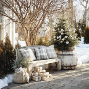
In many of the more refined front porch Christmas decorations, the idea of the tree has been stripped down to its simplest visual parts. There are no branches or ornaments—just smooth cones, sharply angled wooden sculptures, or minimal metal structures.
By reducing familiar holiday symbols into pure forms like cylinders or triangles, the display invites a different kind of attention. It’s no longer about identifying what something is supposed to be—it’s about noticing how it feels in the space.
These forms play with proportion and alignment. Their scale is often exaggerated, their placement asymmetrical, and their finishes matte or brushed, allowing them to read more like art pieces than festive props.
This reduction doesn’t erase meaning—it sharpens it, allowing each object to be understood by shape and stance rather than by decorative cue.

Selective Texture Play
Texture takes on a lead role in helping these abstract forms communicate their presence. A matte-finished cone surrounded by rough gravel, or a smooth ceramic orb tucked among dried grasses—these contrasts create subtle friction between materials, which helps anchor the more sculptural shapes.
What color steps back, texture steps forward. Without bold hues to rely on, these arrangements build richness through how light touches each surface.
Rough, fibrous elements like rattan, twig, or linen give visual softness. Sleek, solid finishes offer contrast.
Together, these relationships allow abstract pieces to suggest seasonal references without stating them outright. The result is calm but not flat, structured but not stiff.
This is where the design gains its depth—by focusing on surface, spacing, and contrast rather than decoration for its own sake.

Light as a Sculptural Element
Embedded Glow vs. Surface Decoration
In many of the most refined Christmas porch ideas, light isn’t added as an afterthought—it’s built into the structure. Trees wrapped tightly with warm white strands, glowing orbs set into natural bases, and translucent cones lit from within all show a shift in how light is being used.
Instead of draping a fixture in string lights, the entire object becomes a source of glow. These forms don’t sparkle or flash; they carry light in a way that feels part of their material.

This internal illumination smooths out contrast, letting edges blur and shapes soften. When a cone glows from its core or a hollow sphere lights up with no visible bulb, it creates the effect of volume lit from within—more sculpture than decor.
These pieces don’t act like props; they feel self-contained. They carry their own quiet energy, particularly at dusk, when the surroundings dim and the internal glow holds the visual weight of the porch.
This approach removes the visual clutter of wires and blinking points, replacing them with calm surfaces that glow evenly. In doing so, light becomes part of the shape, not an accessory to it—a key shift in the more sculptural direction modern christmas front porch ideas have taken.

Shadow and Silhouette
On the opposite end of the spectrum, some designs use light not to reveal form, but to contrast it. Flat silhouettes—like cutout deer shapes or slender winter trees—gain strength when lit from behind or the side.
The goal isn’t brightness; it’s contrast. These pieces create crisp shadows on walls or snow, changing their visual strength throughout the day.
What appears like a simple plywood cutout by daylight becomes a sharp, commanding form by night, thanks to the way lanterns or hidden lights shape the shadows. The precision of these lines gives the decor a dramatic edge—almost like a stage set, where each object has a role defined by its outline and position.
This type of lighting works by subtraction rather than addition. By keeping the light source unseen, the focus stays on silhouette and structure.
It’s a quiet but compelling strategy that turns everyday shapes into bold visual anchors.

Rhythmic Composition and Repetition
Deliberate Variation
Repetition often plays a key part in structured porch scenes, but the trick lies in how variation is folded in. A row of planters, for example, becomes far more dynamic when each pot holds slightly different contents—pinecones in one, cabbage heads in another, or subtle shifts in plant height and shape.
These small differences stop the eye from skipping over the setup. Even humorous elements—like identical cactus forms each wearing sunglasses—benefit from this.
The repetition sets the rhythm, but those subtle twists bring it to life. It keeps the display from slipping into monotony.
There’s a sense of pacing here, like beats in a composition—something visually musical.

Spatial Breath
Some christmas front porch decorations go further, turning the entire approach to the door into a spatial composition. Woven arches, tall curved rods, glowing grasses—these forms aren’t packed tightly.
They’re spaced with room between, which lets negative space take on its own value. The gaps between arches, or the distance between glowing elements, help define the feel of movement.
They pull visitors forward without rushing. Each pause between pieces becomes part of the design, letting the home’s structure peek through and frame the experience.
This rhythm, both in object placement and the space between them, creates a kind of visual cadence that feels intentional and paced. The front path becomes more than access—it becomes a visual and physical sequence, shaped by spacing as much as by objects themselves.

Material Dialogue with Architecture
Tone-on-Tone Harmony
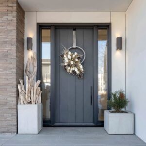
Some of the most visually grounded front door Christmas decor ideas come from setups that borrow directly from their own surroundings. This doesn’t mean matching every piece exactly—but drawing out the tones already present in the home’s materials.
For example, if the facade is stacked stone, then choosing planters or lanterns that echo the same gray or brown undertones will create a kind of visual thread between the architecture and the seasonal accents.

This approach lets the porch feel like a full composition rather than a base with decorations on top. On craftsman-style homes, you might see matte black or iron elements matching trim or railing, while natural wood tones reappear in wreaths, branchwork, or sculptural cones.
Even soft metallics—like brushed bronze or pewter—are chosen based on their relationship to siding textures or window frames. The effect is quiet and steady: nothing screams for attention, but everything fits.

Intentional Contrast
In other cases, the contrast is the entire point. Deep charcoal cones placed in front of equally dark cladding shift the viewer’s attention to silhouette rather than color.
A pure white snowman form placed on a black gravel base doesn’t fade into the background—it sharpens visually. This is a sharper style of composition, where the seasonal pieces stand apart as visual objects, not as extensions of the architecture.
Such setups don’t try to blend; they create pause. They mark the entrance like sculpture might mark a gallery—clear, deliberate, and aware of the space around them.
What makes this approach work is restraint: one large object, one high-contrast material, one shift in texture. The strength comes from simplicity.
In this way, even bold pieces can still support a minimalist layout. Whether blended into the materials of the home or deliberately pushed against them, these setups use material tone as a design tool, grounding the display in its surroundings—or pulling it forward into focus.

Natural Motifs Reimagined
Organic Weave and Transparency
In many modern elegant front door Christmas decorations, natural elements aren’t layered in the traditional way. Instead of garlands wrapping every beam or pinecones spilling out of baskets, the focus shifts to how materials are shaped, woven, and lit.
Loose rattan cones, for example, glow softly because their weave lets light escape in every direction. The structure isn’t hiding the glow—it’s part of it.
Twig stars hanging from a bare branch do more than decorate—they animate the porch with shape and shadow. These textures break up the rigidity of a brick wall or the flatness of siding.
Their airy structure creates a layer between architecture and open space, softening the lines without cluttering the porch.

Regional Storytelling
Some compositions pull their strongest elements from their local environment. In warmer regions, cactus sculptures replace fir trees, but with subtle adjustments—a red hat, a brushed finish, or a matte surface with sculptural curves.
In the Southwest, cubes of soft glowing light nod to luminarias, but reinterpreted in clean rectangular forms. These choices aren’t symbolic add-ons—they come from a reading of the place.
The materials used, the plant types, the way light falls on adobe or stone—they all shape what belongs. It’s not about reusing traditional icons in new colors—it’s about filtering the holiday through the textures and forms native to the location.
This approach anchors the design. It gives the display a sense of quiet familiarity that doesn’t need extra layers to explain itself.
Each element—whether a woven cone, a cactus in sunglasses, or a cube of light—is speaking the visual language of its surroundings. That’s where the strength lies.

Palette Restraint and Tonal Unity
Neutral Emphasis
Many front porch Xmas decorating ideas now lean into quiet, neutral color stories—tones that speak in layers rather than loudness. Creams, soft ivories, pale taupes, and brushed metallics like bronze or pewter are doing most of the work.
The absence of traditional holiday hues doesn’t leave the display flat—it invites texture, layering, and detail to take the lead. When color steps back, materials step forward.
A set of matte ceramic urns can hold dried winter branches without needing any color pop. Rattan spheres placed low near the entry, brushed in natural tan, add shape and rhythm.
Even soft gold or antique silver details, when used sparingly, fold neatly into this restrained palette. What ties it together is how the tones relate across surfaces—each one quietly echoing or softening the others, building a composition that feels cohesive without repeating itself.

Selective Color Accent
That said, even a fully neutral porch can carry tension and direction through one sharp point of color. A deep red twig arrangement in an otherwise muted setting draws the eye upward.
A thin red line etched into a matte black cone becomes a visual spark—small, controlled, and deliberate. These accents don’t need to shout.
Their power comes from contrast. When placed carefully, one mark of saturated color can hold the same presence as a full strand of lights or a garland-heavy railing.
The key is restraint—these accents appear once, maybe twice, and let the rest of the composition stay quiet. They guide attention rather than scatter it, giving the scene a clear focal point without unbalancing its mood.

Narrative through Form and Placement
Character Creation
Even in highly structured layouts, a sense of personality can appear in subtle but effective ways. A cactus sculpture topped with a Santa hat and sunglasses becomes more than decor—it takes on attitude.
A glowing sphere carved with delicate, leaf-like motifs suggests something handmade, even whimsical. These shifts from object to character don’t rely on volume or complexity.
What they do well is insert play into structure. The form stays tight, but the story becomes layered.
It’s not about making decorations look funny or cute—it’s about giving them just enough expression to feel alive. The effect can be charming or quiet, depending on the material and mood, but either way it brings dimension beyond the physical shape.

Visual Anchors and Pauses
Designs that read smoothly always have points where the eye can rest. These are the visual anchors—like a tall potted tree placed right at the threshold, or a set of twig stars suspended in mid-air to create a layer between sky and porchline.
These markers hold weight in the flow. A row of glowing ground-level starbursts or a carefully placed lantern on a wide stair tread isn’t just filler.
It’s a pause—a beat between other shapes. These are especially useful in scenes that include walkways or multiple levels, giving rhythm without clutter.
Even minimal front door Christmas ideas often have this structure built in: a few clear markers, spaced with intention, creating balance through what’s present and what’s left open. It’s this pacing—between elements and their emptiness—that gives a porch its clarity and pull.

Integration of Interior and Exterior Light
Dialogue Across the Threshold
One of the more subtle—but visually powerful—techniques seen in refined Christmas porch decorating ideas is how lighting bridges inside and out. Rather than treating the porch as its own stage, some compositions build a visual link that runs from the walkway to the window glow.
A soft amber light inside a living room—whether from a tree or a fireplace—can echo the tone of warm lights placed in the front garden or under porch eaves. This reflection makes the house feel whole, not divided by walls.

For example, glowing arcs shaped like grass blades outside might tilt upward while catching the golden tone from an indoor lamp nearby. A porch tree placed directly in front of a window might echo the shape or height of a tree visible behind the glass, their two forms connected by reflection and glow.
Even without symmetry, the alignment of warmth, tone, and rhythm allows light to pass visually through the facade.

This isn’t about brightness—it’s about tone. Matching the temperature of light, or aligning shapes seen from outside with those placed inside, gives the house a seasonal rhythm that doesn’t stop at the door.
The effect is subtle, but it makes the experience of viewing the porch more immersive. There’s no harsh divide.
The outside leads gently into the inside, forming one continuous seasonal composition.

Conclusion
What defines the most compelling modern scenes isn’t quantity or tradition—it’s clarity. Rather than layering garland over every beam or filling the yard with inflatables, today’s most memorable displays treat each element like a component in a spatial composition.
They use form, material, light, and spacing the way sculpture does—not to decorate, but to frame an atmosphere.

Cones replace trees. Frosted orbs take the place of ornaments.
Light is no longer strung across things—it’s embedded, reflected, or used to cast shadows. Materials are chosen to echo what’s already present—brick, stone, gravel, glass.
Where color appears, it’s often through one mark: a single red branch, a sliver of metallic, a tinted planter. Repetition is used with variation.
Scale is used with pause.

Christmas porch decorating ideas are about connecting with the structure of the home, reading the light at dusk, understanding how space moves from ground to entry. There’s depth here—not in the number of elements used, but in how they relate.
The result is a kind of quiet confidence that feels both seasonal and thoughtful, where meaning is built through shape and atmosphere, rather than icon or color.