Gallery walls have shifted far beyond neat rows of frames. In various styles—from desert cottages to urban split-levels—the way people approach decorating pictures on wall surfaces has become more layered, more spatially aware, and often more subtle.
These aren’t simply backdrops to furniture anymore. They behave like visual compositions that respond to architecture, light, and texture in a space.
What stands out in today’s best examples is how quiet the decisions are. A mirror nudged slightly off-center.
A textile framed instead of hung. A row of shelves holding framed sketches alongside ceramics, all placed to echo the weight and rhythm of nearby furniture.
None of these choices shout for attention, yet together they shape the entire tone of the room. This article explores the underlying moves behind these walls—the invisible grid lines, the soft material repetitions, the purposeful use of gaps, and the shifts in depth that create movement without adding bulk.
It’s less about symmetry and more about reading the room and finding balance that feels lived-in, calm, and naturally structured. Each section unpacks one of these quiet techniques and how they build a gallery wall that holds more than just images—it holds presence.

Architecture as Anchor, Not Backdrop
In some of the most compelling gallery wall ideas, the room’s structure becomes part of the artwork itself. Instead of treating architectural elements like fireplace columns, stair angles, or arched doorways as empty obstacles, they’re used as subtle guides that shape the layout.
These built-in features shift from passive surfaces to directional tools that shape how the wall is viewed.

One standout approach wraps art around a fireplace corner, where the tight angle might seem limiting. Instead, the frames wrap gently around the bend, softening the hard edge and turning it into a gentle pivot point.
The space gains flow—not through added objects but through a careful response to the wall’s bend. In homes with multi-level staircases, picture arrangements on wall tend to step upward in harmony with the incline.
The change in floor height is mirrored visually by a gentle climb of frames, so movement feels natural and deliberate. The rise in artwork keeps pace with how the viewer ascends the space, syncing physical movement with visual rhythm.

In homes influenced by Southwestern layouts, wall art often bridges two arched openings. The center of the display features one tall vertical piece that seems to grow right out of the space between the arches.
Instead of being squeezed in afterward, the wall arrangement feels like it grew with the home from the start. The way to design a gallery wall here begins by looking at the structure first—taking hints from vertical thrusts, sloped ceilings, or alcove depths.
When those architectural cues guide the frame layout, the result looks embedded and whole, not added on.

Controlled Imperfection as a Design Tool
While symmetry is often seen as a sign of order, these gallery wall inspo examples show that tiny imperfections are what make a space feel relaxed and thoughtful. These small variations act like a breath between notes in music—they keep the eye moving, introduce softness, and make the composition feel natural rather than staged.
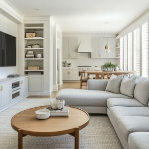
In a casual living space, art surrounds a mounted TV. The spacing between the pieces is slightly uneven on purpose, with one vertical stack placed lower and the top edges floating just off perfect alignment.
This kind of asymmetry doesn’t create chaos—it adds personality. The visual tension it creates feels quietly confident, not rigid or overly planned.

Another example features a gallery wall where a shelf interrupts the expected clean rectangle. It holds sculptural pieces that slightly overlap the top edge of the nearby frames, drawing the gaze upward without pulling focus.
That decision breaks the grid on purpose and replaces it with vertical energy. In a mid-century-style entryway, a small cluster of frames starts strong on the left but trails off intentionally near the top right corner.
This negative space isn’t a mistake—it acts as a pressure release near a mirror and a doorframe, preventing visual clutter at the threshold. These tiny variations only work because they echo something else in the room—be it a line from a mantel, a window edge, or a piece of furniture.
The order is sensed before the irregularity is noticed, which is why it feels controlled rather than off.

Depth Without 3‑D Objects
Adding dimension to a gallery wall doesn’t require sculpture or bulky installations. Ideas show how simple tricks inside the frames themselves can build depth and shadowplay while keeping the wall clean and uninterrupted.
Deep-profile frames are used to give a sense of distance within the artwork. Some images appear recessed, set back behind thick mats, while others stretch nearly edge-to-edge with little space around the artwork.
This subtle mix adds rhythm across the layout without crowding it.

Elsewhere, the matting depth varies between pieces. Some have wide white borders that push the artwork inward, while others are tightly framed, bringing the image to the front.
The viewer’s eye reads this layering instinctively, adding motion and spatial variety without a single object protruding from the wall. An especially light-handed example uses transparent acrylic shelving.
The shelves almost disappear against a pale backdrop, and the framed pieces rest on them at a slight tilt. The artwork seems to float, and the shelves allow cast shadows to become part of the visual experience.
The wall remains flush, but the overall effect is rich with layering. By mixing frame thickness, mat depth, and even glazing finish, the wall gains subtle volume.
These shifts are often measured in millimeters, but their impact can mimic the relief of sculpture without adding dust-collecting surfaces.

Color Echo Strategies Beyond Obvious Matching
Strong color themes don’t always come from matching. Often, visual unity is built through more subtle repetition—tones that echo in quiet ways across art, walls, and furnishings.
Instead of pairing blue cushions with blue paintings, some picture wall ideas focus on how materials and surfaces pass color between each other with a quieter hand. A good example is the use of a clay-colored feature wall, where similar earth pigments appear again inside the artwork—not as direct matches, but as soft, brushed tones that settle into the same visual family.
This creates a connection where the wall becomes part of the gallery itself, rather than a backdrop. Furniture pieces, like boucle chairs or bleached wood tables, then add contrast without competing.

In another room, a set of framed seasonal tree studies progresses from light and spare to bold and dense. This shift parallels the feel of changing daylight across seasons—a conceptual move rather than one based on matching any textile.
The eye senses a rhythm instead of a theme. A space can use a large terracotta abstract above the fireplace as the main voice, while all other surrounding artworks hold back.
Framed in cream or black, they act as quiet punctuation rather than speaking over the central piece. This gives breathing space to the bold choice without losing cohesion.
This approach to color doesn’t rely on repetition. It works by finding one vivid moment and letting everything else support it through tone, texture, or quiet contrast.
It’s a lesson in restraint that modern gallery wall ideas often use to hold a room together without being loud.

Light as Dynamic Frame
What frames the artwork isn’t always a border. In many cases, the frame is cast by light—shifting, narrowing, or expanding the mood depending on the hour.
Lighting shapes how a grouping is read, quietly organizing the scene by directing where attention lands. Brass gallery lights are one example: when placed over a top row, they create a focal line that turns select pieces into highlighted elements after dark.
It adds a subtle hierarchy, especially when used on deeper colors like navy or charcoal walls. In more casual rooms, like those with woven pendants, light takes a more playful role.
The pattern of the shade gets echoed in the wall, layering new shapes on top of the artwork when the sun drops. It’s not fixed—it breathes with time.

In desert-inspired homes with niches, tight spotlighting turns a small grouping of art into a focal column. It separates the frames from the concrete or stucco around them, giving clarity and a sense of containment without any physical divider.
Light, in some examples, is used like an invisible frame that shifts throughout the day. Instead of treating it as an afterthought, these art gallery wall ideas make lighting part of the composition.

Shelf‑to‑Gallery Dialogue
Shelves do more than hold things—they often speak to the rhythm of the wall. In many gallery layouts, a horizontal line at the base of the arrangement doesn’t act as furniture; it becomes part of the composition.
Whether it’s a floating wood plank, a narrow ledge, or a see-through acrylic tier, the shelf becomes a quiet stabilizer. One approach places a wood shelf directly below a TV, matching its width so that both feel like one unified block.
This holds the grouping together and keeps the artwork and technology from feeling detached. The shelf isn’t decorative—it’s structural in how it controls the visual width.
Another example blends framed textiles and soft artwork with tilted books and pottery, all resting on a slim ledge. The slightly uneven lean of the objects mirrors the small irregularities in the framed items above, giving the layout a relaxed but deliberate tone.

Transparent shelving introduces another option. With almost no visual weight, the acrylic shelf lets the art appear to hover.
Yet it still holds space for small ceramics or natural pieces that tie back into the subject matter of the artwork—allowing the shelf to speak the same language as the wall. These layouts show how horizontal elements ground a picture wall and add rhythm beneath the art.
It’s a balancing act where the shelf functions as a steady line beneath the varied verticals, a key technique used in many modern gallery wall ideas.

Negative Space as Active Element
The spaces between the frames are doing just as much work as the art itself. In these layouts, blank areas aren’t leftover gaps—they’re intentional shapes that give rhythm, rest, and architectural awareness to the display.
These gaps help form a balance between tension and calm, and their role is especially noticeable in tight spots like hallways and entry walls.

In one small entryway, the top right corner of the gallery wall is purposefully left open. That empty quadrant mimics the rectangle of the nearby doorframe, drawing a soft visual connection between the art cluster and the built environment.
It’s a quiet but effective way of tying the layout into the room. Elsewhere, a grid of botanical fruit prints leaves slim vertical air channels between framed art and table lamps.
These channels don’t break the grid—they complete it. The spacing forms an invisible column that connects lamps, art, and table surface into one vertical unit.

In a compact desert-style living space, a small gallery wall idea avoids uniform spacing entirely. Instead, the frames are staggered around a corner, and the unequal gaps create a loose rhythm.
Open spaces act as a matte around the grouping, softening edges and avoiding visual weight. Negative space isn’t accidental here—it’s a compositional layer.
These layouts treat blank zones as part of the story, and they’re especially powerful in picture arrangement ideas for walls where architecture cuts across the canvas.

Frame Material as Secondary Palette
Frame color isn’t the only way to create variety—texture, sheen, and finish all play a part in how a gallery wall carries light and rhythm. Frames can be treated as micro-surfaces that shift the mood subtly, sometimes catching reflections, sometimes muting the edge.
It’s a form of layering that doesn’t rely on new objects or bolder artwork. Muted metallics are used with care—brushed brass, antiqued gold, soft pewter—all of which add a hint of richness without going shiny.
They introduce warmth or contrast, depending on where they sit, but they don’t overpower the art they surround. Some layouts use different types of glass to shift the viewer’s experience: standard clear, non-glare, or even slightly frosted.
These variations bend light differently, causing one piece to pop while another recedes depending on the angle of the room. It’s a trick that adds variety without clutter.

In one split-level stairwell, identical light wood frames are hung in an ascending line. The consistency in frame tone creates stability, but the mats inside vary—some are deep, others narrow—so the eye still gets movement.
The material repetition keeps it grounded; the inner shifts keep it active. In accent gallery wall examples, the choice of material adds tone and tempo to the whole.
Whether it’s the patina of a frame or the way glass interacts with the light, this subtle detailing helps the art breathe.

Narrative Through Sequence and Gradient
Some walls speak through order. Without changing subject or theme, the arrangement alone tells a story—through color shift, spacing, or image weight.
These layouts invite the viewer to move with the frames, tracking a sense of rhythm that unfolds over distance rather than loud contrast. A seasonal tree series starts light and airy on the left and gradually grows darker and fuller to the right.
It’s a simple idea, but the effect is strong—it mimics natural progression and quietly mirrors the changing of light through the seasons.

Another wall uses tonal placement as its guiding thread: richer colors are positioned low, paler ones higher. This reversal of shadow logic draws the eye upward.
In homes with limited vertical space, this lift makes the wall feel taller and the grouping more dynamic. In stairwells, the wall becomes a ramp for the eye.
Frame sizes increase with elevation, so as the person climbs, the visuals feel like unfolding panels. It’s not an obvious storyline, but one that follows the movement of the home itself.
This sense of visual narrative doesn’t depend on theme—it’s structural. Even small gallery wall ideas benefit from choosing an arc, whether it’s color, brightness, or scale.
The story lives in the sequence, not the subject.

Textiles Inside Frames—Depth and Warmth Without Bulky Objects
Gallery walls that include framed textiles bring in a layer of softness that’s hard to replicate with paper or canvas alone. Woven fabrics, stitched details, or pressed linen pieces introduce fiber content into the arrangement, yet they stay within slim profiles that keep the wall surface flat and easy to balance.
When placed inside box frames, these materials create gentle relief. The edges cast subtle shadows that shift through the day, offering a quiet sense of movement.
This kind of framing doesn’t overpower the space—it settles in, adding visual warmth without weight.

Often, there’s a shared thread between these framed pieces and nearby decor. The same oatmeal tones or handwoven textures might appear in a throw on the sofa or the cushions along a built-in bench.
These echoes link the vertical wall to the horizontal plane of the room, grounding the art as part of a full environment. In spaces where sculpture feels too heavy or shelving too busy, framing textiles offers a way to introduce texture, tactility, and softness.
It’s a thoughtful solution for arranging picture frames on wall surfaces with minimal depth but maximum impact.

Mirror Placement as Light Engine and Breathing Valve
Mirrors are often part of gallery wall groupings, but they rarely sit at the center. Instead, they’re used to redirect light, break up dense layouts, or lend relief between detailed frames.
Their value lies in what they reflect—and in what they allow the wall to do visually. An antique mirror set slightly off-center, for instance, might catch morning light from a nearby window and scatter it softly across neighboring artwork.
It gives the eye a place to rest and shifts the focus just enough to keep the wall from becoming visually cramped.

In another layout, a mirror tucked left of the main cluster redirects brightness into a dim corner of the room—bringing life to a seating zone otherwise tucked under built-ins. It doesn’t need to shout to serve its role.
Some ideas show that mirrors aren’t used to fill space—they shape it. Thoughtfully placed, they support the overall picture without demanding attention, helping the gallery breathe and shift along with the room.

Furniture as Echo, Not Background
In many photo picture wall ideas, the furniture below or around the gallery isn’t treated as separate. It joins the composition by echoing the forms, textures, or rhythms already present in the artwork.
The room reads as one visual piece—floor to ceiling. Bouclé armchairs pick up the stippled strokes of graphite prints.
A raw wood shelf under a stair gallery mirrors the loose, hand-drawn lines of abstract pieces above. Even a herringbone wood floor can add diagonal energy that balances the calmness of a grid-style arrangement.

What’s important here is the quiet repetition. The textures don’t match exactly, but they speak the same language.
That echo makes the wall feel like it belongs to the room, not layered on top of it. These relationships—between seat and sketch, between shelf and silhouette—blur the line between décor and display.
The gallery wall becomes part of the room’s rhythm, not an object apart from it.

Closing Synthesis
What makes an art wall feel complete isn’t how many frames it holds. It’s how all the elements—the shadows inside mats, the slight sheen of a frame, the spacing between shapes, and the alignment with a shelf edge—come together with restraint.
The smartest layouts don’t scream for attention. They respond to what’s around them.
One of the most effective moves are quiet: a frame that picks up the grain of the floor, a mirror that softens a shadow, or a textile that folds the wall into the fabric of the room. The result is a composition that feels integrated and relaxed.
Whether working with bold pieces or subtle ones, these kinds of art wall inspo approaches show that thoughtful alignment matters more than scale. The wall becomes an active surface—alive not through volume, but through rhythm.