In some homes, the bathroom is treated as a backdrop—functional and finished, but rarely the room that holds visual weight. That expectation has shifted.
Many spaces now put just as much focus into the bath layout as they do the kitchen or main living area, using materials, proportions, and lighting not to impress, but to fine-tune how the space feels.
This article looks closely at how that shift happens—how quiet moves with light, surface, shape, and volume can completely change a room’s atmosphere without resorting to statement pieces or saturated color. Across the range of styles explored here, each bathroom shows its strength through composition: mirrors and ceilings that align intentionally, textures that feel crafted rather than coated, and lighting that works with materials instead of simply revealing them.
What stands out isn’t a single formula but a mindset. In many of these layouts, visual softness comes from contrast in gloss, shadow, and edge—not from decorative items or bold pattern.
It’s a kind of construction fluency that’s starting to define a new layer of luxury bathroom inspiration, one where attention is drawn not to what’s loud, but to what’s carefully controlled.

Disclaimer: This article is intended for general informational and aesthetic purposes only. It does not constitute professional design or construction advice. For project-specific guidance, consult a licensed architect, designer, or contractor.

Spatial Illusion
The sense of space in many modern designer bathrooms is no longer dictated by square footage alone. What appears to be a generous volume is often carefully composed through alignments and reflections.
One standout technique is the use of full-span mirrored ceilings that don’t simply reflect what’s below—they visually extend the entire room upward. When these mirrors are placed in direct line with vanities or counters, they create a visual corridor that reads like one uninterrupted surface, from floor to ceiling.
That alignment causes the mirror’s edge to vanish into the plane of cabinetry, giving the space an illusion of stretching vertically beyond its structure.

Lower down, lighting is employed with equal precision. Plinth lighting positioned just behind the vanity base avoids direct floor illumination.
Instead, the light hits slightly behind, producing a gentle glow under the cabinetry. The absence of a visible toe kick creates a floating appearance—especially effective when paired with pale flooring, which diffuses the glow softly.
It’s this optical gap that tricks the eye into losing track of the floor’s boundary.

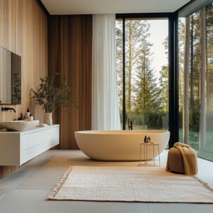
Bathing areas benefit from a similar kind of spatial framing. Whether lifted on a platform or sunken into stone, a tub set apart from the main floor level feels more like a sculptural centerpiece than a fixture.
It becomes an object that belongs inside the room rather than one integrated into the floor slab. This subtle separation adds visual breathing space, making the surroundings feel more expansive.
It’s a move frequently seen in luxury bathroom ideas where each element is placed with measured intention, offering space not only for use, but for visual pause.

Light as a Building Material
In many of today’s most compelling bathroom interiors, lighting no longer serves a background role. It becomes a structural player—shaping how walls are read, where sightlines travel, and how surfaces behave throughout the day.
Backlit materials, especially translucent stones like onyx, aren’t simply decorative. When the veining in the stone is intentionally matched to vertical LED placement, the result is a kind of visual activation: mineral textures seem to glow from within, giving the impression of molten layers frozen mid-flow.
This animation, subtle and constantly shifting as light and position change, turns wall surfaces into living textures.

Suspended lighting introduces its own quiet disruptions. By positioning pendant lights slightly off-center—rather than in the predictable axis above a bathtub or vanity—the balance of the room shifts in tone.
Symmetry can sometimes feel rigid. A pendant that leans gently to one side relaxes the arrangement, softening the visual rhythm while still keeping the composition deliberate.
This is particularly effective in settings where material symmetry is otherwise very strict, such as those with centered mirrors or strong grid lines. One of the more creative applications of light appears in sloped ceiling spaces.
Here, an integrated LED strip follows the angle of the pitch—not just lighting the ceiling, but drawing attention to its form. What might have been an awkward slope becomes the leading line of the entire room.
By tracing this incline with warm indirect lighting, the space shifts from boxy to sculptural. These gestures define why lighting is so often the difference between a standard remodel and the kind of designer bathrooms that stay memorable.

Material Storytelling Beyond Surface Finish
Some of the most thoughtful luxury bathroom design choices aren’t the most obvious. They’re found in how materials are treated, reversed, or placed out of expectation.
One example is banded concrete walls that move through soft tones like dusty pink, pale taupe, and chalky blue—not flashy, but deeply structured. These layers echo sediment, quietly referencing geological history.
Each stripe marks a kind of time stamp, subtly guiding the eye from ceiling to floor. It’s a narrative told in color and surface depth, rather than through decoration.
Against this backdrop, other elements step forward—like leather-strapped mirrors, which contrast the stone’s permanence with a gesture that feels crafted by hand.

Metal, too, tells its own quiet story. Hammered copper basins and oxidized copper panels bring warmth not only in tone but in behavior under light.
The texture is irregular, intentionally uneven, catching highlights at an angle and creating movement across the surface. This type of metalwork feels more at home in cookware or aged architectural doors, but in these bathrooms it rises to eye level—inviting warmth where hard materials often feel cold.
It’s a detail that affects how the room flatters the skin and brings human scale back to a space that could otherwise lean sterile. Even the way stone is finished can reverse expectation.
A vanity with a rough-cut quarry edge placed at the user’s fingertips breaks the typical polish-first approach. Normally, the high-contact areas are sanded smooth and the drama is left for vertical planes.
Here, that logic is flipped—the user experiences the raw, textural face of the stone every time they lean in. Behind it, the wall cladding is smooth, reflective, even refined.
This inversion puts craftsmanship where it matters and allows authenticity to sit where it’s felt most directly.

Geometry as Emotion
In many of today’s more considered interiors, form does more than carry style—it changes how the room behaves. Arches are one example.
Rather than serve as decorative callbacks to older architectural styles, they perform a very specific function in acoustics. The curved shape softens how sound moves, diffusing splash and echo in a way that feels noticeably calmer.
Especially in a shower alcove or bath recess, that curve reshapes the atmosphere through physics rather than styling.

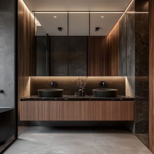
Another tactile feature used to shift how light moves is vertical fluting. Whether on the surface of a concrete sink or lining the face of a soft-glow wall sconce, fluting compresses contrast.
It pulls light and shadow into tight repetition, which then reacts to motion—flickering subtly under candles or pendants. What’s static on paper feels alive in real use.
It’s a texture that behaves almost like fabric, especially in dim rooms where every glint matters.

There’s also a different kind of dimensional play happening in some layouts through negative space. In bathrooms that use cubed glass partitions with recessed wood niches, what feels solid at first glance is actually full of absence.
These cutouts aren’t applied storage; they’re voids carved into form. The absence of material gives the eye something to explore, pulling attention inward and shifting the perception of scale.
For smaller rooms especially, this changes how time moves in the space—slowing it down and turning function into contemplation. It’s one of the more understated approaches often seen in high-end homes exploring fresh luxury master bathroom ideas where space is treated with precision rather than excess.

Chromatic Restraint & Micro‑Contrast
Color, when used with restraint, often speaks more convincingly than a full spectrum. In high-end bathroom design, it’s common to find a single hue stretched across various materials, each chosen not for contrast but for subtle shifts in sheen and surface.
A deep charcoal palette, for instance, may run from satin-finished plaster on the walls to honed stone underfoot and a slightly rawer finish on the ceiling. This quiet gradient helps distinguish zones without changing tone, side-stepping the dated habit of using color bands or tile borders to define function.

Another example lies in how surface variation is built directly into material. Indigo tiles, slightly uneven in glaze and tone, bring movement that can’t be replicated by flat color.
The light never lands evenly. Instead, each tile reacts differently, giving the wall a kind of pulse.
Brass fixtures layered on top do more than provide contrast—they echo the warmer notes inside the blue glaze, pulling harmony from complexity and linking materials through undertone rather than brightness. In some layouts, marble takes center stage, but even then, it’s paired with care.
Rich mauve stone might carry heavy veining in umber and oxblood, but a single abstract painting hung nearby—white base, dark brushstrokes—prevents the weight from settling too deeply into the palette. That pairing doesn’t compete.
It calibrates. The art brings air between materials, allowing the room to feel full without becoming heavy-handed.
This balancing act is often found in modern luxury bathroom design where contrast is dialed low, but intent is sharp.

Tactile Hierarchy
The best interiors consider not only what meets the eye, but also what meets the hand. Many upscale bathroom ideas rely on a careful split between what should feel soft to the touch and what should catch the light.
It’s common to see finishes kept intentionally matte in high-contact areas—think of the edge of a stone counter or a stretch of plaster at waist height. These surfaces avoid unwanted smudges, reduce glare, and feel grounded.
Then, just above, the finishes shift—lacquered cabinets, polished tiles, or reflective stone reaching up toward the ceiling. This shift lifts the room vertically without drawing attention to itself, balancing tactility with visual brightness.

Rounded vanity corners are another subtle but deliberate move. These forms aren’t chosen only for safety or ease of movement.
Their curved profiles catch broader light, creating soft transitions in highlight and shadow. This makes the material appear more substantial, almost as though the vanity were carved from something thicker than it is.
It’s a trick of edge geometry that communicates weight without actual volume. And there are small but impactful choices that make daily use smoother.
Slim wall-mounted taps, for example, don’t only clear the countertop—they make cleaning easier. A single cloth swipe passes beneath them without interruption.
These decisions aren’t driven by ornament but by use. The design language here isn’t loud, but it speaks clearly through how the hand interacts with the space.

Key Takeaways for Advanced Design Thinking
Across many luxury master bathroom design ideas, it’s clear that visual impact isn’t built from loud finishes—it’s constructed through careful alignment. When floors, mirrors, and ceilings act as a continuous envelope, the room stops feeling like a series of planes and starts reading as a single volume.
Reflections connect with materials. Angles blur.
Light sources lose their origin point. The perception of space stretches far beyond what the floorplan allows.

But light here isn’t uniform—it’s tuned. Stone surfaces glow under soft uplighting.
Metallic details react to narrow-beam spotlights. Texture picks up from edge glows hidden inside ledges or cabinetry.
Each layer of lighting tells a different story depending on what material it hits. This kind of lighting design becomes part of the composition, never applied after the fact.

Materials take on sculptural roles too. Raw stone edges, oxidized metal, brushed plaster—each tells a story that feels physical.
These surfaces aren’t just treated; they’re chosen for their character and allowed to carry visual weight without ornament. Even the layout benefits from functional forms—arches that quiet sound, fluting that moves light, slopes that guide the eye.
Geometry here has a job to do. Instead of bold color blocking or contrast, these spaces rely on subtle differences.
A soft grain shift in wood, a low-gloss change between tile and grout, or a barely-there seam in stone—these are the moves that shape rhythm without drawing attention. It’s a palette of restraint, where every detail is deliberate, but no one element overshadows the others.
In the end, what makes these rooms feel resolved is how precisely each piece fits into the whole. Nothing shouts for attention.
The success lies in how the light, form, and material seem to agree on one quiet point: that the room feels complete without needing to explain itself.