Bay window valance ideas often reveal how a simple upper fabric line can shape an entire niche. These concepts go far beyond adding a soft accent; they show how color, rhythm, silhouette, and visual boundaries interact to form a small interior within the larger room.
By looking closely at recurring patterns and subtle design moves, it becomes clear how a bay gains its character, mood, and sense of structure through the textile that crowns it.
Bay window valance as a soft architectural ceiling inside the room
The bay valance often behaves less like a piece of fabric stuck over glass and more like a secondary ceiling line drawn in textile. A few interesting visual effects:
- The top edge as a “false ceiling” inside the bay
By running the valance snug to the crown moulding or almost touching the main ceiling, the fabric line becomes the point where the eye decides, “This is where this wall stops.” Even if plaster continues above, the brain accepts the textile as the visual top.
In a bay window, this matters even more than on a flat wall because the bay itself already creates a mini-room. The valance line becomes the ceiling of that mini-room, making the bay feel like a built alcove rather than an accidental bump-out. - Mini-ceiling vs main ceiling
Often, the overall ceiling is high and the bay valance sits lower than the crown, almost like a hood dropped over the glass. This creates a subtle nested feeling: the main room stays airy, but the bay reads as a more intimate “pocket” with its own lowered canopy.
That contrast is a powerful mood tool: the person seated in the bay feels sheltered, even though the edges of the space remain open to the rest of the room. - The valance as a visual cornice for the furniture, not just the window
When there is a sofa, banquette, or reading seat tucked tight into the bay, the valance line acts like a crown moulding for the furniture silhouette below. The curve or straight band above echoes the line of the backrest under it.
This creates a stacked structure:- top: fabric “ceiling”
- middle: glass and curtains
- bottom: upholstery and cushions
This stacking is what makes the whole bay feel like a single composed scene rather than a mechanical arrangement of window plus furniture.
Main rule:
The bay valance quietly defines a separate optical ceiling for the niche; its top line matters as much as a ceiling soffit in how the bay feels.

Curves, arcs, and why they are so persuasive in a bay
There are can be soft arcs that sweep from one side of the bay to the other, often with slightly deeper dips at the center or at pivot points between angled windows. Those curves are not just “pretty”; they are solving several visual problems at once:
- Pulling multiple window faces into one gesture
A bay is essentially a set of planes at angles. Without fabric, the eye jumps from frame to frame, seeing “three windows” or “five windows.”
A single continuous arc across the top erases that fragmentation: the eye sees one soft line, then reads the glass below it as variations inside a single gesture. This is how a bay stops feeling like a group of windows and starts feeling like a continuous niche. - Softening the geometry of the seat below
If sofas, benches, and cushions in bays are quite rectangular, then the arc of the valance softens that rectangle and stops the seating area from looking too stiff. It is the visual “smile” that floats above all the straight seams and corner joints. - Directing gaze
A curve that dips slightly lower in the center pulls attention toward that middle pane of glass or toward whatever sits under it (sofa center, coffee table, small side table, window seat cushion).
In other words, the lowest part of the valance arc is quietly choosing the exact center of the focal point for the whole bay vignette. - Managing visual weight in a multi-angle bay
Where the bay changes angle, the fabric often has tiny diagonal tucks or angled folds. Those cuts are doing more than accommodating the corner: they soften the sharp angle, turning it into a flow instead of a pivot point.
Regular observers will notice “nice drape,” but what is really happening is a conversion of geometric corner into soft directional movement.
Key point:
The curve of a bay valance is a control tool for how the eye travels: it fuses multiple panes into a single field and chooses where attention lands in the niche.

Rhythm: how folds talk to mullions, panels, and cushion seams
One of the quiet tricks is synchronizing textile rhythm with the fixed geometry of the bay:
- Folds that negotiate with mullions
The valance fullness is planned so that:- either a fold falls exactly over a mullion
- or a valley between folds aligns with a vertical frame
The result is a subtle conversation between soft verticals (fabric shadows) and hard verticals (wood or metal mullions).
This keeps the area from feeling chaotic: even though the cloth moves and changes, it feels respectful of the underlying window structure.
When there are pinstripes or pattern bands, they often:
- echo the verticals of the mullions (fine stripes aligned with window bars)
In both cases, the pattern does not fight the geometry, it clarifies it. Which also means the bay reads as “planned graphic composition” rather than random fabric.
Folds of the valance often mirror:
- the number of seat cushions
- the placement of a central cushion vs side cushions
- or the vertical paneling lines below the window
That repeating rhythm makes the bay feel like a single object. Think of it as visual rhyme: the top edge “rhymes” with the seams lower down.

Main idea:
Bay valances work best when their folds and pattern align – or intentionally counterpoint – the window grid and the upholstery seams below. The valance is not a floating ornament; it is the top line of a carefully tuned rhythm.

Pattern scale: from “warm haze” to graphic statement
Bay window valance ideas can have small-scale patterns on soft grounds, like tiny dots or fine motifs that read almost solid from a distance, then resolve into texture up close. This choice has very specific visual outcomes in a bay:
- From far: a color wash
Tiny motifs blur into a “haze” of color when seen from the middle of the room. The bay valance becomes a colored band rather than a busy print. That keeps the upper part of the room calm and avoids visual noise competing with art or lighting. - Up close: textile richness
Once someone sits in the bay or walks nearer, those tiny dots or micro-patterns reveal themselves. The bay becomes more intimate and interesting at short range without becoming loud in the overall room view. - Pattern concentration near edges
Patterns can be denser in a bottom band or in a border; this band often aligns with a mullion crossbar. That turns the lower edge of the valance into a strong visual line, giving structure to the softness. - Pattern as mediator between inside and outside
When the pattern colors pull from both interior elements (sofa fabric, rug) and exterior tones (trees, sky), the valance becomes a color bridge between inside and outside, making the view feel more integrated into the room rather than something separate.

Key idea:
Micro-scale prints on bay valances allow two readings: calm color field from a distance, detailed fabric experience when seated in the niche. This two-level behavior is perfect for spaces where people both view and inhabit the bay.

Color strategies: blending, bridging, or contrasting
There are three popular color strategies for bay valances, each with a distinct visual function:.
Valance close to wall color
- The valance almost disappears into the wall tone, functioning more as shadowed plaster than fabric.
- This pushes focus onto shape and volume: the arc, the folds, the depth.
- Ideal for:
- subtle, restful rooms
- bays where the main interest is the view or the furniture, not the textile itself.
Visual effect: the niche feels “built in. ” People notice how relaxing and unified the area feels without necessarily knowing why.

Valance as a soft bridge between wall and upholstery
- The fabric color is somewhere between the wall and the sofas/benches below.
- This makes the bay feel layered but friendly, with no sharp jumps in tone.
- It also keeps the window from feeling like a separate, bright hole in the wall; the gradation steps you gently from wall to seat.
Visual effect: the bay acts as the transition zone between architecture (wall) and lifestyle (furniture).

Valance as quiet contrast
- The fabric is visibly darker or lighter than both wall and curtains but still in the same family.
- The valance becomes a subtle graphic header to the bay.
- Works well when:
- the bay is meant to be a deliberate focal point
- you have very calm walls and need one strong horizontal band to anchor the scene.
Visual effect: the eye immediately recognizes the bay as a feature corner of the room, even before noticing the furniture arrangement.

Key hidden rule:
Color choice on a bay valance is less about “nice shade” and more about what role the bay plays: dissolving into architecture, bridging between wall and furniture, or acting as a deliberate focal band.

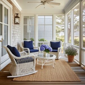
How valances shape the mood of the bay as a “room within a room”
Bay windows naturally suggest a separate area: a reading nook, a tea corner, a small lounge. The valance can reinforce or soften that “room within a room” feeling.
- Wrapping vs front-only valances
- If the fabric wraps around the side faces of the bay, hugging the angles, the bay feels enclosed and cocoon-like. Great for reading, morning coffee, or quiet seating.
- If the valance remains front-facing and stops short of the angles, the bay remains more open to the room, acting like an extended part of the main wall.
Visually a deeper, more sculptural valance reads as closer and more physical. This brings the niche “toward” the viewer and makes it feel more intimate.
A flatter, slimmer valance reads like a line drawn in the air: more graphic, less enveloping.
When the top of the cushion sits low relative to the valance, the bay feels tall and airy.
When the seat is high and close to the sill, the valance, sill, and cushion form a compressed vertical composition that feels like a snug alcove. People may feel gently held by the space.

Key rule:
By controlling softness vs graphic clarity, and wrapping vs front-only placement, bay valances decide whether the niche is a cocoon or an extension of the main room.

The interplay of valance with curtains, blinds, and side panels
A few relational patterns ideas:.
- Valance + full-length drapery
- The valance is all movement; the drapery below is strongly vertical.
- Together they create a visual sentence: curved “accent” on top, calm “paragraph” below.
- This is especially effective when the drapery and walls are close in color; the valance becomes the main rhythmic event in the bay.
- The valance hides the top of a shade line, so the only visible soft horizon is the fabric band
- Side panels that are mostly decorative work as vertical columns framing the bay.
- The valance stitches those two vertical columns together at the top, turning three separate soft elements into one frame.

Key point:
In bay windows, the valance is the organizing header that reconciles many moving parts (shades, curtains, glass, mullions) into one calm composition.

Edge finishes and silhouette details that silently signal quality
- Soft scallops with structured upper edges
A perfectly straight top (close to crown) combined with loose, rounded scallops at the bottom gives a clear message: this is not random fabric; it is designed.
The straight top line aligns with architecture; the softly changing bottom line adds romantic movement. - Very shallow “waves” instead of dramatic swags
Waves can be modest in depth. That restraint suggests a modern sensibility: the fabric shapes are present, but they do not try to dominate the whole wall.
This is a valuable point: shallow movement feels much more current than deep, theatrical swags in bay windows. - How shadows play on the folds
Bay windows already throw complex shadows because of angled sides. When folds are controlled and measured, the shadows fall in regular vertical stripes, which keeps the bay from looking chaotic in changing light.
Key rule:
In modern bay concepts, refinement comes from measured silhouettes: straight top + restrained bottom curves, with shadows acting as soft vertical stripes rather than chaotic blotches.

The bay valance as a framing device
A bay is always dealing with two scenes at once: the view outside and the design inside. The valance quietly negotiates between them.
- Framing the view like a painting
If the bottom edge of the valance lightly skims the top of the visible outdoor scene, it behaves like the top edge of a frame.
Valances can be dip just enough to give the outside view a clear rectangular or arched “window” shape. This makes the outdoors feel curated, less raw. - Framing the furniture composition inside
At the same time, the upper fabric line can sit in relation to artwork, lamps, and seating inside the room.- It might echo the height of nearby door heads.
- It might line up with a bookcase top.
- It might sit slightly lower to emphasize the bay as its own area.
The outdoor scene changes all day; the valance does not. That contrast is important: the textile band is the stable element that lets the eye “anchor” in all the flickering daylight shifts. Without that soft, stable line, bays can feel visually restless because glass dominates.
Insight:
The bay valance is the one constant in a constantly changing light-and-view scenario, acting as a soft, stable horizon that anchors both interior and exterior scenes.

Wrapping Up
- The valance often acts like a secondary ceiling inside the bay.
Its upper line is frequently read as the visual top of the niche, creating a defined upper boundary rather than sitting as loose fabric over glass. - A single continuous gesture across the bay creates a unified alcove.
One uninterrupted sweep or band commonly makes the entire window group design read as one formed space instead of several separate openings. - The rhythm of folds often corresponds to the bay’s structural grid.
Fabric shadows and window divisions can echo one another, forming a steady visual cadence across soft and hard surfaces. - Patterns with dual-scale behavior appear frequently.
Tiny motifs or fine stripes tend to create a gentle wash of color from a distance while offering richer surface detail at close range, which suits bays that include seating. - Color choices often reveal the bay’s role in the room.
- Valances close to the wall tone usually create a calm, integrated look.
- Mid-tone connections between wall and furniture form a subtle transition zone.
- Light contrast positions the bay as a clear visual focus.
When the valance reaches around the angled faces, the bay feels more enclosed; when it stays mostly frontal, the bay reads as an open extension of the room.
Shallow movement, a clean upper edge, and steady folds create a composed outline without dramatic theatrical curves.
Its position influences how much sky or landscape appears, functioning as a soft cropping tool within the overall composition.
In bays with several window planes, blinds, or shifting light, the fabric band becomes the consistent horizontal element that organizes the scene.
It shapes the small interior formed inside the bay, giving it tone, structure, and connection to the surrounding room, rather than acting as an isolated decorative piece.