People usually arrive at two-tone kitchen cabinet ideas because they want a kitchen that feels clearer and more designed without making the design feel busy. The surprising part is that the strongest two-tone kitchens don’t “pick two colors” first.
They build a hierarchy: what should feel light, what should feel grounded, what should quietly connect those two zones, and what should act as the outline, so everything stays readable.
Below is a deep read of the decorating logic—focused on how the look is controlled: weight, edges, temperature, texture rhythm, and how surfaces either calm the scene or make it noisy.

The split is not a color choice
Most successful 2 color kitchen cabinet ideas treat the split like gravity: the lower tone carries “mass,” the upper tone carries “air. ” That’s why light uppers plus deeper lowers keep a kitchen feeling open even when storage is generous.
It’s not because “light colors brighten” (that’s the basic idea). It’s because the eye reads the upper zone as one calm plane—almost like wall—while the base zone reads as furniture, which feels stable.

The calm versions (for example, sage + cream, greige + walnut, warm white + charcoal) work because the split line stays consistent and the cabinet profiles stay consistent. When the door style and proportions repeat, the brain registers one cabinet family with two values, not two unrelated installations stacked together.
That sameness is a quiet anti-chaos move: it reduces the number of visual “languages” the design is speaking.

A more advanced detail: the split doesn’t end at “uppers vs lowers. ” The best kitchens decide what happens with tall elements (pantry towers, fridge surrounds) so they don’t read like separate furniture blocks.
In cleaner compositions, tall cabinets join one of the big fields—either the light field (so they disappear into the wall effect) or the darker field (so they become a single anchor mass). What makes it feel expensive is not the choice itself; it’s the refusal to let tall elements become a third, accidental zone.

Why two-tone can look messy
The fear of a chopped-up look is rarely about color itself. It’s about edge count—how many hard stops the eye is forced to process.
Two-tone fails when it adds new boundaries on top of existing boundaries: cabinet split + strong counter pattern + busy backsplash + scattered decor + open shelves full of contrast items. Even if each piece is “nice,” the total becomes jittery.

The examples that stay calm create one or two “quiet fields” that behave like backdrop:.
- A continuous counter/backsplash surface that reads as one pale band, letting the cabinet split be the main graphic.
- A simple upper run that behaves like one block rather than a jagged skyline of small cabinet changes.
In that logic, the stone or plaster-like wall plane should not be chosen for drama; it’s chosen because it can absorb drama. A lightly moving, pale surface becomes a buffer that prevents the split from feeling like a harsh cut.
That’s why a busy veined slab paired with a strong two-tone split can suddenly feel loud: both want to be the headline.

Contrast that still feels comfortable: value steps, not a cliff
A lot of two tone kitchen ideas are secretly trying to solve a comfort problem: “I want definition, but I don’t want the design to feel sharp. ” The calmer versions create contrast using steps rather than a single jump.

As examples:.
- a true anchor (black range, dark sink, black-framed window)
- a mid-depth base (sage, charcoal, oxblood, walnut)
- a light upper field (cream, warm white, greige, pale wood)
That ladder is why the design feels composed even with contrast: the eye isn’t forced to jump from bright to extreme dark with nothing in between. The mid-depth base is the “bridge value,” and the anchor object gives the whole design a landing point so the upper field doesn’t float.

Warm metal plays a subtle role here too, but not as “pretty hardware. ” Brass and warm gold finishes work like micro-highlights that keep edges readable without drawing hard black lines everywhere.
They soften the feeling of contrast because they add definition through glow rather than through stark outline.

Brightness through surfaces, not extra color
In the strongest two tone painted kitchen cabinet ideas, brightness is created by behavior: reflection, glow, and clean planes—not by adding more pale paint everywhere.

Three popular behaviors:.
- A. Reflective uppers
A glossy pale upper (or even a very smooth satin) can behave like a light amplifier. It catches window reflections and lifts the whole room’s perceived brightness without adding new “color blocks.” This is why a pale grey glossy upper can look brighter than a matte white in the same light. - B. The middle band that glows
Under-cabinet lighting on a warm-veined stone backsplash creates a luminous strip at eye level. That strip is doing more than “lighting the counter.” It’s visually separating the lower depth from the upper lightness, so the split reads intentional and soft, not abrupt. - C. The island as a second bright plane
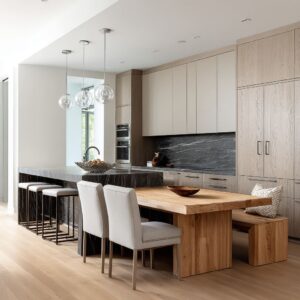
A waterfall island in pale stone repeats the upper “light field” at counter height. This is a big reason the white-and-wood kitchens feel airy: the eye keeps encountering calm, bright mass in the middle of the room’s design, so the wood doesn’t visually take over.

Countertops and backsplashes decide whether the split works
People often think they’re choosing cabinet colors “to match the stone,” but the deeper truth is that stone decides how cabinet colors behave. This is where many 2 tone kitchen cabinets ideas go wrong: the palette is picked in isolation, then the stone makes one color look strange.

The stone succeeds when it can “speak both tones” at once:.
- A warm, sandy or honey-veined surface can sit beside walnut/oxblood without making the wood feel orange, and it can sit behind greige/cream without making them look dull.
- A pale surface with gentle grey movement can sit beside charcoal/black without feeling dirty, and it can sit with bright whites without flattening them.

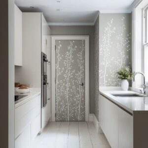
Another non-obvious issue: “too many whites” isn’t really about whiteness; it’s about lack of shadow structure. White cabinets + white backsplash + white counters can merge into one bright mass unless something provides readable breaks: a warm metal rhythm, a mid-tone base, a wood insert, or a single dark anchor.

Undertones: temperature patches at eye level
Most people feel undertone problems long before they can name them: white goes yellow, grey goes blue, green goes babyish, navy goes cold. The design can keep undertones stable by placing deliberate warm or neutral references where the eye naturally rests.

Examples of “temperature patches” that quietly fix the palette:.
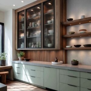
- A wood hood box that repeats the lower walnut at eye level, preventing the upper greige from looking isolated or muddy.
- A concrete or plaster-like hood mass that cools and steadies warm colors (especially reds and golds), keeping them from turning sugary.
- Brass used in multiple locations (pulls + faucet + pendants) so the design has one consistent warmth reference that doesn’t depend on daylight.
This is also why greyed colors behave better than pure, clean hues in real homes. Greyed sage doesn’t flip into neon in sun; muted terracotta doesn’t turn cartoonish; deep charcoal doesn’t turn bluish as easily as a cool black.
The palette stays calm because it’s designed to survive lighting shifts.

What reads high-end
A kitchen looks finished when each tone has a job and that job is repeated in a controlled way. This is the hidden upgrade from basic 2-tone kitchen ideas: the room’s design repeats the second tone in a few strategic forms, so the split feels authored.

The wood-repeat strategy:
- wood lowers + wood hood
- white uppers + white waterfall island
- pale uppers + pale stone block surfaces
- oxblood lowers + warm brass points + concrete calm zone
The shape-repeat strategy:
- round brass pendants feel intentional because a monolithic island is present as an equal “big shape”
- vertical fluting on oxblood lowers feels refined because the uppers repeat the same vertical rhythm in a lighter value
That fluting detail is especially revealing. Texture isn’t decoration here; it’s a saturation control tool.
Fluted fronts break one large colored surface into many narrow highlights and shadows, lowering the “loudness” of a strong color without changing the color itself. It’s one of the most effective ways to make bold lowers feel mature and architectural.

Styling can stay restrained for a reason: the cabinets and surfaces are already doing the visual work. Small pottery, a few cutting boards, a single tall vase with airy branches—these aren’t “accessories.
” They’re quiet shadow makers that add softness without creating a new color storyline.

Open-plan friendliness comes from how the kitchen reads from far away
In open layouts, the kitchen is always in the background of daily life. The best two-tone kitchens behave well at distance because they reduce to a simple, readable banding:.
- light upper plane
- grounded base plane
- one warm bridge note (wood or brass)
- one outline note (black frame, dark range, dark faucet)
That’s why an island in wood often works so well: it reads like furniture, which helps the kitchen relate to living and dining spaces without trying to “match” them. It’s also why scattered third colors tend to fail in open plans: they create extra blocks that fight the rest of the room’s palette.

Mid-tones and grain as camouflage
Lower cabinets can take the visual hits of daily life. The designs that stay clean-looking choose lower tones that hide small disturbances without looking heavy.

Two visual strategies stand out:.
- mid-depth paint (sage, charcoal, deep navy) hides minor marks better than pure white and looks calmer than pure black
- wood grain breaks up large surfaces, so tiny imperfections disappear into natural movement
This is why wood lowers paired with calm uppers often look “lived-in but still neat” without relying on constant styling.

A useful way to classify the strongest looks: “field, bridge, outline”
A consistent pattern is not the specific colors—it’s the structure:.
- Field: the big calm planes (uppers as light field, counters/backsplash as calm band)
Bridge: the connector element that repeats one tone at eye level (wood hood, shelving, island wrap, warm metal rhythm)
Outline: the crisp anchors that keep everything readable (range, window frame, dark faucet, controlled black notes)

Once one notices those roles, a lot of confusion around two color kitchen cabinet ideas clears up. The kitchen stops being “two colors” and becomes a set of visual jobs that keep the design bright, grounded, cohesive, and calm—while still giving the definition people are chasing.