A well-chosen kitchen cart can change the whole center of a kitchen without the cost, mess, or commitment of building a permanent island. For that the cart should not be treated as a spare helper tucked into a corner.
It can act as a central design piece that adds a work surface, shapes movement, supports serving, and gives the kitchen a stronger sense of depth.
That matters because many kitchens have the same hidden problem. The perimeter may be full of cabinetry, counters, appliances, and wall storage, yet the middle can still feel unresolved.
In some homes, the center feels too empty. In others, it feels too exposed.
A kitchen cart can fix that by placing a lower movable mass between the wall plane and the open floor. That single move gives the eye a place to rest, marks out a prep zone, and adds another layer to the room without making the plan feel fixed.
This is why kitchen cart design ideas deserve more attention than they usually get. The right cart is not only about extra storage.
It is a way to add center function, give the kitchen more presence, and bring a bit more flexibility into daily use.

Why kitchen carts still matter in modern kitchens
Kitchen carts usually have wheels or casters. Yet the important part was not mobility alone.
It was how mobility can be shown. Some carts use visible wheels that clearly signaled utility.
These pieces feel active, practical, and ready for daily work. Others use tiny tucked-in casters that nearly disappeared.
Those carts feel more settled, closer to a furniture piece or a small movable island. This creates a very useful design rule: the visibility of the wheels changes the mood of the whole piece.

If you want a cart that feels like a true helper station, visible wheels can support that. If you want a cart that blends into a more polished kitchen and feels less temporary, smaller hidden casters usually work better.
In other words, wheels are not only functional hardware. They are part of the visual language.
This is one reason kitchen carts remain so relevant. They give you physical flexibility, but they can also be styled to feel either active and work-oriented or settled and built into the overall look of the kitchen.

The design role of a kitchen cart
Many people search for kitchen cart design ideas because they want more storage or more prep space. Those needs are important, but the design can do something deeper.
A kitchen cart often brings its greatest value through spatial structure rather than storage volume. In a typical kitchen, the wall zones do most of the heavy work.
Tall cabinets, counter runs, sink walls, and appliances all sit at the perimeter. A cart introduces a middle layer that helps the kitchen feel more complete.
It creates a center point without the heaviness of permanent joinery. Even a modest cart can make the room feel more resolved because it adds depth and creates a more human scale in the center of the plan.

This is a major reason carts work so well in kitchens that feel visually flat. They interrupt the long stretches of cabinetry and counter surfaces with a lower object that creates a richer composition.
They also help in kitchens that feel too open in the middle, where the floor area can seem underused or disconnected from the working parts of the room. A good kitchen cart, then, is not only a storage tool.
It is a center-forming object.

Open storage, closed storage, and the hidden rule of visible density
Many kitchen carts use open shelving or open lower storage. Others rely mostly on closed storage or enclosed faces.
At first, this looks like a style difference. In reality, it points to a deeper design choice.
Open storage lightens the cart visually. It lets the center of the kitchen stay more breathable.
It also makes the cart feel ready for serving and daily use, especially when it holds plates, bowls, baskets, or ceramics. But, open storage only works well when it is lightly filled.

The open carts should never be crowded. Their shelves hold grouped objects, repeated vessel types, and enough empty space to keep the form clear.
The issue is not whether the cart is open or closed. It is visible storage density.
This is one of the hidden rules in kitchen cart design ideas. A cart with open shelves can look warm, useful, and inviting, but only if the visible items are edited.
Once the shelves get packed with unrelated objects, the cart stops feeling like part of the room design and starts feeling like overflow storage.

Closed storage solves a different problem. It gives the kitchen a neater face, reduces visual noise, and helps the cart feel more integrated with cabinetry.
A more enclosed cart often suits kitchens that already lean polished, mature, or tailored. Mixed storage sits in the middle, giving you a cleaner front in some areas and easy access in others.
So the choice is not simply open versus closed. It is a choice between visible use, hidden use, or a mix of both.

Why the top changes the entire role of the cart
There is another important design pattern on the cart’s top. The top is the cart’s credibility plane.
They can use pale stone, marble-like, or bright solid-surface tops, or darker wood or butcher-block tops, etc. The top is the surface that tells the eye what the cart is for.
A bright, pale top tends to make the cart feel closely tied to the kitchen envelope. It brightens a heavier base, sharpens the working edge, connects the piece to surrounding counters, and helps enclosed carts avoid looking too dense.
In practical terms, a light top often says this piece belongs to the kitchen and can work like a small movable extension of the permanent surfaces.

A darker wood top sends a different message. It tends to make the cart feel more like a worktable or serving piece.
It brings warmth, stronger texture, and a slightly more furniture-like tone. That can be especially appealing in kitchens that want a more domestic center rather than a small clone of the main cabinetry.
This makes the top one of the biggest decisions in kitchen cart design ideas. The base may carry the cart’s mood and identity, but the top proves its usefulness.
A bright top often adds clarity and lightness. A wood top brings warmth and a table-like character.
Neither is automatically better. They simply shape the cart’s role in different ways.

The four main types of kitchen cart design
Kitchen cart design is not one narrow category. It breaks into four main families, each with a different job.
Open worktable carts
These carts use visible legs or open frames and keep the floor visible underneath or through the lower zone. They tend to feel lighter and easier in a smaller kitchen.
Because they do not create a strong visual block, they work well where people want a center point without cutting off lightness or movement. They are often the best fit for kitchens that need extra prep space and easy reach for dishes or bowls, but do not want a cart that feels heavy in the middle.

Refined display or furniture carts
This group uses more polished materials, stronger framing details, and more curated shelf styling. These carts often contribute as much to the room’s character as they do to function.
They are well suited to kitchens with a more polished tone, especially where the cart is expected to help shape the identity of the space rather than merely solve a storage issue.
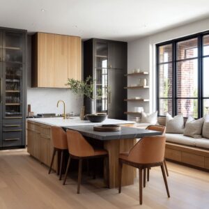
Mini-island or cabinet-block carts
These carts have more mass, stronger closed faces, and a silhouette closer to a compact island. They can be excellent for homeowners who want the effect of an island without permanent work.
They usually offer stronger hidden storage and a more settled center presence. Because they carry more visual weight, they need careful handling so they do not become too dense.
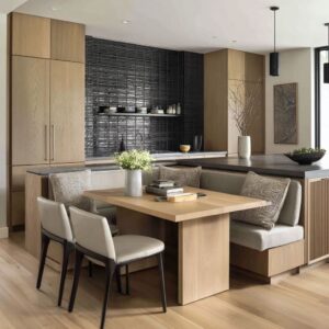
Hybrid workhorse carts
These are the carts that clearly aim for daily service. They tend to use mixed storage, direct practical logic, and a straightforward layout that supports everyday routines.
They are less decorative than the more furniture-led types, but still far better resolved than a plain utility trolley. They suit kitchens where the cart is expected to work hard every day, not only look good on occasion.
This four-part split is useful because it helps explain why some kitchen cart design ideas feel right in one home and wrong in another. Not every kitchen needs the same kind of center object.

How to keep a cart from looking like an afterthought
A cart felt integrated when it repeated at least two signals already present in the room. That could mean the body color sits close to the cabinetry, the metal echos the faucet or cabinet pulls, the top repeats the counters, or the wood tone relates to nearby shelves or flooring.
When a cart picks up two or three of these cues, it looks chosen with the kitchen rather than added later.

If you want it to feel planned, do not rely on one matching detail alone. A single echo may help, but two or three give much stronger cohesion.
A pale top plus brass wheels can tie a cart to the counter and faucet. A wood top plus matching shelf tone can tie it to the floor and wall shelving.
A painted body plus similar hardware can make the piece feel like part of the original palette. This is why some carts immediately feel settled while others look like loose accessories.
The difference often comes down to repeated cues, not expensive materials.

Heavier carts need help to stay comfortable in the center
The more enclosed the cart, the more it needs certain design moves to stay balanced, especially for a larger kitchen cart. A solid or semi-solid cart gains more order, hidden storage, and stronger center presence.
But that same mass can quickly make the room feel clogged if the design does not compensate. There are three methods that help heavier carts stay successful.
First, a bright top cap relieves the upper edge and keeps the piece from feeling like a dense block. Second, wheels lift the body off the floor and prevent it from feeling planted too hard.
Third, softened geometry reduces the severity of the mass.

That last point matters a great deal. Rounded ends, eased edges, curved corners, or turned posts often appear in the larger or more central carts.
This is not random decoration. It reduces the harshness of a bigger object in the middle of a circulation zone and makes the cart feel friendlier and easier to live with.
A useful rule follows from this: the heavier the cart body, the more it needs top brightness, floor lift, and softer edges. Without that balance, a large cart can start to feel like a misplaced cabinet.

Why accent-colored carts can work so well
Accent colors, such as muted plum, dusty blue, terracotta-coral, blush-peach, or yellow-green bodies, work well. These work because the kitchens around them can be pale, restrained, and materially consistent.
A kitchen cart can act as a low-commitment color anchor. If the room shell is light and the other materials stay fairly restrained, the cart can bring in personality at the center without forcing a full kitchen repaint.
The key is moderation. A muted or earthy color tends to work better than a hard sharp one.
The color also needs some relationship to the rest of the room, often through warm metal, wood, or surrounding tones. In that situation, the cart becomes a designed focal point.
In a busy kitchen with many competing accents, the same move could feel random. This makes accent-colored kitchen cart design ideas especially useful for homeowners who want to add character without making permanent changes to all the cabinetry.

A kitchen cart often works best between prep, serving, and display
Another design theme is the way tops can be styled. The carts can hold fruit, bread, trays, branches, flowers, bowls, or glasses.
Then it works as a social staging device, not only a prep tool. So, kitchen carts can shift roles throughout the day.
They may support prep in the morning, hold serving pieces during a meal, and carry a simple arrangement or bowl when sitting idle. That ability to move between work, hosting, and display makes the cart unusually adaptable.
This means the kitchen cart should avoid two extremes. A cart that looks fully decorative may lose its practical value.
A cart that looks strictly utilitarian may add function but not much visual appeal. The sweet spot is in between.
The top should look usable, but not empty. Styled, but not crowded.
Active, but not messy. That balance gives the cart life.

Styling rules that keep a kitchen cart looking resolved
The top should remain believable as a work zone. Even when styled, the strongest carts can keep enough open surface visible.
Usually one or two items are enough. This allows the cart to look active without sacrificing function.
Open shelves work when the contents are grouped and repeated. Matching bowls, stacked plates, coordinated ceramics, and a single basket type creates order.
Mixing too many unrelated objects weakens the form.

Warm metal plays a major linking role. Brass or bronze hardware and wheels often ties the cart to faucets, wall lights, or cabinet pulls.
This helps the cart feel part of the room rather than separate from it. The base and top also work well when they do different jobs.
The base held mood, identity, and storage language. The top carries utility and legitimacy.
This separation made the cart more legible and more balanced. These may sound like small details, but together they determine whether a cart looks intentional or unresolved.

Choosing the right kitchen cart for your layout
If your kitchen is smaller, narrow, or visually sensitive, open worktable carts usually make more sense. Their visible legs and open lower zones help the center stay lighter, and they can create useful surface without making movement feel blocked.
If your kitchen already has a more refined or high-end tone, a furniture-led cart with stronger material contrast, curated shelving, and discreet mobility may be a better fit. These pieces help strengthen the room’s identity.

If you want the effect of an island but do not want to build one, a mini-island style cart is often the strongest answer. Just be sure it has a bright top, some lift from the floor, and softened edges so it does not feel too dense in the middle.
If you want a cart for hard daily use, a hybrid workhorse model with mixed storage is often the most practical. It can hide smaller tools, keep a few daily items easy to reach, and still support the overall design of the kitchen.
The right choice depends less on trends and more on what problem you need the cart to solve. Do you need more surface?
More hidden storage? A stronger center?
A touch of color? A serving station during gatherings?
Once that role is clear, the correct cart type becomes much easier to identify.

Why kitchen carts continue to earn their place
A kitchen cart is a reversible commitment object. It gives part of the benefit of an island, a color accent, extra storage, or a serving station, yet it does not lock the room into permanent construction.
That flexibility is a major reason kitchen carts continue to make sense in modern homes. A kitchen cart can make the center of a kitchen feel useful instead of empty.
It can add warmth without changing the whole room. It can support storage without making the space look crowded.
It can shift from prep station to serving piece with very little effort. And when chosen well, it can feel fully tied to the surrounding design rather than temporary.
That is what makes the best kitchen carts so effective. They do not solve only one problem.
They add a center surface, a stronger visual layer, and a more adaptable daily rhythm all at once.
Final thoughts
A kitchen cart may be movable, but the strongest ones never feel random. They belong to the room through repeated finish cues, they hold the center without becoming too heavy, and they stay believable as working pieces even when styled.
That is the lesson here. The best kitchen cart design ideas are about shaping the kitchen’s center in a smarter way.
They give the room more depth, more function, and more personality, all without the permanence of a built-in island. For many homes, that balance is exactly what makes a kitchen cart such a useful piece.