Light wood floors do something special in a living room: they brighten the space, show natural grain as a design detail, and make every wall color feel a little more noticeable. That last part is the challenge.
Pale oak, ash-leaning planks, and light maple can shift fast depending on daylight, nearby colors, and the number of dark elements in the room.
Instead of treating paint as a standalone choice, we look at paint as part of a full room composition: wall color family, how light or deep the paint is, the undertone direction, the type of light wood, how much grain and knots show, and the support pieces that make the pairing look intentional.

In one sentence, a wall color works with light wood floors when it’s supported by a small set of repeatable design moves: a few crisp dark anchors, a couple of warm material notes, one middle-toned buffer layer, and a clear brightness hierarchy from ceiling to floor.

The paint mistake that causes most “why does my floor look yellow?” effects
The floor looks different depending on what surrounded it. The biggest trigger for unwanted yellowing is usually this combination:
- very pale walls + very pale floors + very pale furniture
- with no strong dark reference points
- and no middle layer (rug, stone, woven fiber) to separate surfaces

When everything is light, the room can lose definition. The eye searches for contrast, and the warm undertone in the wood becomes the loudest note by default.
The fix isn’t always repainting. Designs stay polished using 2–4 dark anchors to give the eye a stable reference.

The 4-part support kit that keeps wall color and wood tone under control
1) Crisp depth anchors
They’re usually black or deep charcoal, and they can be small or medium in size.

Examples:
- black window frames or doors
- a dark firebox opening
- a black coffee table or tray
- thin dark frames on art
- a deep planter
Why it works: it defines edges and makes pale oak look cleaner instead of creamy.

2) Warm anchors placed in the furniture layer
Warm leather is a good warm support option, especially with cooler walls or deeper paint.

Examples:
- caramel or cognac leather chair
- clay or terracotta pottery
- warm wood beams
- warm metal details (brass-like tones)
Why it works: it keeps cooler wall colors from feeling chilly, and it stops dark walls from feeling severe.

3) A middle buffer between wall and floor
This is the bridge layer that prevents the room from splitting into two separate surfaces.

Examples:
- woven fiber rug
- cane/wicker elements
- stone or plaster-like coffee table
- mixed stone fireplace
- textured upholstery
Why it works: it introduces a middle temperature zone so the floor isn’t the only natural material doing all the work.

4) A brightness ladder from top to bottom
A simple hierarchy:
- ceiling and trim: brightest
- walls: slightly deeper or slightly veiled
- floor: light-mid as the main material plane
- furniture: cream to oatmeal steps
- one deep anchor: the visual “weight” that grounds the room
Why it works: it prevents the room from turning into one flat light field.

Identify what kind of light wood floor
Not all light wood reacts the same way.
A) Character oak
If the floor has knots, mineral streaks, wormy lines, or strong cathedral grain, it has high visual energy.

This floor type can be paired with:
- very soft near-whites that let the floor be the texture
- or deep paint that pushes grain into the background as fine detail
What to be avoided: mid-tone, high-color walls paired with very busy oak. That combo often makes both surfaces fight for attention.

B) Rift or straight-grain oak
This looks calmer, more linear, and often more architectural. It’s forgiving.
It worked well with:
- parchment and warm off-whites
- mushroom and sand-gray neutrals
- sage-putty and other muted green-grays

C) Light maple
Maple is often smoother in grain and can pick up wall color fast, so it can look buttery if the room leans too warm.

Maple stay clean with:
- pale cool veils (for example, soft sky-blue)
- or deeper walls balanced by cooler inserts (blue seating, pale stone, crisp trim)

The paint families and how to make each one work
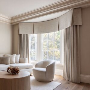
1) Warm near-whites and warm greiges
Think creamy oat-white, parchment, oyster-white, pearl warm greige.

Why it works with light wood floors
- It keeps the room bright, but it avoids icy white that can push oak toward yellow by contrast.
- It gives the wood a friendly neighbor tone, so the floor doesn’t feel raw.
What to add so it doesn’t feel bland
- 2–4 dark anchors: black frames, a dark firebox, a dark tray, a dark planter
- textured upholstery: bouclé-like or nubby weaves
- one warm anchor: leather chair or clay pottery
Avoid
- making walls, trim, rug, and sofa all the same light value with no deep notes
- too much glossy shine, which can bounce warmth onto the floor
Best for
- anyone who wants flexibility: you can change decor later without repainting.

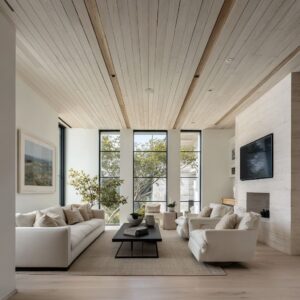
2) Stone neutrals: mushroom, sand-gray, chalky greige
These are the undertone moderators. They sit between beige and gray without swinging cold.

Why it works
- It reduces the blond floor spotlight effect.
- It makes pale wood feel calmer and more refined, especially in strong daylight.
Support pieces
- stone or plaster-like tables
- mixed stone fireplace surfaces
- a mid-tone rug that’s slightly deeper than the floor
- one deep anchor like a dark firebox or black table
Avoid
- icy concrete grays next to warm oak if the room lacks warm material notes
- bright white curtains that make stone neutrals look dull by comparison
Best for
- people who like neutrals but don’t want beige, and people who feel their floor looks too exposed.

3) Green-gray veils: sage-putty, seafoam-sage, sea-glass, olive-leaning charcoals
This family is a way to cool pale oak without making it look gray.

Why it works
- Green undertones sit naturally with wood, plants, cane, and stone.
- It often makes pale oak look less buttery without stripping warmth.
Support pieces that matter
- warm leather (caramel/cognac)
- warm fiber rugs (sand or straw tones)
- black window frames or other crisp dark lines
- plants that visually reinforce the green undertone
Avoid
- stacking too many cool-gray pieces (cool rug + cool sofa + cool art) without warm anchors
- creamy trim that can turn sage muddy; clean trim helps these tones stay fresh
Best for
- someone who wants color but still wants a calm, livable room.

4) Cool soft colors: lavender-gray, pearl-lavender, smoky violet-gray
These can look grown-up and subtle, but they need balance.

Why it works
- Light violet-gray gives a fresh shift from plain gray while staying gentle in value.
- It can make pale wood look cleaner and slightly warmer by contrast, which many people like.
Support pieces that make it look intentional
- warm leather or warm wood notes at seating height
- cooler-toned artwork so the wall color feels sophisticated, not sweet
- a few compact deep accents so the room doesn’t feel weightless
Avoid
- glossy white furniture and icy metals everywhere, which can make the wall feel cold
- too many pastel accents; keep textiles mostly neutral with one controlled color note
Best for
- people who want something different from neutral walls but still want a soft palette.

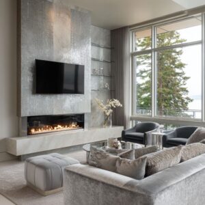
5) Deep blues and charcoal-navies: slate-ink, spruce-blue, charcoal-navy
These are high-contrast choices, used as a deliberate style move in the set.

Why it works
- Dark walls turn pale floors into a bright base plane.
- Grain and knots tend to look calmer because the eye reads the floor as “light field” first, detail second.
Support pieces the concept set relied on
- large light sofa (a big light reflector)
- warm leather so the room stays inviting
- fiber rugs to soften the contrast boundary
- black window grids that make the contrast feel architectural
Avoid
- covering the floor fully with a dark rug; the pale floor is doing the light-lifting
- using only cool decor; add warm materials or it can feel stark
Best for
- people who want drama but still want the room to feel usable in daytime and evening.

6) Muted clay and terracotta families: terracotta-rose, terracotta-beige, terracotta-peach
These colors are rarely bright, mostly dusty and brown-based.

Why it works
- Warm walls can make pale floors feel sunlit instead of raw.
- If the terracotta is muted, it adds warmth without turning wood orange.
Support pieces that keep it refined
- black anchors (tables, frames, window lines)
- olive or earthy green notes as a temperature brake
- pale upholstery repeated in two or three pieces so the room stays bright
Avoid
- too many warm orange accents at eye level; it can push oak toward honey
- shiny floors; lower sheen keeps the warmth from bouncing onto the boards
Best for
- people who want warmth with a modern feel, especially in rooms with strong daylight.

Conclusion
Light wood floors give a living room a bright, fresh base, but they also make paint choices feel sharper and more exposed. The takeaway is that the right wall color is rarely the whole answer.
Successful pairings come from a simple system: add a few dark anchors to define edges, place warmth in materials like leather, clay, and warm-toned wood, use one middle layer (rug, cane, stone, heavy texture) to bridge wall and floor, and keep a clear brightness order from ceiling to walls to floor to furniture.

Once that structure is in place, choosing paint becomes much easier. Warm near-whites and soft greiges keep things bright without pushing oak yellow.
Stone neutrals calm floors that feel too blond or exposed. Green-gray veils reduce buttery warmth while still feeling natural with wood.
Soft lavender-grays add personality when balanced with warm materials and a few deep notes. Dark blues and charcoal-navies make pale floors look crisp and intentional when daylight and light upholstery stay present.
Muted terracotta tones bring warmth without turning the room orange when black and olive elements keep the palette grounded.
So instead of chasing one perfect paint color, start by reading your floor—how much grain shows, how warm it runs, how the room’s daylight behaves—then build the support pieces that control undertones. With that approach, light wood floors stop feeling tricky, and your wall color starts working like it was always meant to be there.