A narrow side-yard sidewalk has a predictable problem: it wants to act like a leftover service strip.
Make the fence the main identity surface. Keep the walking lane clean and add one small human-use moment.
Everything else should support those three sidewalk design moves.

That single recipe can look like waves, arches, dots, scallops, icon parades, relief texture, or color bands. The style changes.
The underlying mechanics stay the same.

The base sidewalk design formula
Think of the corridor as a long, thin room. A room needs:
- A dominant surface that carries the personality (the fence/wall).
- A stable floor plan that stays easy to walk and easy to keep neat (pads + gravel joints, or stones + gravel).
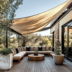
- One proof of human life (bench, ledge, shelf, tiny bar, even a destination like an outdoor shower).
When those three pieces exist (wall identity + quiet ground + one pause), the side yard stops feeling accidental. It feels authored.

Making the corridor feel longer
Two different tricks can stack together.
Cadence: repeating intervals that pace the eye
Repetition can be boring in a living room. In a corridor, repetition is a gift.
A steady run of arches, panels, dots, sconces, stepping pads, or shrubs creates a walking tempo. Your attention lands on one unit, then the next, then the next.
The sidewalk corridor turns into a sequence instead of one long push. Cadence works when the spacing feels consistent enough to relax the eye.
Even spacing makes the corridor feel planned.

Size gradients: shrink the motif toward the far end
A second move creates perceived distance without changing any dimensions: make the motif larger near the viewer and smaller near the far end. Ducks that recede, mushrooms that jump in height with one large anchor, snails that vary in scale—these aren’t cute for the sake of cute.
They function like depth cues. It’s a quiet kind of perspective.
Your brain reads the size shift as distance, so the corridor gains length.

Reducing tightness
Tightness often comes from two parallel lines that run without interruption: fence line and house wall. Softening that problem can be with three specific tools.

Horizontal banding: a width illusion
When the fence carries long horizontal bands—waves, stripes, color blocks, a single wavy line at waist height—the corridor feels less like a tunnel. A horizontal band pulls attention along the length rather than straight ahead.
That sideways sweep reduces the sense of squeeze.

Light gravel joints: a floor that breathes
Large pads with gravel joints are an option because they keep the floor visually airy. A full slab can look heavy in a narrow lane.
Gravel joints break the surface into calm beats, and the pale tone lifts the whole corridor.

Low planting seams: soften the base without stealing width
A neat line of shrubs or tufted grasses at the wall base acts like soft trim. It hides the hard wall-to-ground junction and adds a thin strip of depth.
Because the plants stay low and repeated, the corridor feels wider, not crowded.

Getting people to pause
A bench in a narrow side yard can either feel awkward or feel inevitable. The difference is placement.

Stopping behavior rises when the seating or ledge sits at the point where the wall moment becomes most noticeable:
- where the curves get larger,
- where the icon story hits its biggest character,
- where the mural density shifts,
- where the light rhythm creates a brighter zone.
That’s the peak. It’s the spot where the wall asks for attention.
A bench placed there feels like a natural response to the wall, not random furniture dropped into a passage.

A small shelf can do the same job. It creates a two-second pause: eyes and hand level, zero floor width used.

Keeping tidiness high: lift decor up, leave the ground open
Even playful sidewalk ideas can avoid ankle-level clutter to fell designed. Why it works:
- In a narrow corridor, small objects on the ground compete with walking clearance.
- Visual noise at foot level makes the lane feel tighter.
- Cleaning becomes harder, so the space deteriorates quickly.
Instead, the design concepts can put personality on the wall and keep the floor mostly functional: pads + gravel, stones + gravel, a simple seam of planting. When decor appears, it goes onto slim shelves or a single ledge.
That keeps the corridor feeling neat even when it has character.

The mid-height horizon band: order without extra objects
One of the design patterns is the power of a stable reference line. A mid-height band—dots, scallops, contained mural strips, a single wavy stripe—does something small but decisive: it gives the eye a steady horizontal anchor.
That anchor makes the corridor feel organized even if very little is added.

Why it beats adding more small objects:
- A clean band is read instantly at walking speed.
- It organizes everything below and above it.
- It reduces the urge to decorate the whole length with scattered items.
A single band can carry the entire identity, while the rest stays quiet.

Cropping a motif makes playful graphics feel more grown-up
Cropped motifs tend to feel less childlike than centered motifs, even with the same colors.

Examples of how cropping works:
- a circle that’s partially cut by the edge of a panel,
- Memphis-like shapes that run off the boundary,
- scallops that appear as a band rather than a centered badge.
Centering can feel like a logo. Cropping feels like a composition.
It implies scale beyond the corridor, like the pattern continues, which makes it feel intentional rather than themed.

This also pairs nicely with negative space. A big calm field plus cropped playful shapes can stay friendly without tipping into nursery energy.

One long horizontal ledge calms vertical boards and stripe energy
Vertical boards and vertical stripes add lift and energy, but they can also make a narrow passage feel busy or jittery. The design can solve that with a simple counter-direction: a single long horizontal ledge.
.

It does three jobs at once:
- creates a dominant horizontal line that steadies the composition,
- provides “use” without occupying floor space,
- concentrates small objects into one controlled zone, so the rest stays clean.
This is especially effective where the wall already has strong vertical rhythm. The ledge becomes the visual brake.

Plant silhouette pairing: cohesion without matching colors
A fence palette doesn’t need to match plant color for the scene to feel coherent. There is something more reliable than color matching: shape matching.
- Round shrubs quietly echo ducks, dots, scallops, and circle murals.
- Grasses echo waves and ribbon lines through their directional sweep.
- Upright, narrow plants pair well with vertical boards and stripe walls.
When plant geometry supports the wall geometry, the whole sidewalk corridor feels coordinated even if the greens don’t match the paint. Shape does the harmonizing.
This is one reason a sidewalk design stays tidy-looking: the plant border functions like a designed trim line, not a random garden edge.

Two-height lighting creates night depth without daytime clutter
Flat graphics can look surprisingly shallow at night unless lighting adds dimension. There is a strong lighting stack that avoids extra daytime decoration:
- High wash: repeated sconces or downlights that graze the wall and segment the corridor into lit chapters.
- Low glow: small ground lights or lantern-level light near planters that gives the base a soft lift.
Together, high wash + low glow increases perceived depth. The wall feels layered, the plants cast gentle shadows, and the corridor gains a sense of distance after dark.
An extra benefit: this lighting strategy turns murals into something closer to displayed art at night, while keeping the daytime scene clean.

Bringing it together: a small set of sidewalk design ideas
There are popular combinations repeating because they solve the same psychological needs with minimal ingredients:
- Big wall gesture + pads + low plant seam
(personality, clarity underfoot, softness at the base) - Rhythm wall (arches/panels/lights) + one bench pocket
(cadence + a natural pause point) - Motif on wall + motif echoed on the ground
(instant cohesion, fewer objects needed) - Pastel kept low + warm wood accents + negative space
(friendly tone without turning sugary) - Relief texture + limited palette + warm endpoint note
(sun/shadow keeps it lively, warmth keeps it welcoming)

A final lens that helps these sidewalk ideas stay clean
Every sidewalk illustrative idea treats the corridor like a long, narrow room with a simple hierarchy:
- one clear wall story,
- one calm walking system,
- one small moment that signals human use,
- planting kept low and repeatable,
- light used as spacing, not decoration.
That’s why these simple sidewalk yard fence ideas feel intentional even when the ingredient list stays short.