A modern Craftsman bathroom can look stylish and modern. Current design ideas are not based on removing wood, removing structure, or flattening the room into a generic pale box.
It can be based on recalibrating old-house strengths so they feel lighter, sharper, and easier to live with now.
That shift is subtle, but it changes everything. The bathroom can still keep the parts people actually love in Craftsman interiors: warm wood, framed windows, built-in thinking, useful storage, and a clear sense that the room belongs to the house.
What changes is the visual density. Wood moves into fewer and stronger zones.
Stone becomes broader and paler. Mirrors stop acting like separate decorative objects and start acting like part of the wall.
Open floor, open counter, and open wall areas begin doing real design work. The room keeps its soul, but it sheds the weight that often makes older interpretations feel too dark or too loaded.

What actually makes a bathroom feel Craftsman
There are three main anchors that carry the identity.
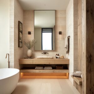
The first is the window.
The window works as a focal point. That is a major clue.
A Craftsman-influenced bathroom is window-led, not fixture-led. The window ends the sightline, frames greenery, gives the room a domestic center, and makes the whole space feel tied to the architecture of the home rather than arranged like a showroom set.
This is why Craftsman baths can feel settled even before you start looking at the vanity or tile. The room already has a center of gravity.

The second anchor is visible wood. Such bathroom designs keep wood in a meaningful role.
Sometimes it can shape the vanity, sometimes the mirror frame, sometimes the tub apron, shelving tower, casing, ledge, or slatted backdrop. That matters because it rejects a very common mistake: trying to keep the Craftsman label after wood has been reduced to a small decorative accent.
In this style, wood cannot be incidental. It has to help form the room.

The third anchor is built-in logic. The space feels Craftsman when key parts seem made for the room instead of dropped into it later.
Tub platforms, framed mirror walls, thick window ledges, bench-seat hybrids, recessed storage, wall-spanning millwork, and continuous vanity-and-sill compositions all support that feeling. This is one reason decorative nostalgia is not actually required.
A bathroom can feel strongly Craftsman without historical ornament if the room still has structure, material honesty, and built order.

Why many Craftsman bathroom updates miss the point
Design updates can make the room newer in a shallow way rather than in a durable one. They replace wood with white surfaces, swap built tub forms for freestanding tubs, or depend too heavily on trend-driven fixtures.
The room may end up fresh in a generic sense, but it stops feeling connected to the house. It loses the rooted quality that made the style worth keeping.

Modernizing this style is rarely fixture-led. It does not mainly happen through statement sconces, a dramatic faucet, or a new sink shape.
It happens through spatial editing, tone distribution, and surface hierarchy. The room becomes current because fewer things are fighting for attention.
The idea is not trying to prove that it is modern. It simply lets the room breathe.

That distinction matters for interior design because it changes what deserves priority. If the window is weak, if the wood is scattered without order, if the mirror is treated as a decorative afterthought, and if the storage feels unrelated to the architecture, then expensive finishes will not save the room.
A modern look in this style comes from composition first.

The central lesson: modern Craftsman is wood recalibration
Modern Craftsman bathroom design is not wood removal. It is wood recalibration.
Broad pale oak and ash-like tones look more modern than deeper orange or reddish woods. But the key change is not color alone.
Wood can also concentrate into larger, calmer planes. Instead of many small joinery gestures spread all over the room, current Craftsman bathroom design ideas use fewer but stronger wood moments: a full vanity wall, a tub apron, a window surround, a shelf tower, or a built bench.
This makes the room feel more architectural and less decorated. At the same time, pale stone, quiet walls, and empty floor area give that wood somewhere to sit.
That balance is what prevents warmth from turning into heaviness. The room stays grounded, but it also feels open.
A modern Craftsman bathroom still needs warmth, but it needs warmth placed with intention rather than distributed everywhere.

What gives the most modern look?
- Negative space
- Integrated sinks
- Light wood
- Black-framed windows
- Floating vanities
- Mirrors absorbed into millwork or a larger vanity-wall composition
Taken together, these signals tell a very clear story, how a modern look can be built through clearing surfaces, reducing object count, and thickening only a few parts that matter. It is less about adding a new feature and more about removing friction from the visual field.
Modern Craftsman design ideas still have material weight. The counter still feels solid.
The casing still matters. The vanity still has depth.
But the room has fewer interruptions. That is a more durable kind of modernity than a room that depends on trend-driven shape or finish.

Integrated sinks
Sink type turned out to be more important than it first seemed. They usually work well alongside pale wood, stronger stone continuity, negative space, and mirror-wall integration.
That combination creates a much calmer visual field. The counter feels less interrupted.
The stone carries more weight. The vanity reads more as architecture and less as a collection of objects.

Vessel sinks behave differently. They are not wrong, they tend to pull the design toward a refreshed classic look rather than the more modern.
They workfor designs that hold onto a stronger traditional core. That does not make them unsuitable.
It simply means they communicate a different mood. If you want a newer, cleaner version of Craftsman style, an integrated sink is usually the more effective move.
If you want a warm traditional base with a lighter touch, a vessel sink can still fit.

Mirrors
Another shift is the role of the mirror. For modern Craftsman bathroom looks, the mirror should stop acting like a separate decorative item and start acting like an architectural field.
It can be framed by wood panels, folded into a millwork wall, placed within slatted backdrops, or integrated into a continuous counter-to-wall composition. Once the mirror becomes part of the wall system, the room feels less accessory-driven.
The vanity zone gains calm and authority. The bathroom begins to feel designed as a whole rather than assembled in layers.
This is a highly useful move. Instead of asking what mirror shape would freshen the room, it may be better to ask how the mirror can belong to the architecture of the vanity wall.

Open storage can work under strict conditions
Open storage works when it stays under control. It can be recessed shelves, narrow storage towers, bench-ledges, or open lower shelves that are visually absorbed into the millwork.
Towels are preferable to stay within a tight color range. Bottle count remains low.
The storage read as part of the room, not as added display.

This is an important point because open shelving is often blamed for making bathrooms look messy. But the problem is not openness.
The problem is visual entropy. If the shelves are integrated into the architecture and the contents are restrained, open storage can actually add warmth, utility, and domestic softness without harming the modern feel.

This matters especially in Craftsman design, where useful built-in elements are part of the style’s appeal. A room with no visible storage at all can sometimes feel too stripped.
The answer is not clutter. The answer is disciplined visibility.

Darker wood asks for compensation
Darker wood does not automatically make a bathroom feel dated. Darker wood does lower the chance that a room will have a very modern look, but it could still work very well when paired with the right balancing moves.
Effective compensators are pale thick stone, open floor area, strong daylight, bright walls, lifted vanity mass, limited accessory count, and one stable visual axis. In other words, darker wood is not a problem on its own.
It becomes a problem when it is combined with too much visual density. For those who love richer oak or deeper walnut and do not want to bleach the room into something pale and generic, the path forward is not to remove dark wood.
It is to limit where it appears and give it enough surrounding air.

Four strong design directions for a modern Craftsman bathroom
There are four main design families and each offers a different route toward a modern look.

The first family is the millwork-wall bathroom. Here the vanity, mirror, shelving, and sometimes lighting all merge into one composed wall.
Light wood, integrated sinks, built-in open storage, and stronger mirror architecture are common. This direction is especially effective for those who want a custom, polished bathroom where the sink zone feels fully designed rather than pieced together.

The second family is the corridor sink gallery. These bathrooms are narrow or sequence-driven, with one strong axis leading toward a window or bathing zone.
Vessel sinks is an option here, and wall-mounted faucets and side light help soften the length. A small or narrow bathroom can still feel considered if the plan is clear and the destination is strong.

The third family is the air-led built-in bath. These are examples of warmth without gloom.
They can use light wood, built-in tubs, pale walls, lower object count, and strong window calm. The room feels open, but not generic.
This is often the right path for people who want a softer and brighter mood without losing house character.

The fourth family keeps more density. These bathroom design ideas retain stronger wood depth, richer material presence, and more traditional mass, then update the room through lighter stone, stricter editing, and better light distribution.
This path suits those who do not want to move too far from the older house feeling.

Main design approaches
One is to let the window lead the composition. If the room is narrow, let the eye travel to the window at the far end.
If the room is broader, let the vanity and mirror support that window rather than compete with it. A strong window is doing more than providing light.
It carries identity, order, and emotional atmosphere at once.

Another approach is to keep wood in one or two dominant roles rather than many smaller roles. A vanity wall, a tub apron, a shelf tower, or a thick casing system will do more for a modern Craftsman look than scattered wood accents that never gather into a strong idea.

A third approach is to simplify sink and counter geometry. Integrated sinks, thicker counters, wall-mounted faucets, and calmer mirror treatment repeatedly pushed the bathrooms toward a more current mood.
Decorative sink moments often did less than broad quiet surfaces.

A fourth approach is to treat empty areas as intentional. Open floor in the middle of the room, a quieter upper wall, a clear counter, or a less crowded tub ledge all make the style feel fresher.
Negative space in these bathrooms is not blankness. It is one of the main tools that keeps the room from becoming too dense.

A fifth approach is to use one strong contrast device rather than many. Black-framed windows, dark hardware, a slatted wood screen, or a lit reveal can all sharpen the composition.
But the strong rooms did not stack many competing contrast devices. They used one clear note and let it do the work.

How to keep warmth without making the room feel heavy
This is one of the design tensions. Warmth works best when it sits low and lateral.
Wood on the vanity, tub apron, bench, or lower built-ins can ground the room beautifully. Brightness then sits high and around it through pale stone, lighter walls, daylight, and reflective surfaces.
Add one darker line for definition and one green note for relief, and the bathroom feels warm without becoming dense.

That balance is far more effective than trying to make every surface warm. Once warmth spreads everywhere, the room loses clarity.
Once all the warmth is removed, the room may still look current but it stops feeling Craftsman-influenced. The successful bathrooms live in the middle: structure and warmth stay, but visual noise drops.

How to keep house character without tipping into nostalgia
A modern Craftsman bathroom does not need historical quotation to feel authentic. Deep casing, strong wood grain, a built tub, integrated storage, and a house-linked plan are often enough.
What dates the room is usually not the presence of these things, but the way they are detailed. Heavy decorative profiles, too many small trim moves, overly object-based styling, or too much distributed darkness tend to push the room backward.

The stronger path is to keep the character-bearing parts and flatten the rest. Let the wood carry the memory of the house.
Let the casing define the opening. Let the tub enclosure and vanity feel built.
Then reduce the number of extra gestures around them.

A simple design formula
To preserve the Craftsman identity, keep at least two of these three: strong window focus, visible wood in an architectural role, and built-in logic such as a tub platform, niche, bench, or integrated storage.

To shift the room into a present-day register, add at least three of these six: lighter wood value or a lighter field around the wood, integrated sink, negative space, mirror as part of the wall system, floating vanity or lifted mass, and one crisp contrast device such as a black window, dark hardware, slatted rhythm, or concealed light reveal. It is a simple design formula for modern Craftsman bathroom design look.

Modern Craftsman Bathroom Moves: What to Keep, What to Update, What to Avoid
| Design goal | What to keep from Craftsman language | What to add for a more modern look | To avoid |
|---|---|---|---|
| Warmth without darkness | Visible wood in vanity, casing, bench, or tub apron | Pale stone, lighter wood tone, open wall areas, fewer objects | Medium-to-dark wood spread across too many surfaces |
| House character without an old-fashioned mood | Deep window casing, built-in tub logic, honest grain, storage that feels part of the room | Flatter fronts, simpler metal shapes, calmer mirror treatment | Heavy decorative trim, too many themed details, busy cabinet faces |
| Small or narrow bathroom that still feels composed | Strong window at the end of the sightline, framed opening, one clear axis | One-sided vanity, open center floor, wall-mounted faucet, side light | Breaking the room into too many small focal points |
| Storage without visual mess | Recessed shelves, towel tower, ledge, bench-seat storage, open lower shelf | Keep storage inside millwork, narrow color range, low bottle count | Open shelves treated like display styling instead of built storage |
| Current look without losing Craftsman identity | Wood in an architectural role, clear framing, built-in order | Integrated sink, mirror as part of the wall, floating vanity or shadowed toe zone, one dark accent line | Removing wood until the room feels generic |
| Stronger visual sharpness | Solid framing and simple geometry | Black-framed window, dark hardware, slatted backdrop, lit reveal | Adding several contrast devices at once |
| Softer and brighter version of the style | Window focus, warm wood, built tub, useful storage | Pale counters, light walls, greenery near the window, reduced surface clutter | Treating brightness as all-white emptiness |
| Richer wood version that still feels current | Deeper wood tone in one concentrated zone | Thick pale stone, open floor, daylight, limited accessories, lighter surroundings | Dark wood on cabinetry, trim, floor, and wall treatment all at once |
| More architectural vanity wall | Wood-framed mirror, integrated shelves, substantial counter | Full mirror-wall composition, integrated sink, fewer decorative objects | Separate decorative mirror, unrelated shelving, too many small vanity pieces |
| More domestic and lived-in feel | Baskets, stool, folded towels, robe hook, bench ledge | Keep those items low in number and tied to the material palette | Hotel-like emptiness or cluttered spa styling |

Final thoughts
A modern Craftsman bathroom is not a mash-up of old wood and new fixtures. It is a more exact recalibration of three inherited strengths: framing, material honesty, and built-in order.
The design should not try to erase the old-house memory. But it can move the visual weight away from ornament and toward composition.
It can let windows lead, and wood stay meaningful. Mirrors organize rather than decorate.
Stone an be as a stabilizing field. Everyday objects appear, but only in a restrained and house-based way.
Then the design feels fresh without feeling anonymous, and warm without feeling dated. Do not reject Craftsman character, refine it.