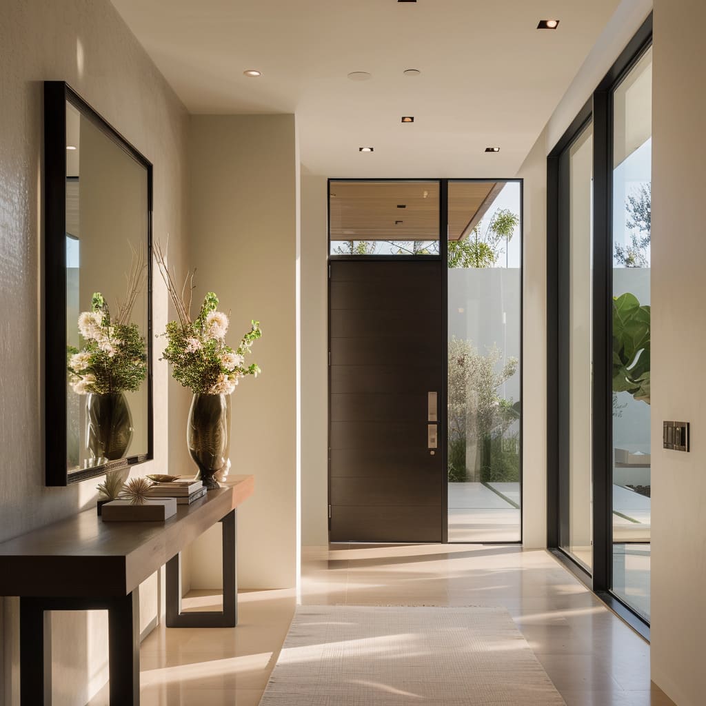
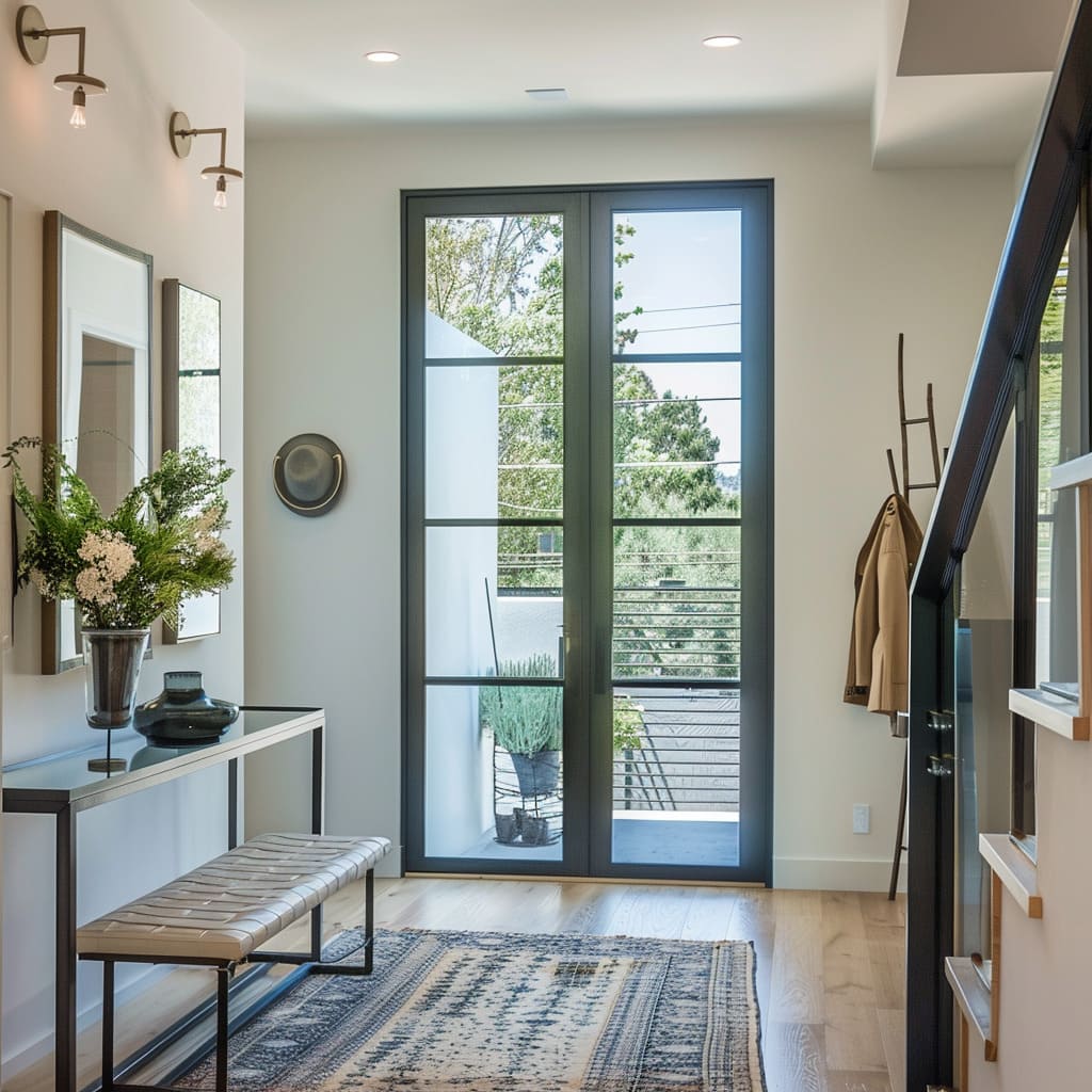
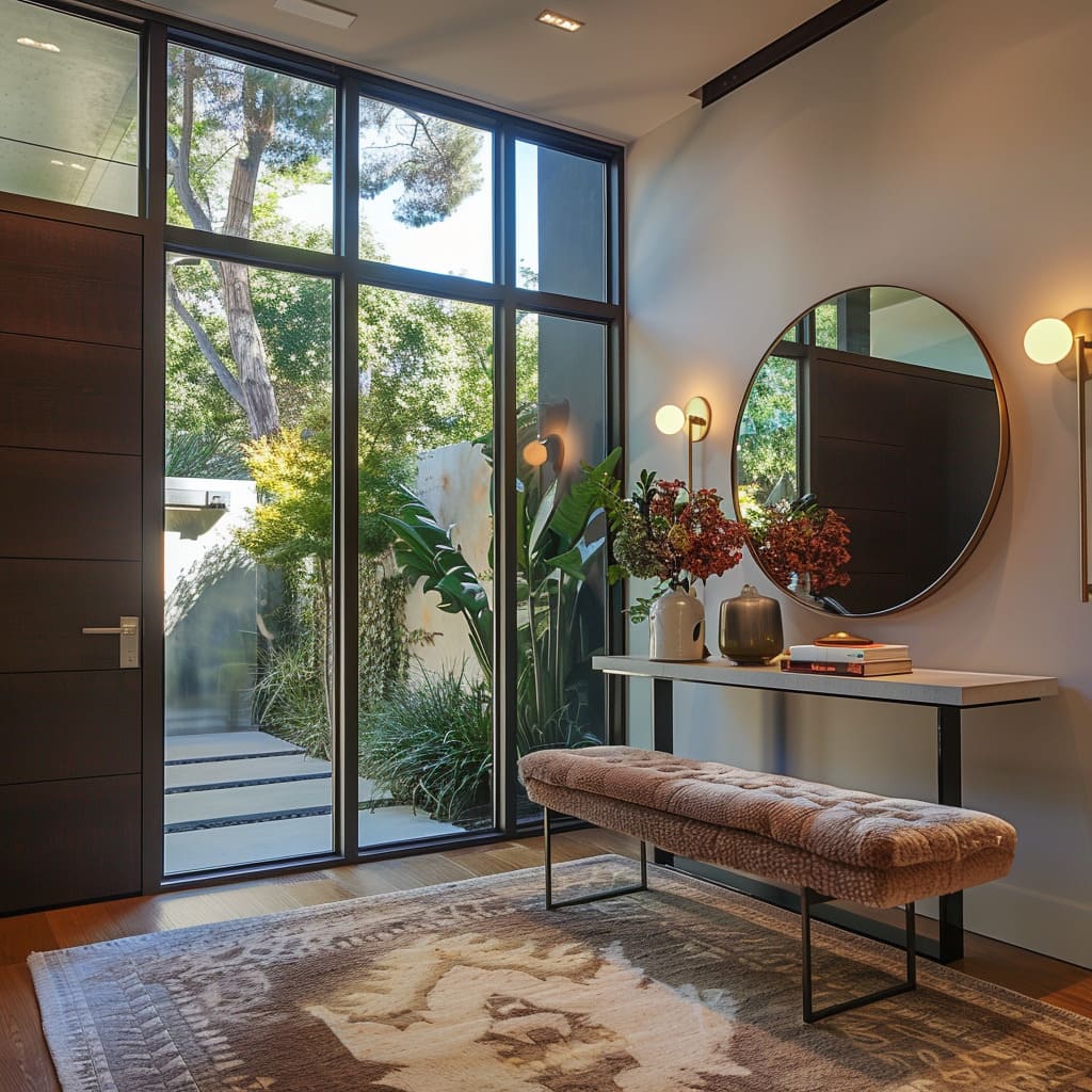
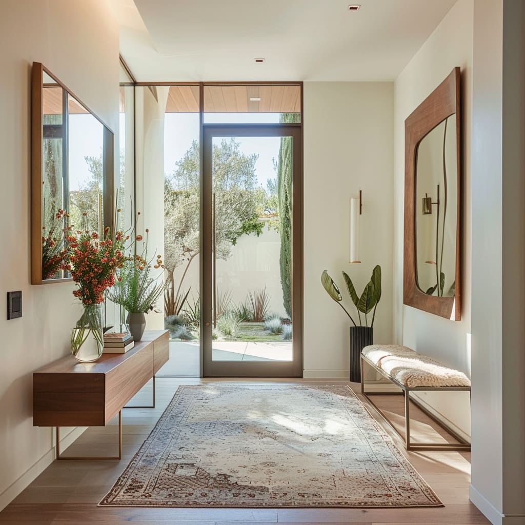
Welcome to a refined exploration of the modern entrance hall, a pivotal space that sets the tone for the entirety of a home. In this article, we dive into the nuanced elements that transform a mere entryway into a memorable introduction to a home’s design ethos.
From the dynamic interplay of doorway designs to the subtle cues of spatial harmony, each component is a testament to the power of thoughtful interior design. For homeowners seeking inspiration on how to elevate their own spaces, this article delves into how combining elements like innovative entrance door designs and cleverly curated interiors can create not just a pathway, but a grand entrance to your home.
Doorway Dynamics
The entryway of a residence is a prelude to the interior narrative that awaits inside. The blend of Contrasting Door Designs, Distinctive Hardware Features, and Diverse Window Framing converge to offer a warm welcome that speaks volumes without a word.
Each element is thoughtfully chosen to convey the underlying aesthetic philosophy of the home, and together, they create an initial impression that’s both memorable and inviting.
Contrasting Door Designs
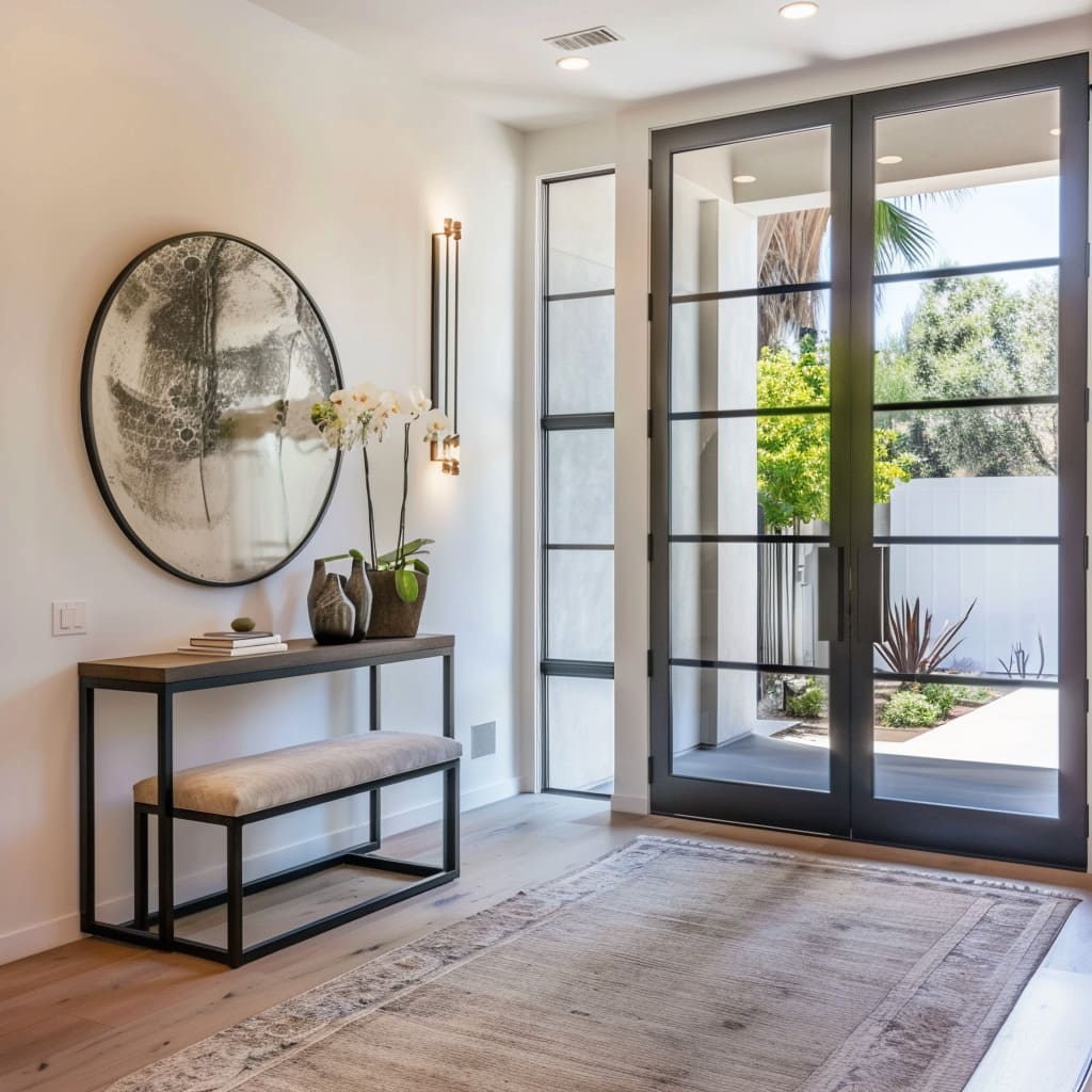
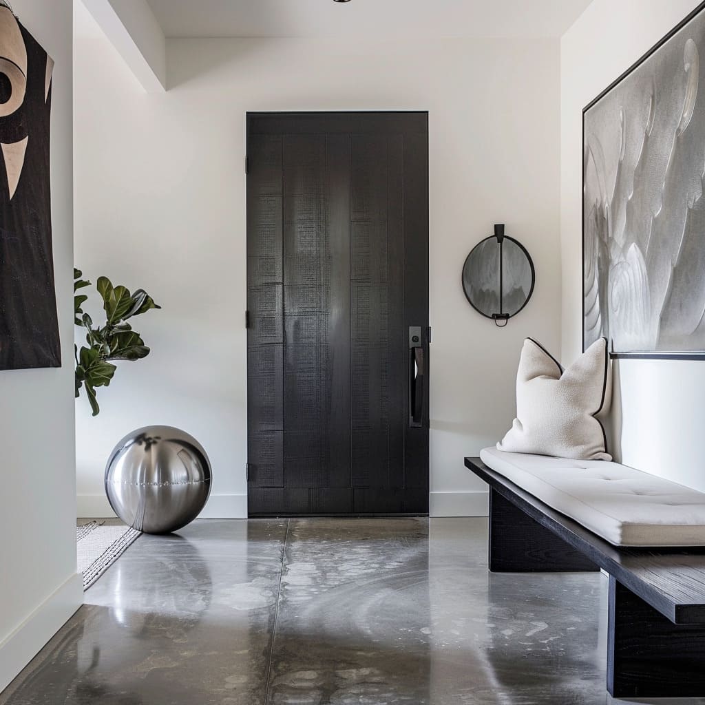
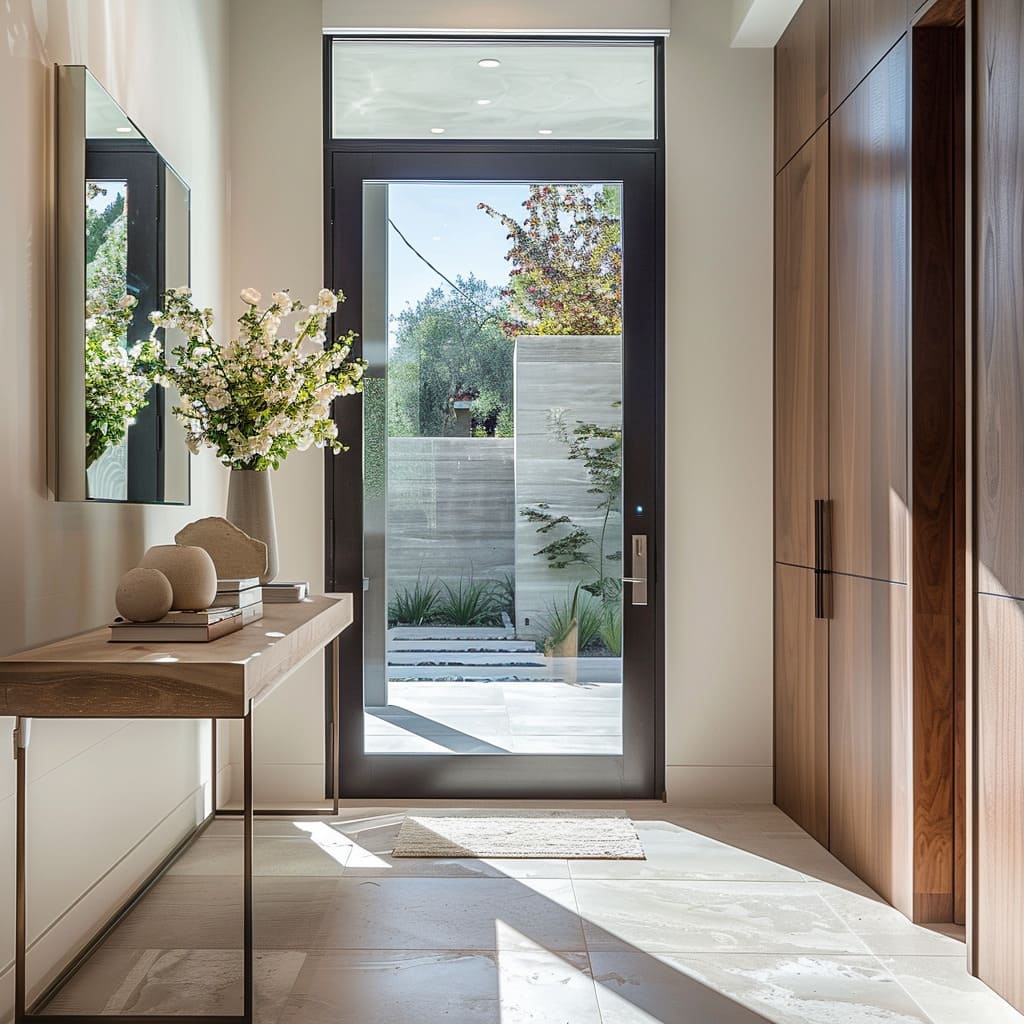
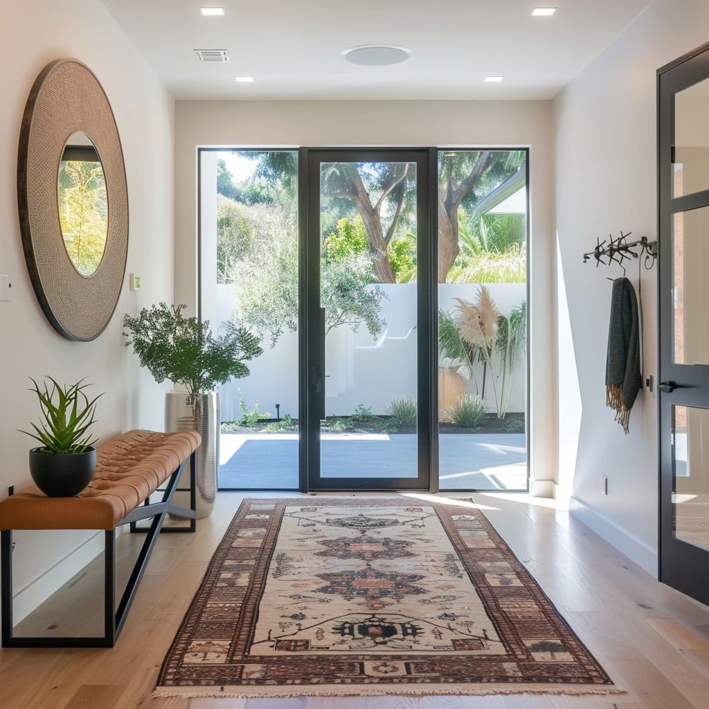
Here, the entrance doors are not mere entry points but personal statements of the home’s design ethos. With a variety of materials, from rich wood to modern metals and expansive glass, they provide a sneak peek into the homeowner’s style preferences.
Their diverse appearances, from robust and imposing to sleek and refined, set the tone for the rest of the home’s design narrative.
Distinctive Hardware Features
Hardware is the subtle yet striking detail that can often go unnoticed, yet it plays a crucial role in the overall aesthetic. Whether it’s a modern brushed metal handle that offers a cool touch of sophistication, or an ornate knob that whispers of a more classical preference, these elements are the unsung heroes of design, bringing both function and finesse to the forefront.
Diverse Window Framing
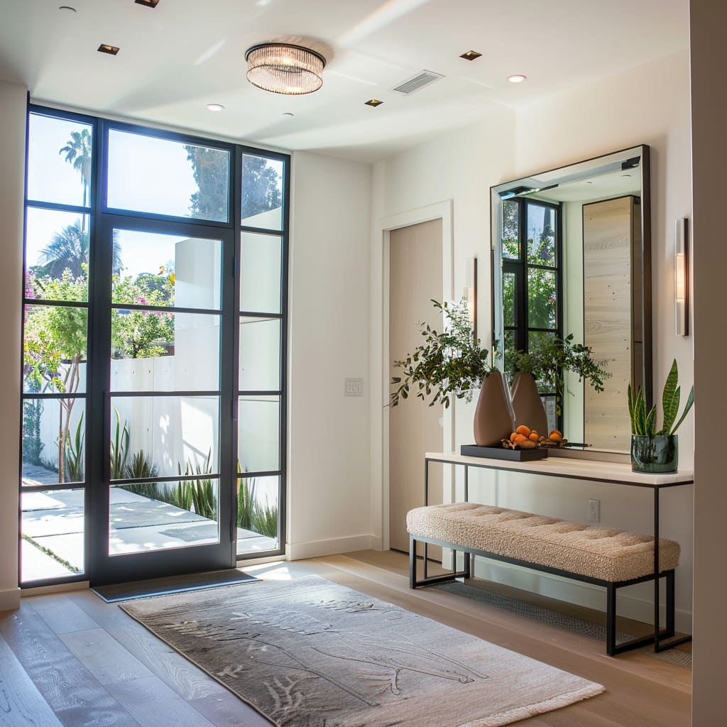
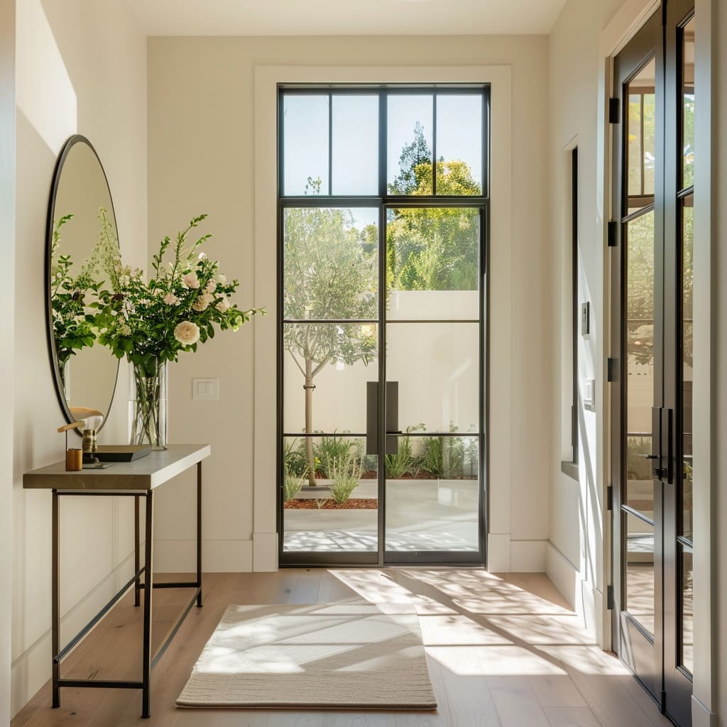
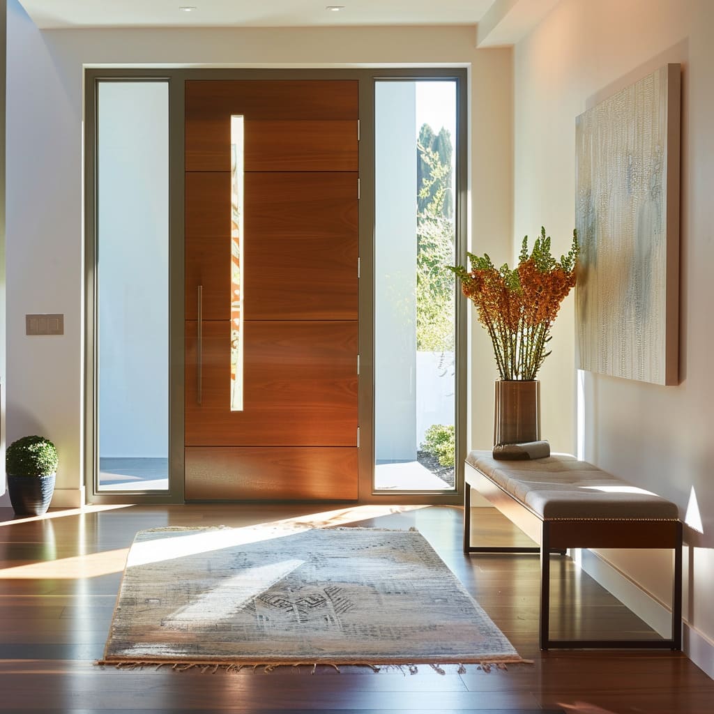
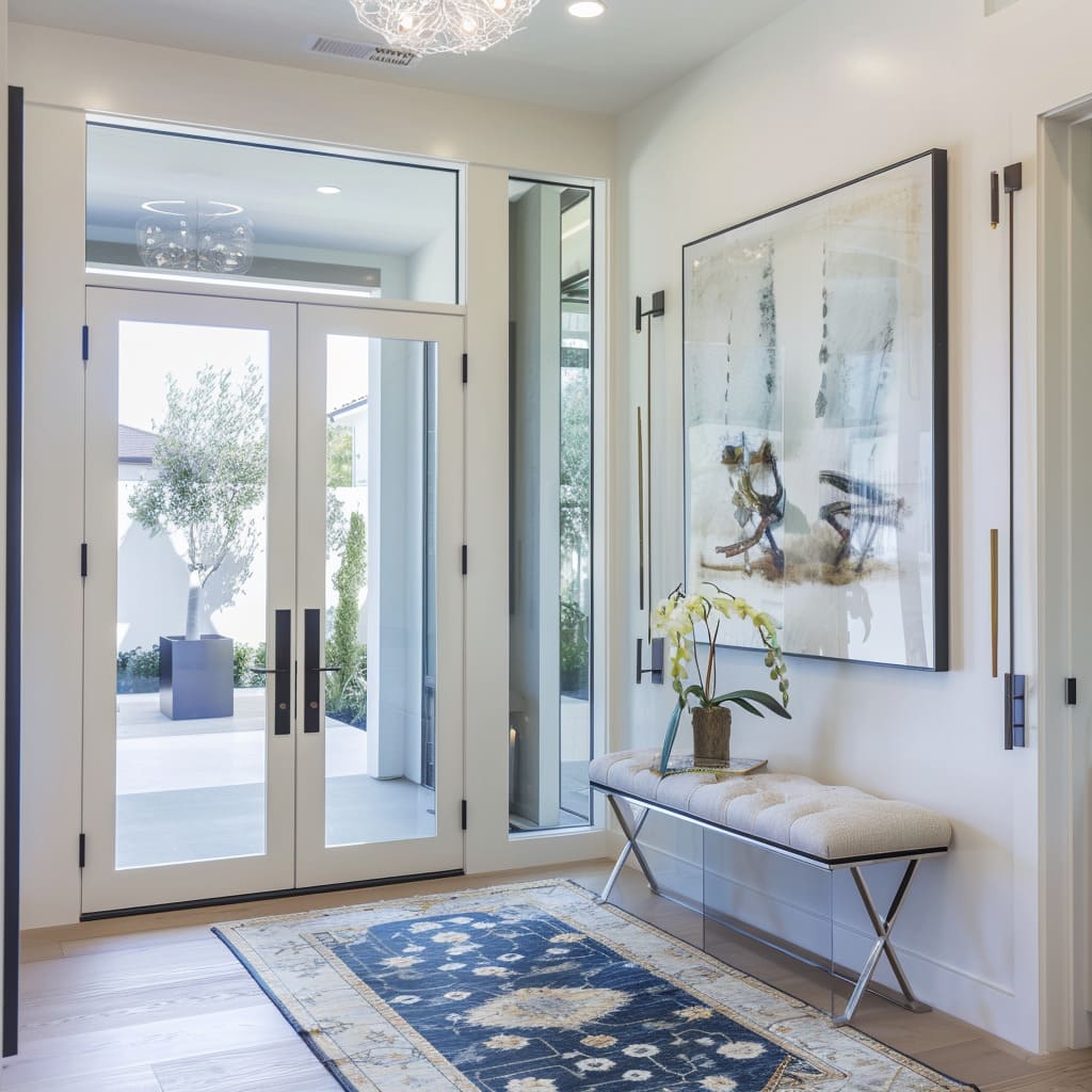
The frames that encase glass in doors and adjacent walls serve not only as structural necessities but also as distinctive art forms. The contrast in their designs—some bold and prominent, others delicate and barely there—creates a fascinating visual dialogue with the viewer.
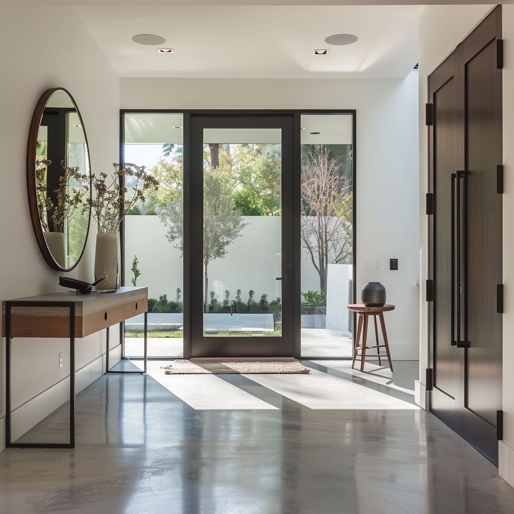
Their role extends beyond mere aesthetics; they frame the outdoor scenery, effectively incorporating it into the home’s design schema.
Spatial Symphony
In this exploration of the entrance hall’s spatial composition, we find that the interplay between Varied Ceiling Heights, Specific Use of Space, and Visual Flow composes a symphony of form and function. The deft arrangement of these characteristics invites a sense of rhythm and motion, guiding one’s passage through the doorway with an almost musical cadence.
The skillful manipulation of spatial elements can transform the mundane act of entering a space into an experience of fluid harmony.
Varied Ceiling Heights
As one observes the overhead contours, it becomes clear that the ceiling is more than a mere cover; it is a dynamic canvas. Some areas soar, offering a lofty canopy that inspires a sense of freedom.
In contrast, others descend, creating intimate alcoves that suggest a cozy embrace. This vertical variability introduces a silent melody that plays with the concept of volume and airiness in the interior concerto.
Specific Use of Space
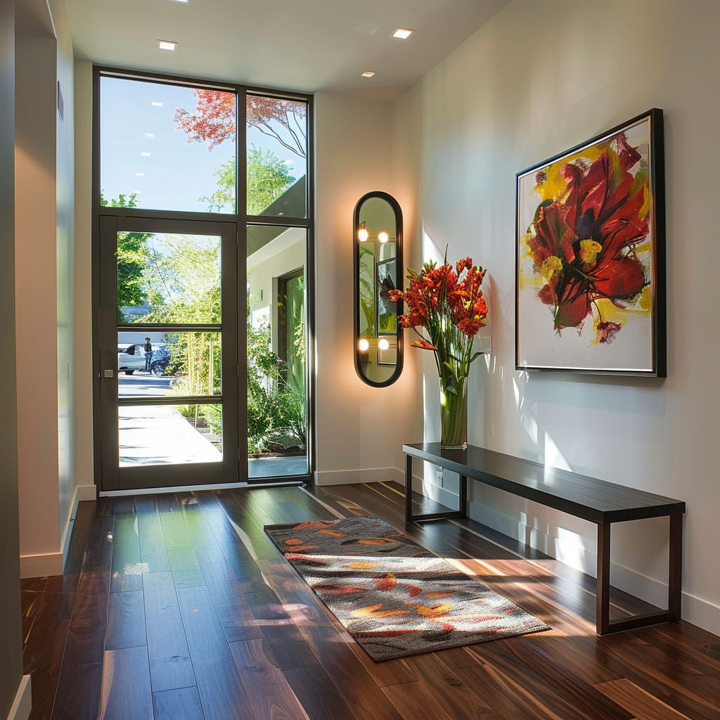
There is an intelligent allocation of space where nothing feels superfluous. Furniture is placed not just to fill an area but to guide movement and serve a precise purpose.
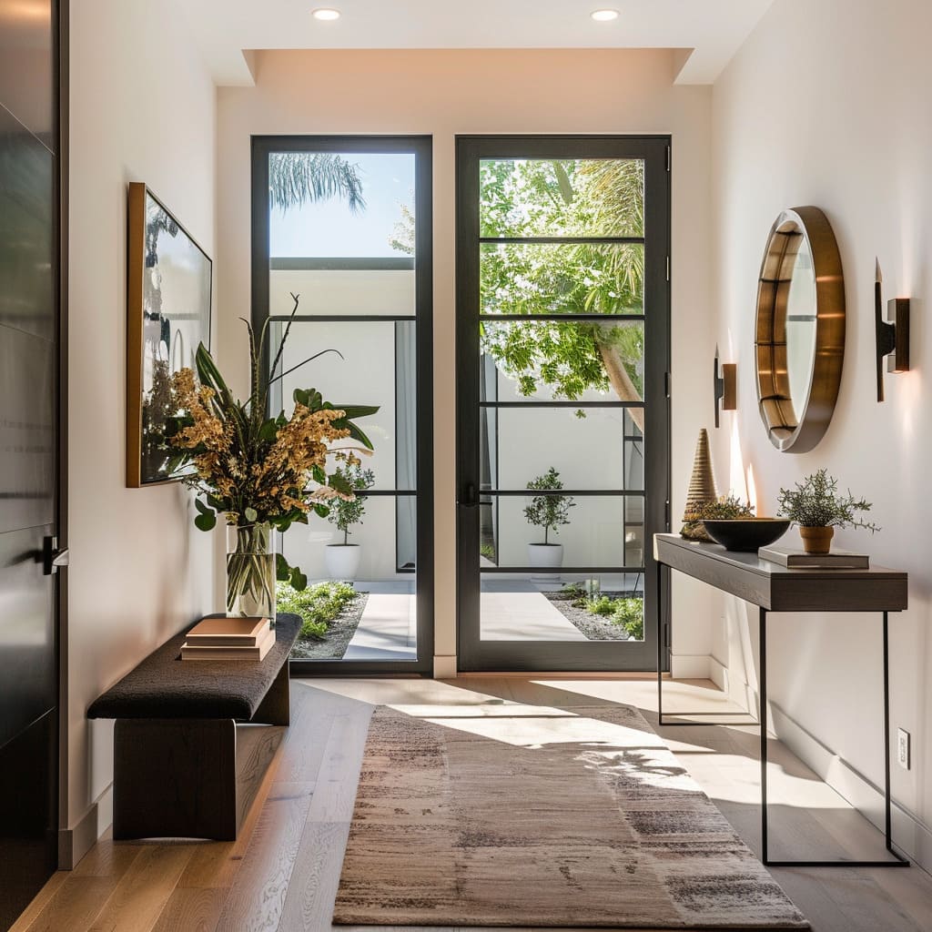
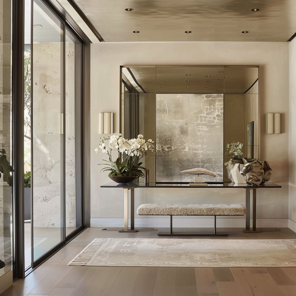
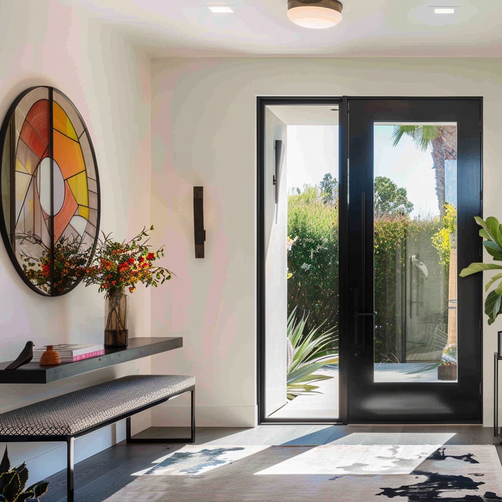
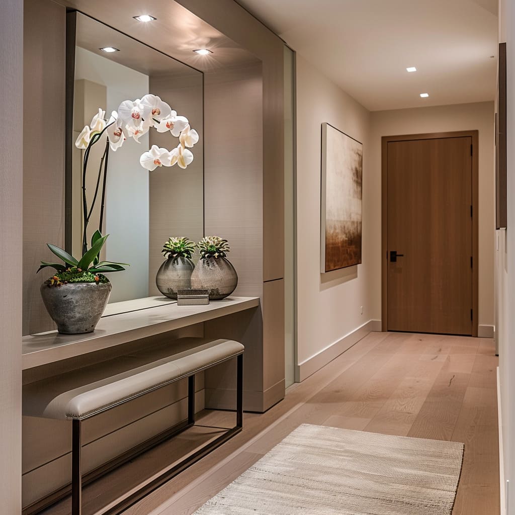
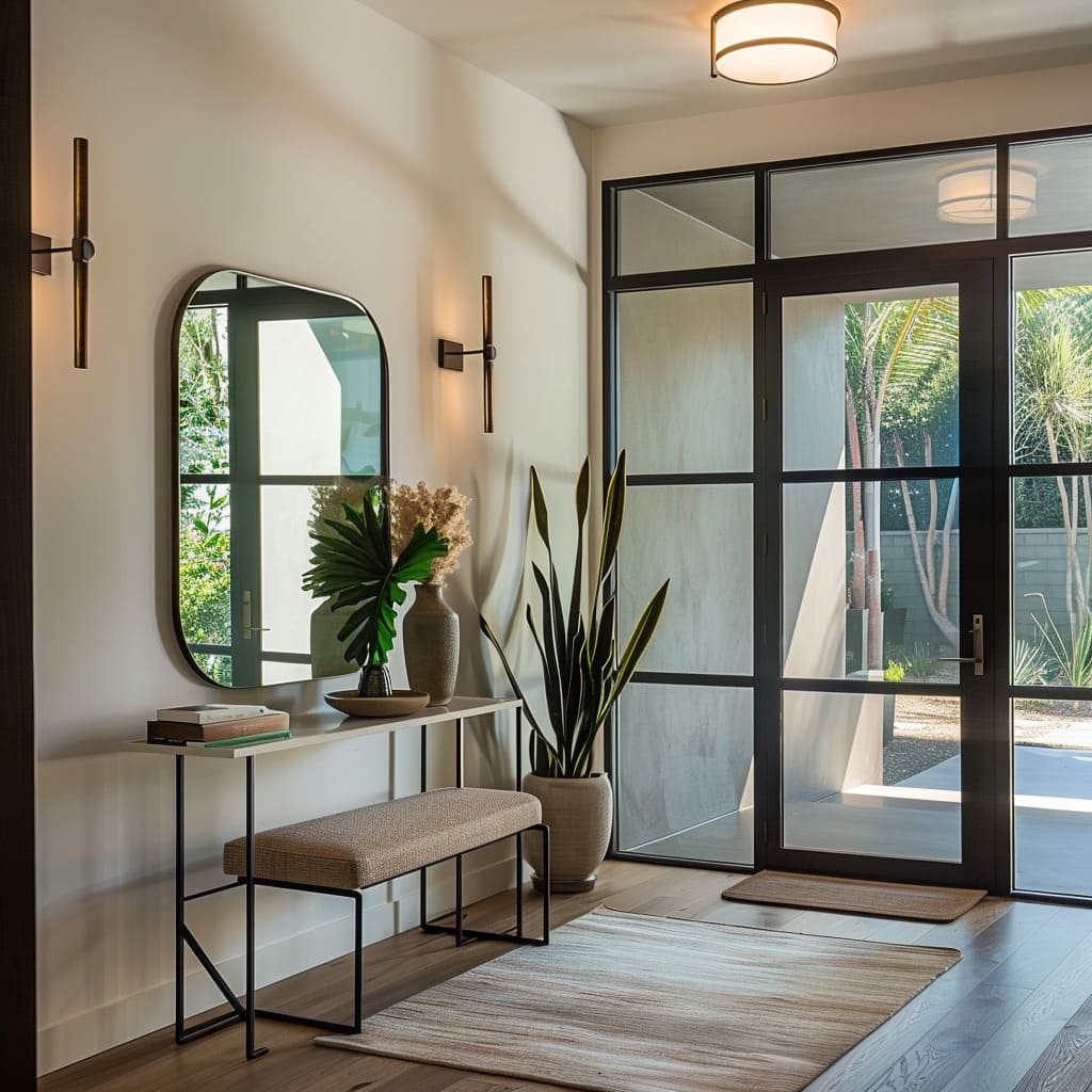
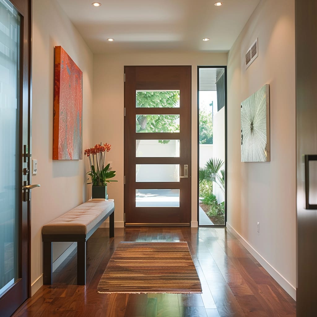
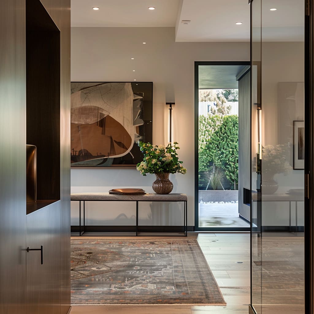
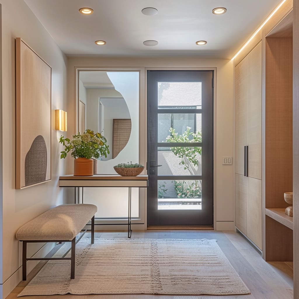
Benches offer repose; consoles provide a stage for personal artifacts. This efficient use of space ensures that each square inch contributes to the overall composition, echoing the philosophy of spatial economy where every element performs a key role.
Visual Flow
The choreography of movement within these spaces is subtle yet intentional. The directional cues are given not by signs but by the silent guidance of lines and forms.
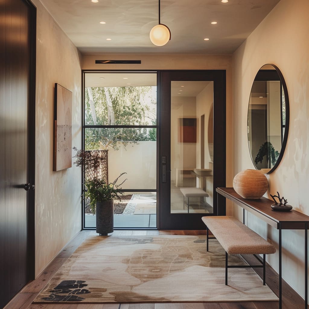
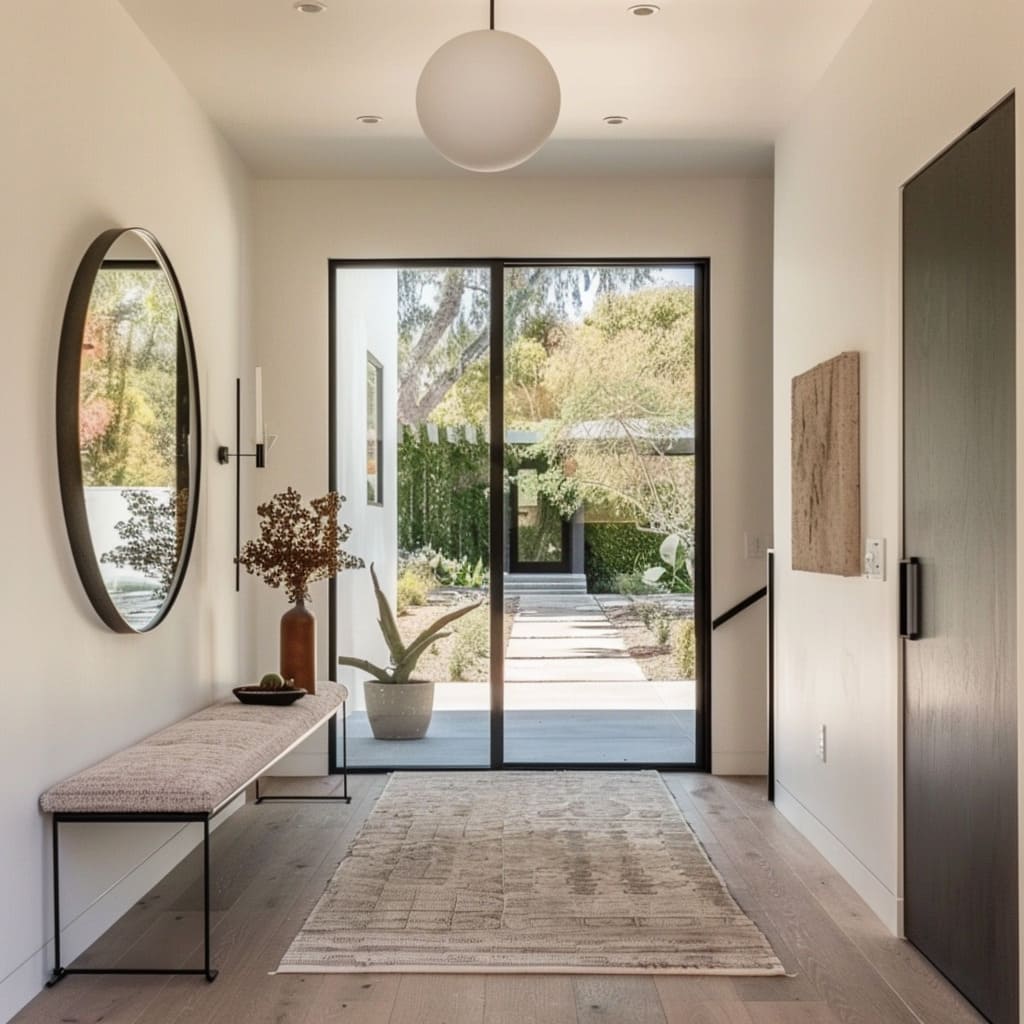
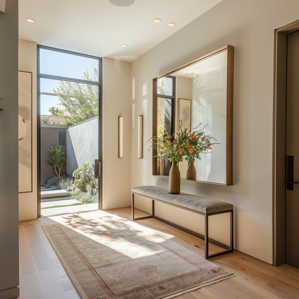
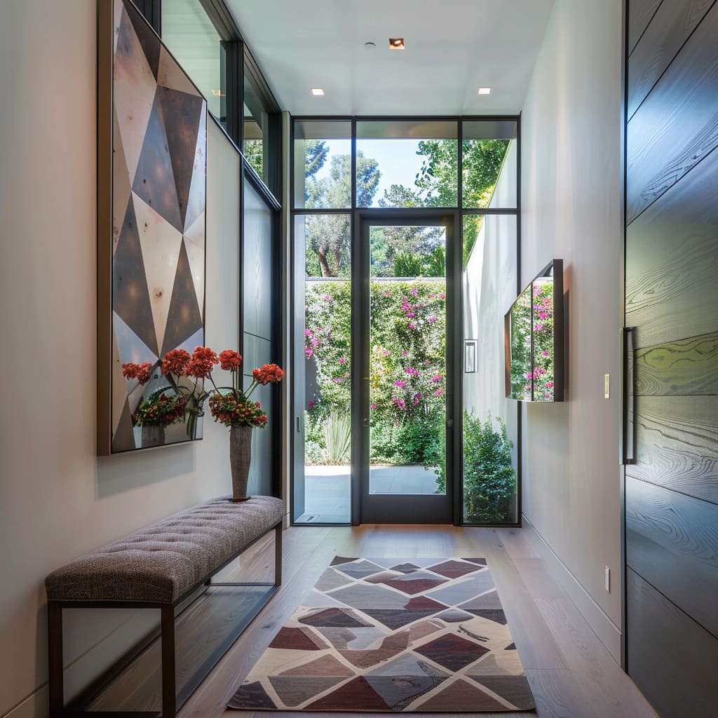
From the elongated path of a rug leading the way to the strategic positioning of a console that gently suggests a path, the visual flow conducts one’s gaze with the finesse of a maestro’s baton, ensuring that the visual journey is as smooth as it is instinctive.
Aesthetic Anchors
The aesthetic anchors in an entrance hall serve as the defining points around which the area’s character and ambiance revolve. These elements, ranging from the Placement of Benches and Distinctive Art Placement to Designated Focal Points and Curated Object Displays, are the pivotal features that root the design narrative, inviting both utility and contemplation.
Their placement is strategic, their presence significant, each contributing to a narrative that speaks to the visitor in a visual language.
Placement of Benches
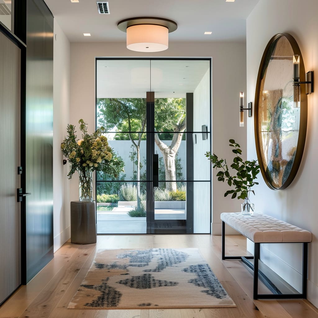
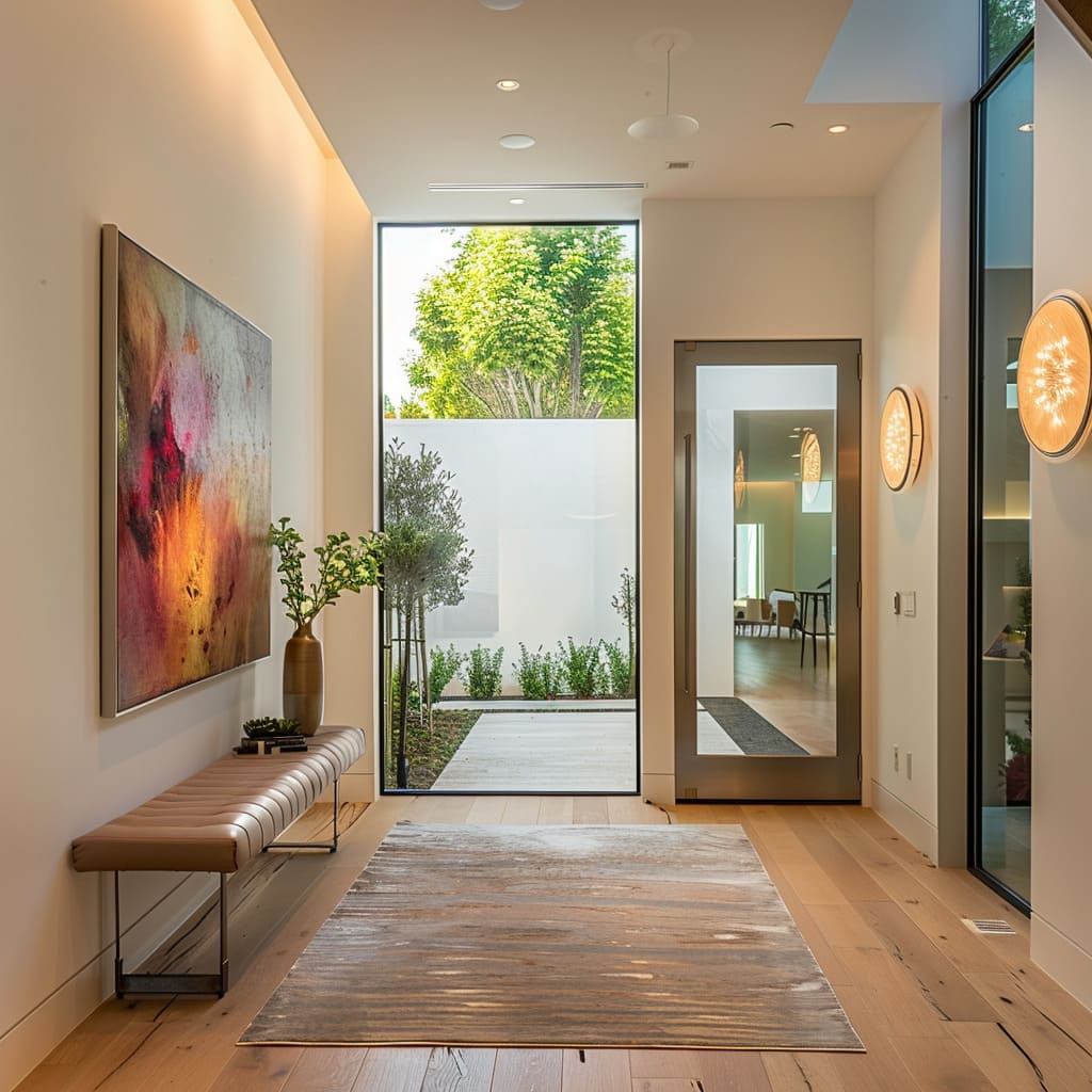
The positioning of benches is executed with thoughtful intent. Their presence offers a resting point, a moment of respite in the transition from outdoors to in.
But beyond their functional role, these benches are selected for their design and how they blend with the surrounding aesthetics—offering a visual respite as well, contributing to the room’s overall feel.
Distinctive Art Placement
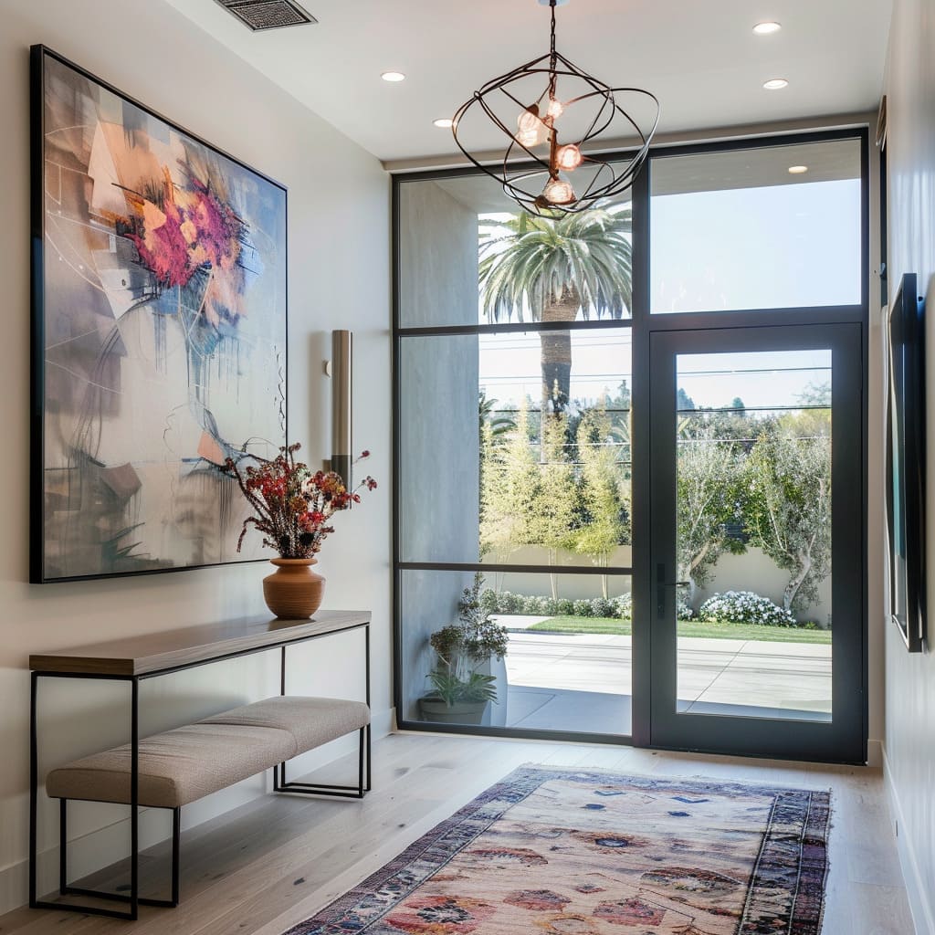
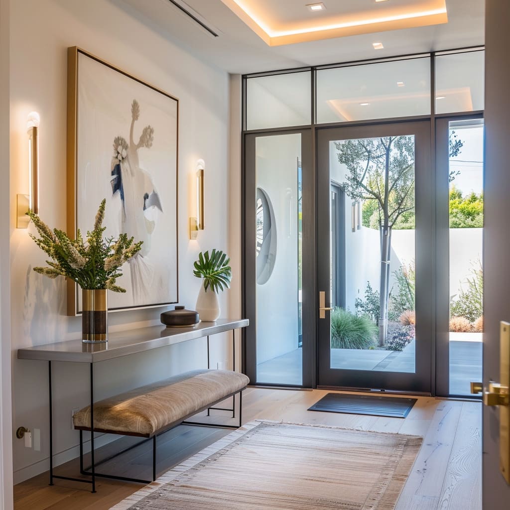
The selection and placement of artwork are done with a curator’s eye, where each piece is chosen not just to fill a space on the wall but to provoke thought and elicit an emotional response. The art acts as a silent interlocutor, initiating a dialogue with the onlooker and imbuing the space with a sense of culture and sophistication.
Designated Focal Points
Within these spaces, certain elements are anointed as focal points, intended to draw the gaze and hold attention. They might be bold in color, grand in scale, or unique in form, but regardless of their attributes, they serve as anchor points within the spatial choreography, providing a sense of stability and focus.
Curated Object Displays
The objects adorning tables and shelves are chosen with precision and care, each contributing to the narrative of the space. They may carry personal significance or be of aesthetic value, but each piece is part of a larger composition, contributing to the visual and emotional resonance of the entrance hall.
Color and Contrast Composition
The composition of color and contrast in an entrance hall is a dance of visual allure, where hues and shades play off each other to define and refine the space’s character. Utilizing Monochromatic Tones, fostering Visual Depth Through Contrast, and embracing Contrasting Textural Details, this design approach is akin to a visual symphony where each note is a color and every rest is a texture, all combining to create an experience that is both cohesive and striking.
Use of Monochromatic Tones
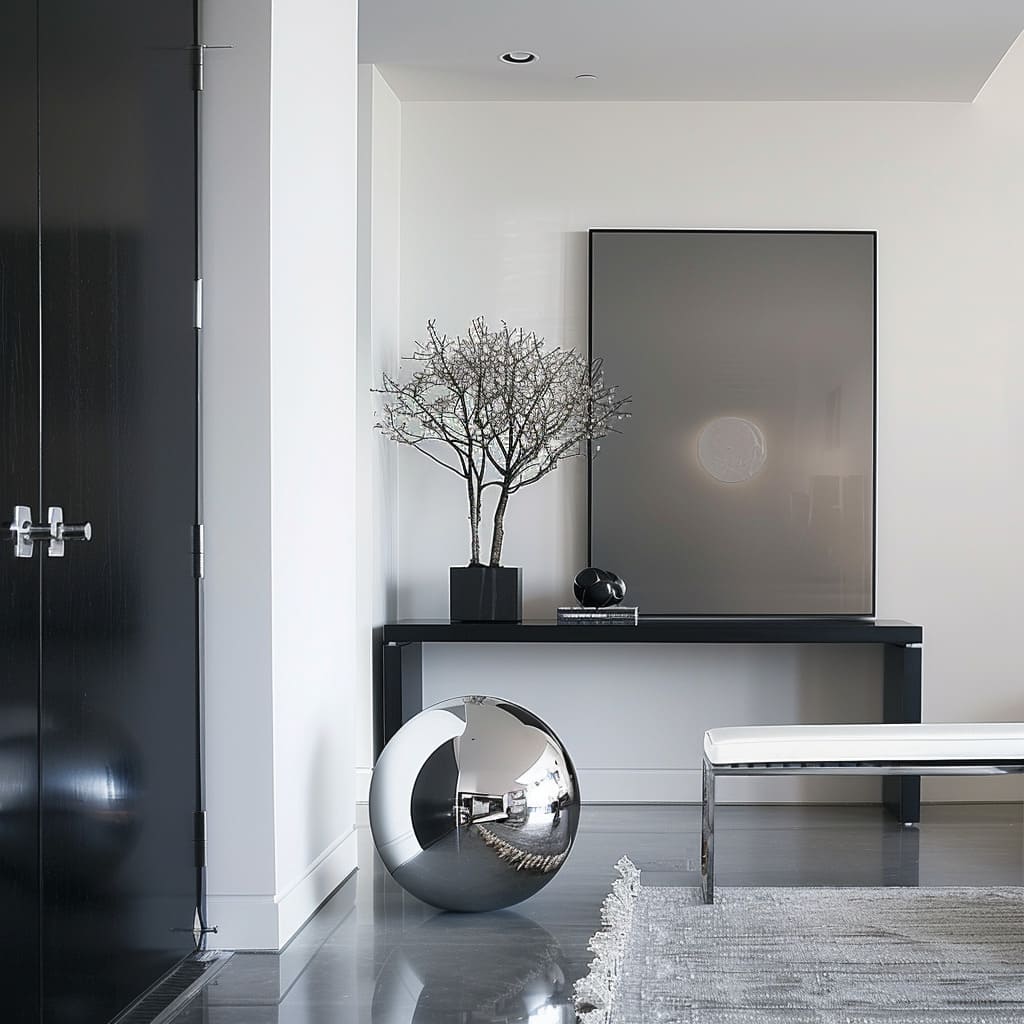
In the careful selection of monochromatic tones, there is a layering effect that lends sophistication to the space. A single color palette, with its varying intensities and shades, can give the room a sense of unity while highlighting the modern architectural features.
The depth created by this method is subtle yet significant, establishing a backdrop that allows other elements to shine.
Visual Depth Through Contrast
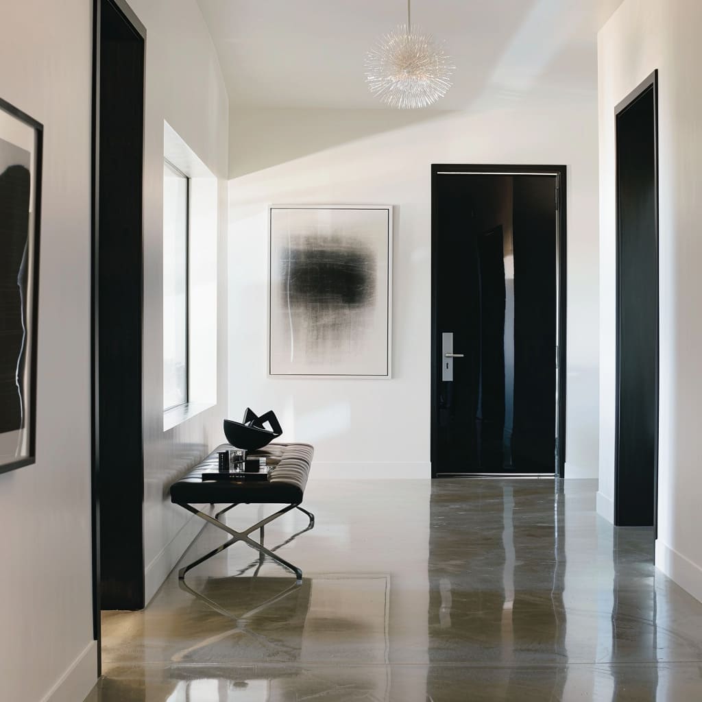
The strategic use of contrast creates an interplay of shadow and light that adds dimension to the space. Dark and light elements are balanced in such a way that they lead the eye and emphasize the volume of the room.
This technique not only defines the space but also adds a dynamic quality that changes with the shifting light throughout the day.
Contrasting Textural Details
A careful juxtaposition of textures adds a tactile dimension to the visual narrative. Smooth surfaces may be set against rough-hewn materials, or glossy finishes against matte, creating a sensory experience that invites touch and closer inspection.
This contrast in textures enhances the spatial experience without overwhelming the senses with an excess of variety.
Vertical Virtuosity
Verticality in an entrance space serves not only to guide the gaze but to shape the atmosphere within. The strategic Accentuation of Vertical Lines, incorporation of Vertical Design Elements, and mindful Consideration for Acoustics work in concert to craft an environment that elevates the senses and the spirit.
These elements, in their upward reach, create a sense of grandeur and expanse, transforming the essence of the room into something both grounded and aspirational.
Accentuation of Vertical Lines
The amplification of vertical lines serves to not only heighten the space but to craft an air of loftiness and dignity. These lines, exemplified by tall doors and elongated decor elements, draw the eye skyward, emphasizing the room’s stature.
The effect is one of cultivated grace, where the vertical aspects act as silent sentinels guiding the visual narrative.
Vertical Design Elements
The inclusion of elements with a vertical emphasis contributes a visual ascent, leading the gaze in an upward trajectory. This can be seen in the slim profiles of lighting fixtures, the slender frames of windows, and the stretch of artwork that climbs the walls.
Each contributes to the sensation of elevation, suggesting a space that transcends its physical boundaries.
Consideration for Acoustics
In the design of these entrance halls, there is a conscious integration of materials and shapes that cater to acoustics. The way sound travels through the space – whether it’s the soft closing of a door, the subtle echo of footsteps, or the hush that envelops the room – is finely tuned to create an auditory experience that is as welcoming as it is harmonious.
Seasonal and Natural Nuances
The interweaving of the natural world and the rhythmic cycle of the seasons into the fabric of an entrance hall infuses it with vitality and a sense of the passage of time. The strategic Mature Plant Selection, the Incorporation of Seasonal Elements, and the Use of Rugs to Define Areas are deliberate nods to the organic and ephemeral aspects of design, uniting the outdoor ambiance with the indoor charm.
These components not only decorate the space but also resonate with the living essence of nature’s own design principles.
Mature Plant Selection
The introduction of mature greenery into the entrance area lends an air of growth and continuity. These plants, with their full forms and rich textures, stand as symbols of nurturing and care.
They are more than mere adornments; they are living sculptures that grow and change, their leaves and blooms marking the passing of time.
Incorporation of Seasonal Elements
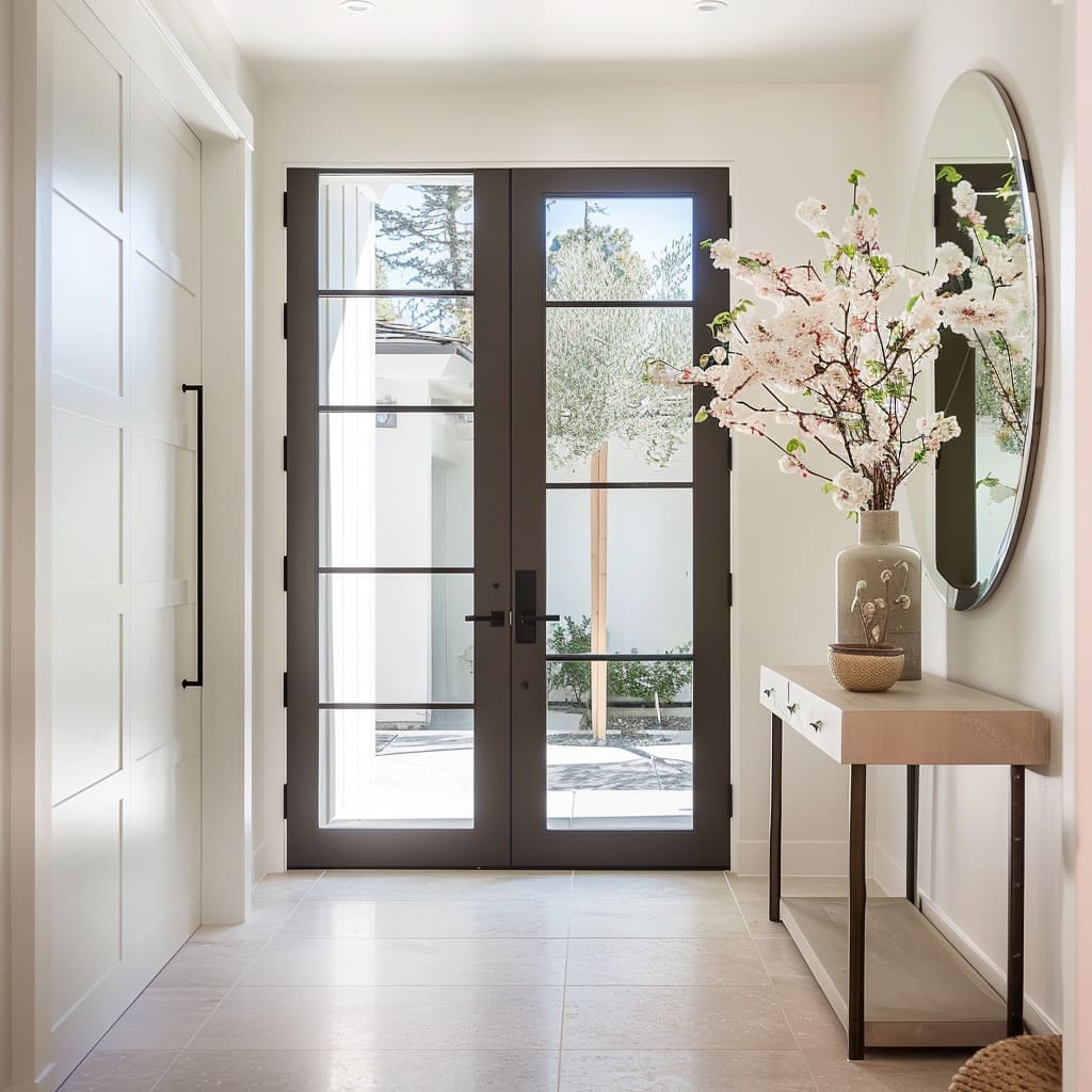
Adorning the space with elements indicative of the current season—be it a bouquet of spring blossoms or autumnal leaves—serves as a bridge between the interior world and the natural cycle outside.
These seasonal touches are quiet acknowledgments of the world’s natural rhythm, offering a visual reminder of the ever-changing nature of life.
Use of Rugs to Define Areas
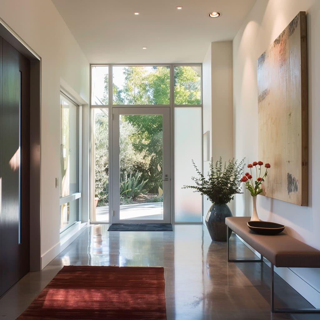
Rugs serve a dual purpose they are both practical and symbolic. On one hand, they delineate sections of the space, creating invisible boundaries.
On the other, they are a canvas upon which the seasons and nature are reflected through patterns and colors that speak to the outside world, grounding the space in the comfort of the familiar.
Serenity and Space Curation
This final collection delves into the tranquil essence achieved through meticulous space curation, manifesting in Visual Quietness, Artful Use of Space, and Selective Use of Mirrors. These design principles act as the silent undercurrents of calm within an entrance, inviting one to slow their step and absorb the thoughtful tranquility offered by the surroundings.
The result is a sanctuary-like threshold that stands in gentle contrast to the kinetic world beyond its confines.
Visual Quietness
This aspect of design is akin to a visual whisper, a subdued palette and uncluttered surfaces that promote a sense of peace and calm as one transitions from the outside in. The absence of visual chaos doesn’t strip away interest but rather focuses it, allowing each selected piece and design choice to speak softly yet significantly, contributing to an ambiance of repose.
Artful Use of Space
The strategic composition of the environment takes cues from gallery design, where the placement of each item is intentional and precise. The result is a space that communicates a sense of purpose and thoughtfulness, each area designed as if it were its own vignette, complete with a narrative that complements the overall theme of the home.
Selective Use of Mirrors
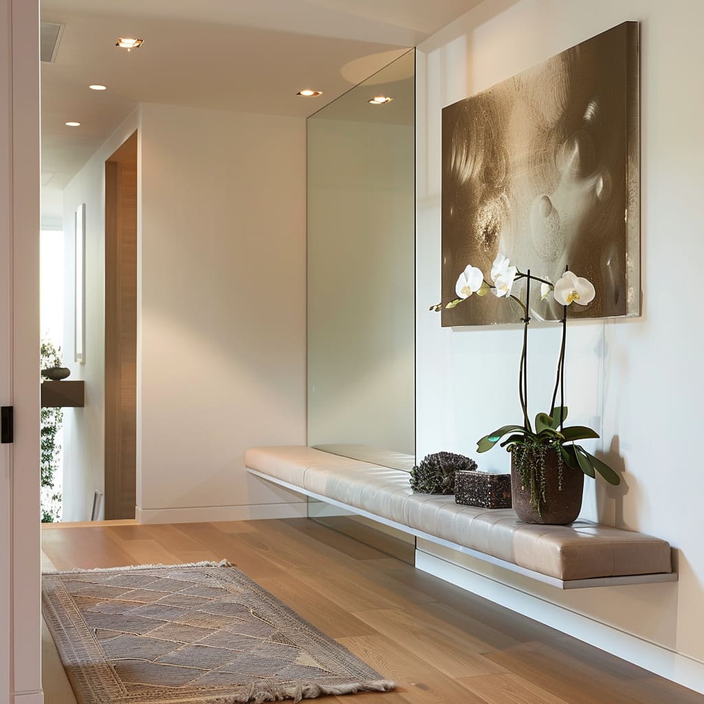
In these spaces, mirrors are employed not merely as tools for reflection but as portals to a larger sense of space. Positioned to catch light and vistas, they offer glimpses into the depth beyond their own surfaces, carefully chosen to amplify the natural light or to bring a piece of the outside view into the interior landscape.
In conclusion, the art of designing an entrance hall goes beyond mere aesthetics; it’s about crafting an experience that greets every visitor with a story. This exploration through varied design aspects—from the tactile intrigue of textures and materials to the strategic placement of art and mirrors—demonstrates how each choice plays a crucial role in welcoming and impressing.
For those looking to redesign their entrance spaces, consider these elements not just as individual pieces but as parts of a larger narrative that your home unfolds for every guest. Whether it’s the echo of footsteps under soaring ceilings or the inviting tranquility of visual quietness, each detail contributes to making your entrance hall not just a transition space but a destination in itself.


