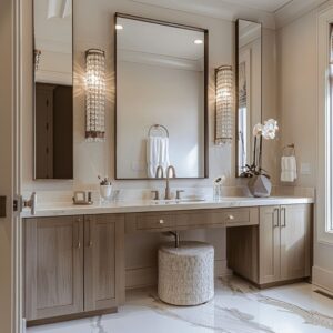
The combination of beige and black has taken on a quieter, more refined role in interior design—especially in bathroom spaces where contrast needs to do more than stand out. It needs to hold form, direct focus, and settle into the rhythm of materials and light.
This pairing is no longer about stark opposition. It’s about subtle alignment between softness and edge, between warmth and outline.
Beige carries the space like a background hum—plaster, stone, or tile surfaces reflecting light in soft gradients, diffusing glare and shaping shadows. It’s never loud, but it builds the entire room’s atmosphere.
In contrast, black cuts through with clarity. Whether it’s in the frame of a mirror, the edge of a fixture, or the grid of a shower screen, it gives structure without shouting.

Together, these two tones form a controlled palette that’s far from plain. Texture replaces pattern.
Shape repetition substitutes symmetry. Every surface and element becomes part of a conversation between tone, line, and volume.
The latest ideas in beige and black bathroom design explore how this balance can be used to define a space—not by competing, but by cooperating. This article breaks down how light, material, proportion, and detail come together to make this palette feel both grounded and sharply intentional.

Beige as Atmosphere, Not Color
In many interiors, beige doesn’t behave like a typical color. It acts more like a filter—like the ambient tone of a quiet sky or the dusted light in a shaded courtyard.
Especially in a beige and black bathroom, the beige works as a spatial backdrop that holds the room together, not by adding saturation but by muting everything around it into balance. Whether the surface is plastered by hand, cut into limestone slabs, or set in fine zellige patterns, beige builds a continuous envelope where light can drift smoothly.
There’s no harsh bounce, no sharp break. Instead, it absorbs and scatters just enough light to give the room a soft focus.
Corners soften, fixtures begin to hover, and the eye is pulled more by outline than by color.

The texture of beige plays a quiet trick on perception. Its temperature shifts gently with the daylight—leaning cool near windows, warm under artificial light—which makes walls and edges appear to move slightly across the day.
A sharp corner at noon may blur by dusk. This slow, tonal drift changes the perceived shape of the room over time, introducing a subtle kind of motion that has more to do with light behavior than layout.
Even when polished to a gloss, beige can shimmer like moving water, while in matte form, it absorbs the glare and turns the shape of each object into a clearer silhouette.

Black as Graphite Line—Thin, Thick, and Shadow
Black is never merely “contrast. ” It serves three distinct graphic jobs:
| Graphic Job | Visual Outcome | Examples |
|---|---|---|
| Calligraphic outline — razor-thin frames, faucets, grid mullions | Sketch-like edges that sharpen beige softness without adding mass | grid shower, mirror edge, pendant & frame |
| Weight anchor — solid monoliths or ceiling planes | A controlled “gravity field” that stops the eye from drifting and grounds pale stone | pedestal sink, slatted ceiling, tongue-and-groove lid |
| Shadow proxy — recesses or negative gaps read as true black | Adds depth without additional material, so beige feels thicker by contrast | window mullions reflecting mirror shape, back-lit niche |
When black appears as ceiling slats or upper beams, it visually compresses height, making horizontal beige surfaces feel broader—an illusion that enlarges footprint without changing square footage.

Texture Duets: Quiet Roughness vs. Polished Density
A beige black bathroom design rarely depends on heavy decoration. What creates depth here is contrast—not of color, but of texture.
These interiors often rely on carefully planned surface dialogues, where one material reflects softly and the other absorbs sharply.
- Soft grain beige against high-vein black creates a balance that’s easy to feel but hard to pin down. For example, beige tiles laid in a rigid grid might face off against slabs of dramatic black marble, and though their textures differ wildly, the white veining in the marble often mirrors the tile joints below. This subtle sync creates an almost musical alignment that ties wall and floor together, even if they’re built from opposing materials.
- Porous beige against flat black metal tells another story. Walls lined in mosaic or handmade stone may carry tiny irregularities, catching warm light in specks and shadowing unevenly. Against this, slim matte black fittings stand still—linear, quiet, and absolute. The contrast sharpens the shimmer in the stone, making small highlights feel deliberate, not accidental.
One of the finer observations in these rooms lies in the stone itself. Beige surfaces often hide mineral flecks—specks that, when dark enough, seem to mirror a black sconce or faucet nearby.
This is not just surface detail. It’s a hidden connector.
A tiny dark dot in a limestone slab quietly makes the black elements feel like they belong. Not because they match, but because they echo something already present in the material.

This is how beige and black work when used with visual intent. They rely on tone, material, and proportion—not flash.
And when the surface stories are this carefully tuned, even the quietest bathroom design holds more than meets the eye.

Curves vs. Lines: Calibrated Softening
In many layouts, the most expressive shapes are the quietest ones. Curves—whether carved into an arch, mirrored in an oval frame, or formed by a rounded vessel sink—create a softened pulse inside an otherwise linear setting.
These shapes bring a counterbalance to straight lines found in cabinetry, tile grids, or frameless panels. The choice of beige here does more than just match surroundings.
Its low contrast and warm tone gently mute the outline of curved forms, allowing them to feel natural instead of graphic. Where white might sharpen a curve into a highlight, beige allows it to recede slightly, blending the edge so it feels calm and smooth, not stylized.

This is where restraint becomes technique. In spaces where there’s already strong geometry, the curve steps in as a quiet correction—rounding off the sharpness without shifting the design’s tone.
One subtle visual tactic: when black follows the line of a curve, like a pendant with a saucer-shaped shade or a bowed fixture arm, it conceals any seam or join in the form. The deep tone absorbs light, making the object appear as one complete gesture.
This can give even modest fixtures the impression of being cast from a single piece—an effect that elevates without showing off. This visual trick is one of the understated advantages in many black beige bathroom ideas, where form can be simplified by color, not cost.

Light Handling: Beige as Lamp, Black as Dimmer
Light behavior in a beige bathroom with black fixtures rarely announces itself—it’s built into the structure. Soft-toned plaster or stone surfaces in beige often serve as quiet reflectors.
Whether cast by LED strips hidden behind a mirror or uplighting tucked into a ceiling ledge, the beige surface absorbs and returns a glow that feels even and wide. These finishes tend to reflect warmer wavelengths better, spreading a golden bounce without hotspots or glare.
That glow softens corners, lifts volumes, and turns the wall into a light source itself.

In contrast, black functions more like a shutter. It holds the shape of the glow by containing it.
Fixtures in matte black—especially wall-mounted ones—can appear almost silhouetted under a bright mirror. The effect is dramatic without needing shine or polish.
Black fittings here don’t demand attention. They frame the light, stopping it exactly where it needs to rest.
In checkerboard compositions, this contrast gets more dynamic. Beige tiles pick up the glow and reflect it gently across the surface, while the darker squares seem to swallow it.
The eye reads this as motion. Even in a still space, this quiet alternation gives a sense of progression—like a rhythm that guides how someone moves through the room without visible signage or obstruction.
These quiet strategies are what give these spaces their layered precision. Light, tone, and material aren’t treated separately—they’re allowed to cooperate.
And it’s that cooperation that lets both curves and contrast feel intentional, not ornamental.

Psychological Weight Balancing
In a space where contrast is used with intention, there’s always the risk of visual imbalance—especially when darker elements are concentrated near the ceiling. Overhead black slats, bold pendant groupings, or even matte black ceilings can compress a room visually if not paired with something that restores equilibrium.
What often corrects this is a horizontal beige element placed at eye level. Whether it’s a fluted counter edge, a long light-toned mirror frame, or a stone vanity top with visible grain, this stretch of beige acts like a visual shelf.

It doesn’t simply divide the space—it holds it. By situating the lighter tone across the middle third of the view, the beige “carries” the darker features above it, giving the room a grounded center of gravity.
The result is a space that feels quietly stable, even when it plays with strong tonal contrast. This technique appears again and again in a beige bathroom with black features—it’s the kind of move that’s felt more than noticed.
It keeps the eye from reading the dark as too heavy, making the entire height of the room feel more evenly distributed.

Miniature Landscaping: Touches of Living (or Dried) Green
In otherwise tightly controlled color schemes, plants step in as the only hue that pushes past beige and black. Their use is often minimal—a single potted stem, a branch in a vase, or a low cluster of grasses—but in a room built on subtlety, that’s enough.
Against the softness of warm stone or plaster walls, green becomes visually active. It pops, not in a loud way, but in a calibrated shift.
The black elements around it—mirror frames, faucet stems, or window trims—echo the line weight of the plant itself, so the color becomes more than a decoration; it feels structured into the space.

There’s also a quiet optical trick happening. Because beige tones often carry a red or yellow base, even a small amount of greenery will appear richer, slightly more saturated, than it would in a white or gray setting.
This allows the use of very restrained plant accents to carry more weight than expected. A tiny olive branch or dried stem can bring the same vitality as a full leafy arrangement in a colder palette.
These touches shift a black beige bathroom away from feeling too stark and instead give it something that feels lived-in, calm, and complete—without needing a single extra color to break the scheme.

Checkerboard Re-think: Warm Neutral vs. Warm White
The familiar checkerboard floor has taken on a softer tone in recent bathroom layouts—trading its traditional stark white for a buttery, sandy beige. This one adjustment changes the entire behavior of the surface.
The visual snap of black-and-white contrast gives way to a more gradual rhythm. Shadows between tiles no longer form sharp outlines but melt slightly, allowing the pattern to feel quieter and more continuous.

This warm shift also makes it easier to pair with materials like brass and natural wood. Instead of bouncing cool glare, beige reflects a subtle golden cast, softening metallic finishes and giving them a glow rather than a glint.
Even the black elements benefit: black reads deeper when flanked by two warm hues, like the gentle beige tile and brass fixture. The eye reads the dark tone as richer, more grounded—not just present but intentionally placed.

In these layouts, the checkerboard stops feeling like a vintage reference and starts behaving like part of the architecture. It doesn’t pull attention but still structures the room with a quiet, dependable rhythm that supports everything around it.

Subconscious Echoes and “Spatial Rhymes”
Some of the most powerful visual alignments in a space are the ones that aren’t obvious. Certain forms repeat across the room—not exactly, but close enough to create a quiet harmony.
These shape echoes build a kind of visual memory, where the eye finds familiar patterns without needing to identify them.

Think of a slim vertical wall sconce placed beside a mirror—it’s not just a light, it mirrors the shape of a nearby window frame. Or a fluted vanity made from light oak—the vertical texture here might be picked up again in the ribbing of a wall tile.
Even round vessel sinks can reflect the curvature of a pebble-mosaic floor or a nearby mirror. These repetitions aren’t loud.
They happen at different scales and materials, but they land just enough to keep the viewer anchored.

This is where a black beige bathroom earns its visual stability. The color contrast holds attention, but it’s the repeated shapes—hidden rhymes in structure—that make the space feel whole.
And while most visitors might not consciously spot these moments, their presence shapes how balanced the room feels. It’s less about symmetry and more about rhythm—a language of forms that plays softly in the background.

Conclusion
The balance between beige and black is less about contrast and more about control. Beige sets the tone by behaving like a visual filter—softening edges, spreading light, and letting the shape of the space lead over its color.
It works quietly, filling the room not with statement but with atmosphere, where fixtures and surfaces can blend, hover, or recede depending on how light lands.

Black, in contrast, defines. It acts like punctuation—marking where the eye stops, turns, or lingers.
A thin-framed mirror, a flat faucet, a slatted ceiling—these details aren’t added for drama, but for clarity. They separate areas without physical barriers and let the room breathe between accents.

Where color would typically lead, here it’s texture that speaks. Surface variation—polished against matte, grain beside gloss, ribbed paired with flat—adds interest without needing loud tones.
Even the smallest detail, like the echo between a fluted cabinet and a ribbed tile, contributes to a quiet rhythm that holds the room together.

This approach leaves space for thoughtful contrast—a dried branch, a brushed brass fixture, or a single green plant—to stand out without noise. These elements don’t overwhelm because beige keeps them grounded and black gives them shape.
The result is a beige and black bathroom that feels composed, but not over-controlled. The restraint is what makes it current.
The simplicity is what keeps it lasting. Every choice carries weight—not in how much it shows, but in how well it holds.