Modern classic living room design keeps the dignity of traditional architecture while removing the extra visual weight that can make a formal room feel dated. They do not mix old and new in a random way.
The architectural shell carried the history, proportion, and permanence, while the furniture and styling were simplified to keep daily life comfortable, open, and current. That is the foundation of modern classic design.
It is not classic decor with a few newer pieces added in. It is a room where the architecture leads, and everything placed inside it is edited so the room feels settled rather than overloaded.
The first key element: a strong architectural shell
Modern classic living rooms begin with a permanent-looking envelope. This shell often included coffered ceilings, beam grids, wall paneling, deep trim, built-ins, balanced fireplace walls, and symmetrical framing.
These details gave the room its sense of order and weight.

What makes this feel current is not the removal of those traditional elements. It is the way they are handled.
The shell stays present, but it is often finished in close tonal ranges, broad shapes, and cleaner profiles. That means the room still has depth and structure, but it does not feel busy.
This is why modern classic interiors often feel expensive and stable. The room looks as though it belongs to the house, not as though it was assembled from individual decor pieces.

The second key element: simplified furniture that lowers visual noise
Once the shell is strong, the furniture has to step back. Sofas stay low, broad, and calm.
Chairs are often blocky, gently rounded, or lightly sculptural, but not fussy. Tables are substantial, simple, and easy to read from a distance.
Accessories are kept few in number.

This is where the modern part of modern classic appears. If the ceiling has a heavy grid, the furniture becomes quieter.
If the walls have panel molding, the upholstery avoids loud prints. If the fireplace is built in stone, the styling on and around it stays sparse.
The room keeps one main layer of detail at a time, rather than letting every surface compete. A useful way to think about it is this: traditional architecture gives the room authority, while simplified furniture makes that authority livable.

Why ceiling structure matters
The ceiling carried a major share of the room’s identity. The modern approach to such ceilings does not make them full of ornamental flourishes.
They relied on broad spacing, deep shadow lines, and crisp geometry. In many cases, recessed lights can be used instead of a highly decorative chandelier, especially if the ceiling grid is already strong.

That choice matters because the ceiling is doing more than adding style. It is organizing the room.
In open layouts, it claims the living zone without adding walls. In more formal spaces, it gives the room a sense of ceremony without needing more decorative layers.
The deeper and more prominent the ceiling structure is, the more the rest of the room should settle down. Deep coffers often work well with lower furniture, calmer rugs, and fewer strong patterns.
This keeps the total visual load in balance.

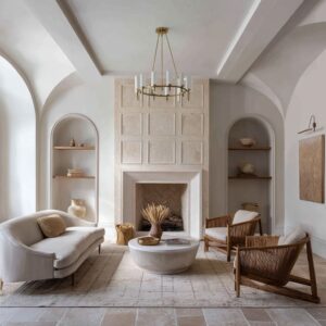
The fireplace as the room’s stabilizer
That happens because the fireplace does three important jobs at once. First, it provides visual mass.
Stone, plaster, or paneled fireplace walls give the room a fixed architectural center that makes the seating area feel intentional. Second, it provides contrast.
The firebox opening is often one of the darkest elements in the room. In pale interiors, that darker void gives the eye a place to settle.
Third, it provides proportion. The mantel line often sets up a horizontal rhythm that is repeated in the coffee table, artwork, bench, or nearby shelves.
That repeated line helps the room feel unified.

This is why a fireplace in modern classic design often feels far more important than a simple decorative feature. It is a scale reference, a contrast reference, and a texture reference all at once.

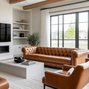
Center tables as design anchor
Use of a dark or visually weighty center table anchors the design with a black table, a deep wood block, a dark ottoman, or another substantial central piece. This choice solves a very specific problem.
Pale sofas, pale rugs, white walls can make a seating group feel as though it is floating. A darker, heavier center piece gives the room gravity.

This creates a value structure:
- lighter tones often sit up high, in ceilings and upper walls
- medium tones stay around mid-height, in walls and upholstery
- deeper tones gather near the floor, in the firebox, coffee table, chair legs, and a few accent pieces
That value structure is one of the reasons modern classic neutral rooms still feel grounded. They are not relying on strong color.
They are relying on placement of light and dark.

Pattern works best when it stays contained
Another modern classic feature is herringbone brick or tile inside the firebox. That detail may seem small, but it says a lot about how this style works.

Modern classic rooms often avoid spreading pattern across large surfaces. Instead, they place it in smaller, more legitimate zones: the firebox, a few pillows, a soft rug, or a limited textile detail.
This keeps the room calm while still giving it refinement.

The herringbone firebox is especially effective because it adds craft in a place where visual richness feels natural. It gives the hearth depth and finish without turning the whole room into a pattern statement.
If the room already has strong trim, stone, beams, or paneling, pattern should stay concentrated and disciplined.

Large art above the mantel is doing structural work
Large-format art above the mantel is a modern move for classic designs. To bring modern look, these pieces can be abstract, tonal, softly atmospheric, or reduced in detail.
They are rarely small, busy, or heavily ornamental.

That larger artwork helps in several ways. It can introduce a subtle new tone that later appears in pillows, flowers, or nearby upholstery.
It can prove that the fireplace wall can carry a large statement without needing many smaller pieces. In taller rooms, it can also help regulate the vertical scale, especially when the room rises well above standard height.

So the art is not just filling empty space. It is shaping the wall and helping the room hold together.
In designs with heavy paneling, the art acts as a pause within the grid. In rooms with simpler walls, it can act almost like a panel itself, giving the wall a clear focal field.

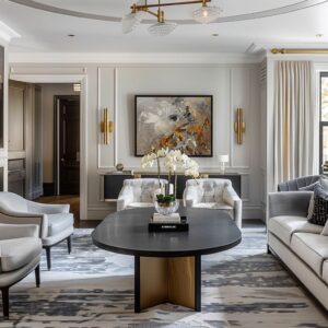
Tall rooms need low contrast and fewer gestures
In rooms with double-height walls or monumental paneling, trim and wall color often stay close in tone. Cream on warm ivory, pale beige on beige, soft greige on light greige.
The molding should be seen through shadow and relief rather than sharp contrast. This is a very important modern classic move.

Tall rooms already carry high visual intensity because of their scale. If strong contrast is added to every molding line, the walls can become too active.
Keeping the trim close in color allows the height to feel calm, architectural, and easier to live with. That is also why these taller rooms often used very few decorative gestures.
One large artwork, one floral arrangement, one sculptural branch, one heavy center table. Then the room stopped.
It did not keep adding smaller objects. In large-volume spaces, restraint is often what makes the room feel refined.

Open-plan modern classic rooms rely on soft boundaries
In open living-dining layouts, a ceiling grid organized the volume, a fireplace wall gave the living area identity, and a strong center table kept the seating group from drifting into the circulation path.

Since open rooms do not have hard boundaries, modern classic design builds soft ones instead.
- The ceiling marks the zone from above.
- The rug defines the seating group below.
- The fireplace gives the room a face.
- The center table gives the furniture a middle.
Modern classic can work very well in open plans, but only if the room is given a clear structure. Without that structure, the style can lose its sense of permanence.

Small black accents sharpen the whole room
Another pattern is the use of black in limited, careful placements. It can appear in lantern pendants, thin table frames, chair legs, window frames, small picture frames, or compact decor accents.
These black notes are rarely dominant. They are used like thin lines in a sketch.

In pale, warm-neutral rooms, black helps sharpen edges. It makes moldings look more intentional.
It gives pale upholstery more definition. It can also connect adjoining spaces by repeating the same dark note in small ways from room to room.
This is a useful design tool. A modern classic room does not always need bold color to feel crisp.
Sometimes a few repeated black or charcoal accents are enough to give the room needed precision.

Texture replaces ornament
Rather than relying on carved detail, crowded displays, or many patterned fabrics, modern classical designs build richness through material contrast. That often meant:
- stone against painted trim
- nubby upholstery against smoother walls
- warm wood against pale rugs
- woven accents against structured paneling
- soft linen-like textiles against more solid architectural surfaces
This is one of the ways modern classic differs from a more traditional decorative room. The richness is still there, but it comes from material feel, not from a high number of decorative statements.

Geometry needs a softer counterweight
Rooms are often built from rectangles: coffer grids, window muntins, shelf openings, mantel lines, panel frames, stone courses, and rectangular tables. Left alone, that could make the room feel strict.
The design can be softened in one of two ways:
- a single botanical gesture such as branches, greenery, or a floral arrangement
- a softer furniture silhouette such as a rounded chair, curved occasional seat, or woven piece with a gentler outline
The key is that this softer note usually appears as a single interruption, not a whole second design language. It breaks the strictness without undoing the room’s order.
That balance is a major reason modern classic spaces can feel polished but still human.

Final thought
Modern classic living room design works in a modern way because it keeps the architecture legible and the furnishing layer disciplined. The room does not chase novelty.
It builds confidence through proportion, contrast placement, material richness, and restraint.
That is why this style keeps working in both formal sitting rooms and family-friendly great rooms. It gives you the sense of a room with roots, but it edits those roots for the way people live now: fewer objects, cleaner lines, softer palettes, and a much stronger focus on structure, balance, and calm visual order.