Bathroom color ideas are changing in a very clear way, and the shift runs deeper than a simple swap from cool gray to beige. The current direction is built on a new color logic.
Instead of chasing one headline shade, current bathrooms are being shaped through warmth, close tonal layering, softer contrast, textured surfaces, and careful light control.
That change matters because it makes bathrooms feel better in daily life. The room feels calmer.
Skin tones look better. White fixtures feel less harsh.
Dark tones feel less severe. Accent color feels easier to live with because it is often used in smaller, more controlled ways.
The latest bathroom color ideas are not centered on a single trending hue. They are centered on atmosphere.
The room is being tuned to feel restful, flattering, and grounded first, with accent color added only where it truly helps.

The New Starting Point: Warmth Before Accent Color
The shift in current bathroom color design is that warmth now sets the emotional base of the room. Not heavy yellow-beige.
Not dated tan. The newer warm neutrals are softer, quieter, and better edited.
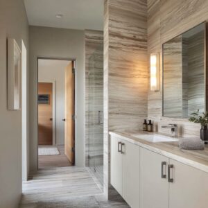
Think powder beige, pale almond, creamy stone, warm taupe, mushroom greige, sand, clay-beige, mineral beige, and smoked taupe. These shades create a gentle envelope that feels settled and human before any accent appears.

This is why many new bathrooms feel calm even when they are visually simple. The warmth is doing the emotional work.
In older bathroom schemes, warmth often sat in the background while a bold accent carried the personality. In the newer approach, the warm shell itself becomes the personality.

That shift also explains why many current bathroom design concepts feel softer without looking flat. The walls, stone, cabinetry, and wood are often close in tone, but each surface is slightly different in undertone, sheen, or texture.
The result is warmth with depth, not warmth with heaviness.

Why Low Contrast Feels Current
A lot of new bathroom color ideas are built on low-contrast layering rather than sharp visual breaks. Instead of a dark vanity placed against bright white tile, the room often uses a narrow tonal range and lets smaller differences create the structure.

That structure may come from:
- a warm plaster wall beside pale stone
- a matte vanity under a soft gloss countertop
- a white tub set inside creamy tile
- a mirror halo that adds warmth near the face
- the curve of a basin against a straighter vanity run
This is a major reason current bathrooms feel rich without looking busy. The design relies less on dramatic color separation and more on shape, surface, and light.
That also makes the room easier to live with. Strong contrast creates energy, but it can also create visual tension.
Low-contrast layering gives the bathroom a gentler mood while still keeping it interesting.

Light Now Acts Like Part of the Palette
One of the current ideas in bathroom color design is that light is no longer treated as a neutral background condition. It actively changes how the palette feels.

Warm mirror halos deepen beige and taupe undertones. Under-vanity lighting can warm white cabinetry and make it feel less clinical.
Daylight can cool terracotta, blush-beige, and warm stone so they stay airy instead of dense. Reflected greenery can soften darker interiors.
Glossy pale floors can bounce light upward and make the whole room feel wider.

This means color in a current bathroom design is often light-activated. A soft beige wall can feel creamy in evening light, chalkier in daylight, and slightly cooler near a large window.
A smoky taupe room can feel intimate under warm concealed lighting but still fresh once daylight and garden views enter the scene. This is a practical lesson: test paint and materials in the actual light conditions of the space.
The finish is only half the story. The light completes it.

The New Accent Strategy: Smaller, Smarter, Easier to Change
Another major shift is how accent color is being used. Older bathroom palettes often declared accent color in a direct way: a dramatic tile wall, a strong painted cabinet, or a repeated themed shade.
The newer approach is tighter and more disciplined.

Accent color now often arrives through one of four routes:
- Flexible accents such as towels, flowers, art, baskets, ceramics, and plants.
- Architectural containment, where one wall plane, one niche, one shower zone, or one vanity run carries the color.
- Materialized objects such as a colored tub, tinted basin, or patina-finished piece.
- Borrowed outdoor color from trees, foliage, leaves, and sky-cast daylight.
This is why many new bathrooms feel colorful even though they are not covered in strong color. The room keeps a stable base, then places color where it can be enjoyed without becoming a permanent burden.
That makes the whole palette feel safer. A bathroom can have character without forcing a full commitment to a bold wall or strong tile choice.

The Color Families Defining Current Bathroom Ideas
Warm Mineral Neutrals
Soft cream, powder beige, pale sand, almond, creamy taupe, and warm stone now form the backbone of many modern bathroom designs. These tones feel new because they are handled with tighter tonal control, chalkier finishes, gentler white pairings, and layered texture.

This color family works well for anyone who wants a bathroom that feels restful, warm, and refined without obvious drama. It is especially useful for readers who like neutrals but want to avoid a plain or builder-basic look.

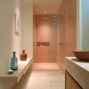
Rosy Earth and Clay Warmth
Blush-beige, dusty rose clay, terracotta, apricot warmth, caramel, and cinnamon-rust bring a richer emotional tone to the bathroom without turning loud. These shades are usually softened by beige, grounded with stone and wood, and often limited to one wall or one key area.
This family is ideal for readers who want visible warmth and character while keeping the room soft and grounded.

Botanical Soft Greens
Green is usually presented in a calmer way than before. Instead of bold green cabinets or decorative patterns everywhere, the newer version often uses faded sage, pale mint, pistachio, celery-yellow green, soft wasabi, or patina blue-green.
Very often, green enters through plants and the view outside rather than permanent surfaces. That makes green feel fresh rather than forceful.
It cools a warm neutral shell without making the room feel cold.

Muted Yellow and Saffron Notes
Butter yellow, pale marigold, dusty saffron, muted mustard, and soft golden yellow are returning in a quiet way. These shades are usually placed in towels, flowers, small decor, or a niche detail instead of large fixed surfaces.

The effect is optimistic and warm, but still controlled. This is a smart option for readers who want a sunnier bathroom without moving into bright, playful color.

Water-Soft Blue and Mineral Blue-Green
Blue has become calmer and less obvious. Instead of crisp coastal blue or sharp navy contrast, the current version tends to be washed, misty, painterly, and slightly mineral.
It often appears in art, textiles, a basin, or a patina-like finish. This family brings freshness and a spa-like feel while keeping the room soft and quiet.

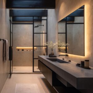
Deep Smoky Neutrals
Dark bathroom designs are still very popular, but they now feel warmer and better balanced. The newer version leans toward charcoal with brown undertones, smoky taupe, deep cocoa neutrals, near-black wood, and stone-based dark tones, often paired with pale floors, reflective glass, and warm concealed light.
That makes dark feel intimate and high-end rather than harsh or industrial.

Controlled Plum and Mauve
Plum, aubergine, dusty violet, and muted mauve can now appear in a highly controlled way. Instead of filling the room, they are often limited to one textured wall, a small art group, a towel family, or a decorative cluster.
That gives the bathroom individuality and richer mood without visual overload.

Borrowed Green
One of the practical lessons from bathroom color design is the role of borrowed green. Many fresh-looking bathroom designs do not paint green onto every surface.
They let green enter through the window, through indoor plants, through reflected foliage, and through branch arrangements.

This works especially well because it keeps the fixed shell quiet. The design can stay in warm taupe, creamy stone, pale wood, and soft white, while living green supplies the freshness.

That makes the bathroom feel alive, but it also makes the palette easier to update. If the green comes from plants and the outdoor view, the room gains freshness without the commitment of green tile or cabinetry.

Bold Color Still Works — But It Needs a Boundary
Strong color has not disappeared. It is simply being handled with more control.
Bolder bathroom designs usually place the color in one clearly defined zone:
- one terracotta wall
- one mauve texture field
- one red-orange shower volume
- one mint vanity line
- one wasabi niche
- one patina blue tub or sink family
That border is what makes the color feel intentional. The color has a clear edge, a clear purpose, and a clear relationship to the neutral shell around it.

This is a safe way to use bold color in a bathroom. Keep the base calm.
Let one contained area carry the drama. Repeat that hue lightly in one or two smaller details.
That is usually enough.

Why Bathroom Color Ideas Feel Different
The previous bathroom cycle often leaned on cooler gray, sharper black-and-white contrast, strong fixture contrast, and cleaner but flatter neutral fields. The new direction is different in a deeper way than a simple color swap.

The room is now being shaped for softness, skin-flattering warmth, and emotional ease. Contrast is built through material shift, close tonal layering, light changes, and shape.
Green is quieter. Yellow is softer.
Blue is calmer. Dark shades are warmer.
Accent color is smaller and easier to revise later. In short, the bathroom design feels less like a graphic statement and more like a carefully tuned environment.

That is why so many of today’s best bathrooms feel restful even when they are highly styled. They are not trying to impress through strong contrast alone.
They are building comfort first, then adding character in measured ways.

The Rule Set for Getting the Look
The current bathroom color approach can be reduced to a few clear rules.
- Start with a warm neutral field. Let the walls, stone, wood, and larger surfaces set a calm emotional base.
- Keep the tonal range fairly narrow. Let the room feel layered through subtle shifts, not strong jumps.
- Use texture to create depth. Plaster, honed stone, veining, woven pieces, wood grain, and matte-gloss contrast make a restrained palette feel full.
- Let light do part of the work. Daylight, mirror lighting, under-cabinet glow, and reflected greenery all change how the room feels.
- Use stronger color in one controlled zone. A niche, a vanity, a basin, a tub, a wall plane, or a small grouped accent is usually enough.
- Place some personality in changeable pieces. Towels, art, flowers, and plants make the room feel current without locking the space into one permanent statement.

Final Thought
The latest bathroom color ideas are not about hunting for one magic shade. They are about building a bathroom design that feels warm, calm, layered, and easy to live with.
That is the real shift.
Today’s bathroom designs begin with a soft warm shell, rely on low-contrast depth, use light as part of the palette, borrow freshness from nature, and keep stronger color controlled and deliberate. The result is a bathroom design that feels human, polished, and current without becoming harsh, cold, or tiring.