A lot of people still think of scullery design as a storage problem. They imagine a secondary room where extra dishes, pantry items, and countertop appliances can be pushed out of sight.
Storage matters, of course, but the strongest idea is much deeper than that. The best scullery is not mainly a room for storing more things.
It is a room for controlling what the kitchen has to show.
That shift changes the whole way scullery design should be understood. A well-planned scullery takes in the visual spill of daily kitchen life before that clutter spreads into the main kitchen.
It gives the house a second work surface for rinsing, staging, drinks, small prep tasks, and everyday overflow. It helps keep the public side of the kitchen clean, settled, and easier to live with.
It also turns utility into something that belongs to the wider design story of the home, instead of letting it sit like a leftover service corner.

That is why sculleries are not trying to impress through flashy styling or oversized decorative moves. Their strength comes from order, visibility control, and a clear sense of what should stay hidden, what can stay partially visible, and what deserves to remain ready for use.

The job of a scullery
Seen in this light, a scullery works like a pressure-transfer room for the kitchen. It takes the mess, motion, and object load that would otherwise collect in the main cooking space and relocates it into a better-managed zone.
That includes everything from stacked dishes and coffee equipment to trays, glassware, fruit bowls, pantry overflow, and the small routines that can make a beautiful kitchen feel crowded by midday.

This is why strong scullery design often has such a calming effect on the main kitchen. The main kitchen does not need to carry every single task in plain sight.
It can remain cleaner in visual terms because the scullery is doing the hidden work behind it. That role also explains why the scullery has become far more important in homes built for open-plan living.
In a house where the kitchen is visible from dining and living areas, there is a bigger need to manage what the eye sees all day. A scullery provides that control.

Why sculleries use mixed storage
Sculleries almost never rely on only one kind of storage. They are rarely fully open, and they are rarely fully closed.
Instead, they use a layered storage system that creates a visibility gradient. The sequence is usually this: hidden storage first, then semi-visible storage, then a clear active counter.

This means tall pantry cabinets, full-height doors, deep drawers, or plain outer walls carry the bulk and the mess. Then open shelves, glass-front sections, recessed niches, or framed dish alcoves provide access to everyday items.
Finally, the worktop stays relatively open so the room still functions as a prep and staging space rather than turning into a storage wall with no working life.

That layered structure solves two different needs at once. It keeps the room usable, and it keeps the room orderly.
People can reach daily plates, bowls, mugs, glasses, or boards without opening ten cabinets, but the heavier visual load stays hidden. That balance is one of the strongest reasons these sculleries feel composed.

Open shelving works only when it is contained
Open shelving works well when it is disciplined. Modern sculleries treat them as framed access.
That framing can happen in several ways. Shelves may be recessed into a niche, backed by warm wood or stone, divided into compartments, placed under a light strip, or edited into clear object families.
Even simple floating shelves work best when the styling is light and the objects are grouped with care.

This is why some open-shelf sculleries look polished while others look messy within days. The issue is not whether shelves are open.
The issue is whether that openness is contained. A bounded shelf wall tells the eye that the visible items belong there.
A loose shelf with random stacking often does the opposite. Bowls stay with bowls, glassware stays with glassware, boards are grouped together, and there is enough empty space between clusters for each group to hold its own shape.
That is what gives open storage a curated quality instead of a crowded one.

Why narrow sculleries can still feel spacious
Sculleries can have compact or narrow plans, yet still come across as generous. The reason is not extra width.
The reason is visual release. Narrow sculleries should include a release point: an end window, a side window at the sink, a bright doorway, a lit niche, or a wide concealed opening.
These elements give the eye a place to travel toward. Without them, a narrow scullery can become a tunnel.
With them, the same width can feel far more open.

This produces an important design principle. In a compact scullery, spaciousness is built from two directions at once.
The horizontal lines of counters and shelves stretch the room sideways, while a bright opening or visual endpoint pulls the eye forward. Together, those two moves reduce the boxed-in effect that narrow service rooms can easily create.
So if a scullery is small, one of the smartest decisions is not always adding more cabinetry. Very often, it is protecting a release point and making sure the room has a clear visual exit.

The most effective sculleries often have two faces
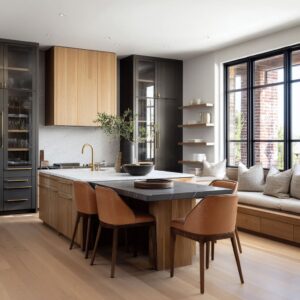
Another design idea is the dual-face layout. Sculleries can divide the room into two different visual roles, often wall by wall.
One side is more active, open, and accessible. This is where dish shelves, coffee equipment, display storage, or the main counter run may sit.
The other side is more solid and concealed, with tall pantry units, full-height doors, or quieter storage planes.

This creates a very stable room because each wall does a different job. One surface supports daily rhythm and quick access.
The other absorbs bulk and visual noise. That is one reason a scullery can stay useful without looking overfilled.
It is not asking every wall to do everything. The room is separating access from concealment, and that separation makes the whole space easier to understand at a glance.

Light is organizing the room
Integrated shelf lights and under-cabinet light bands can sit exactly at the seam between upper storage and lower work surfaces. That makes them powerful visual organizers.
They define the working band, separate the shelf layer from the counter layer, and give the wall a stronger sense of structure. The light strip also helps the storage wall look intentional rather than improvised.
A shelf with warm lighting under it feels like part of a designed composition. The same shelf without that line can feel less grounded.
This is why lighting in a scullery is often most effective when it is linear, restrained, and placed at the right height. It acts almost like a visual guide rail through the room.

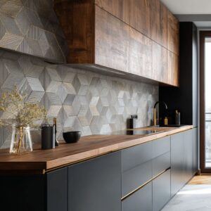
Material warmth does the work that ornament often tries to do
Sculleries do not rely on loud color contrast, busy surfaces, or heavy styling. Yet they still have depth.
That depth usually comes from materials. Warm wood backing, pale stone-like counters, ribbed or fluted details, brick, baskets, textured dividers, soft tonal layering, and shelf thickness are good options for that.
These moves give the room richness without filling it with decorative clutter.

This matters because sculleries tend to work better when the palette stays tight. Too many strong materials in a small service room can fragment the space.
A narrower material range, by contrast, allows grain, relief, and warm-cool shifts to become more noticeable. That is why a simple scullery with pale cabinetry, a wood shelf wall, and a stone counter can feel far richer than a scullery with more decoration but less discipline.
The character is built into the surfaces themselves.

The sink matters, but it is rarely the star
One of the interesting kitchen scullery ideas is that the sink can be visually minimized. The sink can appear as a compact dark cutout, an integrated basin, or a small anchor inside a larger, continuous counter.
It is present, but it is not carrying the room’s identity.

The focal points are usually the storage wall, the long work surface, the niche reveal, the light band, or the balance between visible and hidden elements. This is an important lesson for scullery design.
A scullery usually looks stronger when the sink is treated as part of a broader working surface rather than as a single object that dominates the composition. Surface continuity and storage order tend to matter more.

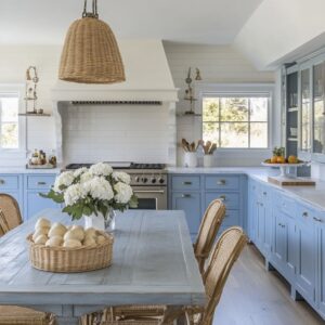
A scullery supports hospitality too
Another design idea is that the scullery can work as a backstage hosting room, not only a cleanup room. There are direct cues tied to entertaining and daily rituals: coffee stations, undercounter coolers, trays, staged glassware, serving pieces, pastries, fruit, and drink storage.
These details widen the room’s role. A scullery can support breakfast setup, coffee service, drink prep, and the hidden labor of hosting, all while keeping that activity out of the main kitchen.
That is a major reason sculleries are so appealing in current homes. They help protect the visual order of the kitchen, but they also support the social life around it.
They give the house a practical backstage area where the less polished part of entertaining can happen without taking over the main scene.

The three-scale balance behind a strong scullery
Scullery design should keep three visual scales in balance. The first scale is the large mass: tall pantry walls, long cabinet runs, full-height doors, concealed outer shells, and big wood or stone fields.
These provide order and carry the hidden load. The second scale is the medium band: counters, shelves, light strips, backsplash zones, and window lines.
These define the working layer and give the room its horizontal structure. The third scale is the small object group: dishes, bowls, glassware, baskets, boards, fruit, plants, and a few daily-use pieces.
These bring life and make the room feel lived in.

When these three scales are balanced, the room holds together. If the large masses dominate too heavily, the scullery becomes dense.
If the small objects spread too far, it turns noisy. If the medium bands are weak, the room loses its structure.
This balance is one of the clearest hidden frameworks behind the strongest examples.

What weakens a scullery
There are a few common ways a scullery can underperform. Too much fully open storage with no grouping or backing can make the room look messy very quickly.
A narrow room with no window, doorway, or visual endpoint can feel compressed. Too many material changes in a compact footprint can break the room into small fragments.
Heavy storage on both sides without enough brightness relief can make a scullery feel boxed in. A room with no difference between display and concealment can feel visually flat because every item carries the same weight.
And a purely practical room with no domestic details at all can feel detached from the rest of the home. These are useful warnings because they show that a successful scullery is not built by adding more function alone.
It has to manage how that function is seen.

What scullery design gives the home
At its best, scullery design creates a second operating room for the kitchen. It protects the main kitchen’s image, absorbs daily overflow, supports prep and drinks, hides the visually noisy parts of household life, and still remains connected to the design language of the home.
That is why sculleries have such a lasting impact. They combine hidden storage mass, selective visible access, grouped display logic, a clear work band, a release point for comfort, warm material layering, and a few signs of real daily use.

The result is a room that works hard without announcing every task it handles. It allows the kitchen to stay more open, more settled, and easier to live with, while the real labor of the space is handled just behind it.
In other words, the scullery does not simply store the overflow of kitchen life. It organizes what the home has to show, what it can soften, and what it can keep out of sight until needed.
That is what makes a scullery truly well designed.