Wood is no longer treated as background—it’s becoming the centerpiece of surface composition. Across interiors today, walls clad in timber are doing more than covering structure.
They shape the room’s tone, direct light, and establish rhythm. Whether laid in chevron, segmented into floating blocks, or interrupted by metal and stone inserts, these surfaces create more than pattern—they form atmosphere.
Current ideas in wood wall design move beyond decorative paneling and into architectural dialogue. Materials are chosen for how they reflect or absorb light, how they interact with furniture, and how they modulate visual weight.
Lighting, shelf placements, and directional grain each play a role, turning the wall into a coordinated system. Some concepts lean on sculptural geometry, others rely on tonal nuance—but all aim for one thing: to make the wall part of the room’s visual thinking.
This article breaks down the key design approaches behind these compositions—focusing on depth, rhythm, grain movement, contrast, and material coordination. It’s less about building a feature wall and more about constructing a surface with purpose.

Depth, Relief, and Architectural Texture
Walls can behave like sculpture when depth is treated as part of the surface design. In some of the most visually compelling wood accent walls, the material isn’t applied flat—it’s cut, shaped, and stacked to cast shadow and catch light.
Whether in the form of protruding cubes, sunken alcoves, or carefully staggered blocks, this sculptural approach introduces movement across the surface. The result shifts with time of day and lighting conditions, allowing daylight to skim across textures and create secondary shapes out of shade.
Some panels seem to lean outward while others retreat, causing the wall to pulse with quiet dimension. The viewer no longer perceives the wall as a background—it becomes a textured object with its own presence.

This kind of volumetric play shows up often in designs that apply geometric repetition with thoughtful variation. Cube formations and segmented wood units are composed into strict grids, but inside that frame, colors and depths fluctuate.
Lighter woods might appear more frequently near eye level, while darker, recessed blocks add visual weight below. Because the rhythm is regular, the richness feels organized rather than messy.
It’s an example of how decorative wall panels for living room settings can push beyond visual flatness without overwhelming the space.

A large part of this effect lies in restraint—letting just a few dimensions change while keeping others stable. The most compelling installations often vary tone and depth, but fix the spatial logic.
There’s a deliberate limit on visual chaos, even if dozens of small parts are at play. Repetition does the work of keeping the eye grounded, while the interplay of angles and textures draws it in deeper.
These sculptural walls invite close attention, rewarding viewers who pause long enough to notice how light and shadow fold across the composition. Whether created with reclaimed pieces or precision-milled surfaces, this category of wood accent walls acts as visual architecture—not only backdrop but texture, rhythm, and structure in one.

Lighting as a Built-In Graphic Language
Light becomes part of the composition when integrated directly into a wooden feature wall, rather than added as a separate source. In some of the most refined installations, lighting is not decorative—it behaves like a drawn line, slipped between panels or embedded within grooves.
Vertical cuts fitted with LED strips glow softly from within the wall itself, casting light that enhances the grain instead of washing it out. This subtle technique draws attention to the wall’s texture and rhythm, like highlighting the structure without overpowering it.
Shelf undersides, niche interiors, or narrow seams between slats can all host this kind of lighting, creating a soft backlit effect that defines shape without hard edges. The glow doesn’t flood the space—it traces it.
The impact of light isn’t limited to fixtures. The design considers how daylight interacts with texture throughout the day.
Certain wall cladding ideas rely on form and orientation to create shifting patterns as sunlight moves. Ribbed surfaces and slanted lattices reveal new detail depending on the hour.
A diagonal panel catches morning light differently than in the late afternoon, and a recessed line turns into a glowing shadow when hit at the right angle. These walls feel active—quietly shifting in tone and sharpness throughout the day without any mechanical change.

The interaction between light and wood is more than a contrast—it’s a relationship. Some surfaces seem flat at first glance but come alive when shadows carve between ridges.
Others remain dark until the hidden glow of a recessed strip softly defines their edges. These effects are planned with precision, often invisible until illuminated.
Even without direct sunlight, internal lighting can highlight the smallest joint or slope, giving depth to what would otherwise be a static surface.

In spaces where this lighting approach is used, the wall becomes both object and instrument—something seen, but also something that performs. The movement of light doesn’t just reveal shape; it contributes to the character of the room.
This careful balance of material and illumination places these walls far beyond ordinary installations. The wooden feature wall becomes a time-sensitive canvas—reactive, layered, and expressive—shaped equally by construction and by light.

Geometry, Order, and Intentional Irregularity
Precision doesn’t always mean perfection. In many of the most refined interiors, order is applied with just enough irregularity to keep the visual experience alive.
Think of a chevron wall that runs in flawless symmetry—each joint aligned, every plank cut to match—but then interrupted by an offset shelf or a narrow clerestory window. These interventions aren’t accidents; they’re intentional.
They introduce moments of contrast that gently shift the rhythm, adding a layer of subtle friction that makes the viewer slow down and re-engage with the layout.
This approach is often seen in chevron or herringbone patterns used in a wood panel feature wall. The base structure feels calm and controlled, yet a small asymmetrical element—slightly staggered shelving, a shifted TV mount, or an off-centered niche—acts like a musical rest between repeating notes.
These calculated moves prevent predictability while keeping the composition grounded.

Absence also plays a key role. In some cases, what’s missing carries just as much weight as what’s built in.
Fine grooves cut between boards, recessed channels, or slim vertical dividers of brass or blackened metal don’t add volume—they create space. These linear voids function like linework in drawing, cutting through wood to form punctuation marks in the surface.
It’s a quiet technique, yet it controls how the wall breathes. In certain wall panel design for living rooms, these micro-voids soften the weight of full-height coverage.
They give the surface room to pause and let light slip through. Instead of overwhelming the room, the wall becomes a measured presence—solid, but never heavy.
This method works especially well in spaces that already have strong architectural lines or large furniture pieces. The wall, though prominent, still leaves room for the eye to rest.

So while the layout might appear controlled at first glance, a closer look often reveals careful offsets, interruptions, and open space designed with purpose. These moments of deviation—small, deliberate breaks in structure—are what give the wall its character.
Precision is used to set the stage, but it’s the controlled irregularity that makes the composition feel alive.

Material Conversation and Hybrid Surfaces
Mixed finishes can speak quietly without clashing. In many of the most compelling interiors, wood isn’t used in isolation—it becomes part of a broader surface conversation.
Thin brass inlays, mirrored panels, and stone sections are embedded directly into the wood framework, creating a calm visual contrast based on reflection and texture, not strong color shifts. These combinations create surfaces that are visually unified by tone but differentiated by finish.
Brass catches light with a soft gleam, stone adds mass and matte texture, while mirror invites depth and movement. Together, these inserts interrupt the rhythm of the wood without overpowering it, making the wall feel complex yet balanced.

This blending of materials allows the wall to act as a curated surface, not a uniform block. It becomes something closer to a composition—each inserted material playing a supporting role to the timber base.
Mirror segments in particular do more than reflect—they slice through solid volume and subtly alter how the viewer perceives the dimensions of the room. Stone slabs, especially with natural veining, introduce weight and grounding, while slim vertical metal lines can add a kind of drawn structure within the field of wood.
These ideas are showing up more frequently in high-end wood accent wall ideas where restraint matters just as much as visual layering.

Another layer of this complexity lies in grain direction. While color and material changes are easy to spot, shifts in orientation are more nuanced but just as effective.
Vertical slats meeting horizontal ceiling beams, chevron walls aligned beside floating shelves, or plank layouts alternating in direction across panel sections—all these choices steer the eye in quiet, intentional ways. These movements don’t feel abrupt; they flow naturally, guiding attention from one feature to another.
The wood becomes a kind of visual map, pointing toward focal areas without literal lines.

This technique is especially relevant in thoughtful panelling ideas, where texture and rhythm are used to organize space. One direction of grain might push the eye upward, giving a room more height.
Another might draw it sideways, emphasizing a long fireplace or built-in bench. Sometimes, grain changes are subtle, relying on daylight to reveal the contrast between soft reflection and directional shading.
But even in these quiet moments, orientation plays a defining role. Together, material blending and grain movement form a silent structure—anchoring the wall without needing bold graphics or loud contrasts.
It’s this level of nuance that separates a basic installation from a surface that continues to hold attention over time.

Lighting, Shelving, and Vertical Structure as Rhythm
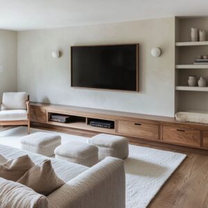
Shelves in today’s interiors often do more than hold objects—they guide how the wall is read. A long stretch of wood cladding becomes more engaging when broken up by a floating ledge or a recessed box.
These placements aren’t random. Whether using thick walnut slabs, blackened wood platforms, or slim bronze-lined boxes, shelving in many modern compositions behaves like punctuation: it creates pauses, shifts direction, and establishes rhythm.
The eye catches on a shelf, then glides to the next, forming a quiet tempo across the surface. Even when sparsely populated, these shelves add more than function—they shape how the material is experienced.
In certain layouts, the balance between solid wall and shelf insert is precise. Too much symmetry feels stiff; too much irregularity loses direction.
The strongest visual impact often comes from slightly off-center arrangements or contrasting shelf thicknesses, creating movement without visual noise. These techniques appear repeatedly in wood wall paneling ideas where structure and softness need to coexist.
A wall might feature just three shelves—but the way they float, align, and cast shadow transforms them into visual markers within a broader field.
Another powerful move is letting the wall reach higher than expected. Some of the most striking rooms stretch their paneling onto the ceiling—either through continuous vertical slats or by shifting the wood diagonally upward.
These forms challenge standard proportions, especially in spaces with strong boxy volumes. Suddenly, the ceiling becomes part of the composition—not just overhead, but continuous, directional, and active.
Diagonal applications in particular shift perception. A chevron layout rising from lower left to upper right cuts across the visual field, implying expansion, while slatted ceilings with matching wall finishes double the sense of scale.
These methods don’t rely on additional space—they adjust how the space is understood. The eye tracks the motion and assigns volume where none was added.

This idea connects with broader wall covering ideas where surface treatment shapes not just color or texture, but perceived form. Lighting accentuates these extensions even further.
Cove fixtures along ceiling seams or soft LEDs placed where wall meets ceiling highlight transitions and stretch sightlines. The wall no longer ends at eye level—it folds upward, leans forward, and draws attention through movement, shadow, and material direction.
Together, shelving and ceiling interaction introduce a layered rhythm. They break up surface continuity while reinforcing flow.
And whether subtly integrated or clearly visible, they shift the room’s pace—from still to active, from closed to expansive—without changing its footprint.

Emotional Weight Through Contrast and Color Harmony
Tone shifts within a narrow range can carry as much impact as full contrast. In refined interiors, quiet layering often replaces strong visual breaks.
A wood panel accent wall made from pale timber—like bleached walnut, whitewashed oak, or soft ash—can feel light yet grounded when multiple tones are placed side by side. These differences might be slight—a plank with a cooler base laid next to one with golden warmth—but the effect is cumulative.
Instead of reading as repetition, the surface gains depth through tonal vibration. It doesn’t jump out; it pulls the viewer in through subtle fluctuation.

This approach is especially effective where openness and calm are priorities. The surface appears unified from a distance but begins to reveal tone variation as daylight changes.
What seems like a single hue unfolds into layers depending on angle, time of day, and proximity. This is the power of tone-on-tone storytelling—the wall feels active without introducing contrast that fractures the composition.
A timber feature wall built this way carries a softness while still maintaining its weight as a central visual anchor.

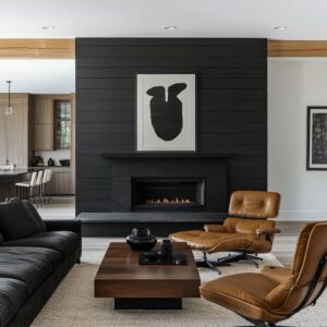
On the other end of the spectrum lies deep contrast, used with intention. Dark wood—charred, brushed, or stained black—doesn’t overwhelm when paired with pale, textural elements.
In fact, the darker the paneling, the softer the furnishings tend to be. This balance between near-black walls and plush ivory or greige seating creates a rich push-pull effect.
The darkness gives structure and intensity, while the soft tones in fabric and rugs act as visual counterweight. Together, they generate an atmosphere that feels settled, neither stark nor heavy.

There’s a spatial strategy here as well. By anchoring one surface in deep wood tones and leaving the rest of the room quiet, the wall becomes a visual weight that stabilizes the space.
A matte black wall beside light flooring and neutral seating doesn’t feel dark; it feels composed. It creates an edge—one that defines the layout without sharpness.
Whether through subtle layering or controlled contrast, these tonal approaches rely on restraint and timing. A timber feature wall doesn’t need bold color to have presence—it can carry its message through temperature, light absorption, and surface variation.
The material speaks quietly, but its impact is lasting, especially in rooms where comfort and clarity matter most.

Curvature in a Linear World
Soft arcs can shift the tone of a space more than color or pattern. In interiors where straight lines dominate—gridded ceilings, boxy layouts, squared-off furniture—a curved installation can introduce a quiet counterpoint that changes the atmosphere without needing decoration.
A fully curved wall niche lined with vertical slats shows how shape alone can define a mood. Each board, milled straight, becomes part of a larger curve that wraps around the viewer.
The result is spatial—not decorative—comfort.

This kind of move brings structure and emotion together. It creates a pocket within the room that feels set apart, even when it shares materials with the rest of the space.
The vertical rhythm of the slats remains consistent, but the arc changes how that rhythm reads—it compresses near the edges, flows smoothly across the bend, and draws the eye inward. Rather than using bold texture or sharp contrast, the geometry itself carries the visual load.
These curved installations appear in reading alcoves, built-in benches, and quiet sitting corners—places where function benefits from a sense of enclosure. The approach aligns with some of the most thoughtful modern wall paneling ideas, where lines and surfaces are shaped not just to look good, but to create a change in how the space feels and moves.
A curve softens boundaries. It hints at intimacy, without closing off the room.
There’s also a visual balance at work. The arc acts as a reply to the room’s straight edges.
Flooring, furniture, and ceiling lines stay linear, but the curve provides relief—without disrupting alignment or scale. Light tracks differently across the bend than it does across a flat wall.
Shadows shift gradually, and materials gain dimension as they follow the surface. A single, smooth curve surrounded by sharp corners becomes a visual rest—a moment of quiet shape within a structured setting.
This kind of geometry doesn’t need ornament or layering. Its effect comes from the way it bends space and resets proportion.
The eye reads it as a contrast, but the material remains familiar. That’s the power of gentle form: it can reframe the room without demanding attention.
Furniture as Chromatic Counterpart
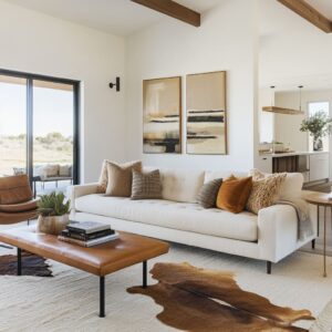
Color harmony between furniture and wall surfaces often shapes the room more than layout does. In many interiors with strong material features—especially wood-clad surfaces—furnishings are selected not to contrast, but to extend the visual language.
The idea is simple: the palette of the seating reflects, softens, or mirrors the tones in the wall. This strategy makes the space feel composed from one idea rather than assembled from separate parts.

For example, a warm oak wall with golden grain can be paired with saddle-toned leather seating that seems to echo those natural streaks. The leather doesn’t match perfectly—it resonates.
That tonal repetition across different textures creates quiet cohesion. The wall speaks in wood; the furniture replies in hide.
The same principle works in cooler tones. A dark walnut surface with rich brown depth can benefit from contrast that isn’t harsh—a navy velvet chair, for instance, cools the warmth without challenging it.
The combination plays out like temperature balance, not opposition. It’s not about color wheels—it’s about light behavior, texture, and depth.
This kind of chromatic pairing prevents the wall from feeling like an isolated backdrop. Instead, it becomes part of a larger field where seating, tables, rugs, and even lighting elements work as extensions of the material story.
A wood panel that might otherwise dominate becomes integrated—not diminished, but supported—by the palette that surrounds it.

Soft boucle, rich textiles, polished leathers, and woven textures all come into play here, with color chosen as carefully as material. The success lies in subtle overlap, not duplication.
Walls don’t need to match furniture—they just need to be in quiet conversation with it. In such spaces, the accent wall stops being a feature and starts becoming a setting.
It frames, supports, and enriches the character of the furniture around it. The result feels unified, not staged—like the room was built around a shared tone rather than individual parts placed side by side.

Emotional Temperature Through Wood Selection
The wood itself sets the tone—before shape, before color accents, before lighting. Every species brings its own atmosphere, and in modern interiors, this quiet influence is used with purpose.
The selection of timber isn’t only about grain or durability—it’s about how the surface feels to the eye. The visual temperature of a room often begins with the first panel chosen.
- Warm walnut creates depth that feels close. With its chocolate undertones and smooth, continuous grain, it invites softness and comfort even in sleek layouts. A space wrapped in walnut reads calm but grounded. It holds the light just enough to dim the brightness and deepen the air around it.
- Pale ash, bleached oak, or whitewashed finishes open the room up. These woods reflect light with a soft glow, and their low-contrast grains don’t pull the eye in aggressively. The result is a clean base with texture that doesn’t shout. Used in open spaces or minimalist settings, lighter timbers quiet the room without draining it of life.
- Charcoal-treated oak or blackened finishes shift the room’s balance entirely. These woods darken the perimeter, hold shadows longer, and create a low, rich visual gravity. They add weight but not coldness—especially when left matte or with visible brushing that breaks up the surface. These choices often come into play in interiors meant to feel structured or enclosed, especially when paired with soft upholstery and neutral flooring.
The impact is all in the restraint. Most of these surfaces are used with very little stain or added pigment.
The tone comes from the natural color of the species and how it reacts to finish—satin, wire-brushed, oiled, or raw. A slight shift in gloss or grain direction changes how the timber reads: reflective or quiet, warm or cool, formal or soft.

This is why the mood of a room is often shaped long before the furniture is placed. The timber surface provides the atmosphere—the room’s emotional base layer.
It’s a background that doesn’t stay in the background. Instead, it tells the viewer something before anything else in the space does.
A quiet message, delivered in grain.

Conclusion
The most effective wood walls today aren’t decorative—they’re composed. They respond to light, balance surrounding tones, and build layered visual logic into the space.
Whether through subtle asymmetry, curated material mix, or tonal restraint, these walls offer a studied calm that supports the entire room.

Timber isn’t being used as an afterthought. It’s selected for emotional effect, spatial direction, and how it carries the story of the interior.
From pale ash panels that reflect light with quiet clarity to dark ribbed slats that anchor the room in texture, each surface makes deliberate choices. The success lies in how well those choices speak to everything around them.
This approach to wall design reflects a shift in thinking—from covering space to shaping perception. In that sense, these wood walls are less about style and more about structure—where visual rhythm, temperature, and material alignment all work together to define the space.