Modern interior designs often treat terracotta as part of the architecture rather than a scattered shade in small items. Instead of placing the color only in cushions or pottery, the palette becomes structural—appearing in ceilings, wrapped niches, stair pockets, or full-height media walls.
This creates a space shaped by warmth rather than simply decorated with it. When terracotta appears overhead with beams or across a full vertical plane, it works like a visual guide, drawing the gaze toward windows, gardens, or sculptural corners.
Pale walls around it prevent the hue from feeling heavy, letting the architectural form stay light, spacious, and calm. In these environments, terracotta becomes the atmosphere-setting backdrop that anchors the room’s layout and its interior rhythm.
This is the layer where terracotta living room design becomes a spatial idea instead of a surface flourish.
Subtle Undertones That Shape the Mood
One crucial detail in modern terracotta designs is the undertone. Contemporary ideas often avoid bright, saturated orange in favor of clay shades softened by brown, dusty pink, muted red, and diluted rose.
These tones exist in the world naturally—sun-baked clay, canyon stone, worn leather—so they feel soothing rather than loud. They often work with a spectrum of clay tones within one design:.
- muted plaster clay
- pink-leaning blush clay
- brown-pulled earthy clay
- soft apricot-dust tones
- deeper burnt clay accents
- pale sand and biscuit colors buffering the warmth
This creates a layered palette where the eye never hits a single flat block of color. Instead, the hue flows in subtle shifts, shaping emotion rather than dominating the space.
The undertone choices also matter when building terracotta colour schemes for living rooms, since soft clay shifts feel more modern and adaptable than intense tones.

Texture as the Tool That Controls Volume
The feeling of terracotta depends heavily on texture. A smooth paint surface creates one effect; ribbed textiles, velvet, plaster, stone, and wool bring completely different shades and depth.
Modern terracotta rooms often include several of these textures simultaneously, creating a dynamic, layered surface.
Key Texture Categories and Their Effects
Plaster surfaces
- Dry, powdery, naturally matte
- Slight mottling brings movement
- Makes large areas feel soft, even when saturated
Velvet and dense upholstery
- Shadows shift as light moves
- Deepens terracotta in low light, softens it in bright light
- Adds comfort and quiet richness
Ribbed fabrics and corduroy-like textures
- Small grooves create micro-shadowing
- Adds rhythm without prints
Wool rugs or speckled textiles
- Ground the space with organic warmth
- Contain clay tones in muted, blended fibers
This balance gives each clay shade a purpose. Terracotta becomes more than pigment—it becomes a set of soft, structural surfaces that shape the design personality in quiet but noticeable ways.

Horizontal and Vertical Color Placement
Terracotta can completely change the way a design feels simply through its placement. A clay ceiling creates a warm canopy, while a clay wall behind a sofa forms an anchored zone for conversation.
Even a long bench cushion in terracotta forms a horizontal line that organizes the seating. They often can use terracotta in consistent directions—either wrapping upward around a niche or forming long ground-level lines that stabilize furniture.

Common Placement Approaches
- Wrapped recesses for reading zones or stair pockets
- Full-height media walls for a monolithic backdrop
- Terracotta bands acting like soft wainscots
- Bench cushions tracing the shape of the window seat
- Clay-toned rugs covering the floor for broad grounding
Such layouts guide the eye smoothly from one area to the next, turning color into a spatial marker. When terracotta is placed deliberately like this, the design gains structure even without adding new furniture or ornamentation.

The Power of Natural Light on Clay Tones
Terracotta responds to light more vividly than many other warm neutrals. Soft daylight can shift a clay wall from warm apricot to deeper brown as the sun moves.
Curtains in clay tones glow when backlit, tinting the whole design in a warm haze. A velvet sofa changes depth as its nap catches morning or evening light differently.

Three Main Light Behaviors
Light transforming fabric:
- Terracotta curtains filter the sun, coloring the design with warm atmospheric glow.
Light revealing texture:
- Clay plaster shows gentle tone shifts across curves and niches.
Light softening bold color:
- Strong terracotta on a sofa or ottoman becomes approachable when sunlight flattens shadows.
This relationship between color and sunlight creates a dynamic quality that feels natural and calm. Instead of appearing static, the design breathes with the daylight.

Clay Tones as a Zoning Strategy in Open Layouts
Terracotta is especially effective in open layouts because it can define zones without adding walls. A clay media wall marks the living area in a large combined space.
A terracotta bench cushion under a window becomes its own nook. Clay-colored chairs near a kitchen island create a link between cooking and lounging zones.

Common Zoning Uses
- A terracotta corridor as a transitional gateway
- A clay niche under a staircase as a cozy seating pocket
- Clay dining chairs mirroring living room accents
- A terracotta lounge pair placed centrally as color anchors
- A clay-toned rug marking the living footprint in an open floor plan
These placements feel intentional, not forced. Terracotta quietly shapes zones through color mass rather than partitions.

The Neutral Framework That Supports Terracotta
Modern interior designs rarely pair terracotta with bright whites or stark contrasts. Instead, the design is usually built on a gentle envelope of warm off-whites, stone neutrals, oatmeal fabric, pale wood grain, and quiet grey upholstery.
This approach allows terracotta to feel warm and soft, not overwhelming.

Supporting Neutrals Commonly Used
- Soft off-white plaster
- Light creamy boucle
- Pale textured linen
- Blonde wood
- Matte stone tables
- Low-saturation grey upholstery
These tones build a steady foundation. Terracotta feels integrated rather than flashy, and the overall composition stays balanced even when the clay shade is rich.

Wood, Stone, and Clay: The Three Natural Anchors
Modern terracotta designs often rely on the trio of natural materials. Each one influences the others in subtle ways.
Wood
- Adds warmth without competing with the clay
- Frames seats and tables where the body touches surfaces
- Helps transition between pale furnishings and clay accents
Stone
- Provides cooling balance to warm clay tones
- Often appears in coffee tables, vases, or shelves
- Keeps the composition grounded and calm
Clay Surfaces and Objects
- Bring a tactile softness
- Add character when matte, ribbed, or handcrafted
- Blend with wood and stone for a naturally cohesive palette
Together, these materials create a connected aesthetic rooted in earth-inspired calm.

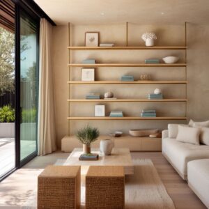
Terracotta Through Object Collecting and Display
Modern clay-based designs often use curated pottery and handmade pieces. Instead of filling shelves, arrangements are sparse, giving each object room to breathe.
Terracotta bowls, hand-shaped vases, and earthen sculptures act as color punctuation marks. This style also avoids clutter—each piece is chosen for form, finish, or slight color shift rather than quantity.
When placed on stone tables or pale shelving, these objects become subtle visual highlights. This approach supports terracotta accessories living room design, where small touches can shape the entire palette.

Different Types of Clay Objects and Their Visual Roles
Often placed on coffee tables or console surfaces, they act like calm, horizontal color anchors. Their open shape invites the eye inward and keeps the mass of terracotta close to the surface, which feels grounded rather than upright or commanding.
These introduce vertical movement in the composition. A slender terracotta vase beside lighter ceramics creates a gentle upward line, guiding the gaze from the tabletop toward art or shelving above, without feeling severe.

Slightly asymmetrical objects, with small variations in thickness and contour, bring in a soft human touch. In modern terracotta living room decor schemes, these sculptural pieces prevent the palette from slipping into something too smooth or anonymous.
These compact items often sit near the edge of shelves or on stacked books. They read as quiet punctuation marks: small dots of clay color that keep the eye moving without demanding attention.

Spacing, Rhythm, and Repetition on Shelves
On open shelves in a clay-toned palette, empty space is considered as carefully as each object:.
- Breathing gaps between pieces keep the clay tones from visually merging into a single stripe of color.
- Rhythmic repetition appears in how pieces are grouped: perhaps two taller items on one shelf, then a single bowl on the next, then a low cluster of three.
- Subtle echoing of shapes and heights guides the eye diagonally across the shelving rather than in a strict left-to-right line.
Terracotta becomes part of a visual rhythm—appearing here, pausing, then reappearing—rather than a continuous block.

Color Micro-Variations Within One Clay Family
Contemporary shelves rarely hold several identical terracotta shades. Instead, there is a delicate ladder of tones:.
- One vase leaning more pink.
- Another slightly browner, closer to baked earth.
- A bowl softened with a chalky veil.
- A pot with deeper saturation at the base and lighter edges near the rim.
These micro-variations give depth to the whole collection. The viewer perceives a unified clay story, but also senses the subtle differences, which adds visual interest without any need for bold patterns or strong contrasts.

Terracotta as the Color of the Floor Plane
A floor-level clay tone changes the reading of the whole design . When terracotta sits underfoot, the warmth spreads outward and upward, lending a soft glow to furniture and walls even if they stay neutral.
The floor becomes the quiet source, rather than the walls or ceiling. This is especially clear when a large rug in muted clay tones stretches under the main seating area.
Rug Texture and Pattern as Gentle Structure
Terracotta rugs in modern spaces often rely on texture more than strong graphic motifs:.
- Speckled or heathered fibers introduce tiny flecks of lighter and darker clay, sand, and stone, so the rug looks deep rather than flat.
- Subtle striping or tone shifts can appear as bands of slightly darker or lighter terracotta, creating a soft path without forming a bold pattern.
- Thicker knots or looped pile add shadow and softness, making the seating arrangement feel protected and grounded.
The rug functions like a warm landscape under the furniture—a field of color that supports everything on top.

Clay Floors and the Perception of Lightness in Furniture
When terracotta appears as tile or stone flooring, pale sofas and light wood pieces seem to float above it. The visual weight moves downward into the floor plane:.
- Pale boucle seating appears almost cloudlike over clay tile.
- Light wood chair frames look refined rather than rustic because the floor already holds the earthy role.
- Stone or light-toned coffee tables feel crisp and cool, resting on a subtly warm ground.
This effect works especially well in interiors that want warmth without darkening the vertical surfaces.

Transitions Between Terracotta Floors and Adjacent Materials
Clay-based floors often sit beside other finishes—such as wood, polished concrete, or a different stone. The connecting lines are important visually:.
- Soft color bridges through rugs, mats, or runners that contain both clay and neutral tones help the eye accept the material change.
- Furniture legs that share some warmth with both surfaces can visually tie them together, like warm timber legs spanning a terracotta area and a paler adjacent zone.
- Repeating clay tones elsewhere (a cushion, a vase, a framed textile) keeps the floor from feeling isolated as a single colored block.
In this way, floor-level terracotta sets the emotional temperature for the space without needing to dominate every surface.

Clay and Cool Neutrals: A Modern Contrast
Terracotta pairs surprisingly well with cool greys and soft charcoal tones when used carefully. These cool shades emphasize terracotta’s warmth without turning the palette heavy.
A textured grey sectional against a clay ottoman creates a cozy equilibrium. A pale grey linen sofa placed in front of a clay wall adds depth without contrast harshness.
This combination is particularly effective in grey and terracotta living room ideas, where the palette depends on balancing warm richness with calm neutrals.

Roles of Terracotta and Grey
In these combined palettes, each color takes a distinct role:.
- Terracotta often appears in objects that feel more tactile or sculptural—sofas, ottomans, cushions, pottery, rugs.
- Grey tends to define structural elements or large neutral surfaces—sectionals, concrete-looking tables, soft wall colors, or stone finishes.
Because of this, terracotta reads as the emotional note, and grey acts as the calm frame.
Temperature and Value: Why the Mix Feels Balanced
The mix works so well because of subtle control in both temperature and lightness:.
- Cool grey tones dial down the visual temperature, preventing clay tones from feeling overly warm.
- Mid-depth terracotta shades keep their presence without becoming too strong.
- Lighter greys around a clay feature help the terracotta stay prominent but not harsh.
- Darker greys in small elements (like a slender metal lamp, or the line of a window frame) sharpen edges and prevent the design from feeling soft in every direction.
The result is a space where warmth is always present, but never overwhelming.

Textural Conversations Between Clay and Grey
Texture plays a key role in this pairing:.
- Clay leather or velvet beside heathered grey wool shows a gentle difference between smooth and slightly fuzzy.
- Matte clay pottery on a cool grey stone table creates a small, refined contrast between porous and dense surfaces.
- Terracotta cushions on a grey linen sofa keep the eye moving along the seating while tying into clay accents around the design.
The pairing works as a continuous dialogue: grey sets the tempo, terracotta adds warmth, and texture ensures the relationship stays visually rich.

Using Greenery and Outdoor Views as Complementary Tones
Green is terracotta’s most natural companion. Plants soften clay tones with cool freshness.
Desert plants, soft olive leaves, eucalyptus, or muted garden foliage mirror the balance found in nature. When the outdoor view includes dry grasses, trees with warm tones, or stone surfaces, the terracotta inside feels like an extension of that landscape.
This interplay creates a connection between indoor comfort and the natural world, giving the design a calm, earthy presence without adding new accent colors.

Types of Greenery and Their Visual Effect
Different plant types change the mood of a clay-toned interior:.
- Desert-inspired plants (cacti, succulents, agave)
These pair particularly well with terracotta, echoing arid landscapes. Their sculptural forms add strong silhouettes against warm walls and clay pottery. - Soft olive-toned foliage
Eucalyptus and similar leaves bring a dusty, muted green that sits perfectly with clay and stone, adding freshness without sharp contrast. - Fine-leaved trees or shrubs
Trees outside a window or an indoor tree in a clay pot can create a delicate mesh of branches and leaves, casting moving shadows over terracotta surfaces and adding gentle animation.

Indoor–Outdoor Color Echoes
In spaces where large windows reveal gardens, courtyards, or wider views, terracotta often mirrors the outdoor palette:.
- Clay tones inside may echo the soil, rock, or bark colors outside.
- Dried grasses, seed heads, or autumn foliage visible beyond the glass repeat the warm hues of rugs and cushions.
- Stone surfaces or pale gravel outside resonate with indoor stone tables and light wall finishes.
The result is a seamless conversation: clay inside, earth outside, both framed by branches and leaves.

Clay Containers and How They Interact with Plants
Terracotta pots themselves play a dual role as color and container:.
- When pot and wall nearly match, the pot visually dissolves into the background and lets the plant’s trunk and foliage stand out.
- When the pot is deeper in tone than the wall, it becomes a distinct grounded shape, anchoring a corner or a shelf.
- When the pot sits on a stone or wood surface, it completes a three-material story—clay, wood, and greenery or clay, stone, and greenery—all rooted in a quiet earth-inspired palette.
By pairing plants with clay containers, modern interiors extend the terracotta story into living, changing elements that respond to light, seasons, and daily use.

Terracotta in Soft Furnishings and Lounge Furniture
Contemporary design often express terracotta through comfortable seating—loungers, modular sofas, velvet armchairs, cushioned benches, or sculptural ottomans. These pieces anchor the design through form, texture, and warmth.
Ribbed terracotta upholstery creates softness and subtle shading. Velvet produces quiet depth.
Linen shows tone variation through folds and natural creases. When paired with neutral rugs, pale plaster, and soft lighting, these pieces become warm focal points that define the mood of the space.
This approach captures the essence of modern terracotta lounge ideas, where comfort and clay-inspired color work together.
Conclusion
In modern styles, terracotta works less as a single feature and more as a quiet system that shapes mood, rhythm, and zoning. It moves between architecture, textiles, objects, and flooring, changing character as texture, light, and neighboring materials shift around it.
Soft neutrals, pale stone, warm wood, and muted greenery create a calm frame that lets clay tones feel rich without becoming heavy, while cool greys and charcoals keep the palette precise and contemporary. Together, these elements show terracotta as a flexible, deeply atmospheric color language—equally suited to bold walls and sofas, or to the smallest handmade vessel on a pale stone table.