A porch can look finished and stylish without lots of decor when one calm wall mural appears as part of the entry composition. This article explains why murals work so well in simple porch designs, and breaks down the visual strategies that make a simple mural porch feel intentional—through spacing, rhythm, contrast, grounding at the base, and a controlled sense of warmth.
In simple porch designs, the most convincing wall-mural look happens when the mural behaves like an atmosphere layer sitting on a calm wall surface, while the entry elements act like clear punctuation. The overall effect tends to read as composed and finished with very few objects because the visual hierarchy is doing most of the work.

Main ideas for successful schemes:.
- one quiet wall field (soft plaster, stucco, concrete panels, or a washed paint finish)
- one linear mural language (bamboo stems or trunk bands, light foliage marks, generous empty space)
- one anchor shape (a strong door rectangle or a recessed door pocket, which can be paired with crisp glazing)
- one grounding system at floor level (planters, clipped shrubs, gravel strips, low ledges)
- one warmth control (wood overhead, warm metal, warm interior glow, warm wall-wash light)
.

The mural reads like finish when the wall behaves like material
Many easy front porch ideas with murals succeed because the wall is treated as a surface with its own quiet depth first. Subtle mottling, soft trowel movement, velvety stucco, or faint panel seams create micro-variation that changes how linework is perceived.

That surface behavior quietly shifts the mural into a higher-end register:.
- thin lines feel embedded because the wall already has tonal motion to hold them
- contrast feels controlled without making the drawing disappear
- the mural reads as part of the exterior finish story, not as a separate graphic laid on top
The result is a porch wall design that looks finished even when the mural itself stays very restrained.

Door color typically plays one of two roles: tone sibling or gravity block
A consistent strategy is to decide whether the door should blend into the mural’s palette or act as the strongest anchor in the composition. Tone-sibling doors sit near the mural’s color family (dusty greens, muted violets, pale neutrals).
This creates a blended entry where the door and wall feel like one calm field, and the mural becomes a soft layer inside that field. The mood tends to be quiet, art-forward, and gentle.

Gravity-block doors go darker or warmer (black, deep navy, rich wood). This creates a clear center of gravity that holds the whole porch design together.
The mural then functions less like a “feature” and more like a corridor backdrop that supports the door’s weight. The mood tends to be more formal, focused, and confident.

The “simple mural” effect depends on a strict stem-to-leaf ratio
A non-obvious control lever is how much leaf information is allowed. When a mural includes too many leaf clusters or overly detailed foliage, the wall starts to behave like wallpaper.
When stems dominate and leaf marks stay sparse, the mural reads as rhythm and spacing instead of a themed scene. This is why bamboo and winter-trunk concepts work so reliably on porches: they naturally translate into tall linear strokes that can scale up without becoming visually heavy, as long as the empty wall remains a major part of the design.

Negative space around openings is what keeps art from turning into clutter
Murals feel more intentional when they respect windows, arches, sidelights, and door surrounds with clean margins. Instead of pressing busy linework right to the edges, the composition often thins out near openings or “drifts” around them.
That breathing room does two things at once:.
- it keeps the architecture readable as the primary structure
- it makes the mural feel like it lives behind the architecture, which stops it from looking applied later
Even a very simple line mural can look refined when the openings stay crisp and legible.

Vertical rhythm is doing mood work: taller, calmer, more sheltered
Porches are naturally transitional spaces, so vertical line systems can shape the feeling of arrival without adding extra objects. Tall stems and trunks pull the eye upward and stretch the perceived height of a porch wall, which often reads as calmer than a horizontal-heavy approach.
When the mural’s vertical beat is paired with a quieter overhead plane (plain ceiling, soft soffit), the eye tends to settle into the wall rhythm instead of bouncing around, which is why these compositions can feel serene even with very little décor.

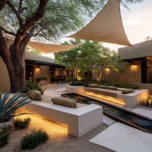
Counter-shapes at the base keep line murals from feeling sharp
Because mural linework is often slender and vertical, grounding forms at floor level usually lean toward simple, heavy geometry: bowls, cylinders, urn-like volumes, cubes, or clipped spheres. These shapes act as visual counterweights.
This contrast creates a balanced conversation:.
- linear and airy on the wall
- dense and calm at the base
It also reduces the risk of the wall feeling “top-heavy,” especially when the mural is large-scale.

Grounding systems replace “decor”: planters, shrubs, ledges, and gravel act like a baseboard
A lot of easy front porch decorating ideas stay visually strong by relying on base-weighting instead of accessory clutter. Repeated planters, low clipped greenery, and gravel strips create a clean lower band that stabilizes tall mural lines.
This base band works like an exterior baseboard: it anchors the composition, organizes the floor zone, and gives the wall a clear start point. When that grounding is present, the mural can stay light and the porch still feels complete.

Light often functions as second paint, especially with subtle line murals
Simple murals become far richer when lighting is treated as part of the composition rather than a separate utility element. Warm wall washes, low uplights, and step-edge glow can make thin linework read like shadow drawings at night.
This approach changes the mural’s role through the day:.
- in daylight, the mural stays quiet and airy
- in evening light, the same lines gain depth and presence without any change in paint
The “expensive” feel frequently comes from this time-based shift rather than from complexity.

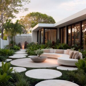
Layering “real + drawn” creates depth without adding objects
A stylish design signal is pairing a mural theme with planting that echoes it in a different register: bamboo or upright plants near a bamboo mural; soft airy foliage that creates live shadow texture near painted linework.

When the layers are organized with discipline, the eye reads depth:.
- a foreground plant layer with real shadow and motion
- a flat mural layer that stays calm and fixed
- crisp architectural cuts (door glass, black frames) that keep the composition sharp
This layered reading makes small porch zones feel larger and more immersive while staying minimal.

The corridor effect: murals quietly guide the approach
A useful strategy in easy porch ideas is using repetition and tapering to create directional pull. Larger clusters near the start of an approach, followed by smaller repeats farther along, can draw attention toward the door without signage or busy decor.
Black-framed openings, sconces placed in “calm gaps,” and a consistent mural rhythm can turn side passages and narrow entries into intentional approach sequences that feel curated rather than leftover.

Visual look families created by these strategies
- Quiet ink-wash / gallery entry. Soft wall fields, low-contrast linework, warmth from wood or small metal notes, minimal base objects.
- Formal classic refreshed. Traditional envelopes (arches/columns/brick) kept readable, murals used as softening layers, strong door anchors, disciplined symmetry.
- Graphic shadow-play modern. High contrast linework reading like frozen light/shadow, cropped scale, minimal objects, crisp frames as punctuation.
- Winter grove / trunk-as-structure. Oversized trunk bands behaving like architectural rhythm, fine branch detail, cool wall tones balanced by warm overhead wood.
- Large façade “one big idea” entries. Murals used to control scale on tall surfaces, planting and lighting layered for richness, recessed doors and glazing adding depth.
- Warm hand-crafted corridor. Straw-toned linework paired with woven texture and gentle floor patterning, repeated mural rhythm on more than one plane.
.

The underlying principle
The strongest mural porches read as a single composition built from: a quiet wall field + controlled vertical rhythm + clear architectural punctuation + grounded base weight + one warmth system. When those five parts are aligned, the mural stays simple, the porch stays calm, and the entry still feels finished and intentional.
With clear spacing, controlled repetition, and a few grounded accents, the mural becomes part of the design, so the entry looks finished without feeling busy.