The pantry entry can quietly set the rules for how a kitchen feels. The door isn’t treated as a leftover closure; it becomes a control surface that decides how much “inventory reality” is allowed into the room, how light is shaped, and whether the end of a cabinet run reads as a flat stop or a designed destination.
In this sense, kitchen pantry door ideas often function like composition tools: they manage visual noise, create rhythm, and stage depth without changing the layout.
The pantry door as a lens: turning storage into atmosphere
Reeded / fluted glass: vertical compression
A strong pattern of vertical ribbing can act like a visual condenser. Instead of reading labels, corners, and tiny contrasts, the eye reads:
- vertical light bands
- softened silhouettes
- warmth gradients
This is why reeded glazing can imply a full pantry while still feeling calm: many small items merge into one tall texture field. The kitchen’s dominant horizontals (counter edges, shelf boards, drawer rails) feel more composed when a pantry entry contributes a steady vertical rhythm.
These are classic pantry glass door ideas because the surface itself becomes the editing layer—storage turns into tone, not inventory.

Rippled / crinkled glass: sparkle-first hierarchy
Heavier, irregular texture changes the order of attention. The surface reads as light-play before it reads as depth.
This creates an endpoint that feels lively even in restrained designs: a pantry can become an “active surface” without adding color, simply by scattering daylight into small highlights that animate a long view.
Frosted glass: tonal blur with a smooth silhouette
Frosted glazing removes detail evenly, turning contents into soft blocks of value. In minimal kitchens, this matters because the door avoids introducing another busy pattern while still delivering a sense of depth.
Frosted glass pantry door ideas often rely on even interior light so the door reads as a gentle luminous plane rather than a dim rectangle.

Frames do psychological work: outlines that define mood
Black framing: crisp boundary lines
Dark metal outlines behave like graphic linework. They give light a clear edge so an illuminated pantry reads intentional rather than incidental.
Thin, consistent frame thickness tends to read controlled and contemporary; the outline becomes a calm perimeter that gathers nearby dark accents into one visual language.
Brass or warm metal framing: warmth without heaviness
Warm metal frames add glow and softness while still providing a boundary. Instead of cutting sharply, they “warm” the portal and make smaller warm-metal details feel unified, because the pantry frame becomes the largest, calmest metal moment in the view.

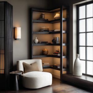
Pantry doors as corridor endpoints: perceived length and composure
Pantries placed at the end of a run naturally collect the room’s directional lines. This makes the door behave like a visual anchor: shelves, toe-kicks, and counter edges aim toward it, so the pantry becomes the place where the eye rests.
A subtle compositional effect often shows up in tighter layouts: strong horizontals aiming at strong verticals (tall pulls, glazing ribs, mullions) creates a stable tension that feels “finished. ” Many small pantry door ideas succeed by using this endpoint logic—turning the far wall into a designed stop that carries the kitchen’s linework cleanly to a conclusion.

The “visual density switch”: doors that let the room change modes
French-style doors and partially glazed doubles create a useful density mechanism:.
- closed: the wall returns to a calm cabinet face
- open: the pantry reads as a staged niche
Narrow inset glazing works as a restrained “signal” of depth. Because the glass reads like an accent line more than a full window, it provides reassurance of light and storage without dumping every detail into view.
This density control is also where bifold pantry door ideas often sit aesthetically: the door type supports a quick shift between a uniform wall and a revealed storage scene, keeping the kitchen’s overall calm intact.

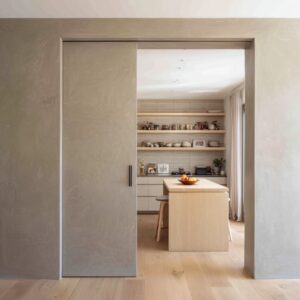
The “one quiet plane” approach: solid wood doors that stabilize complexity
In interiors with industrial cues, sharp shadow lines, or active open shelving, an unglazed wood slab can act as a visual full stop. The pantry becomes the calmest surface in the design: a single warm rectangle that absorbs attention and steadies contrast.
A minimal handle choice matters here because it becomes the one deliberate punctuation mark on the plane. The result is a studio-like edit where the pantry can hold visual chaos, while the kitchen maintains a controlled surface story.

Arches and shaped portals: turning pantry access into a destination
A curve changes the pantry from “service opening” to “architectural moment. ” Even without ornament, an arch introduces a softer geometry that breaks cabinet-box repetition and adds a sense of threshold.

Three recurring visual strategies tend to appear:.
- a crisp outline framing a soft curve (graphic clarity + gentle shape)
- warm wood wrapping the curve (threshold warmth + sculptural depth)
- layered outlines (a portal that feels nested, pulling the eye inward)
These approaches often work because the curve catches light in gradients, creating a natural vignette that frames the pantry zone even before glass or hardware is noticed.

Feature-wall pantry doors: concentrating texture and glow in one zone
A pantry wall can become the designated place where the design keeps its texture and light drama—especially in modern kitchens with many flat planes. Large textured glazing paired with warm interior lighting creates a focal field without requiring a new palette.
This is a “concentration” tactic: rather than distributing decoration everywhere, the pantry becomes the single zone where tactile surface + glow + tall proportions live together. The kitchen stays quiet, while one area carries the room’s atmosphere.

Ribbed-wood sliding surfaces: softness through shadow, not ornament
Fine vertical fluting on wood behaves like a shadow instrument. Under grazing light, the surface shifts between matte and sheen, creating movement that reads controlled, not busy.
Dark-stained versions feel moody and gallery-like; pale fluted versions feel like a warm daylight band inside muted cabinetry. A repeating pattern of grooves also changes how adjacent styling reads: rounded ceramics, calm jars, and greenery soften the strict vertical rhythm, preventing the wall from feeling severe.

Doorless portals and slat screens: separation through rhythm, not closure
Removing the door shifts the pantry into the room’s everyday visual field, so the framing becomes more important. Deep surround color can push the pantry back like a “mat,” making the interior feel intentional and composed.
Vertical wood slats nearby can create a sense of boundary without blocking openness, adding rhythm that balances long horizontal counters and islands. Dark shelving inside this setup often performs visual cleanup: it reduces the contrast of small packaging edges and makes storage read as silhouettes and blocks—calmer from a distance.

The pantry interior is part of the door effect
Many pantry door designs depend on a hidden rule: what reads through glass (or around a doorless opening) is not the literal item list, but the silhouette plan.

Order that reads well at a distance usually comes from:.
- repetition of jar heights and lid shapes
- baskets forming texture bands (often high or low)
- consistent spacing that creates rhythm
- darker shelf backdrops that mute small label contrast
This is where pantry door storage ideas become a design language: storage isn’t treated as separate from aesthetics; it becomes the content that the door edits into pattern, tone, and calm.
Micro-details that quietly signal intention
Small choices scale up visually:.
- long vertical pulls that reinforce height and reduce blankness
- minimal hardware on fluted fields so the surface stays continuous
- clean meeting seams on sliders that read as a crisp shadow line
- narrow glazing proportions that behave like accent lines, not windows
- substantial casing that turns a pantry entry into a true threshold

A mood map of outcomes (visual results by strategy)
- graphic calm + warm glow: reeded glass + dark outline + interior light
- airy shine: rippled glass + warm metal perimeter
- quiet built-in effect: solid doors aligned to cabinetry planes
- clean luminous volume: frosted glass + even interior lighting
- architectural destination: arched portals + layered thresholds
- controlled drama: textured glass feature wall + concentrated glow
- soft shadow texture: ribbed wood planes + restrained styling

These strategies describe why many pantry door ideas feel “designed” even when the rest of the kitchen stays reduced: the pantry entry is where the room’s editing, rhythm, and depth get resolved.