Wood cabinets already bring texture, warmth, and a lot of visual personality. Wall paint can either make that wood look richer and cleaner, or accidentally push it toward yellow, orange, or dull.
The difference usually isn’t one magic paint chip. It’s the way several choices line up: the wood tone, the grain pattern, how much wood fills the room, the counter and backsplash materials, and even how glossy surfaces bounce light back onto the walls.
8 design points that decide whether the pairing feels right
1) Wood warmth level
Think of this as how much yellow or red energy the wood brings.
- High warmth: honey oak, warm oak, teak-like veneer, espresso-leaning stains
- Medium warmth: walnut-brown oak, medium oak, walnut (varies by cut)
- Low-to-mid warmth: washed oak, white oak, rift/straight-grain oak, pale maple/birch veneer
Why it matters: warmer woods can look overly golden if the wall paint also leans creamy-warm, or more orange if the wall paint is a clean cool gray.

2) Grain activity
This is the busyness of the wood pattern.
- High activity: walnut with big cathedrals/feathering; some honey oak with strong cathedrals
- Medium activity: typical oak grain with some variation
- Low activity: rift/straight grain; calm veneer figure; slab fronts with controlled grain selection
Why it matters: the more active the grain, the more the walls need to stay calm (usually muted). If you want noticeable wall color, calmer grain makes it easier.

3) Wood massing
How much of the kitchen is wood: tall cabinet walls, long runs, island faces, paneled fridge, open shelves. Why it matters: the bigger the wood footprint, the more the paint must hold the room together.
Small wood moments can handle bolder paint. Full-height wood walls often need paint that plays a supporting role.

4) Paint temperature axis
Warm vs cool is not about the label; it’s about undertone.
- Warm can be creamy, sandy, or taupe-warm
- Cool can be blue-gray, green-gray, or lavender-gray
- Many successful paints sit in the middle: greige, stone-gray, mushroom-taupe
5) Paint chroma
Muted (low saturation) vs clean, clear color.

A major repeating pattern in the concepts: muted wins. Bright, clean color is rare because wood already brings visual flavor.
Muted paint tends to look intentional next to grain.

6) Paint value
How light or dark the paint is.
- Light walls often aim for airy and open
- Dark walls can frame wood and simplify visual noise
- Mid-light walls often work as a steady background for mixed stone + wood combinations

7) Mediator surfaces
Counters and backsplash are translators between paint and wood.
- Warm mediators: creamy stone, warm off-white surfaces, travertine-like tones
- Cool mediators: aqua/blue-green glass tile, gray stone, gray tile, cool pale veining
- Texture mediators: handmade tile relief, wavy tile, stacked seams (adds depth without adding a new hue)
This is a big deal: many paint problems are actually counter + backsplash problems that the paint is forced to solve alone.

8) Edge definition and reflection behavior
Two quiet levers that change everything:Edge definition: black window frames, dark hardware, darker hood insert, dark cooktop line
- Keeps soft palettes from turning blurry
- Helps pale wood stay crisp in bright daylight
Reflection behavior: glossy tile and bright counters bounce light and tint the walls
- A wall color can look perfect on a sample, then turn buttery once glossy white tile starts reflecting sun.

Trendy paint families
Instead of focusing on a single trendy shade, notice the families that are popular now:
- Warm off-white / cream / beige
- Greige / taupe / mushroom / stone-gray
- Green-gray (sage/olive/pewter-green/gray-green) (very common for oak correction)
- Blue / blue-gray (usually gray-based and softened)
- Dark warm neutrals (cocoa/charcoal-brown) (especially, for framing pale wood)
- Lavender-gray complex neutral (quiet cool veil approach)
Kitchen paint color for wood cabinets lean low-chroma and undertone-aware. The goal is usually yellow/orange risk management, not matching.

5 pairing ideas
Warm light walls + deeper warm wood
Good for: walnut-brown oak, medium oak, walnut, richer stains when you still want a bright kitchen. How it works
- Walls sit in warm cream, warm greige, or sand-beige
- Counters stay light, but not icy
- Texture in backsplash or stone movement prevents flatness
- Small dark accents stop the kitchen from leaning too traditional

Key detail
A small gray/taupe ballast in the paint keeps warm light walls from turning buttery once tile and counters start reflecting daylight.

Dusty green-gray to calm warm oak and yellow-risk woods
Good for: honey oak, warm oak, pale maple/birch veneer, teak-like warmth that feels too orange.

How it works
- Choose muted sage/olive/pewter-green with a gray base
- Pair with a translator backsplash (aqua/sea-glass, gray tile) so stainless and counters feel connected
- Add warmth elsewhere (floor, brass, leather, wood trim) so the room still feels welcoming
Why green-gray shows up so often
It cools warmth without making the wood look aggressively orange by comparison. It tends to feel natural next to wood.

Dark warm walls that frame pale wood
Good for: pale oak, birch/maple veneer, washed oak when you want architecture and contrast without a cold mood. How it works
- Use deep cocoa or charcoal-brown rather than blue-charcoal
- Pale wood becomes the bright focal mass
- Keep floors warm and lighter
- Under-cab lighting turns dark backsplash materials into a textured band instead of a heavy block
Hidden benefit
Dark warm walls can make the kitchen feel tidier by visually reducing background edges, so cabinet proportions and wood figure stand out.

Dark warm walls can make the kitchen feel tidier by visually reducing background edges, so cabinet proportions and wood figure stand out.

Softened cool-neutrals for pale oak
Good for: light oak that starts looking yellow in certain lighting, especially with lots of white stone. How it works
- Walls in foggy lavender-gray, sea-salt blue, or mineral blue with a gray base
- Warmth returns through brass tones, warm lighting, and wood floors
- Works best with straight-grain woods or calmer cabinet faces
Important pairing point
Deeper cool wall colors tolerate wood better when grain is disciplined. Busy grain plus deeper color can feel visually restless unless something organizes it (strong stone, strong trim, or a dark frame).

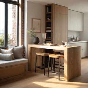
Tone-on-tone warm neutrals with light oak
Good for: galleys and long kitchens where you want the space to feel open and steady through the day.

How it works
- Paint, stone, and wood sit close in value (light to mid-light)
- Few harsh breaks; the room feels continuous
- Crisp outlines (black frames, darker counter line, hood insert, hardware) provide structure
Key detail
Tone-on-tone succeeds when contrast is used as thin, controlled lines, not big blocks.

The core mechanics that solve the most common problems
Undertone compensation beats matching
Choosing a wall undertone that makes the wood look like a cleaner version of itself.
- Warm oak that feels too yellow: dusty sage, olive-sage, gray-based blue, warm stone-gray
- Walnut that starts leaning red: mushroom-taupe, sand-beige that avoids creamy yellow
- Pale maple/birch that picks up yellow: pewter-green or dusty sage
Avoid two traps:
- Clean cool gray that makes warm wood look more orange by contrast
- Creamy yellow-beige that stacks warmth and pushes amber
Warmth budget: spread warm notes so cabinets don’t carry everything
Many oak looks too yellow moments happen because warmth is concentrated in one place.

Ways the concepts distribute warmth:
- Floor + leather + brass share the warmth load
- Walls act as the mediator while wood and stone set mood
- Warm lighting and brass soften cooler wall colors
Reflection loops: glossy surfaces can retint the wall color
If there is glossy white subway tile or very bright counters, they can bounce sun back onto the walls and shift the paint warmer.

Practical takeaway:
- In shiny backsplash kitchens, greige/taupe/stone-gray neutrals often stay steadier than creamy warm paints.
Placement strategy: where to put color changes how strong it feels
Repeated placement moves that work well:
- Paint wraps the room to frame cabinetry and make it feel built-in
- A high band above cabinets cools a warm-wood kitchen without surrounding you in color
- Color concentrated on one focal wall near shelves keeps the scheme composed
- Dark paint used mainly on vertical/upper planes, while floors stay light, prevents heaviness

Quick pairing guide
- Start with the wood
- Warm honey/amber wood? Treat it as high warmth.
- Calm straight-grain white oak? Low-to-mid warmth, low grain activity.
- Dramatic walnut figure? Medium warmth, high grain activity.
- Choose one of these goals
- Want the wood warmer and richer: warm light walls with gray/taupe ballast
- Want the wood less yellow/orange: dusty green-gray or gray-based blue
- Want architecture and contrast: dark warm frame around pale wood
- Want steady brightness in a long space: tone-on-tone + thin dark outlines
- Pick mediator surfaces on purpose
- Bright/cool counters: avoid creamy yellow walls
- Glossy tile: assume it will warm the wall by reflection
- Busy grain: keep paint muted and add depth through texture, not stronger color
- Add edge definition
If your palette is soft, plan a few crisp elements: hardware, frames, hood insert, or a darker counter line.

Common problems
- My honey oak looks yellow: choose dusty sage/olive/stone-gray, then spread warmth through floor/leather/brass
- My light oak looks washed out in sun: warm off-white with a muted base + metal hardware lines + stone movement
- I want drama but not a cold vibe: cocoa/charcoal-brown walls + warm floors + pale wood + under-cab lighting
- I want color but easy to live with: gray-based blues with warm metals and warm lighting
- My stones don’t match (cool backsplash, warmer counter): a mediator neutral like taupe-gray or complex lavender-gray that sits between them
- My walnut looks red: mushroom-taupe or sand-beige walls, bright trim/counters, restrained styling